Stonemarket 2012 brochure
Events have conspired to make this first brochure review of the new season a little later than usual, but then, so many of the annual rush of new products are now announced during the autumn that the official publication can seem like something of an anti-climax. The element of surprise and delight is lost and so the focus on the actual brochure itself becomes ever keener.
Some manufacturers rely on overwhelming us with new products to distract attention from the lack of quality in the new season's catalogue, and some manufacturers dress up old ideas to make them seem new and exciting in barely re-vamped catalogues. Luckily for us, Stonemarket have a long tradition of providing top-notch new products in an alluring new brochure on an annual basis.

The current Stonemarket model of stark white cover and non-standard size format has seen several years of service now, but still looks fresh, chic and classy. Good design has legs, you see. And a whopping 140 pages, which matches last year's edition exactly – not bad for these days of austerity. In fact the only item of any note is the appearance of the legend 2012/13 on the spine: are they hoping to get two years' service out of this edition?
As already mentioned, the new products were signposted back in November , so there's no point in going through them all once again. Instead, we'll look at how the brochure has changed and developed.
By and large, it's very much what has to be recognised as the Stonemarket house style. Wonderful layout enriched by superb quality photographs, sparse but adequate descriptive text, and ample technical information to allow designers, contractors and DIYers determine just what they will need.
Admittedly, some of the photos are now quite familiar, but then we have to ask how many people actually read or consult these brochures year after year after year? There can't be that many sad people like myself, can there? Surely the vast majority of the intended readership will be new visitors, blissfully unaware that, for example, some of the Fieldstone images date back to those heady days before the world was screwed.
One very noticeable change is the prominence of 'social media' follow-ons. The contents listing on page 3 provides links to the YouTube channel and online videos on the Stonemarket website. And QR codes providing scannable links for smartphones. This wasn't even dreamt of two years ago!
And if I have to pick out one item from the whole of the catalogue that really cheers my heart, it's the inclusion of quality native stone, what they refer to as "Indigenous". There's nowt wqrong with the stone pouring in from Asia and further afield but we should never forget that we are blessed in these isles top have some of the finest paving and walling stone on the entire planet. The crazxy mixed-up workings of modern economics mean that it's often cheaper to drag a great lump of rock 10,000 miles across continents than it is to load it on a lorry and drive over from South Wales, but that shouldn't put us off. Props are due to Stonemarket for poutting "Indigenous" stone back on the menu!
Thinking back over the twenty years or so that I've been charmed by the various generation of the Stonemarket catalogue, it strikes me that a consistent theme has been the imagery. Nothing sells paving and hard-landscaping better than a bloody good photo, and I can't think of any other manufacturer, in Britain or anywhere else in the world, that understands and implements this concept quite as well as Stonemarket team. There's a style that only they seem to achieve and even for the products which wouldn't be on my list of favourites are made to look surprisingly attractive by the clever use of staging and lighting. It's not cheating: it's very, very clever and subtle marketing.
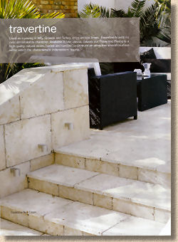
Given the right staging, even travertine can look good......sort of.
Those of us who have been in this trade far longer than our backs and knees would have liked will be able to recall the days when there was almost no support for domestic paving and landscaping. I vividly recall showing residential clients in the early 1980s technical documents and incredibly stingy photos produced by manufacturers for the specification market. The sort of images that were needed to show such clients what was possible with their driveway or patio just didn't exist, so I had to build my own portfolio.
By the turn of the century, just a decade ago, the amount of marketing material available had become overwhelming. Even now, there are shelves in my office that are literally bulging under the strain of carrying all the printed material that I have amassed over those years. Now, in the second decade of this century, more and more contractors are relying on laptops, tablets and online content to show clients what might be possible, but there is something reassuring about a printed brochure, even if it is only the fact that you can leave it with a client.
However, in a time when you could easily fill a 4x4 with all the sales and marketing bumf that is available to the typical patio and driveway contractor, if you had to limit yourself to just three brochures what would they be? I know there will be debate about second and third choice, but no-one in their right mind could deny the fact that, if you don't have the latest Stonemarket brochure as your number one sales tool for patios, you don't have sh….anything!
