I met up with an old acquaintance a couple of weeks back, not seen each other for 10 years or so because he’s been plying his trade in that Canada but is back for a couple of months’ research, waiting for the plains of Winnipeg to thaw out before starting back to work. It was insightful to hear his thoughts on the changes that have occurred in the British hard-landscaping market since he last wielded a maul on these shores in the shadow of the Bankers’ Balls-Up which convinced him to seek his fortune elsewhere.
Amongst the topics of conversation was the number of paving suppliers that had built-up their brands on the back of the boom in imported stone in the late 1990s and early 2000s, often giving themselves a name along the lines of “Super Stone” or “Worldwide Stone Providers”, and now find that previously defining moniker something of a hindrance as they thrust into the new dawn of porcelain, ceramics, vitrified and digitally printed paving. All of a sudden, the attachment to stone doesn’t seem as beneficial as it once did.
We could have been (but weren’t, especially) thinking of Global Stone, a brand that grew from sideline of a regional Builders’ Merchant into an industry-leading supplier of all sorts of imported stone, particularly the Indian materials, and played a hugely significant role in getting those products firmly embedded into the psyche of British and Irish contractors, designers and customers alike. And now, in 2020, almost half of their just-released brochure is given over to today’s big thing: porcelain (and the like).
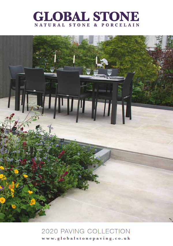
Yet Global don’t seem to be intimidated in any way by their history or the brand name. A change of ownership last year could have resulted in new brooms unnecessarily sweeping away all the good work and good will developed over the years of selling stone, but that winning team has, largely, been kept in place and given new impetus to push hard into the promised lands of porcelain (and the like). They’ve wisely created an identifiable sub-brand, Trovia, for the fired products, but, for now at least, Global Stone remains the name on the tin.
For 2020, they have stuck with the core of their stone offer - established ranges of quality paving sold at value-for-money prices – but rather than tread water while heads are turned by the shiny kiln-fired products, they’ve significantly expanded the ‘traditional’ side of things with new flags, setts, pavers and walling. Seventeen, yes, seventeen new products are identified right at the outset of the brochure, and while some of these are simple additions to colour options, there are some genuinely new items, notably two new clay pavers, “Rustic Flame” and “Cherry Blend”.
I do like to see new products picked out when they are first shown in a brochure. Not solely because it makes my job that bit easier, but I feel it shows customers and contractors alike that this is a brand that is very definitely not standing still, but is continually developing, always innovating, permanently looking for something new, different and exciting. If you’re making all that effort, it makes sense to ensure your potential customers know all about it.
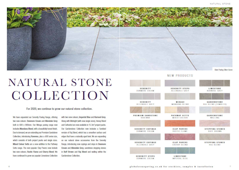
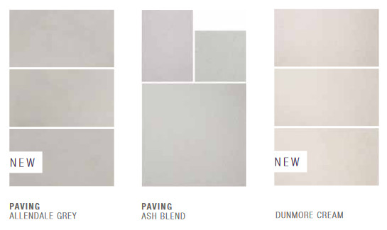
Having said that, and judging solely from the brochure, some of the new colours and new colour blends are just a tint away from an existing line. I full accept that they may well look completely different ‘in the flesh’ but swatches shown side-by-side in a printed brochure strongly suggest you’d struggle to tell them apart! The seductive Serenity paving is a classic example. We’ve had the “Ash Blend” for a while now, but 2020 sees the addition of Allendale Grey (a smidgen darker) and Dunmore Cream (a soupcon lighter), but it’s akin to looking at pencil shading done with a HB against shading done with H or B pencils. (p24) Are customers really that discerning/fussy?
The Serenity Steps and Copings are much-needed additions that bring essential versatility to a range that almost sells itself. The new option of Pathway Setts in mixed colours, and tumbled or untumbled options, is a logical move, but indicating the sizes on the page might aid those with less familiarity. When the sizing information is disclosed, some 8 pages later, it turns out that while the existing colours are all 100/150/200mm pieces, the new mixed colours are supplies as incompatible 140/280mm modules. Why would anyone in their right mind want to mix, say, Autumn Blend with the new Mixed Tumbled? They probably don’t, but then why overcomplicate the offer by having different module sizes?
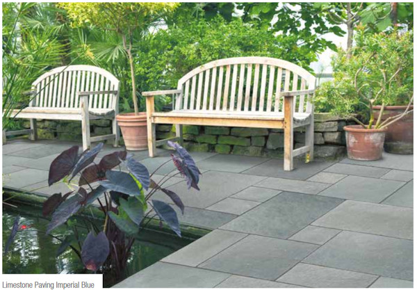
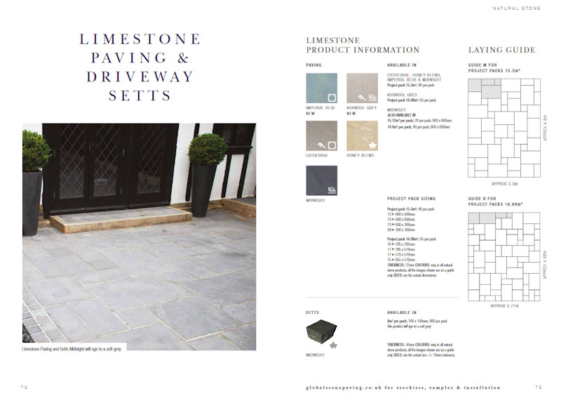
A new limestone flag – Imperial Blue. I’d have loved to see this, ideally in real life, the half-page site-shot will have to tie me over. It gives an ‘impression’ without actually revealing very much….but what’s it really like? That’s on my list of quests for 2020 – what is Imperial Blue limestone paving really like? Is it as delicious as it looks?
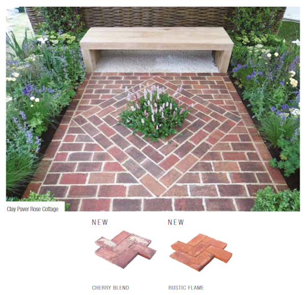
A quick word about the new clay pavers, which push the range to five appealing colours. I’m a huge fan of clay pavers – I may have mentioned, just once or twice, that my garden is paved exclusively with reds and browns from the 1990s – but these imported pavers (from Belgium) are revealed to be unsuitable for driveway use. That worries me, mainly because we laid thousands of square metres of 50mm clay pavers to driveways ‘back in the day’ and more than a few of them are still performing perfectly well. That these imported clays are said to be unsuitable for such use, suggests to me that they lack the tensile strength that was inherent with British clays (back when we still made British clay pavers).
Still, they are a lovely thing and will enhance any cottage garden or courtyard – just a pity they can’t be extended around to the driveway as well.
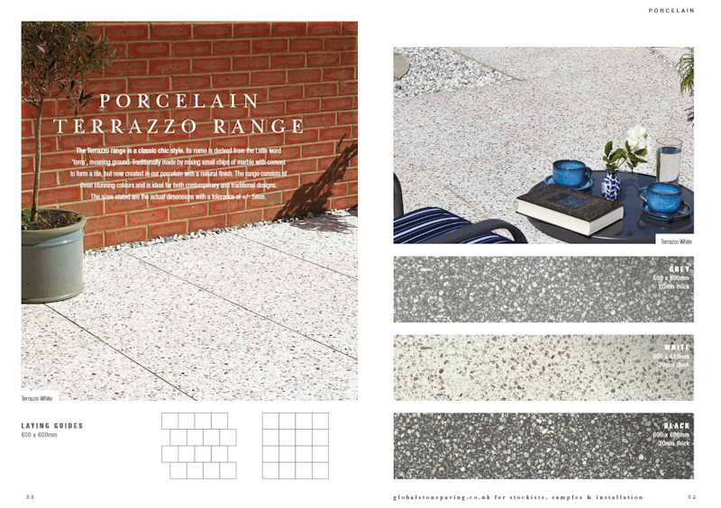
And so, a turn of the page brings us in to porcelain territory, and, as with the ‘traditional’ paving, the Global Stone/Trovia massive have not been polishing office chairs with their backsides, oh no they’ve not! Eighteen, one more than the ‘traditional’, eighteen new products, in flag format, as cladding and, most excitingly for me, as a Small Size Series, and the advent of Project Packs
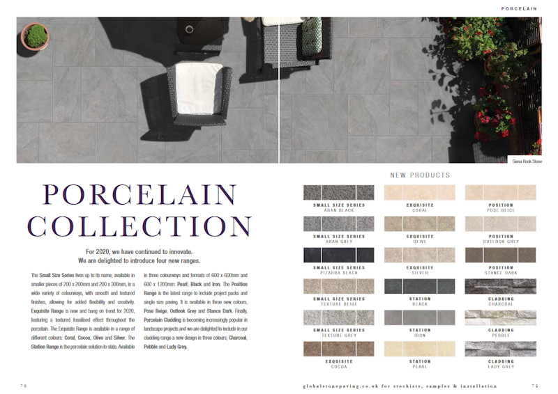
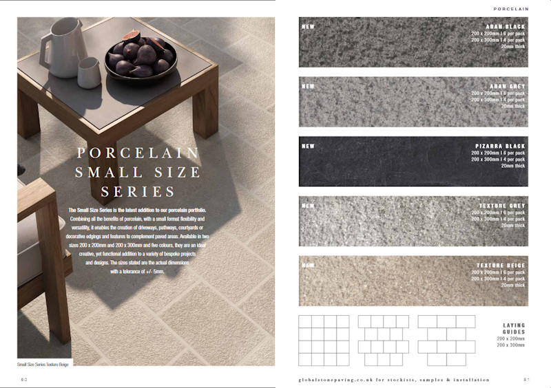
When we first clapped eyes of the porcelain/ceramic/vitrified paving a few years back, while the colour and pattern options were wide and varied, it very much tended to be a one-size-fits-all game, but anyone with any understanding of the hard-landscaping market could see where it would be heading, and this is it: unbounded versatility as exemplified by the 200x200mm and 200x300mm Small Size Series.
Five colour/texture options to start with, but, yet again, you can read where this is headed. No more watching damned fine contractors slice-up massive slabs to make those small detail pieces for edge courses or break bands or to pave an area with complex falls. Handy-sized pieces that finally deliver the true potential for fired-pavings.
And that Pizarra Black – I can see that flying off the metaphorical shelves! The trade has been crying out for that for far too long!
There is so much to set the heart a-racing in this superb and expertly curated collection of porcelain (and the like). Rather than dwell on one or two items, consider the offer as a whole: there is nothing of consequence missing. It is verging on encyclopaedic in its coverage of every desirable and popular colour, texture, style and size for contemporary garden design. In a paving of limitless possibilities, the true art lies in discerning what the buying public will desire, otherwise the storage yards would be overflowing with ‘possibles’ and precious few ‘probables’. This collection is about as good as it gets. Nuff said!
Look again at that Pizarra Block Small Series – can any contractor/installer out there honestly say there’s not a job this year that wouldn’t benefit from using that little beauty? It’s enough to make me want to rush to the shed and ferret out my spade!
A final word on porcelain, but this refers only to the cladding. I accept that it is increasingly popular, and I also accept that it’s a very modern styling that doesn’t work on every project nor can it appeal to every taste, but I have to admit I’ve never really taken to it. There’s summat about it that smacks of ‘manufacture’. It’s obviously artificial (which is not necessarily a bad thing) and all too often it’s garish and loud and intrusive, but that’s just my own personal take on it.
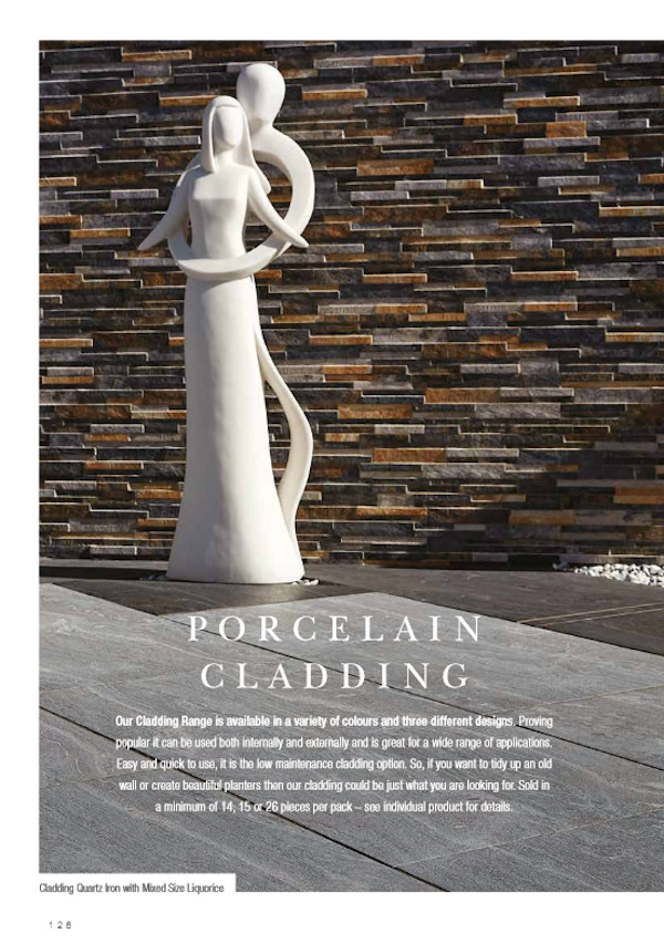
On the posh side of my village (where they get out of the bath when they want a pee) some over-privileged Big Time Charlie has bought up one of the Big Edwardian house near the Golf Club and “re-styled” it, which basically seems to involve removing any bit of character or decorative feature, slathering it all with a sparkly white render, sticking-on an obscenely ostentation pool house, and….this is the worst bit….creating wing walls at the driveway entrance which have been decorated with a porcelain cladding of the sticky-out sort.
Talk about a sore thumb! I reckon it would look better if they’d let my grandson and his mates in Year One glue macaroni and pasta to the walls and paint the lot with Poster Primary colours. It is so incredibly out of place.
There’s no arguing that there is a place for porcelain (and the like) cladding in modern design. I know it can look ‘acceptable’ in a rear garden on low walls or as background screens, but it can also strike completely the wrong note when used inappropriately. As attractive and as useful as it may seem, please use with caution and discretion. There’s a lot to be said for the adage that “Less is More”.
Anyway, enough of my rant and back to the brochure. How does it rate as a vehicle for the Global Stone Goodies and how useful is it to designers and installers looking to sell a product or concept to a dubious client?
It’s the standard A4 size that Global have used for seemingly ever, and it’s in the traditional portrait orientation. Semi-stiff cover and back, full colour (although there are a couple of tasteful B&W shots) and an ample 142 pages in total.
The division of products is exceptionally simple: Traditional (stone and clay) and then Porcelain (and the like). There’s minimal blurb at the outset, the main item being a well-considered piece about trends for the coming year, and the same approach at the rear, just a comment on their supply chain, the use of appropriate ancillaries, and directions on how to locate additional installation information.
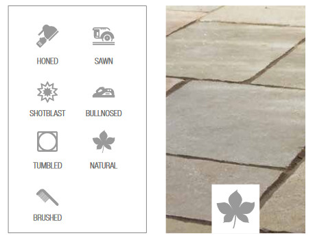
Not for the first time, a series of icons has been provided as a supposed guide to the textures of various pavings…this means ‘honed’ and this means ‘sawn edge’ etc. While I appreciate the effort, icons only really work when they are stunningly self-explanatory or so well-known even babies understand them. I found myself repeatedly returning to pages 8 & 9 to ‘refresh’ my recollection. Maybe that’s more a comment about the state of my mind but if icons are to be used, then let’s have them maintained for at least 3 years, preferably longer, and let’s consider the possibility of, perhaps, a fold-out explanatory flap so those of use with busy and cluttered memories don’t have to keep turning back.
As has become something of a house style for Global, the text is bare, with hardly a single phrase more than is absolutely necessary. They tell you what it’s called, give an alarmingly brief description of what it looks like, maybe an extravagant sentence about its potential use, and then bam! On with the images.
And that’s what we’ve come to expect from Global – less a descriptive, grandiloquent brochure and more a photo album of products and projects.
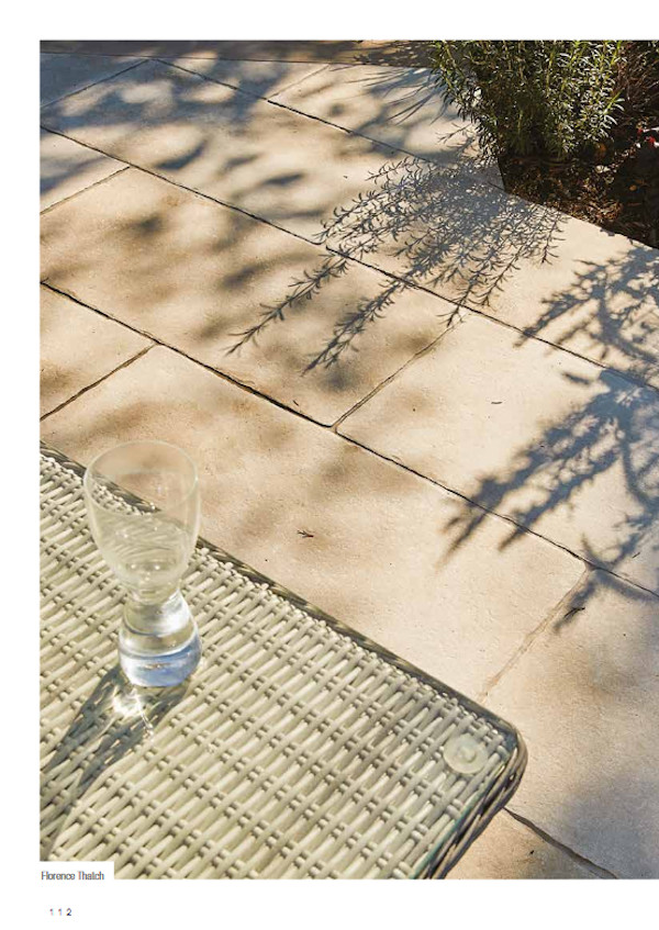
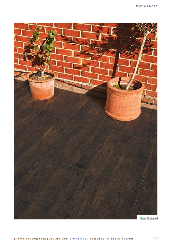
However, if that’s the plan, the photies better be damned good. After all, they’re said to be worth a thousand words. By and large, the photies in the 2020 Global brochure are perfectly fine. One or two border on the spectacular without quite reaching it, but more than one or two are let down by indifferent workmanship. Lovely products spoiled by shoddy and sub-standard installation. Flick through and see if you can spot the ones I mean!
If I had any say whatsoever, I’d weed out these images as a priority and find (or arrange for) alternatives. They are literally spoiling the ship for a ha’p’orth of tar. They are not doing justice for what are very good pavings.
And the colour printing. I’ve mentioned previously that, to my eyes, the Global brochure always looks as though the printer cartridge will need changing before the end of the day. It’s a little faint and lacking in impact, but I really am being hyper-critical now.
The blend of images, minimal text, and well-positioned (in most instances) size and packaging info is about as good as it gets. The whole brochure flows without interruption and is a genuine pleasure to browse. The balance of content and white space is perfect, never feeling stark nor cluttered, and the exceptionally generous swatches are an example to all.
Not for the first time this year, I lament that a supplier has included new products without having a ‘Hero’ shot to really show it off to its best advantage. Such a shame! I understand how logistic and schedules and opportunities can conspire to deny such images, but, as an avid fan of all things new in the world of paving, I find it disappointing to be left only with the merest taste, which is all a swatch can ever really provide. Oh! How I long for the full course!
In summary, it’s a wonderful and exciting brochure from Global Stone. An incredibly generous slew of new products to whet the appetite; a cultured and excellently presented brochure; and all topped-off with an over-riding sense that this is a highly professional supplier, with a real eye for quality and style. It’s been a genuine pleasure to leaf through it all.


Global Stone's Customer line: 0845 60 60 240


