Global Stone 2019
Big changes have been taking place at Colchester’s Global Stone, with ownership being changed and it becoming part of the Shree Agencies of India/World Of Stones empire, but retaining the key elements of the previous management. Consequently, there is likely to be little change on the surface, but we will, and indeed already are, witnessing significant changes when it comes to product range, and based on what is shown in the newly-published Global Stone 2019 brochure, that change is to be warmly welcomed.
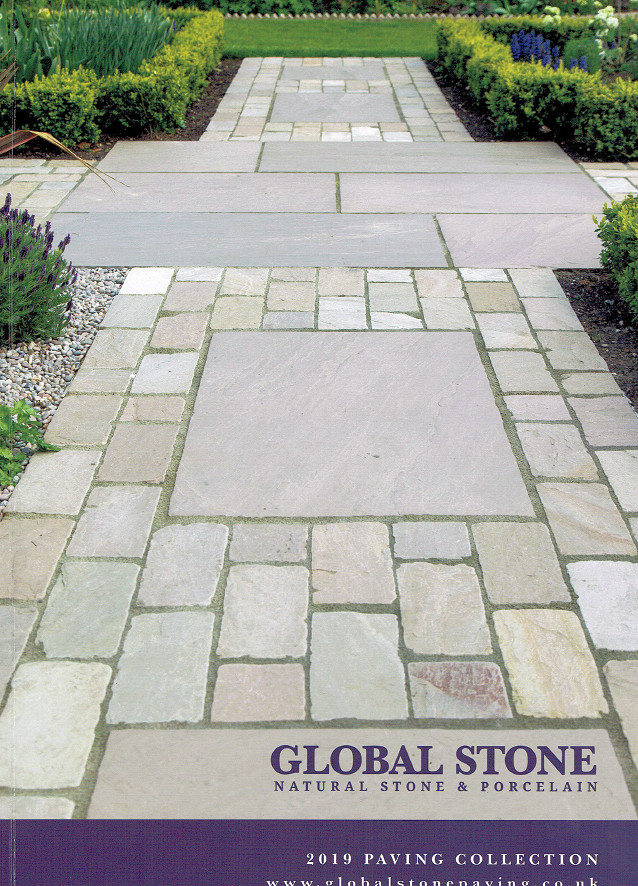
However, when it comes to the brochure itself, the tried-and-trusted formula of recent years is largely unchanged, maintained as it was last year, and years before, with the distinctive purple strap across the bottom of the front cover and a dominating full-page image of Global’s sandstone setts with large flagstones.
For the first time in living memory for Global, I’m not sure that the cover image is one I would have chosen. The jointing width varies too much, because the width of five courses of setts does not equate to the width of a single flagstone, and consequently there’s a strikingly oversize joint to each side of the flags, which distracts the eye, drawing it away from the delicious products and, instead, focussing attention on the gristle of jointing and questionable installation.
The width of the sett panels should have been better balanced, and the easiest way would have been to trim a few millimetres off the centre course to ensure the outer edge of the setts aligned with the outer edge of the flagstone. Such a basic error, but one with such an impact!
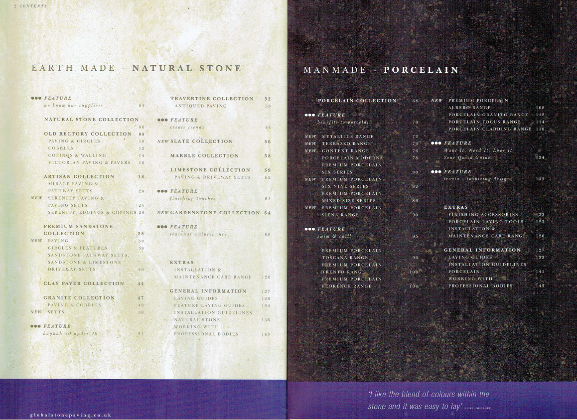
Anyway, enough of my pedantry and on to the real matter in hand: what lies inside the 2019 edition? The double-page index relies on last year’s trick of dividing the products between ‘Natural’ (or the godawful " Earth Made " as they term it) and ‘Man Made’, which effectively means Porcelain. While the Global brand remains loyal to its origins with a more than ample selection of the better imported natural stone, and actually augments it with a light sprinkling of new products, the real growth, and the bulk of new products, lies with the current in-thing, the porcelain, which now more-or-less matches the stone products for number of pages. Obviously, Global Stone can see which way the wind is blowing - hence the subtle change to include "& Porcelain" on the brand logo!
Very conveniently for us, all the new stone products are introduced right at the start of the section in a double-page spread showcasing the Top o’ the Range Serenity Mandana Blend textured sandstone in all its glory but providing postage stamp sized swatches of all five newbies and the barest of text introductions. Certainly enough to whet the appetite, but a hint as to which page hosts each newcomer would be welcome.
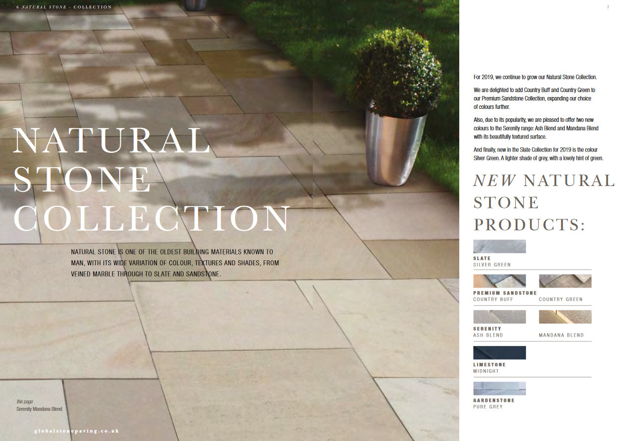
New stone products for 2019
The aforementioned newly-unveiled Serenity Paving products are the first to be encountered, but there is precious little to say or show, I’m afraid to say. Maybe they couldn’t acquire suitable photographs in time for publication, and so we are left with a single third-of-a-page photie of the intriguing Mandana , cropped from the bigger image already used on the opening New Products page, and nothing at all of the new Ash Blend , which is left with little more than a single swatch to sway the paying customer.
The Serenity as a paving range is a known commodity. Shot-textured sandstone with straight, sawn edges and a subtle variation in colour, so it should be safe to assume the new colours are more of the same. From what I can tell, the Mandana is a blend of paler buffs while the Ash is a grey blend. Both are available only as project packs of 18.8m² but, as yet, no sign of complementary setts, as there are for the existing Buff Brown and York Green options.
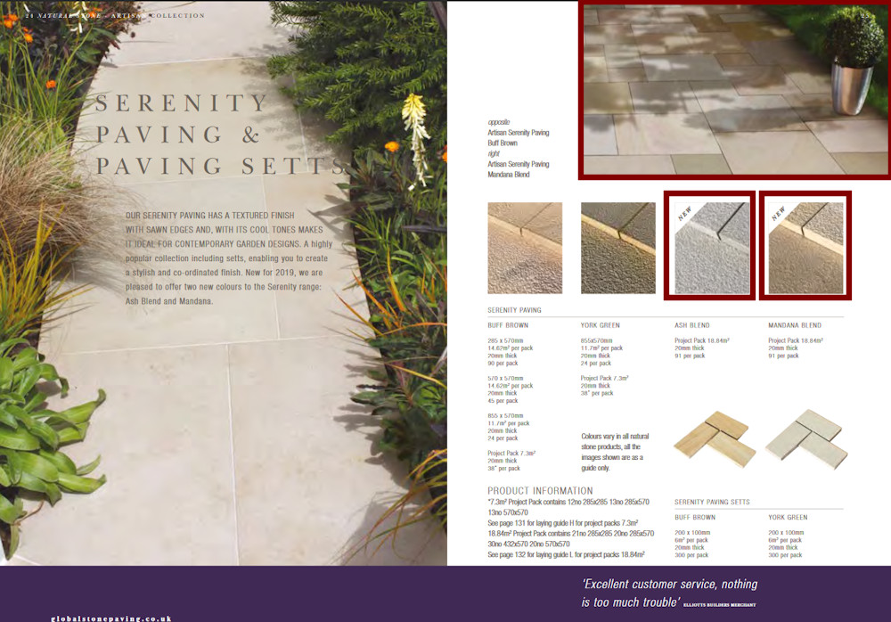
Not much to show for the new Serenity Paving
Serenity has been a good seller and is rightly popular, but it will be hard to push these new colour options without adequate marketing support. There’s always a surge in interest from customers for new products, and that interest can be piqued and, hopefully, successfully turned into a project with the right imagery and explanatory text. A swatch and a single image in a brochure will not be anywhere near enough, I’m afraid.
It’s the same story with the new Premium Sandstone colours, too. All we have to rely on is a simple pair of swatches; one for Country Buff and a second for Country Green . How can anyone make an informed decision based on a few square centimetres of somewhat indifferent photography?
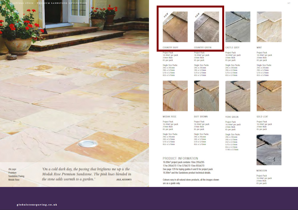
Precious little to show of the new premium sandstones
Again, Premium Sandstone is a known quantity (but just how Mint came to be classified as ‘premium’ anything, other than skip-fill, is beyond me!) so all that can be assumed is that we’re expected to extrapolate from the colour options we already know, and assume (because it’s bleeding impossible to tell from the swatches) that Country Buff will be, most likely, somewhat buff-ish and Country Green will be, not green, but have a dash of olive somewhere in the vicinity.
I wish I could say the situation was different with the new slate, named as Silver Green , but, alas, no. A single quarter-page, poorly-staged photie and a swatch. I’m not even sure the one image actually shows the product in question, which is stated to be available in just the one size, 915x610mm, while the image on the page seems to show random length setts! Figure that one out…..and good luck trying to sell it to clients!
Was no slate available for photography by the deadline for the brochure? Could not a few square metres be set-up at the quarry of origin and emailed over to make it into this brochure? Showing no product is almost better than showing the wrong product.
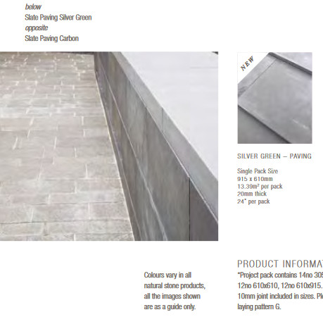
Maybe things will improve when we get to the porcelain, as, judging from the fervour at recent exhibitions, this does seem to be what most excites GS just now, a supposition backed up by the appearance of sixteen new colours/products on the double-page spread that kicks off the porcelain section. Pride of place with the page-and-a-third photie goes to the apparently mis-labelled Six Nine Series Somnium , which is actually a pre-existing product from the Six Series and not at all featured as a newbie. Go figure, as our American friends say!
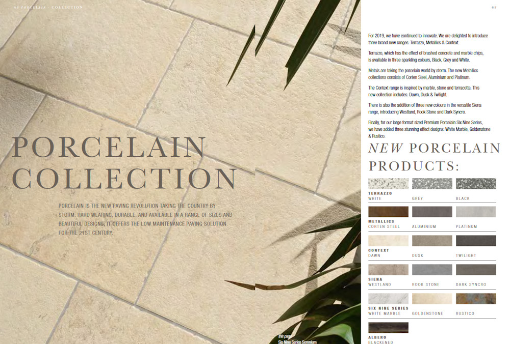
New porcelains from Global Stone
Rather than have me wearily attempt to describe sixteen new porcelains, which, given the rapid pace of the market right now, could well have been superseded by the time this review gets published, I’ll attempt a summary and pick out a couple of highlights.
There are three new Metallics , the most eye-catching of which is the Corten Steel , if only because it is so of-the-moment we’ll be able to use it in the future to accurately date patio installation date. Got a Corten Steel effect porcelain? Definitely late 2010s!
I’m often wary and nearly always sceptical about what might pejoratively be referred to as ‘fad’ colours and textures. This yen for rusty steel is understandable, as such features, when used vertically, can look fantastic in a garden as we’ve seen at recent Chelsea shows, but I’m much less convinced of its value as a paving. It is possible to have too much of a good thing. Still, used sparingly, perhaps as step treads or feature panels, its wilder demands for attention could be tamed.
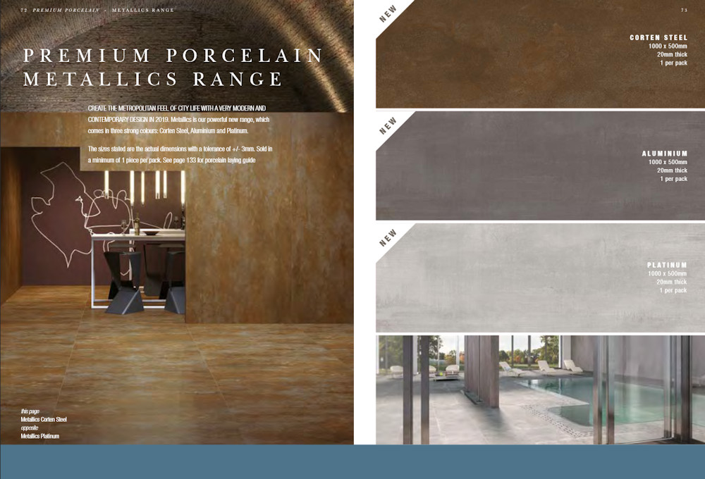
Metallic porcelain
The Terrazzo range interests me because it is a return to the 1970s with its shopping mall floor styling. Three basic tones: light, medium and dark. You’ll be sorely tempted to acquire a circular floor buffer to maintain the look!
Before it dominated commercial and retail floors, genuine terrazzo had its moment in the sun during the interwar years, with glorious panels laid at doorways and as enchanting pathways, but it was always small areas, relatively speaking. The ease with which porcelain tile terrazzo will enable large areas, such as patios, to be covered should be used with care, to avoid an overly municipal effect. Clever contrast, along with subtle dressing with appropriate furnishings, and the counterbalance of strong planting will help prevent it becoming too much a la Arndale circa 1973.
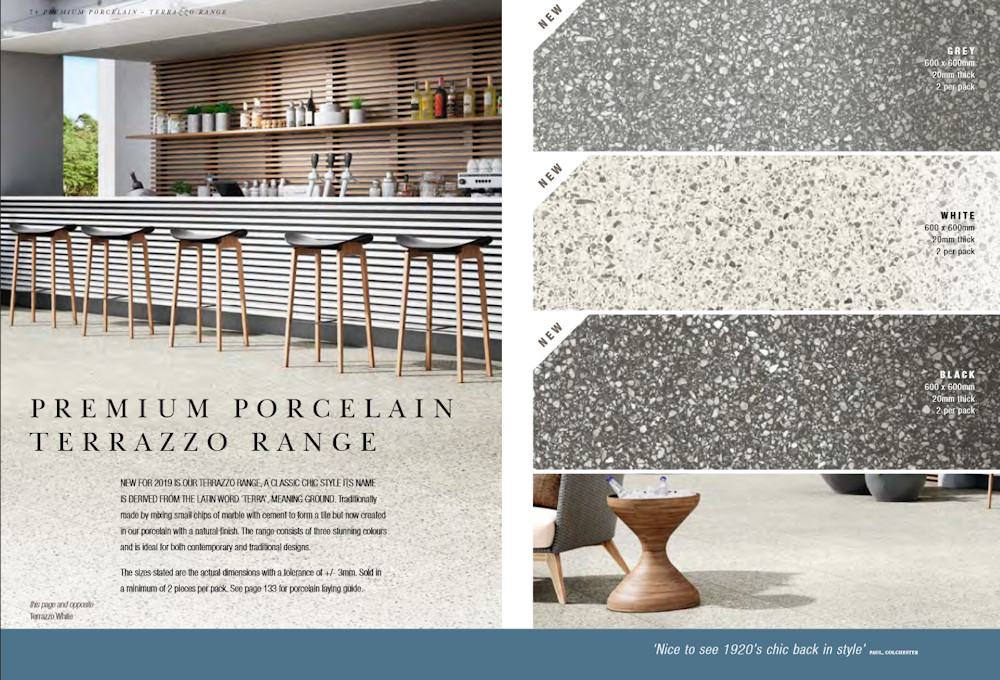
Terrazzo porcelain
The wittily entitled Six Nine series also has three new entrants, the best of which, for my money at least, is the Rustico , a fairly faithful reproduction of the troublesome Indian flaky-rusty slate. The original slate has always been an attractive product that is sorely let down by its tendency to delaminate and flake away in the damp of a British winter. Maybe Rustico can solve that problem, but with only having the one size (600x900, of course!) the design potential is severely and sadly limited.
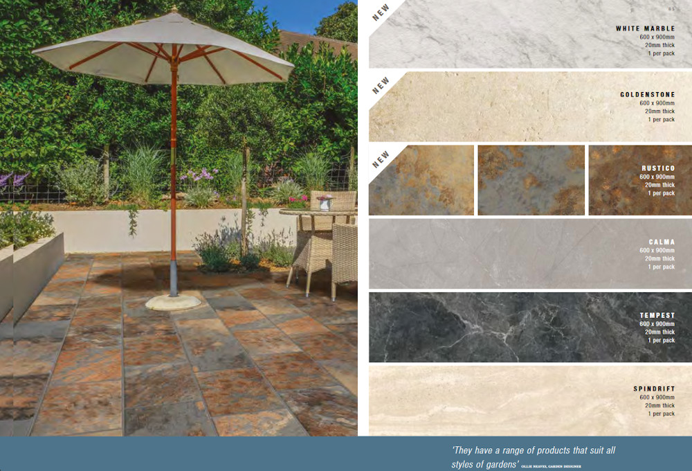
Rustico porcelain
This is one product I feel desperately needs complementary smaller sizes and, if possible, a sett format, because it is a distinctive and highly appealing stone that works best as detail, such as edge courses or inlays. I’ve seen large, and very large areas of the original slate laid on several projects and it always strokes me that the individuality and character of the stone is diluted when viewed en masse.
There are a handful of other new products, but they are non-entities as far as I can tell. More of the bland, earth-toned big tiles that you either like or you don’t care. They aren’t awful, but they aren’t outstandingly attractive either. They are a neutral, personality-free background on which to place trendy garden furniture or to complement what’s on the other side of the bi-fold doors in the kitchen.
There’s no doubt about there being a place for such tiles in the modern portfolio, but it’s hard to become enthused by then, and harder still to wax lyrical on their behalf. They are what they are: tiles. Meh.
So: what can be said in summary? That the new products will offer the usual high quality that has allowed Global Stone to firmly establish themselves in the market is guaranteed, I’m sure, but the push that we might expect for them from a new brochure is noticeable mostly by its absence.
The new sandstones deserve far more prominence. They look interesting, they warrant further attention, but the imagery and text doesn’t do anywhere near enough to confirm that. These are not cheap products that can be sold without some effort at selling – they will not thrive without adequate support.
The porcelain range has grown to the point of bewilderment. There is more than can be taken in, and there is a real danger that, perhaps, the customer may well be blinded by choice. There is just so much of it! But that is the way with “tiles” and maybe it’s old dinosaurs such as I that have to adapt, rather than have the suppliers offer what might be considered to be more of a curated choice to their clientele.
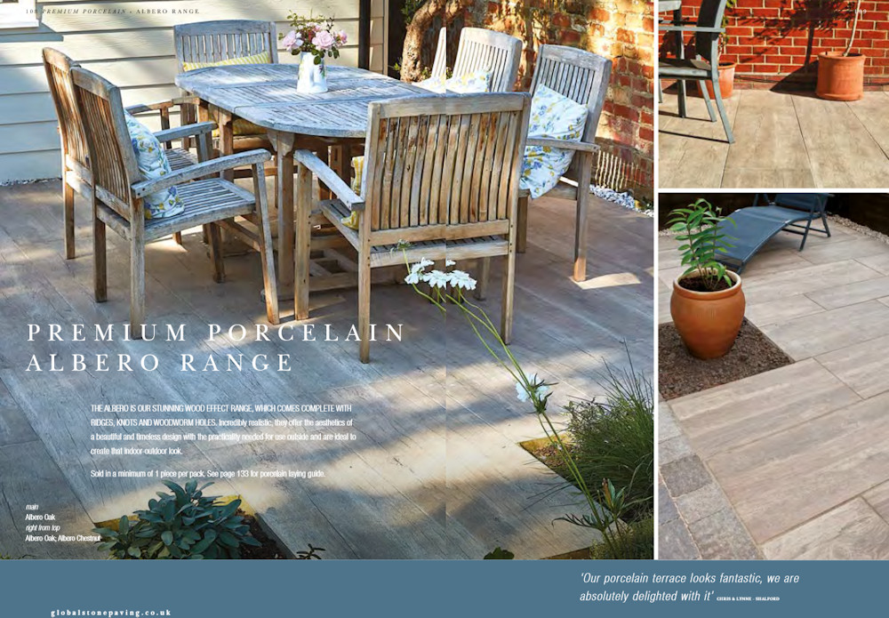
Some of the photography is phenomenol....
The lack of adequate photography for new products is remiss, even in a market that is evolving at such a breakneck pace as this. Not to have photies of important new products, to have items mis-labelled, and to rely on page-width strips as swatches rather than project shots, will sadly diminish the effectiveness and usefulness of this brochure.
On the subject of photies, some of those used are of dubious value. The cover shot with the glaring installation error is regrettable, but throughout the brochure, there are images where the workmanship does not do justice to the product, or the staging is unbalanced, or the lighting is wrong. I appreciate it takes time to replace the less-good images with better ones, but some of the suspect pics in the 2019 edition have been casting the wrong sort of shadows for too many years now.
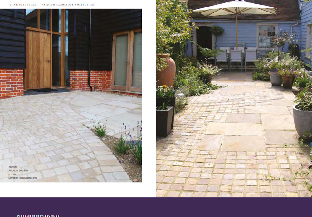
....while other images leave something to be desired
However, while the 2019 brochure may not be quite as amazing as we would have hoped, there is still so much to commend it. Global Stone are in the elite league of suppliers that simply cannot be ignored by anyone serious about their paving, and, more than that, with the advent of porcelain, there is a strong case to be made that Global Stone is leading the pack. For that reason alone, this brochure will be an invaluable and essential component for anyone building, designing or simply desirous of a new patio or driveway in 2019.
Click here to download brochure


