RHS Tatton Show 2013
The RHS Show at Tatton Park never fails to arouse me from my mid-summer sense of all being well with the world. Every year I find things that delight and things that depress, so I unfailingly leave the site uncertain as to just what I feel about it all. Chelsea nearly always delights with occasional disappointments. Hampton Court nearly always disappoints with occasional delight, but Tatton never fails to mess with my head and leave me wondering just what I do actually feel about it all,
On the plus side, this year, there is a noticeable enhanced presence from a couple of big names in the hard-landscaping trade, and the farce of combining press viewing with RHS member admittance has been knocked on the head, thankfully. On the downside, the larger show gardens have been scattered all over the site leaving the focal point of the Egerton Clump, visible from almost any part of the site, to be commandeered by catering and commodity sales, with just a couple of gardens, and the gardens sponsored by the aforementioned big names do seem to have been overly-harshly judged for that age-old sin of creating gardens with noticeable, practical and usable paving.
Much of what makes Tatton unique amongst the RHS shows remains. The local flavour is much in evidence and the generous allocation of space to primary school gardening is, perhaps, its most noble achievement. There is also the undeniable sense that this is a more relaxed, less crowded and definitely more friendly show than the others.
So, on to the gardens worth seeing, and also a round-up of the little gems that are often tucked away, hidden almost, in gardens with no obvious hard-landscaping agenda.
Bradstone made their first real effort at Tatton (as far as I can remember) by supporting their pet designer Paul Hervey-Brookes with his Precious Resources Garden supported by The APL . This is an eminently achievable garden, one that could be, should be and probably will be incorporated into many a back garden right across the north. In place of the six-figure aspiration of Chelsea, Paul created a realistic, family-friendly, functional garden that is also sustainable and all on a budget limit of 15,000 quid.
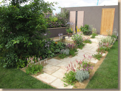
I freely admit I can't see 15 grand in the garden, but then I haven't a clue about the cost of planting and I was reliably informed that the bulk of the dosh went on the squishy green stuff rather than on the hard paving and masonry.
The eponymous Precious Resource is water, and in this garden, it's exploited to the max, but still allowed the option of returning to ground via a SUDS strategy, if there should be too much of it. The water running off the (imaginary) roof and very real paving feeds a combined bog-garden soakaway, rendering it all very eco-sustainable-greeny. My limited knowledge of plants suggests that they're all very lovely – the abundant bees and butterflies certainly seemed to think so! The paving is Bradstone's Ancestry riven effect concrete flagstones and their Smooth Natural sandstone, which you might think would jar (I normally don't like mixing manufactured with natural paving materials) but it does actually work, at least while the Ancestry is new and unworn.

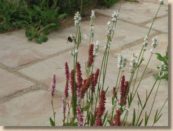
Designed by the incredibly busy Mr Hervey-Brookes, the garden was built by a team of 4 independent contractors, two from the Bradstone Assured Scheme and two from the APL. Two of the contractors had previous show garden experience and two were innocent virgins. Just getting four contractors to co-operate is a major feat; getting them to co-operate to a medal winning standard is something of a miracle!

All this is part of a larger plan, though. The garden is one of the freebies from the Bradstone Design Service, which is intending to make the talents of Paul H-B available to the general public. The design for this Tatton garden is downloadable for nowt via the Bradstone website, along with a handful of other designs with more to come later in the year.
In the myopic eyes of the RHS judges, this garden merited a Silver, which I felt was mean, but only to be expected because it featured paving. However, justice was done in the form of the People's Award, with the garden winning the award for Best Small garden. When will the herbaceously obsessed RHS come to realise that a garden has to be usable? As I've said umpteen times, a garden without paving is just a field.
Meanwhile, over in what is usually the prime location of The Egerton Clump (a copse of large trees) fellow big name, Marshalls , made a return to Tatton and sponsored their own 100% ethically sourced garden with a name that explains the whole concept – The Edible Medley - designed by Angie Turner and constructed by Actual Landscapes , led by the wonderfully engaging Rory Tompsett.
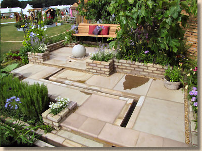
In an overly simple précis, it's a pretty veg patch with some lovely paving and a slow flowing rill snaking its way from back to front. The result is a very chilled, very relaxed, very inviting space. The harsh geometric layout is countered by the softness of the planting and the intrigue created by the rill.
The king-size Fairstone flags give a small garden a real sense of grandeur. Counter to what is apparently taught in garden design school, small paving elements in small spaces do NOT create scale; they look bitty. Using large elements forces the eye outwards and convinces the brain that the space must be bigger than it really is. Add changes in level aided by low walling in complementary Fairstone, and the effect is reinforced, and then the interest generated by a soothing rill edged with sawn-faced Fairstone blocks ties it all together.
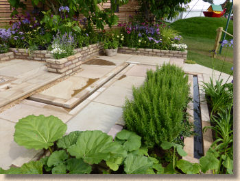
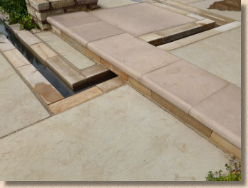
I know from talking to the contractor that they faced a series of challenges presented by the incorporation of a timber-framed water feature, and they had to make compromises in the paving quality, most noticeably with variation in joint width, but the standard is still pretty high. Unfortunately, the judges apparently failed to see this and were wrong to award only a Silver for what is another achievable, family friendly and bloody useful garden concept.
I trust Angie and Actual Landscapes will not be disheartened by this parsimony of officialdom. Those of us with practical experience of hard-landscaping, as opposed to hypothetical nonsense learned as an afterthought to a softscape course, recognise quality when we see it, and we saw it in this garden.
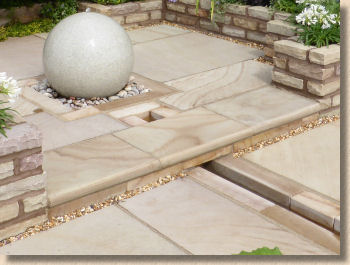
While the two big boys are very welcome at Tatton, one of the medium sized suppliers to the hard-landscaping trade has been a more-or-less consistent presence at the show for the last few years. Natural Paving have supported at least one garden every year, but they rarely make much noise about it. They should! They have some lovely products, with some fantastic implementations, and more people should be aware of their efforts.
This year, they've provided their sandstone paving to two gardens: The Dirty Stop-Out's Garden designed by Michele Martin, and The Alzheimer's Society's Remember To Reflect garden designed by Louise Harrison-Holland, both built by different teams from Greenbelt Landscapes.
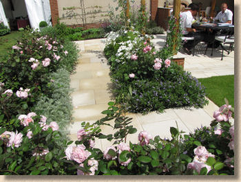
Dirty Stop-Outs is an all-weather family garden, with a lawn for the sun, a pergola for the shade, veg patches for the grub, and herbaceous borders for cut flowers and decoration. The key question for a garden such as this is 'does it work?' Well, the proof is in the pudding – look where the show team chose to eat their lunch on what was a baking hot day.

Maybe it was the simplicity of the garden, the fact that there was nothing outlandish, nothing spectacular, nothing that didn't have a purpose, which marked it down in the eyes of the judges. Silver, as with similar gardens, seems churlish. This is another achievable garden aimed squarely at what our politicians insist on calling "Real People". That make it far more valuable as an exercise in garden design and construction than some of the frankly doo-bloody-lally designs we see walking off with undeserved Golds!

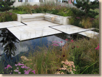
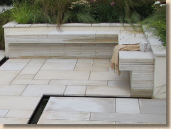
The Remember to Reflect garden is what I call a thinking garden. It's a space where you are almost compelled to take a seat, plonk down yer arse, and contemplate on the more important aspects of life, such as why can't every day be as gorgeous as this. The shot-textured sandstone glints in the sun and provides a delicious tactile sense to bare feet. The obsidian black pool mirrors the soft, wind-tickled planting and the rectangles of paving act as stepping stones, crossing the water and separating it from the lush planting to the rear.
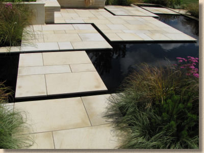
A rather clever construction using the same flags to create low walls and a gravity defying L-shaped bench all give testament to the build quality. But it's the overall feel of this garden, the way it makes you want to take a few minutes to enjoy it, how it soothes the spirit just by looking into it, are probably what helped it win a very well deserved Gold.
It should also be noted that the World Landscape Skills Championship was taking place, with what I assume was the award ceremony taking place on the Wednesday (Press Day). I really don't want to take away from the effort put in by the young teams, but the completed work left me concerned. I'm sorry, but if you can't lay basketweave pattern concrete block paving to line and level, you have hell of a lot more learning to do before you can consider yourself a tradesperson.
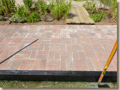
I appreciate that there's more to 'landscaping' than just paving, and the planting is a large part of it, but both the block work and the flag-laying were not even close to the standard of workmanship that would be needed to win at World level. Their tutors need to emphasise the endless search for perfection and refuse to accept the "it'll do" attitude that seems to pervade this event over recent years.
There is a lot to see at Tatton, far more than can be covered in a review such as this. The aim has been to look at those gardens supported by names we know from the paving trade, but it would be an injustice to overlook a few of the hard-landscape highlights hidden elsewhere.
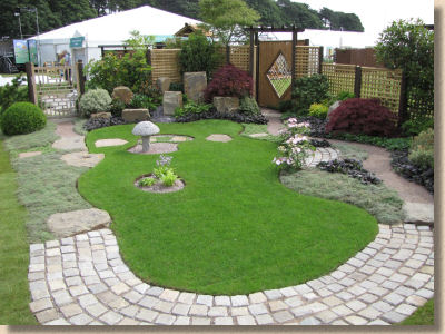
A lovely, serene Japanese garden from The Japanese Garden Society for Bury Hospice is let down by poor sett work. Uneven, gaping joints, untidy and so out of keeping with everything else. You could snap an ankle trying to walk on that curving path, yet it wins a Gold! There is no justice.
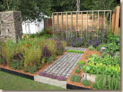
Tony Woods deservedly won Gold as a Young Designer for this Escape from The City garden, which features a wide range of textures, both hard and soft. Stack bond reclaimed granite cubes with recessed black mortar jointing set in a field of crushed terracotta aggregate; a beautiful dry-jointed stone wall of Pennine Gritstone; sensuous hardwood vertical screens and a mixture of decorative and vegetable planting.
Reaseheath College on the outskirts of Crewe is probably the leading landscape skills seat of learning in North-West England and they present a garden every year at what is, for them, their local garden show. And every year, the students manage to spring a surprise with some innovative detail or other. This year, a spiral design on behalf of St Luke's Hospice with raised turf banks and an arcing access path constructed using silver-grey cropped granite with flagstone insets.
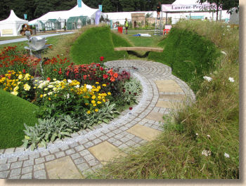
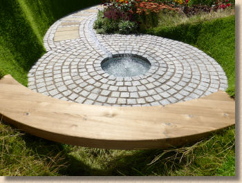
Exceptionally well laid out, and in contrast to paving laid by students elsewhere at Tatton, the standard of work is pretty close to perfection: neat, clean and accurate – they deserved more than a Silver for this effort.
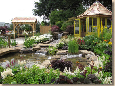
You can't make it out in this image, but there is a bit of random layout stone flag paving at the back of the inevitably gorgeous water garden from Harry Levy at The Pond Building Company . It's a variation of the theme that works so well for them every year at Tatton, and is the perfect example of the adage "If it ain't broke...."
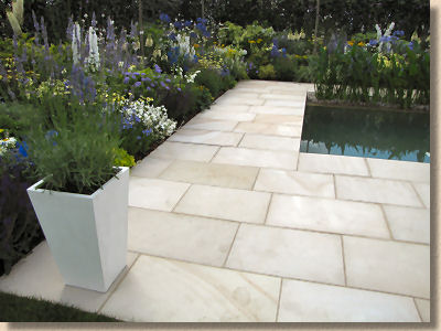
Stone importer, Digby Trading , also sponsored a garden, 'Splash' by designer Pip Probert which heavily featured their crisp and clean Opulence Dune sandstone with its shot textured finish. It's a strange product, being available in 3 lengths at a gauged width of 450mm which severely limits the design possibilities, but laid in transverse courses, it looks quite fetching. As with all very light-hued stone, it shows every mark so regular maintenance is essential.
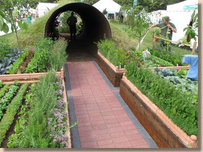
Tatton Park Gardens gave us a tunnel which they dubbed Through Nature, said to be inspired by the Peter Rabbit stories of Beatrix Potter. Well, I suppose so, if the steel tube tunnel is intended to echo a warren and the raised vegetable beds belong to a certain irascible Mr McGregor.
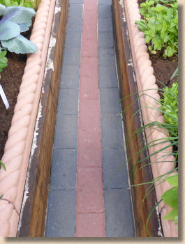
The paving was pretty basic: stack bond 200x100 concrete blocks, but I liked the way they had been used on very narrow 300mm paths between raised beds. I'm not sure I could squeeze my ample carcase through there, and it might be difficult to keep clean, but it does look very effective.
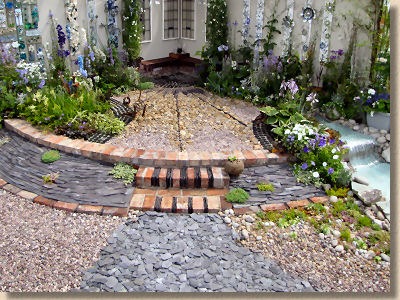
A garden built entirely from recycled and salvaged materials from Creative Recycling Group and Eco-Landscapes featured quite a few intriguing uses for what many might consider to be rubble, refuse or just plain crap. The slate mulch is familiar, but the use of slate-on-edge between the step risers and slate-laid-flat with interplanting of thyme and soleirii looked great, but note also the clever use of graduated aggregates and inverted bottles to create variety in texture.
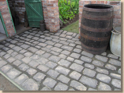
Reclaimed gritstone setts laid in traditional gauged courses and jointed with grano dust formed the entrance to the traditional allotment plot created by Finchale College to evoke memories of wartime economy and the famed Home Guard. OK, the joints should have been tighter, but it's a good effort and better than many similar elsewhere on the site, but the half-buried Anderson Shelter brought back memories of the garden where I grew up, where a wonderful ex-Parks gardener by the name of Ernie Boardman gave me my first taste of hands-on gardening.
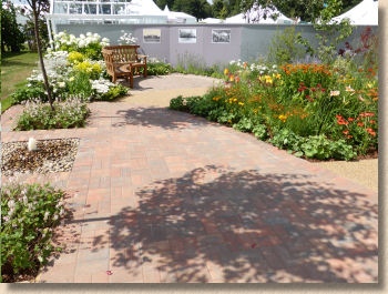
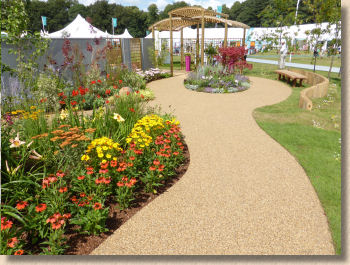
The Belong Garden: A Sense of Space designed by Carolyn Hardern had the biggest expanse of paving in any garden at the show, and it was generally quite well laid apart from the lack of inboard cutting on curved sections. There was nothing stunningly original, but it was a good mix of standard concrete blocks laid to basketweave and stretcher bond pattern, with a near circle of tumbled blocks as a feature seating area and linked by a neat path of resin bound golden aggregate. As I said, nothing spectacular but a good example of how to combine different surfaces, colours and textures.
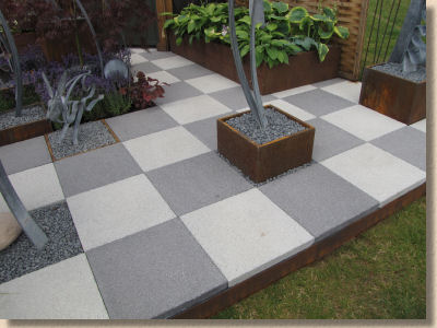
Not so much a garden but a display of sculpture from Ian Gill uses the Bradstone Patio Deck system to form the base of his show stand, and it works phenomenally well. Ian opted to leave out individual flags and use them as planters or display spots. The neat edge skirts supplied with the Patio Deck kit have been replaced with more attractive (in this setting) rusted strips which build on the metallic feel of the display.
As discussed with Bradstone's marketing supremo, Jane White, this is an idea that can be adopted and adapted by so many other display/commercial exhibitors at garden shows and, particularly, for indoor events where the appearance of a paved area is required.
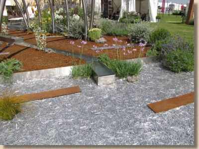
A Stainless Century by Sanctuary is another metallic themed garden celebrating Sheffield's own Harry Brearley, the inventor of stainless steel. It's visually striking and, somewhat surprisingly for a garden with limited planting and bold hardscaping, headed back over the Pennines with a Gold medal. What really caught my eye, though, was the use of steel and stainless blank waste as a mulch and/or surface dressing, inset with long plates of rusted steel reminiscent of sleepers set into crushed aggregate. Maybe it isn't very practical but it's certainly eye-catching!
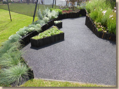
The garden representing The National Schools' Observatory was another spiral design, and you really needed to get inside it to appreciate all it had to offer and figure out why it blasted off for home with a Gold medal. Lots of educational snippets, obviously, but look down at what you're stood upon. A jet black 6mm aggregate resin bound surface dressing which is meticulously laid and bears an uncanny resemblance to bitmac. So why not use bitmac?
So, overall, this was another confusing Tatton. The gardens varied in quality but tended to be more realistic, and I make no apology for using this word yet again: achievable, rather than the banker's bonus gardens we see at other shows. Annoyingly, the fact that they have been scattered haphazardly across the site is confusing, and the catalogue is even worse, bearing almost no relation to the site layout, with the Floral Marquee items mixed in with Young Designers, School gardens jumbled in with commercial exhibitors, and no sense of logic to any of it.
However, the school gardens, the allotments, the Parks' Dept Flower Beds, the absence of camera-seeking, dazzling be-gnashered media whores, all of this goes to give Tatton that unique sense of being for the people rather than the elite, and that is probably its greatest strength.
And to be fair to the Show Gardens large and small, or however else they are categorised, the standard this year did seem higher than any other year I can recall. In fact, I can't think of a single garden that caused a WTF moment. The workmanship has improved, evidenced by the paucity of images for this year's Hall Of Shame, and there's a sense that some of the bigger names in the paving trade have re-discovered the value of this very special show, where they can put their product in front of 80,000 or so visitors at a fraction of the cost for other such events.
I keep going to Tatton because it's local for me, and I like to support local events, but also I go because I'm convinced that, one year, the organisers *will* get it right. A bit like Eric Morecambe's piano playing, they have all the right notes but they don't always get them in the right order.
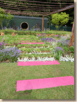
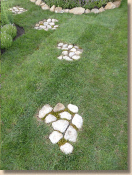
For designers and ambitious contractors, Tatton is the perfect first step into the sometimes scary world of show gardens, and the rewards can be phenomenal. Some regular exhibitors rely solely on the interest generated at Tatton to keep them busy, extremely busy, for the rest of the year, and every contractor I've spoken to over the last 15 years of the show has, on reflection, enjoyed the experience. Tatton gives young talent a chance, whether they are at primary school, tertiary college or just setting out on the lifelong adventure of landscaping for a living, and that, alone, is reason enough for it to continue.


