London Stone 2019 Brochure
How can we define just what it is that the various manufacturers and distributors in the paving trade consider to be a brochure? For some, it can be a couple of home-printed A4 pages folded to A5 and stapled somewhere roughly central, while for others it’s a year-long enterprise, fully bound, stiff- or hard-cover that is all-too-easily mistaken for being a coffee table book. And then there’s the "Technical" publications, ring- or spiral-bound tomes, with acres of incredible detail to CivEng Hons. level and beyond, and with an accompanying memory stick, possibly in the shape of sett or flagstone.
Many of the ‘brochures’ reviewed here each year sit comfortably somewhere towards the centre ground, Many are fairly basic with a little dash of coffee table and just sufficiently technical guff to get by, so it’s a genuine source of pleasure for me to be presented with one that excels in all those requirements, and the 2019 edition of the offering from London Stone most assuredly manages that.
It’s in keeping with previous editions, which have somehow managed to evade review despite the best efforts of London Stone themselves, in that it’s hefty yet not cumbersome, impactful without being gaudy, and simply oozing quality. It’s absolutely stuffed with products with which you will most definitely want to work.
The brochure is portrait format, 260x200m so not quite A4, with a soft-textured grey background image plainly adorned with the London Stone logo. A semi-stiff cover encloses 212 pages and the first real content is the index page and a few introductory words from MD Steven Walley. The index is simple and logical, with products grouped by material, which is just about the easiest way to arrange such a comprehensive collection. A possibly over-generous 25 pages of scene-setting before the real content, though. I know the introductions, the awards, the ethics, the installer schemes, etc., all have their role to play, but how much of this is ever actually read?
It’s page 26 before we encounter the first of the product ranges. Maybe that’s where we should start: the sheer breadth of products. It’s hard to think of any contemporary paving product other than concretes or clays that is missing from this portfolio. That natural stone is included goes without saying, but not only is it available in almost every imaginable format – flags, setts, edgings, steps, copings, walling, planks, cubes and so on – there is representation from practically every type of stone that is worth laying in the temperamental British climate. Sandstone, slate, granite, limestone; native and imported; riven, sawn, honed, textured, flamed…have they missed anything? I suspect that, should some Smart Alec point out any worthy omission, it will be included by 2020!
And, naturally, the mandatory porcelain range is present in abundance, and once again, it seems that all bases are covered, whether it’s the range of colours, of textures, of sizes, of formats, even of price range – it’s all there, almost perfectly curated.
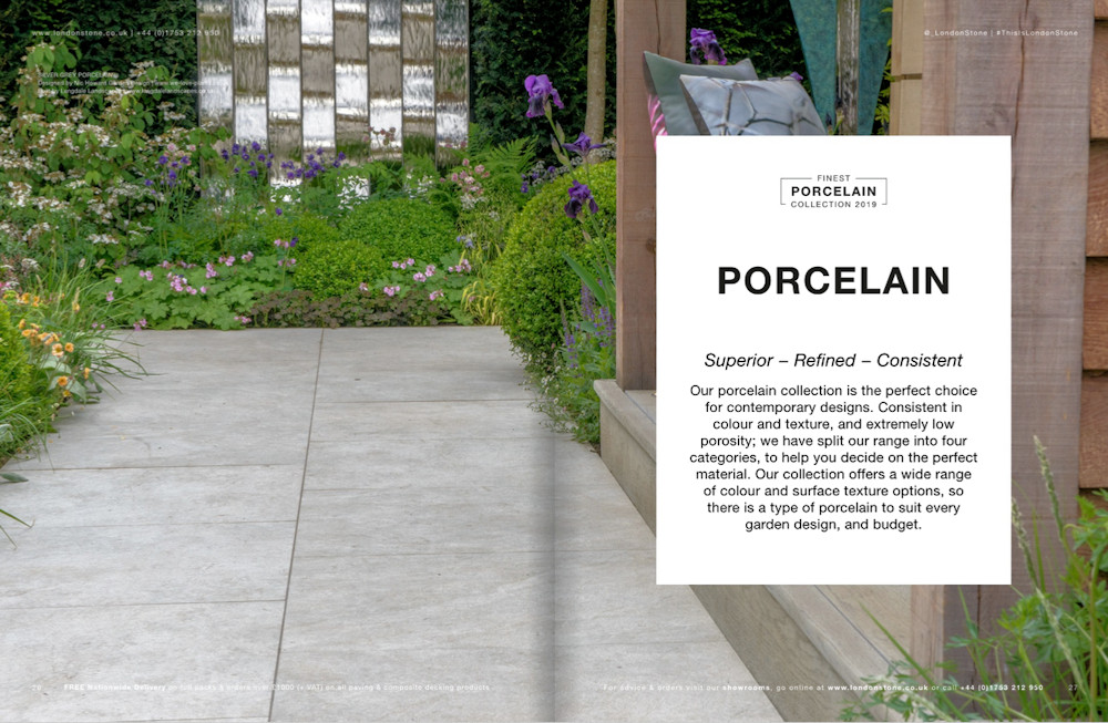
Porcelain from London Stone
They offer it all, from what we might refer to as ‘bargain’ ceramics from SE Asia right up to the real top-of-the-tree almost too good to go out in the garden premium porcelains from northern Italy. If you can’t find a porcelain/ceramic to suit your project from this little lot, then there really is no hope for you!
Beyond the paving products, and I could wax lyrical for the remainder of this review about them, we also have look at the supporting cast. The sealants, jointing mortars, bedding mortars, cleaners, colour enhancers, edging systems, decking nonsense….and every single one of them from a recognisable quality manufacturer: Aco, Dry Treat, GftK, Lithofin, Core LP, Ardex, Millboard…this is not a stock of white label junk manufactured to a price point somewhere in off-grid China, it’s all quality kosher goodies, as fine as you can get anywhere in Britain.
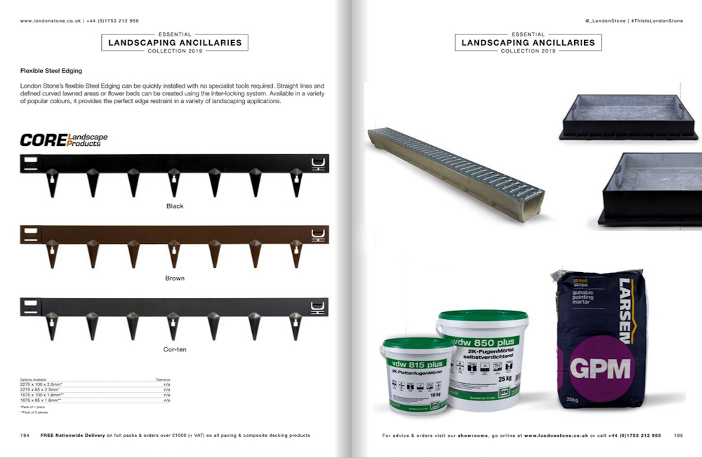
Accessories from London Stone
This is a supremely comprehensive package. Short of the bulk aggregates, a freshly-serviced mini-digger and a couple of decent labourers, is there anything else London Stone could add to improve it? I can’t think of anything!
So, they’re fine products, but what about the presentation? The word that keeps coming to the forefront of my mind as I repeatedly flick through the 200+ pages is " considered ". It looks, feels and reads as a publication that has been created with pride by a team enthused with passion for the subject material.
Start with the photography. There are, perhaps, three different 'classes' into which each image could be placed: Stunning Large; Medium View; and Product Shots.
The Stunning Large images are all at a pretty high standard, but none of it has that ‘staged’ appearance often found at the ’coffee table’ end of the brochure spectrum. The shots relate as real gardens, genuine projects, and while they may be impressive, astounding even, none look beyond the realm of possibility. I suppose with the LS roster of installers that’s been compiled over the last two or three years, there’s no shortage of photogenic projects which contractors are only to willing to offer up for publicity shots, and rightly so.
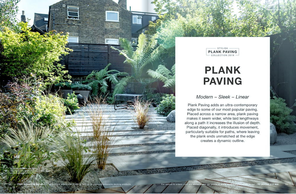
Stunning Large image of plank paving leads that section of the brochure
A limited number of the Medium View images sometimes feel as though they are filling space – they are maybe indistinct, or not particularly good, or don’t really show off the product, so why include them? Well, in many cases, they ‘balance’ the look of the page, keep the ratio of hard content to white space at a fairly consistent level, and they’re not actually doing any harm, so leave them be, I suppose. As the picture library at LS accrues, the quality of such images can only head upwards.
I could start my notorious nit-picking with the workmanship on a few of these images, but it’s unfair to spoil the ship for ha’p’orth of tar. In general, it’s all perfectly fine, excellent in some instances, and all things considered, probably above the average we see in many brochures. Is that down to judicious choice of shots by LS, or possibly they attract the better installers, or perhaps a bit of both. I fancy the latter, personally.
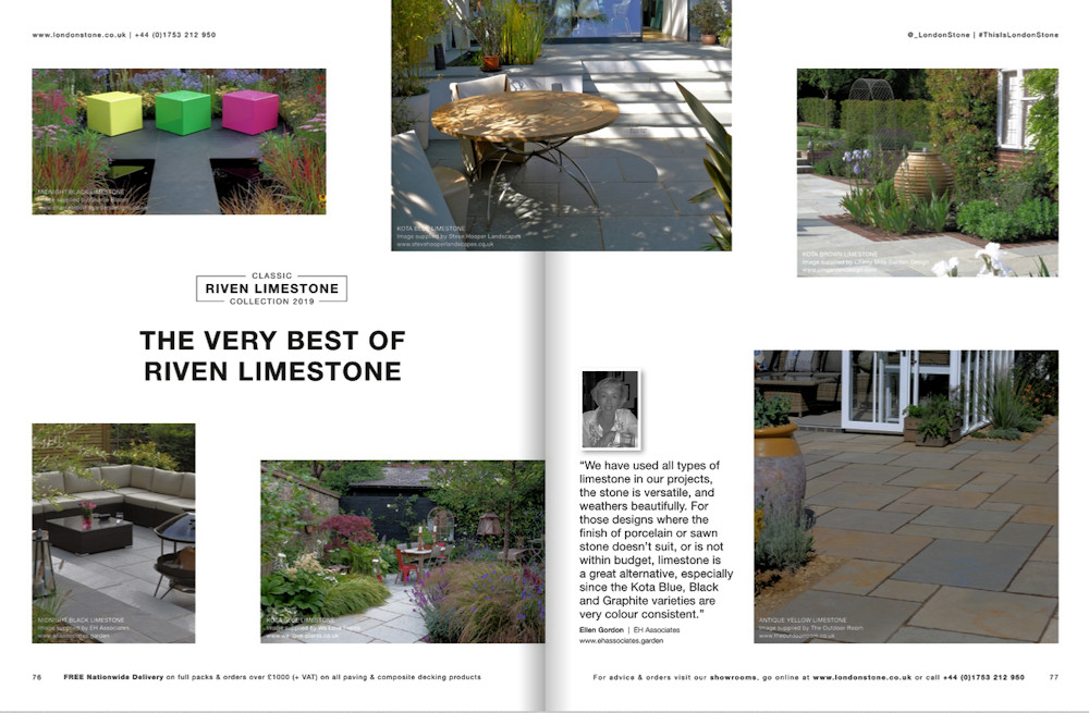
Medium View images of limestone paving
Finally, the Product Shots are obviously done in a studio and are generally bexcellent, with very good lightiing to banish unhelpful shadows, and great composition which shows off the contrast between items in each group. The absence of background context can, in some brochures, make the products seem artificial, but that never happens here. There's a realism that permeates each image, showing off the product(s) and emphasising the essential character, while simultaneously acting as an illustration for the essential Technical Info.
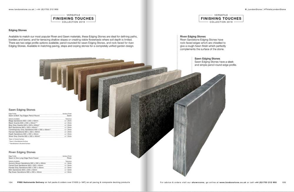
Product Shot of Edgings
Imagery dealt with: what about text? For that included on the product pages, there’s nothing too heavy handed, no excess hype, no overstretched verbosity, all the necessary with none of the flummery. There’s sufficient information to sell the product and make it feel relatable and, as far as I can see, no resorting to the flights of fancy and “unrealistic expectations” that besmirch some rival brochures.
Having griped ever so slightly over the 20-odd pages of trumpet-blowing at the outset of the publication, the inclusion of short, single page articles on relevant issues (child labour, gender equality, etc.) doesn’t feel at all intrusive or ‘space stuffing’, quite the opposite. The few pieces are strategically placed at logical breaks within the product ranges and occupy no more than 30 seconds or so to absorb. Maybe a similar approach could have been used with some of the front-loaded items?
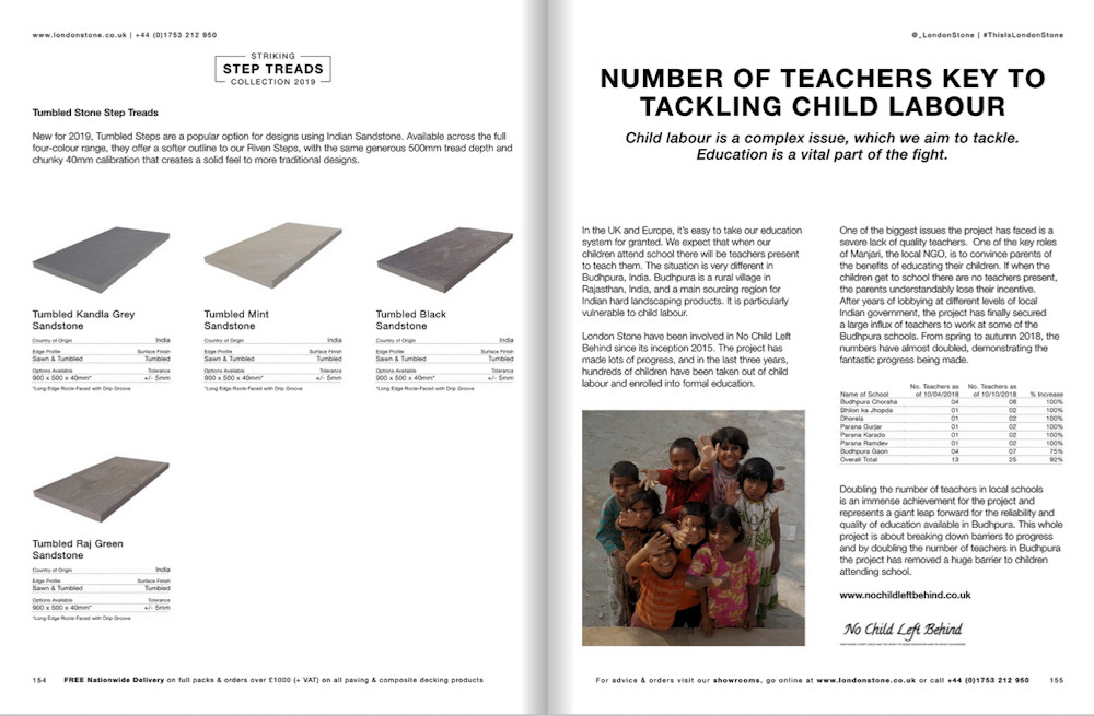
Single page child labour article separates two sections
Technical information is kept to the essentials, which means essentially sizes, colours, textures, arris details, origin, and, very usefully, tolerances. The relevant info for each product group is usefully placed at the end of the apposite section, so no scrabbling to find such-and-such a page at the back of the brochure then losing your place in the main section. The presentation is neat and clean and uncluttered, therefore easy to digest. It seems most products carry no pack information, suggesting they can be bought in any quantity, but there are a few of the exceptionally popular lines that do have Project Pack options, and this info is provided when necessary.
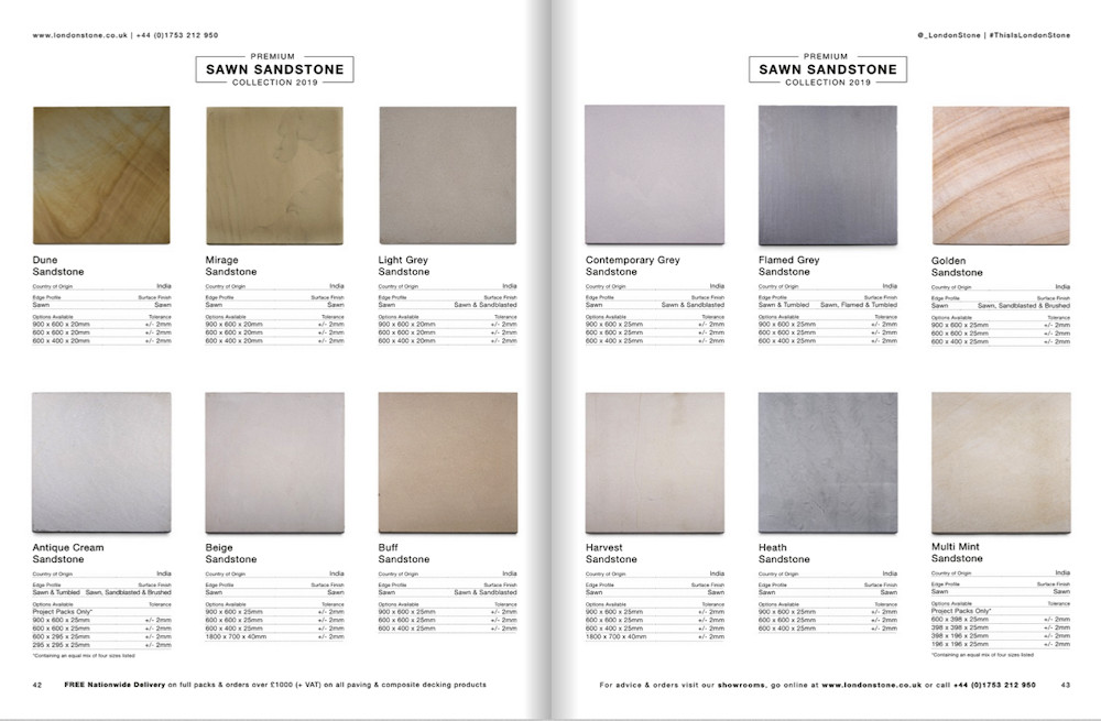
Technical Info for popular sandstones
As stated already, the page composition is just about as good as it’s possible to get, with a comfortable balance of imagery and text. The only minor issue for me is the spoiling of what seem to be highly impressive full- or double-page images with a big white box surrounding the title text at the start of each product group. I’d have loved to see more of those particular images – use a transparent box with a minimal white frame, perhaps? I’m not a graphic designer or a marketing specialist but, as an avid fan of great paving photography, it seems wasteful to smother wonderful pictures with boxes of blank space.
What more is there to say? As a brochure it has it all, but then London Stone also have the sort of marketing budget that befits their place in the supplier hierarchy and so it’s certainly no less than we ought to expect, and actually quite a bit more than we probably deserve.
How useful is it? It’s a great showcase of quality materials in quality installations, so it will certainly appeal to the buyers. That generosity of images will also prompt some inspired design amongst the creatives and allow them to compare and contrast compatible products. For contractors and installers, it’s a useful guide to what’s available, but one that’s better suited to the selling process than to the installation. There’s no sound information on how the various products should be laid or installed, so the brochure’s usefulness out on site is limited, but then, that is how brochures have evolved, certainly over the last decade or so.
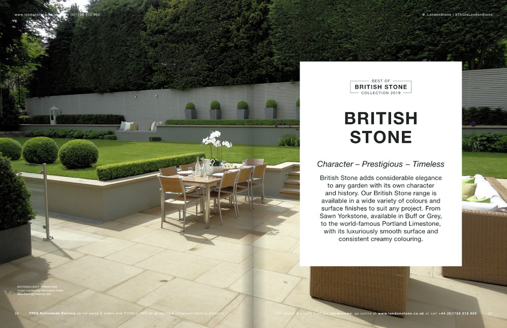
British Stone from London Stone - great image, shame about the big white title box!
The days when the back pages of such brochures allocated 1,500-2,000 words and a couple of cross-sectional drawings to installation methods are gone, and that can be a double-edged sword. On the one edge, the aim of the brochure should be to sell the products therein, and the intended audience is largely the buyers and designers, with installers making up a small percentage. However, the other edge, and one I’ve increasingly encountered when carrying out assessment reports on allegedly sub-standard work, is that the less clued-up installer claims there was nothing in the brochure to tell them that, say, a primer should be used with porcelain, or the one-part polymeric jointing mortars are prone to causing picture-framing with certain granites.
Yes: that critical installation guidance is readily available separately, on request, but how many contractors have the nous to ask? Some would fear exposing the fact that they don’t even know the basics, while others already know it all and have nothing new to learn, or so they reckon. No matter how long you’ve been wielding the maul or the mallet, it’s just simple common sense to check that your working practices are up-to-date and that you’re taking best advantage of modern methods and materials. The trouble with common sense is that it’s not all that common!
So: why should you get your own copy of the This Is London Stone 2019 brochure? Well, if nothing else, it’s a bloody gorgeous publication and it costs nowt. However, no matter how you are involved in the paving and hard-landscaping trade, as a client/buyer, a designer, an installer, or even a rival, this is just about the most comprehensive overview of what’s what in contemporary hardscapes that you will find this year.
London Stone Helpline: 01753 212 950
Brochure Download: Click Here

