New website for Cemex
Cemex seem to have been drifting along like a lost ball of tumbleweed in a western movie since they bought out RMC a couple or three years back. No-one seemed to know what would happen next and no-one I spoke to within the company had any idea what the future held for the hard-landscaping side of the business. I put up with the vacant looks and shrugged shoulders for the first 12 months or so, then gave up asking. It really did feel that, if their own employees can be arsed, why should I?
Then, late last year, someone deep within the bowels of Cemex Towers must have found my email address and telephone number because they started to communicate once again – nothing earth-shattering, just short billets-doux, but a significant improvement on the deafening silence that had filled the previous years. They wanted to revamp the logos used in the Suppliers' section, update the contact information, oh, and by the way, they were planning to have a new website that might actually be worth a look.
I suppose a company with the sprawling multi-national presence of Cemex have to decide how to position a new hard-landscaping website. Should they lump it in with the asphalt, mortars, ready mix and all the other tentacles of their businesses, or make it a stand-alone micro-site? They went with the latter and I'm not convinced that was the right choice, to be honest.
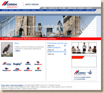
One of the biggest problems when faced with this question is the url, the web address. Imagine some poor contractor wanting to know the sizes available in the Ionica range. Assuming he or she is reasonably sober, a logical guess would be cemex.co.uk, which leads to a home page encompassing all of the Cemex activities and provides subdued links to the various brands and products. So, for the Ionica question, there's the option to use the “Building products” link at the top of the page, to click on the “ReadyPave” icon in the lower left corner, or to navigate through the drop-down menus in the centre of the page.

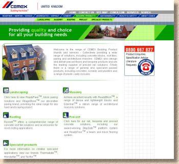
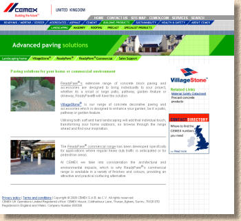
I'm not sure how intuitive this might be for anyone not familiar with the Cemex brand. It's a fair assumption that most contractors will be aware of the difference between Village Stone and ReadyPave, but would a residential customer or DIYer? If our hypothetical enquirer had plumped for the “Building Products” link contained within the horizontal navigation bar at the top of the page, this would lead them onto a subsidiary page with a direct link to Landscaping products, which in turn links into a dedicated landscaping products page with clear links to the sub-categories of Village Stone, ReadyPave and the commercial paving products. This should be the page to which landscape enquiries are directed, whether it be from elsewhere on the web or in the printed promotional material, yet it is encumbered by a swine of an url - http://www.cemex.co.uk/bp/bp_la.asp - can you picture that being featured in the next ReadyPave brochure? Why couldn't this be something simple, such as cemex.co.uk/landscaping ?
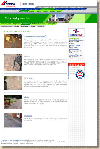
So, following each of the three links, starting with ReadyPave, this leads on to a further page where the block paving range is, rather arbitrarily, divided into categories of sustainable, heritage, contemporary, classic and accessories. So which of these would include Ionica? The block ranges included within each category are listed in a small block of text adjacent to a rather small and indistinct picture, so I can see that Ionica has been lumped into the “Contemporary” category. Clicking on that category take me to yet another sub-page, where the Ionica and its cousins in the contemporary category are featured in a similar parsimonious manner, using a small image to the left and a sparse few words of fairly bland text to the right, along with a link to a colour/size PDF. While the PDF is reasonable quality, it runs to just two pages and fails to give either a good impression of the product or a comprehensive table of technical data.


The same hierarchical approach is followed in all the other categories of blocks, and with the Village stone patio flags section. The commercial section is more or less the same, although the PDFs are even less appealing.

By this stage, I'm beginning to be bored. This is a very simplistic and undemanding web experience. Back in 1996 it might have been considered adequate, but at the back end of the first decade of the 21st century, it's staid, pallid and unengaging. The hierarchical design is understandable, but it doesn't tempt site visitors to explore further and it leads only to uninspiring bland text, low resolution images of stingy proportions and all against a flat boring white background. What little character there is can only be found buried within the PDFs, and PDFs are NOT an acceptable way to present information. They are the lazy web designer's Friday afternoon skive tactic: documents prepared for print, but scanned-in and uploaded in an attempt to dupe web visitors into believing that there is content.
The web offers unique and exciting ways to present information to potential customers. In this time when the buzz is all about web2.0 and interactivity, this site falls well short. Simply presenting digital PDF versions of print media is just not acceptable to today's web-savvy punters. They expect more. They expect to be entertained.
The sheer naïveté of this site suggests that no-one bothered to look what the likes of Marshalls, Formpave, Charcon and Tobermore were doing with their web space. There's no indication that a target market has been identified, no tailoring of content to suit, say designers or DIYers. There insufficient technical data to meet the needs of architects or contractors and a there's complete lack of stop-you-dead-in-your-tracks photographs to entice the artistically-inclined designers and homeowners.
Cemex have been treading water since acquiring RMC, but, as they acknowledge in their “Restructuring business” document (available, inevitably as yet another bloody PDF on the website) their customers have been patient. Patience is a finite commodity in business and if Cemex are serious about maintaining their place in the hard landscaping industry, they need to “up their game” as the saying is. This website, in its current format, will do nowt to win new customers, and will do little to convince existing customers that their long-suffering patience has been worthwhile.
Someone at Cemex Towers needs to tell the bean counters to put their hand into the till and find the pesos to fund attractive and well-designed promotional material, both in print and, more importantly for us, on the web. As my form master used to write in the annual school report card: “has the ability and the potential but must try harder” .


