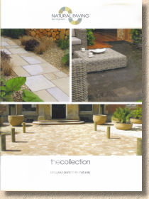
Natural Paving 2012
Well, it's a couple of years since the last review of a Natural Paving brochure, and looking back at that assessment, it was surmised that the lack of a date on the cover may indicate its planned use over a couple of years, and so it seems to have turned out. There's a growing sense that more and more manufacturers are looking at bi-annual hard-copy publications and relying on the web to play catch-up with any sudden additions, alterations or inspirations, rather than investing so heavily in cash and time on a yearly basis for a brochure that can be out of date as soon as it's sent out.
This strategy can have even more appeal at a time when innovation is risky and new products are difficult to launch. When a product range is only evolving gradually, it can seem wasteful to go splurging big money on a printed brochure that is 95% the same as the previous edition.
However, despite it being a couple of years since the pavingexpert desk was last graced with a new Natural Paving brochure, the one thing that can't be said about the company is that there's not much new. Not much? It's bloody chock-a-block with new stuff! Where have they found all this lovely new stone?
From the outside, it all seems pretty much as was. The brochure is still A4, white background, three nice photies and a logo, and running to a generous 76 pages, which immediately tells you that this is not some chancer off eBay flogging B-Grade Autumn Brown at a knockdown price. Only the serious distributors go to this much effort.
Inside, there's been a bit of a sort out, with the very impressive range sub-divided into so-called 'collections'. So, there's the Fired Earth™ Collection, PremiaStone, FineStone and a few others we've seen before, along with CragStone and KirkstallStone, which if memory serves me right, are new, or new groupings at least.
The Fired Earth™ thing caused intense creasing of the forehead last time, but the very patient team at Natural Paving made several attempts to explain it all to me in words of one syllable, and I think I got there eventually. It's a tie-in with an upmarket brand that borrows colours and textures to create an holistic approach to design….I think. It's some bollocks like that, anyway.
Glancing through the highly useful contents page, it's obvious that the usual favourites are still with us, proving that cream will always rise to the top. So the gorgeous York Grey is still with us, as is the too-clever-by-half Jupiter Grey double-sided marble flagstones. Surprisingly, the<spit> Travertine rubbish has not been culled – an oversight, obviously.
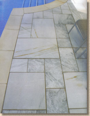
The better-than-average PremiaStone range has a few newbies that need to be introduced.
Ibis is a pinky-gold sawn-and-honed sandstone, calibrated to 20mm and sold in 15-ish m² project packs of four sizes based on a 250mm module. Ivory comes on the same terms, but is a lightly veined mix of creams and buffs, and Argent is a super smooth blend of greys with light charcoal veining.
Pumice is also a grey-toned sandstone but has what looks like a shot-textured finish, and Thistle has the same texture but more pastel-inclined colouring than the aforementioned Ibis, while Cornsilk completes the set by offering creams, beiges and coffee hues.
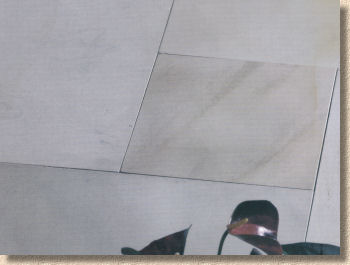
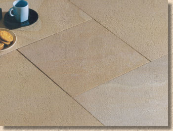
They all look delicious, and that shot texture is bound to attract customers wanting the look and feel of a more slip-resistant surface, but the flip side of that is the fact that such surfaces are all too often a bloody magnet for algae, so I'd be urging top quality installation that will allow annual cleaning without compromising the all-important jointing.
Rounding off the newbies to PremiaStone comes Rustic Quartz , which is, unsurprisingly, a riven quartizite with greens, greys, golds and buffs in that quintessential sparkly quartzite finish. Three different lengths (300, 450 and 595mm) in a gauged 250mm width and calibrated to 25mm, this really lends itself to transverse broken bond courses, and sits comfortably in that funny area where it's too big to be a sett but not quite big enough to be a flagstone. Looks very interesting for projects requiring a more rustic styling. Further, for those who are keen on the sett-styling option, the same stone is available in 150mm gauged width (150, 200 and 250mm lengths) as part of the FosseStone range of Natural Stone Block Paving.
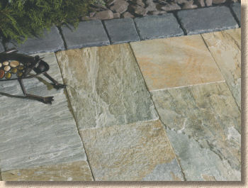
CragStone , as stated previously, is a whole new range and is said to feature a ”weathering process which creates a smoother surface…and softer edges”. So: that'll be the brushing process, then. It's a technique that's been around for yonks but with the right stone, it can transform what might have been pretty uninspiring flags and setts into something worthy of wonder. The process does create more of an aged look, which adds oodles of character and helps emphasise the natural profile of the pieces. The whole range comes as 18.9m² Project Packs comprising four sizes based on the 300mm module and is amply supplemented by the provision of circle kits.
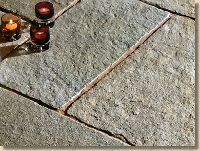
First up is Barley Sandstone which is said to feature pinks, golden yellows and creamy greys, while Meadow is a sandstone blend offering muted browns and soft greys. Saffron is the final sandstone and veers towards rusty pinks and sandy browns.
In the limestone department, there is Teal , which is silvery greys and ice blues, and then there's Tuscan which is more yellowy with soft greens, mustards and hints of olive.
KirskstallStone is also new and is the company's foray into providing a native British sandstone. It's a gritty, strongly coloured stone, boasting gold, orange, tan, buff and brown tones in a rugged pitched-face walling or as flagstones of random length in either a 300mm or 600mm gauged width and calibrated to a thinnish (for British stone) 40mm, with 10m² of paving per pack. The paving option is probably a bit lively for most projects, as there is plenty of banding and colour variation, but then this is what makes it such an attractive walling stone. I'm always delighted to see native stone on the menu, but I worry that Kirkstall in flag format will have limited appeal.
That's it for the new stuff. Does that sound perfunctory? It shouldn't! I make it fourteen brand new product lines, which is more than that put up this season by three of the 'big name' suppliers combined. And all this from Doncaster! You've got to give respect to Mark and Paul and Gino and the rest of the team for having the cojones to put so many new products out and to provide the sort of inspiration that many designers and customers are beginning to look for once again. As is only to be expected, some products will fare better than others, and there's a couple that we might not see again (2014 perhaps?). Hopefully, the bloody Travertine will be amongst those that fall by the wayside.
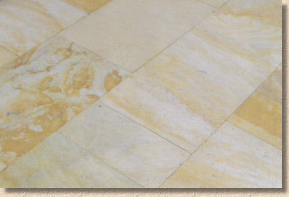
So: there's no faulting the products, but what about the brochure? How does that measure up, both as a selling tool for customers and contractors, and when compared to the catalogues put out by Natural Paving's main competitors? It's fair to say that NP don't have the budget of the biggest companies in this field, yet some of the photography is more than a match. There might not be quite as much stage dressing and clever lighting, there are definitely fewer Pretty Young Things blinding us with their teeth and their lifestyle, but the overall feel is one of solidity and quality. The products are, by and large, left to speak for themselves.
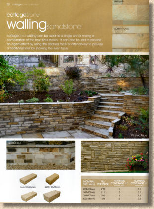
The text is verging on non-existent. There's the product name and the ten or twelve words describing colour and/or texture is the simplest of terms, but that's about it. There are no 'features' looking at design or styling or colour choice, but there is a reasonable installation guide at the back. Packaging info is basic and it's not always obvious which pack size applied to which product, but there's enough to get by. Swatches are minimal, but this tends to be offset by the generosity of the photos. And that has to be the abiding memory of this brochure. In essence, it's a portfolio of photographs, and nothing sells paving better than a good set of photies.
Over the years, NP have striven to expand their distribution network, and now they are in the enviable position of being within 30 minutes of the majority of the population, so it's not too difficult to get hold of their stuff if you want it. They can't compete with the mega-nationals in terms of distribution, but they are very definitely worth tracking down as a genuine competitor to the usual suspects. The brochure as a sales tool is reasonable, but as a source of inspiration for designs and combinations, it's better than most.
So: where can you get your own copy of the Natural Paving 2012-and-beyond brochure?
0845 072 1150


