Natural Paving 2007 Catalogue
It's the first of the May bank holidays and you naturally think all the big paving catalogues for this year are already hiding somewhere in the van, in of thoe dark, deep recesses that can only be reached by the longest finger of one hand, buried beneath a layer of sandwich crusts, wrappers off Ginster's Pasties and empty cardboard coffee cups. But wait – here's a whopping great sixty-page, glossy, full-colour, A4-sized late entry from Natural Paving Products, the Doncaster-based supplier that have been shaking up the decorative paving market since launching their natural stone block paving (NSBP) eighteen months ago.
It does seem to be a significant 'statement of intent' for such a young company. There are a number of “well-established” nationwide suppliers with decades of experience who still haven't produced a catalogue that looks as impressive as this. In fact, I had a very minor part to play in the development of this catalogue, and even I'm surprised at how well it has turned out!
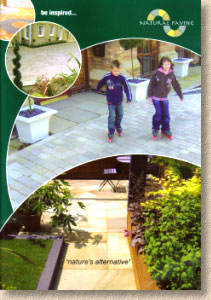
The front cover is very Marshalls-esque. Although the Natural Paving logo is prominently displayed top right, there's something about the dark green background colour and the circle-cut photographs that is highly reminiscent of the Marshalls' catalogues from the last few years.
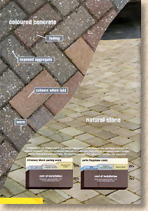
A simple opening section with a logically laid-out contents page, and then a couple of pages delivering the company mantra, which for Natural Paving is that their offerings are “Nature's Alternative To Concrete”. So: there's a not-entirely fair pictorial comparison of aged and worn standard concrete block paving (CBP) viewed in close-up with a landscape view of freshly-laid tumbled stone block paving.
I appreciate the point being made, but I do feel that the image of the CBPs shows a not-very good example, while that of the NSBP is almost immaculate. It's not exactly comparing like with like, but then, the paving industry has a long history of concrete products claiming to be superior to natural stone, so maybe it's about time the concrete boys and girls got a taste of their own medicine.
It's also noticeable that Natural Paving has seen fit to include a statement outlining their “Code of Ethics”. In the current kerfuffle regarding imported stone, where some parties attempt to paint themselves whiter-than-white while simultaneously daubing their competitors with a coat of faecal brown, almost every major supplier now feels obliged to trumpet their own ethical stance. As a highly-placed executive with one of the biggest 'players' told me last month, shouldn't we be expecting this ethical concern to be the norm amongst the better-known names, and not a policy that's exclusive to just one or two of them?
Flicking through the catalogue, a couple of things strike me: there's a significant variation in the quality of the photographs, and there's a real need for a literate proof-reader. The photos range from loosely-focussed snapshots to deliciously staged and stunningly executed professional compositions. In general, the text is sparse, and most pages offer little other than product names and colour options, so the presence of grocer's apostrophes is all the more visible, and can a landscape really be described as “baron”?
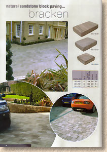
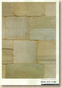
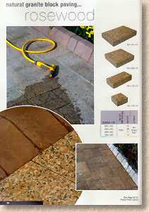
In fact, much of the catalogue is more of a labelled photo album than a brochure. There's no vacuous waffle about “lifestyle” and “creating a statement”, but a few lines of well-chosen descriptive and genuinely helpful text can complement even the very best of images. While most of the 'views' are faultless, some of the full-page close-ups fail to do full justice to the products. Natural stone is not the most co-operative of materials to capture on film (or CCD), and often, the closer you get, the less you see, as the beauty often lies in the variability, and it's not always easy to see that variability in half-a-dozen sample blocks.
Annoyingly, the shots of the sedimentary block products (sandstone/limestone) never quite manage to convey texture as they should, while the granite blocks, with far less natural texture, look superb in both view and close-up pictures.
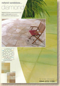
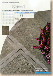
Moving on to flagstones, the texture is more apparent, as it should be in a riven product. The full-page close-ups are gone, and we are presented with much smaller swatches in their place. Some photos seem to have a colour cast, and when two images sharing a page have casts from opposite sides of the colour wheel, this can exacerbate the problem, making each seem even more unnatural. Nowhere is this more obvious than on page 41, where an image with a pinky cast has been superimposed over a photo with a heavy greeny-yellow hue. Ouch!
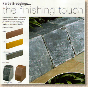
But it's not fair to carp on about image quality or the lack of text: this is an impressive catalogue from one of the smaller companies plying their trade in the paving market, and credit must be given for the innovative attitude of the Natural Paving team. Trying to establish a new-ish company into the overcrowded and highly-competitive imported stone business is no easy task and offering the boringly familiar selection of Raj/Modak/Fossil/Kota flagstones is not going to interest any potential distribution partners. Natural Paving have generated interest by offering something different. The Natural Stone Block Paving is already being copied by others, and a distribution deal has been agreed with a major national 'player'. But they haven't stopped at that: there are new and genuinely exciting products throughout the catalogue – NSBP octagon features, the stylish “Picture Frame” flags, and the very clever stone multi-kerbs and round-top edgings that are certain to have designers and contractors alike looking for projects where they can be used.
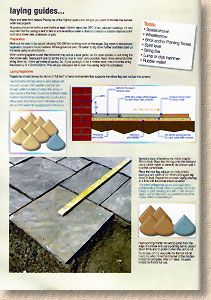
The technical advice section is quite wordy, and that is entirely down to me. Natural Paving asked me to put together the “How to…” section, gave me two pages of space, and left me to it. Even with two full pages, it was a struggle to condense everything I wanted to get across into a few hundred words of text, two key cross-sections drawings, and three illustrative photographs. While I appreciated and enjoyed the challenge, I feel that I want to do it again, that I want to stage specific photos to illustrate particular concepts, and re-jig the layout, but I'm like that with everything I do – I always believe I can do better. Judge for yourselves (I'm sure you will) and let me know what you would do to improve it.
Time and again while compiling this review, I've had to remind myself that while Natural Paving are not short of experience within their sales and management team, they are still a very young company, and for them to put together such a well-considered and genuinely intriguing catalogue stuffed full of innovative and inspiring products is a creditable testament to their skill in identifying the niches within the market that are ripe for further development. If this is their first effort, I can hardly wait for the next edition!
Request your own copy of the Natural Paving 2007 catalogue:


