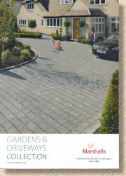
Marshalls 2010 Collection
For most contractors, the annual Marshalls ' catalogue is one of the key heralds of Spring. When you see that distinctively-styled brochure appear on the counter at your local Builders' Merchant or land on your doormat, you know it can only be a matter of weeks before the bright days return, work picks up and we're off riding the hard-landscaping roller-coaster for another year.
The 2010 edition (or 2010-2011 Collection as it is entitled) follows the now familiar format that has been with us since 2002: Glossy soft cover with the green spine, generous full-colour photies and a simple, clean font. As with last year's effort, there are a hefty 172 pages to peruse, but as revealed a few weeks back, the number of new items is sensitively and sensibly restrained.
And as with all the editions of recent years, there's plenty of guff leading into the real meat of the catalogue. To be fair, "guff" might be a tad pejorative because much of it is now given over to the commendable efforts to support sustainability, fair trade, worker's conditions and carbon control. I'll un-guff (or is it de-guff?) those topics and instead reserve the term for the usual "what type of garden is yours?" and "you can do owt wi' Marshalls" pages, which are probably relevant to homeowners but cause my eyelids to at least quadruple in weight whenever I see them in any manufacturer's brochure.
Let's ignore the pastry and get to the meat. As mentioned last November , Fairstone® is the big news this year. Previously named after a certain Bronte-related northern heath , the stone remains familiar in colour, texture, formats and sizes. It's just the name that's changed, so no shocks, no need to re-design pre-booked patios, no need to learn a whole new range.
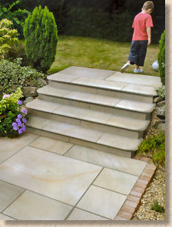
The one new addition is the superb step feature which will be copied by just about every other importer any second now. They say imitation is the sincerest form of flattery but they can only be pale imitations. From the samples I was shown up at Marshalls' Towers, they can't improve on the quality or workmanship: they are superb in the truest sense of the word, and the new photies selected for the catalogue show them at their best.
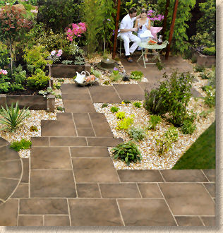
Heritage Paving has been going almost long enough to be regarded as a heritage product but it's familiar tones have been augmented by a new upstart: Weathered Yorkstone , a browny version that's been daubed with the Active Shield ® Teflon® surface protector. I still haven't decided whether I like this idea of pre-sealed/coated flags, but I do like the fact that the new Weathered York circle feature comes with an optional bonding-in kit as an alternative to the usual boring square-off kit. It's also available as an Octagon kit which, apparently, some people actually like!
The new colour has prompted new photography, which is of the expected high standard but I can't help but notice that the perfect couple feature in several photies seem to have gone Heritage mad at their house. They've got the stuff in various colours all over the garden!
Closing the patio paving section, I'm not sure why the so-called Utility Paving, the Pendle and Richmond ranges, has been awarded a traffic-light red banner to the top of its page, while every other patio and walling product has the standard issue green-for-go. There must be some clever marketing psychobabble behind it but it's too clever by far for the likes of me!
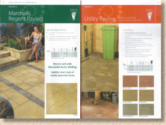
The Fairstone® brand re-emerges in the walling section with a 3-size range of natural stone walling available in two colours (Autumn Brown and Silver Birch) and two finishes (pitched and tumbled) which will allow a consistency of materials to grander designs. At the very least, it would make sense to use the Fairstone® walling as risers for the Fairstone® steps, and, of course, the Fairstone® Paving can double up as copings or pier caps for any walls requiring them. The relationship between paving and walling can be awkward. The nature of the surfaces often results in the same material looking completely different in the two applications. York stone walls in northern England are often blackened with soot, but even when cleaned, the stone has a different character to the near-identical stone that has been used to pave the streets. The only difference is whether it's a horizontal or a vertical surface, and, of course, whether it's been trafficked.
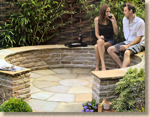
Generally speaking, using the same material for paving and walling works well with natural stone, but I'm never convinced when the same thinking is applied to concrete products. It's a purely personal thing, but I don't think the Tegula walling looks good with Tegula Paving, or, for that matter, that Heritage walling works well with Heritage paving. Perversely, Tegula walling with Heritage Paving (or vice versa) I can see working, but the designer in me would never use just the one product type. The one exception would be Argent, which must be because its character is more faithful to the genuine appearance of natural stone than some other products.
There's an interesting photie of the pitched Autumn Bronze Fairstone® walling on page 94. Have a look if you get the chance: is it me of did they change brickie and mortar mix about half way around the circle?
We're on page 116 already and into the teal-headed pages that denote driveway products, and lo and behold! There's the Fairstone® brand again; this time it's Fairstone® Setts. The logo says these are new, but surely they are the same as the Haworth Moor branded setts from last year? The photies are exactly the same; even the swatches are exactly the same, so maybe 'new' means 'new name' rather than 'new product'?
Whatever: there's no doubt that the new colour for Drivesett Tegula is very, very definitely new. As revealed weeks ago, it's to be called 'Hazelnut' ; it's an earthy brown that's missing the reds, greens and blues seen in 'Traditional'. I've yet to see a laid expanse of this colour but the photies suggest it's a little too flat and homogenous for my taste. However, having said that, it may be due to the photie on page 118 which pairs the Hazelnut paving with a reddish-brick house. In my mind's eye, I've replaced the red brick 1950s house with a buffy-beige stone building and it could possibly work. I'd be interested to hear from anyone working with this colour in the coming year.
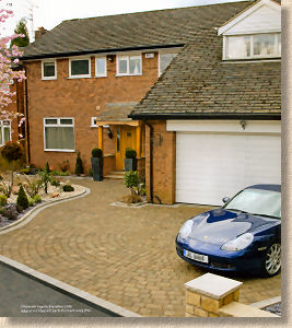
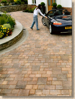
The jumper block, a 320x240mm wrist-snapper of a block, is very welcome addition to the Drivesett Tegula range but the photie on p122 doesn't really do it justice, as it shows it being used to create a pattern that also features a dangerously-close-to-being-straight perpend join. Years ago, on a commercial city centre paving scheme, we worked with the jumper block in the grown-up 80mm Tegula, and used it as a random feature dropped in as and when the lad at the laying face had the fancy, and it looked great. It broke away from the rigid coursing of traditional Tegula paving and introduced an element of playfulness, of rule-breaking, of anarchy almost. The same should be possible with the Drivesett Tegula Jumper block because that pattern just doesn't do it for me!
In terms of items worthy of comment, that's about it, but that's not to decry the remaining products that haven't been mentioned. It's just that most of us will have seen them before and the photography, sparse text and size tables are all as they were last year and the year before. The fact that they are still with us is testament to a product's success.
The technical info that closes the brochure is heavily skewed towards administrative, maintenance and the like, with a token column given over to installation guidance, and then only for the ankle-twisting Cobblestone Sett Paving which I've never liked.
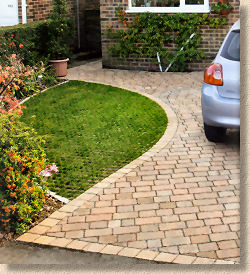
Overall, it's exactly what we expect from Marshalls' catalogue. It's the photies that sell the product to customers, so they are given due prominence while the text tends to be functional and informative rather than gushing and meaningless. There's just enough info for most patio and driveway contractors, but they have access to more detailed technical data should they need it, and the catalogue is better for it being absent. The pedant in me can still spot faults in some of the projects. If you're pushing registered installers as the best in the trade, then the photies used to show their work should be vetted by these self-acclaimed assessors to ensure that it meets the standards set out in the relevant documents, including those published by Marshalls themselves.
However, the Marshalls catalogue remains the one against which all the other major manufacturers will be judged. As the rest of the trade gets their brochures out to me in the coming weeks, it will be instructive to see whether Marshalls status quo has allowed the others to catch up or whether the recession has forced them to go down like a Led Zeppelin.
As ever, this *will* be on the dashboard of many a Tranny-van for the coming year, and rightly so. Get yours here


