Natural Paving 2009
You can always tell when it's nearly Christmas because Easter eggs start appearing in the shops (seen 'em at Costco this week) and the new paving and landscaping catalogues start to emerge. First off the blocks this year is Natural Paving with their "2009 Collection" (very fashionista!)
It's been a little over 18 months since the previous edition and the market for natural stone paving has matured in that period, with greater demand for high-end or secondary processed stone. The Natural Paving catalogue has similarly matured with a more magazine-like styling throughout the 68 full colour A4 pages. As this isn't really an 'annual' publication, the failure to identify new products could be excused, but it does seem like a missed trick. It never does any harm to highlight the newer, more exclusive items within a portfolio, as this helps reassure the consumer that product development is ongoing and that the company is dynamic and forward thinking.
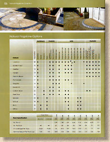
The catalogue starts with a concise but useful definition of the various types of processing to which stone can be subjected. While most contractors will understand what is meant by the terms “calibrated” or “weathered”, the homeowner or casual browser probably won't, and will find these one-line explanations highly beneficial. Even more useful is the product matrix over the page, showing what's on offer, in what sizes, which colours and the range of various finishes, along with the availability of any feature kits, such as circles or octagons.
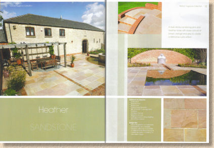
The bulk of the catalogue is made up of single- or double-page spreads for each paving type, with a larger 'feature' photo supplemented by a handful of smaller satellite images and a single descriptive sentence.
The various options available with each paving type are listed with bullet points, so that all relevant information is viewable as one. There's a separate section for flag circles, octagons and diamonds, and while the ever-popular circles are treated to a double page feature, the Octagons and Diamonds are squeezed together and would really benefit by having images of whole features, rather than the cropped, partial photos that have been used.
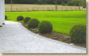
Natural Stone Block Paving comes next, and follows the same format as that used for the flagstones, with single- or double-page spreads and concise text. It may be an optical illusion, or my diabetically-challenged eyesight, but the images used throughout the block section seem flat and short of colour. I'm familiar with most of the products shown here and I just don't think many of the photos do justice to what are deliciously nuanced items. Obviously, it's difficult to capture the texture, but I would prefer to see photos that give a truer sense of the colour and warmth of many of these stones. The image used to illustrate the G603 silver grey granite setts is just bleached to buggery and beyond!
And while I'm having a moan: them's not cobbles; them's are setts! Cobbles are unworked or roughly dressed elements. Think of beach cobbles. Once stone is worked into a cubic form, it's a sett. I do wish the correct terminology would be used, because when someone calls or emails asking for advice on the best way to lay/joint cobbles, the method is completely different to that used with setts, so I have to spend the first two minutes determining whether what the enquirer thinks are cobble are actually setts or, indeed, cobbles.
Thankfully, the colour is back when we get to walling products. However, the Cottage Walling is slightly confusing, as it is said to have both pitched and smooth (sawn??) faces, but this isn't apparent from the unit photographs which seem to show split faces to all visible sides. This dual-finish option is a big selling point for this walling and I would have expected to see it more thoroughly explained, as the potential benefits are not immediately apparent. A 'coverage' table at the foot of the page reveals that, when the smooth face is presented, you can get 50% more wall per pack than when using the pitched face. This needs a visual explanation.
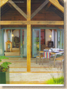
Lovely house, but can you spot the Walnut natural stone block paving? 
The concrete block paving is a bit of a non-sequitur. The original thinking behind Natural Paving was to supply the best stone products at reasonable prices, and to compete with the antediluvian “dinosaur” concrete products that had dominated the market up until a few years ago. I understand the argument for why CBPs have been included, but the main photo used to show off the product is unlikely to sell very much. The colour doesn't come through; there appears to be a bad case of efflorescence affecting many blocks; and the design is uninspiring. Even the colour swatches seem to be showing eff-affected blocks. Is this a not-so-subtle attempt to persuade customers to use natural stone?
The laying guide is largely unchanged from the previous incarnation and as it was written by yours truly, any comment is unnecessary (and biased!). The brief guide to Sustainable Drainage is new, and for a relatively short piece is exceptionally lucid and accurate.
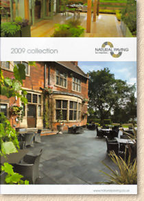
Overall, this 2009 catalogue is attractive, professional and informative. The issue of colour in the block paving section is a bit of mystery, but it shouldn't detract too much nor is it likely to deter potential customers. Some of the images are less than ideal in composition, but then it's always difficult for a relatively young company to build up a good library of images from which to select. Most of the new photos are an improvement, in terms of style and composition, over previous editions, and most do faithfully portray the products in question. The accompanying text is informative without ever descending into unnecessary grandiloquence. The technical information covering dimensions, pack quantities, coverage, etc., is impeccable and clearly presented.
How could it be bettered? Well, the images have already been mentioned, and as an extension of that I would like to see more design ideas, which can only be presented as they become available – the chicken and egg thing again for young companies - combinations such as dark limestone setts with Gold Fossil flagstones, for example. The use of khaki and grey colour blocks seems a little flat, and in places the khaki text is difficult to read against a whiter background.
Having said all that, there's no denying that this is bound to become an essential component in the good contractor's armoury, as it is one of the most comprehensive albums of quality natural stone from India and beyond, and will definitely fulfil its prime objective: selling natural stone to the more discerning customer.
Download your PDF copy here


