RHS Tatton Show 2018
It’s 20 years since the first RHS Tatton Show , they tell me, and while many may be tempted to wonder what happened to those two decades when they weren’t paying attention, I’m more taken with the changes that this outpost of RHS-ery in north-west England has experienced over that time.
It’s certainly evolved, and while some of the innovations have become show standards, others have fallen away. Tatton has a flavour all of its own, it’s more of a community affair making much of local involvement, from the fabulous school gardens to the local authority bus stops and culinary delicacies of the north, but the core of the show is shared with all the other successful shows: gardens and floral displays.
The floral displays, no matter how fantastic they may be, lie beyond my remit, so it’s the gardens I’ve come to see, and yet again, the number of big feature gardens seems to have dropped. Why is this? What is it about the set-up at Tatton that deters designers, installers, local businesses looking for sponsorship opportunities, and the horticulturally adventurous?

What gardens have managed to put in an appearance are grouped into features. So, we have the aforementioned School Gardens, more of them later, along with the alleged Show Gardens, Young Designers, the ever-wonderful Back-to-Back Gardens, the enigmatic Future Spaces, and then the Beds and Borders, which I always overlook because they are, or seem to be, a minimum 99% soft-landscaping.
The Show Gardens:
I’ll start with what is often considered the real crowd-pullers, the Show Gardens which, in the 20th year of the Tatton Show, total a highly underwhelming four. Yes. Four. One more than three; one less than five. It’s not promising, is it?
If there was a prize for unmissability, The Ginspiration Garden by Preston-based Belinda Belt sponsored by Manchester Gin and long-term pavingexpert supporters, Stone Paving Supplies , would walk away with it all wrapped up in a presentation box with a raffia bow on top. You can’t not look at it!

I know it’s all bloody hard-landscaping…maybe that why I love it but the judges weren’t as keen, giving it a stingy Silver. Harsh, I thought. I know it wouldn’t take Gold but it was well worth a Silver-Gilt.
It’s a recreation of an eminently credible contemporary back garden, or, more accurately, an "outdoor space", where the emphasis is usability, entertainment and low-maintenance, all of which is embodied by the very-in-yer-face use of Ceramics or Porcelain. There’s ceramic/porcelain paving everywhere, porcelain cladding to the verticals, porcelain copings to the low walls…. There’s a lot of porcelain. And why not? It’s sponsored by one of the leading ceramic suppliers to Britain’s hard-landscaping trade, so of course it bigs-up the porcelain!
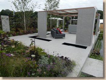
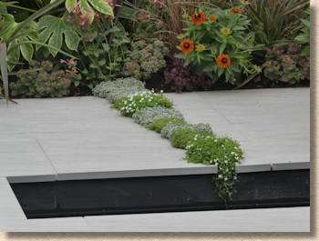
It’s not easy to simultaneously combine promoting a particular product with creating an attractive show garden. All too often it skews one way or the other, but the balance looks and feels right with this. There’s no mistaking the porcelain push, but it’s never too much. It works perfectly as a modern outdoor space, a clever blend of easy-to-maintain ceramic softened with subtle planting and calming, cooling water rills and spills.
The Judges’ Choice for Best Show Garden went to JW Lees: From Hop to Glass , a garden eulogising the craft of the Oldham brewery. I really wanted to like this garden more than I could bring myself to do. It’s got some millimetre-perfect custom-cut yorkstone crazy(ish) paving, all meticulously laid, with eye-catching verticals and soft, discreet planting, but I couldn’t get past the sense that it belonged in a park rather than a garden.

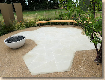
It’s open, airy, spacious, clean and, for me, a little too corporate. This is one I couldn’t see at the back of someone’s home. Oh, there’s no doubt it would work phenomenally well as an “urban oasis”, providing a place to eat your Pret or Subway on a dinnertime break from the office on a warm day, and it may well incline you to think of the delight in quaffing one of JW Lees’ celebrated ales once work is over, but it left me thirsty for something more.
If the Beer Garden was too open, then it’s neighbour, Jungle Fever by Pip Probert was too enclosed. You can hardly see anything from outside, protected as it is by walls of vertical sleepers. I’m sure this designer did something similar last year, and I made the same comments back then – if you have to be in it to see it, how do you convince people it’s any good?
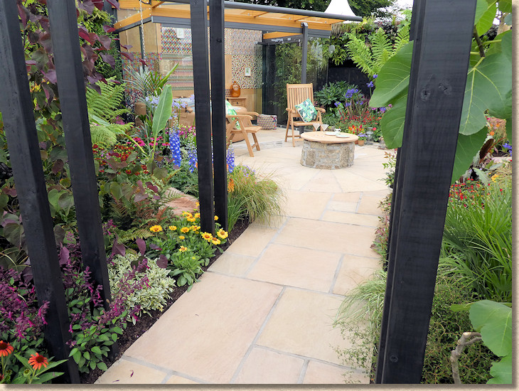
Every time I tried to get inside, my way was barred by a TV crew or another press interview which would have been rude to interrupt, so I was limited to peeking through the gaps and grabbing a glimpse through a roped-off gate. So much for the access given to us during Press Hour!
What I did manage to see looked interesting enough. Indian sandstone paving laid in a sort of random layout pathway leading to a central 16-sided feature laid with custom cut radial spokes, and a slightly lop-sided capped well-cum-table plonked smack in the middle. Rich, verdant unmistakably jungle-y planting create an exotic atmosphere that seems to exude humidity.
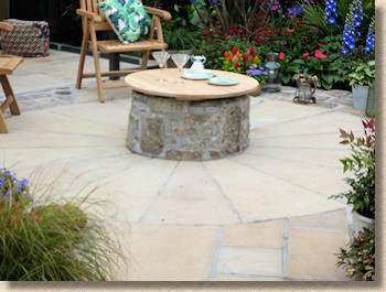
This could well be a back garden. It would be a wonderful secluded, quiet enclave within a bigger garden. I only wish I could have seen it from the inside and get a better, more comprehensive understanding of what there was that earned it a Silver medal.
And finally for the Show Gardens, the detached (as in at the far side of the showground) Up Here garden from local news program BBC North-West Tonight. As you’d expect, it plays to a north-westian theme, so it’s Pennine grit for walls and paving, industrious Mancunian bees engraved on many a flat surface, and a new rose named in honour of the youngest victim murdered by a deluded coward in the Arena bombing last year.
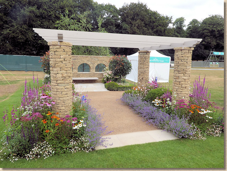
The triple arches of stone evoke the railway arches that dominated the industrial towns and cities of the north, and the honed yorkstone flags represent the re-found confidence and brio of those urban centres. The warm buffs of the circular columns evoke the drystone walls that clamber up and down the Pennine foothills, while the sandstone self-binding gravel is the background colour scheme to so much of this part of the world.
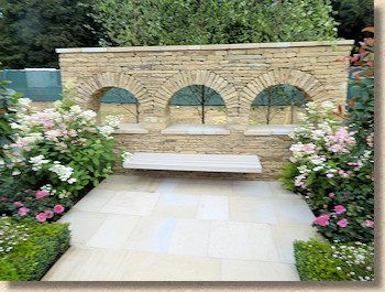
It’s well constructed. The walling, in particular, deserves credit. The paving is basic but faultless; if anything, it’s too understated. The planting is soft and soothing. In fact, the whole is very much a garden for everyone. There’s nothing controversial or confrontational. It’s a garden that will please children and grandparents, city-dweller and out-of-towner…in fact, the target audience of a BBC local news programme, albeit with that unmistakable northern warmth and openness.
Young Designers:
Next, I suppose we should see what the Young Designers have for us. Five of these, all grouped together in one location to allow comparison and reflection, but each given more than enough space. There is nothing cramped or parsimonious about these plots. They are generously sized and so give these emerging designers a huge canvas on which to display their talents.
Finding [urban] Nature by Eds Higgins is, I suspect, about how nature recovers from human occupation. I was initially concerned at the sight of yet more SF2, the recycled rubble which seemed to be unnecessarily popular at Chelsea back in May, but having looked more closely, a wider story emerges. A brownfield site transitions from despair to productivity, and there are so many thoughtful touches. Who’d have thought that Bloody Buddleia and Rosebay Sodding Willowherb would ever be part of a medal winning garden at the RHS?
![Finding [urban] Nature Finding [urban] Nature](/images/news/2018/tatton/FuN_01.jpg)
The hardcore and breeze blocks gradually evolve into a patio of Indian sandstone, mostly hidden under a beach- or picnic-rug. If only that rug had been moved over enough to hide the nasty crossed joints in the flagstones! And so what was what we used to call a bombsite is now a back garden. That’s progress for you!
![Finding [urban] Nature Finding [urban] Nature](/images/news/2018/tatton/FuN_02.jpg)
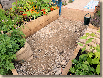
Calm In Chaos by Max Harriman is one of those gardens that is about a journey. How much of a meandering path can you stuff into a garden? It’s like the " How Much Scalextrix Track Can We Lay In The Front Room " challenge we used to play on rainy days as children.
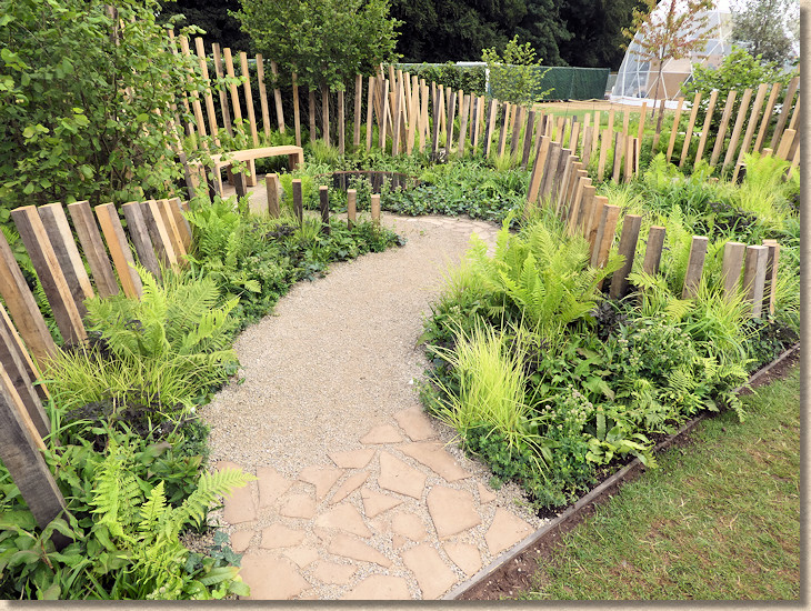
A meandering path of not-very-self-binding gravel worms its way through a plot of wayward palings and flowerless greenery for no apparent reason. The path starts, and ends, with a couple of metres of sandstone crazy paving more scattered haphazardly than laid – I don’t like wide joints with crazy paving – and even before the hordes have descended, the gravel has been scattered everywhere.
Born to Bee Wild by Jimmy McAdam has a simple premise. Can you guess what it might be(e)?
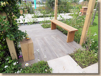
Another garden taking advantage of porcelain, or maybe we should call it ‘vitrified’ paving given that it’s been provided by Marshalls. Timber-effect linear planks link to paths and patios of larger soft-limestone-effect, all laid at angles to the plot boundaries, with bee-friendly planting aplenty in between. Some of it looks unkempt, deliberately so, and some paving-enclosed patches look unduly small, but overall it’s quite pleasing.
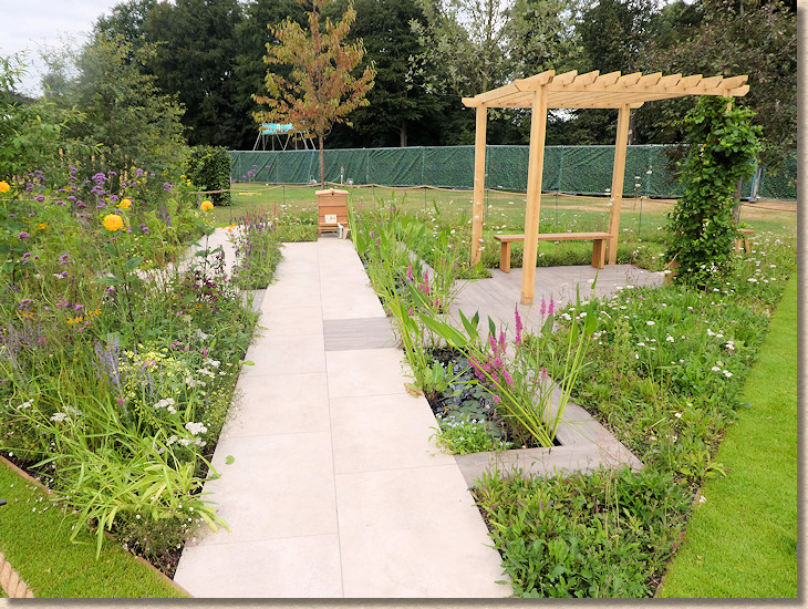
What did strike me was the contrast between the precision and perfection of porcelain with the unruliness of naturalistic planting. Even now, some days later, I’m not sure whether this worked or not.

At One is the garden deigned by Will Williams for the mythological young, urban, professional couple that we all despise. The one thing that immediately comes to my mind is that this young couple would NEVER be capable of looking after a garden of such rich diversity and studied planting. They’re too busy snapchatting and drinking over-priced coffees to deadhead and weed.
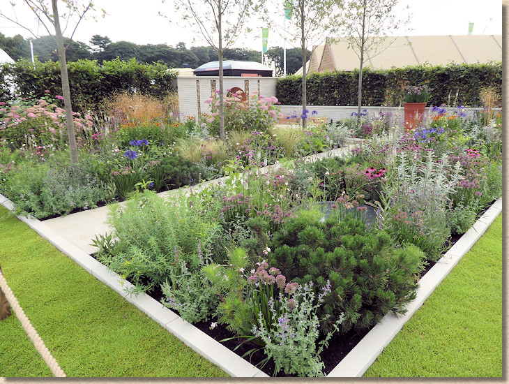
There’s a semi-sunken (for no good reason!) entertaining area of off-white paving, with off-white shot-textured stone walls and off-white fluffy cushions, all desperate to get covered with dirt and algae. Dried stick and log inserts within the wall provide homes for lacewings and all sorts of other creepy-crawlies to harass you and your guests as you sit out taking extreme care no to splosh your Vimto on the white soft-furnishings, and a strange copper satellite dish with a mini Anthony Gormley figure at its centre.

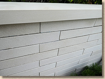
This is precisely the sort of garden that looks wonderful in a Sunday Supplement to one of the broadsheet newspapers but is a bleeding nightmare in real life. Maintenance intense, and useful for so little of the year. It’s precisely what I don’t want in my garden.
Raised By Rivers comes from Nicola Oakley and is an evocation of a waterside childhood. This is much more to my liking, even if it does feature the dreaded decking.
In this setting, though, decking, and it is high-quality hardwood decking, looks right. Maybe a timber-effect porcelain would have worked visually, but under bare feet nothing other than real wood would feel right.
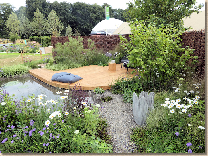
The wooden sett paving is a joy, and to make it even, more joyous, it’s interspersed with little white concrete castings embossed with motifs from nature. Grit jointed and sealed for protection, it’s a delicious touch to what is a wholly delicious garden.

Streams of pea-gravel wend through soft, glistening planting of varying heights, so that there are hidden gems lurking at every turn as the aggregate works its way to a small shingle-beached pond. The balance between hard-landscaping and soft is as close to perfect as I can imagine, and on what was a rapidly-warming-up summer’s morning, the temptation to plonk myself on one of those flumptuous cushions and just let the day drift by was almost irresistible.
Great to end on a high, and just when you think it can’t get much better, there are the eight 6m x 4m Back-to-Back Gardens to peruse.
Back-to-Back Gardens:
I reckon it would be fair to say there’s some variation in quality here. Some of these are stunning; some look as though they were built by someone that had been stunned with a bolt gun.
The first I encountered turned out to be one of, if not, *the* best of the lot, so maybe I had my expectations prematurely raised. Bee’s Gardens: The Penumbra was rightly awarded a Gold medal to keep company with the Best Bac-to-Back Award and the Best Construction award. This could really be an entire back yard garden. It oozes quality and character and style and atmosphere. It’s an absolute pleasure from which it’s difficult to tear oneself away.
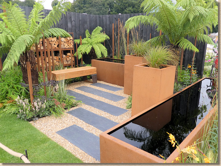
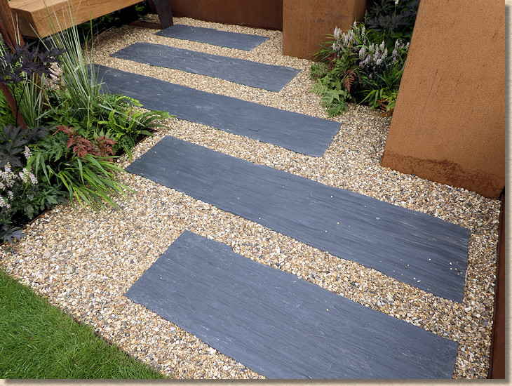
Compelling slate wood or wood slate gives intrigue and texture amidst golden gravel and Corten Steel (the rusty-looking stuff that’s *so* popular right now) water troughs and planters stuffed with tree ferns and complimentary planting. It somehow manages to be simultaneously immaculate yet lived-in, precise yet relaxed, formal yet informal. It’s a Back-to-Back showpiece!
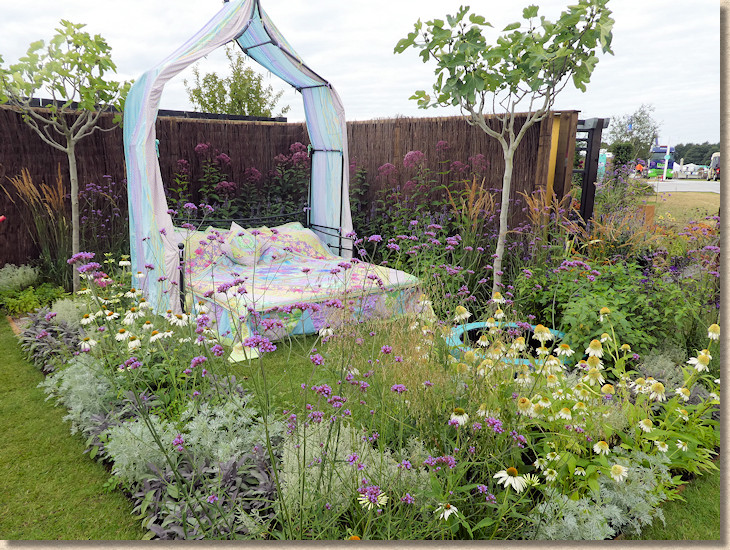
Sleep Well. It’s a bed. In a garden. That’s right! A bed in a garden. A bed, with sheets and pillows and some weird canopy thing. In a garden. Bonkers!
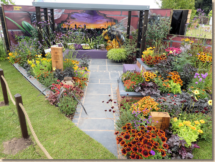
The Buzz of Manchester is yet another horticultural paean to the Myth of Manchestoh, allegedly targeted at the aforementioned mythical "Young Couple". Black limestone flags, complete with garish cement mortar and crossed joints, edged with black limestone setts, set amidst strong red, orange and yellow bee-attracting herbage, and plenty of slogans more commonly seen on cheap market stall T-shirts now etched into sleeper off-cuts, with a particularly garish and child-frightening “Muriel” on the back wall.
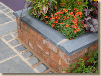
The finishing of the pre-cast concrete apex copings at 90° corners is especially awful and almost makes one forget that hideous pointing between the flags.
Almost.
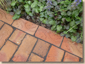
Thankfully, the very next garden is A Place to Ponder which does much to calm my jangled nerves. I could quite happily ponder here for a while. A near-perfect rigid-laid clay paver path (we’ll overlook the lack of inboard cutting) slashes across a garden of what I consider to be Cottage Planting, with a tiny dark-granite paved sitting area. The clay paver path is laid in a simple transverse stretcher bond with gorgeous York Handmade edging bricks, and the whole then climbs the sombrely clad rear wall in a surreal twist on perspective.
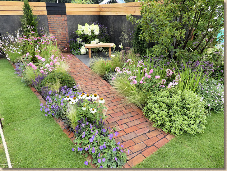
This, like all the best Back-to-Back gardens, really could be a corner in someone’s back garden, or even a small yard at the rear of a terraced property. It’s balanced and functional and aesthetically pleasing, never fanciful or pretentious. It’s another case of a gorgeous garden enticing me to rest my overheated and wearying-by-the-minute bones.

Don’t Chop Me Down looked like a very interesting little garden, but, on the three occasions I attempted to view it, some young lady was having her bare front chests painted while she perched on a low wall. This, it turns out, was to be part of a so-called "Photo Opportunity" later in the day.
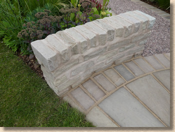
At 8am, I worried more that I’d look like some kind of drooling perv if I hung around for longer than 10 seconds or even noticed that she was in a state of emulsioned undress, so I grabbed a quick photie of the matching low wall constructed of Indian sandstone and moved on double-quick.
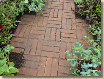
Which brought me to The Flowers of Arley , a flavour of the celebrated Big Posh House to the south of Warrington and its horticultural glories. I suppose it’s a recreation of a long border: a central path of triple basketweave red clay pavers, rigid laid, with an exploding border of bounteousness to each side.
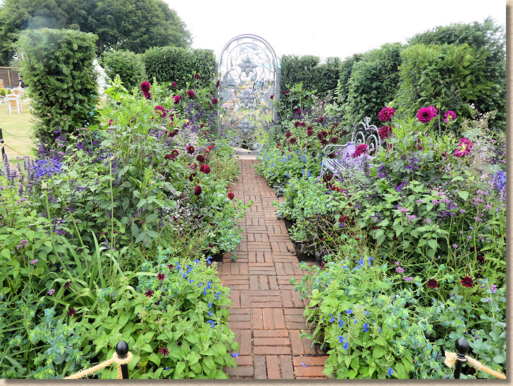
I suppose a garden with such a title really has to go big on the flowers, and so the paving is of minimal consequence, except it’s a neat example of just how damned well clay pavers work when laid rustic-style with no ostentation in a garden setting. Understated simplicity lets the flowers do the shouting while the paving is solid, safe and uncannily soothing.
 L
L
130 Years of Port Sunlight. I’ve been to Port Sunlight, several times actually, it’s a lovely place, and it may well have 130 years of history, but nowhere in that charming monument to Victorian patriarchy does it have sett paving anywhere near as bleeding awful as represented here. Not even in the bits dug up by the gas board and thrown back down on a Friday afternoon.,..which is, quite possibly, how these setts were laid, and I use the term “laid” with quite some reluctance.
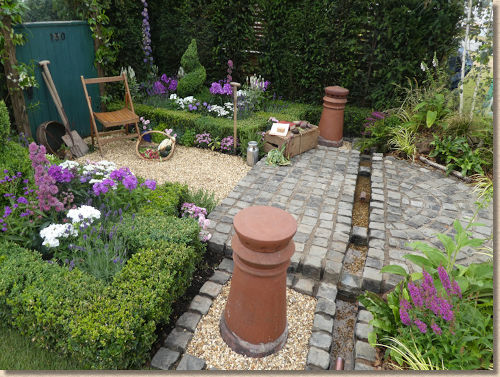
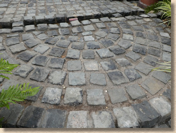
It may have been a very pretty garden, but I couldn’t tear my eyes away from the insult to streetmasonry that had been perpetrated by some cack-handed clown. The worst on the whole site, and that includes some of the low-budget trade stands which normally excel at this sort of awfulness.
Finally, A Path to the Future , which was actually an arcing path of loose sandstone gravel across just one corner of a rectangular plot. The gravel was just about retained by a steel edging, but it was already escaping at every opportunity.
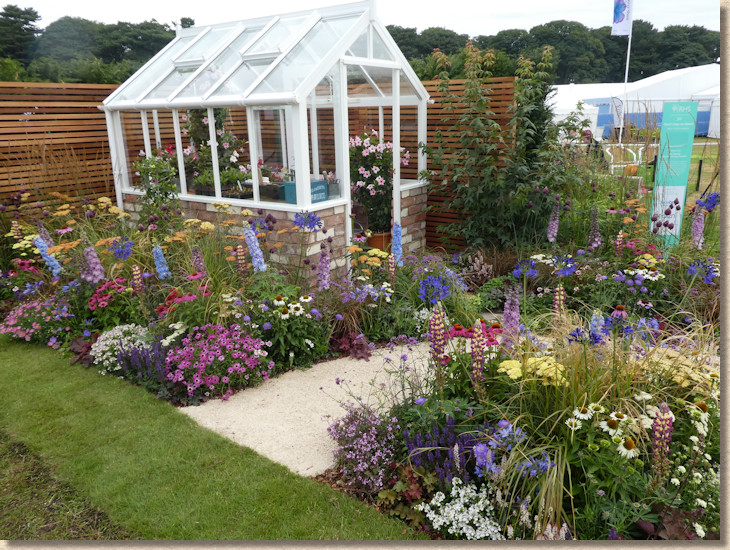
Some too-small-by-far badly spaced rectangular stepping stones led to a greenhouse and that, other than the colourful planting, is about all I can say. A Path to Nowhere with nothing to say, really.
Future Spaces:
Oh well, on we trudge to the last group: the Future Spaces gardens, where designers and installers dose up on mescaline and try to imagine how we might be gardening in a Post-Trump world.
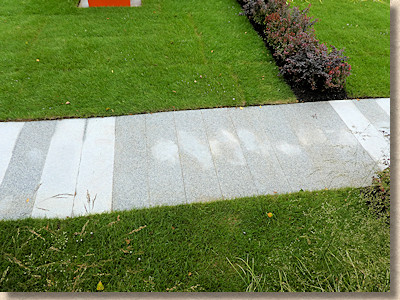
These are generous plots, plenty of space to make a statement, to promote ideas, to prompt consideration of how we may be living in the not-too-distant future. So why did the Future Art Garden choose to install a single, straight line of the highly unreliable silver-grey granite flagstones, off to one side of the plot, starting in the middle of nothing and heading to precisely nowhere?
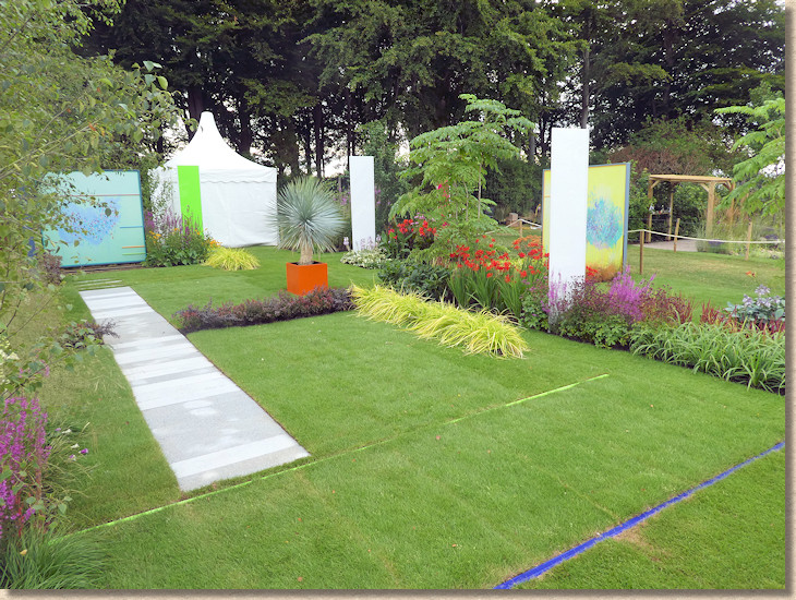
It serves no purpose. It does nothing other than save a bit of turf. It’s pointless, characterless, featureless and bloody useless. Oh: wait a minute! It’s great example of how variable in porosity is the silver-grey granite and how bad it can look when laid by someone in desperate need of a clue.
There! I found a use for it!
Food For Thought is another strange ‘un! There’s an abstract art representation of a tractor in one corner, rows of underperforming veg, and a curving path that starts off as whole, Modular Indian sandstone flags then switches to large chunk crazy paving of the same material and then, finally, to smaller chunk crazy paving.
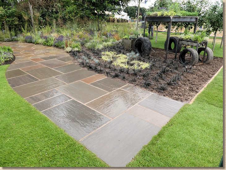
As if you couldn’t guess, the path represents "a journey" from chaos and disorder, through a bot of tidying-up and hoovering, to a whole and complete future. Of course it does!
Crazy paving is NOT easy to do well. The key is to keep the mortar jointing to an absolute minimum. Trim the pieces so they nestle neatly against their neighbours, and make the paving stand out, not the jointing. To be fair, this wasn’t a bad effort, but that pink-ish mortar based on the local red building sand, is too dominant and detracts from the warm, earthy tones of the sandstone. A black mortar would have been more reticent, less obvious.
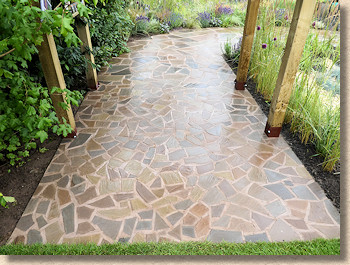
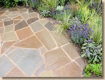
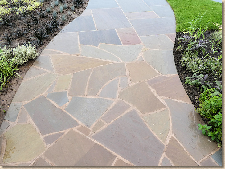
I like the idea of the transition from chunky-crazy to tiny-crazy, I think there’s the germ a great design there, but the transition from whole flags to crazy is clunky and crass and crude. It’s too straight-line, to organised. It needs to be far more gradual, a bit-by-bit mood change from whole flags to shattered pieces where you can barely see the join.
And so on to the final entry, Dave Green’s Oasis Garden , which romped home with Best Future Space and the highly coveted Peoples’ Choice garden, and rightly so!
Dunes of glistening, golden Donegal Quartzite march across the plot before ceding to a tranquil oasis (are oases ever not tranquil?) sunk in at the back. The rear of the dunes reveals dense, exceedingly lush, verdant foliage thriving in the lee of each mound and taking advantage of the natural moisture-collecting propensity of such structures.
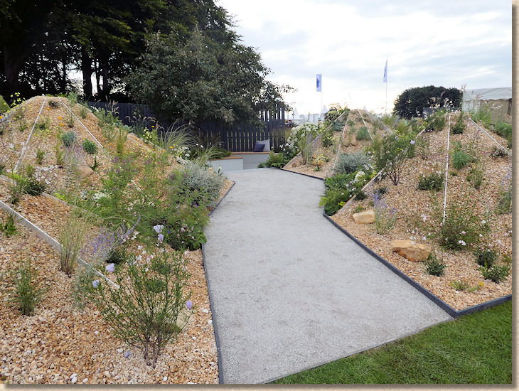
A broad, jagged path of crushed silver granite leads through to a hollowed-out relaxation space, where stucco walls and silver porcelain paving contrasts with warm golden-brown hardwood benches and copings.
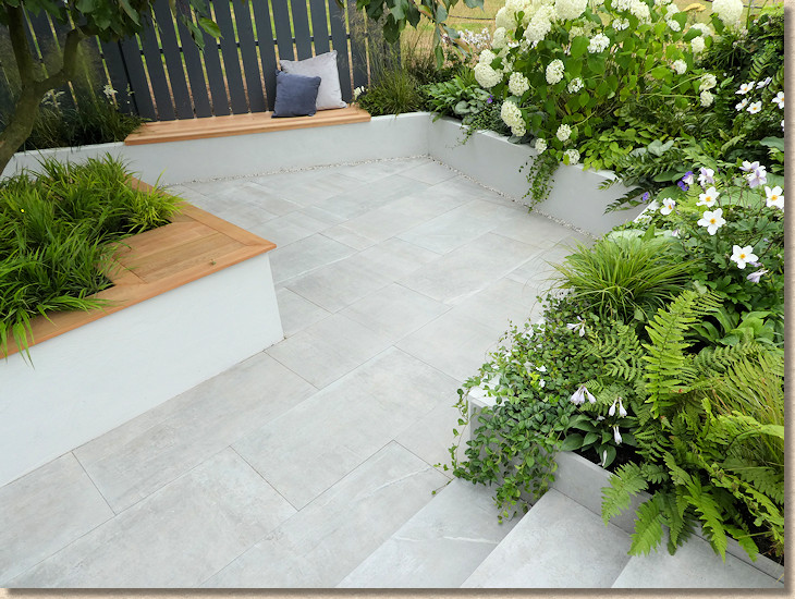
It’s a visual treat, no doubt, but the construction is deceptive. It looks decidedly simple but getting those dunes to match, getting the quartzite to stay put, getting the porcelain so perfectly laid, none of that is easy and it’s a great credit to Rory and his team from Actual Landscapes . This impeccable construction at Tatton is becoming a habit for him!
Schools' Gardens
: That’s it! All of the ‘grown-up’ gardens visited, inspected, and assessed, but, before I finish I want to give credit to the Schools’ Gardens. This year's theme is inspired by art and artists.
There’s probably more imagination, more creativity, more sheer inventiveness in these tiny plots than anywhere else at Tatton. Inverted Fruit Shoot bottles as path surfacing, hand-imprinted clay rounds as stepping stones, empty teachers’ wine bottles as edging kerbs, cobbles painted as Mancunian bees…it’s a riot of originality and wonder.

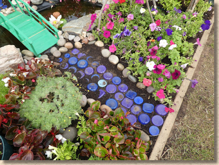
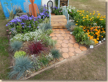
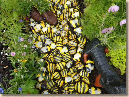
Whatever else may change at Tatton, never, ever, ever let these beacons of childhood freedom and fantasy disappear. They are worth the entrance price on their own (not that I actually paid to get in!)
Summing-up:
“Was it a great show”, is what everyone asks? I don’t think it was what might be dubbed a classic Tatton. I think it was OK, but not brilliant. In light of all the Bee gardens and metaphors, it should have been “buzzing” but it was actually a bit flat. Why was that?
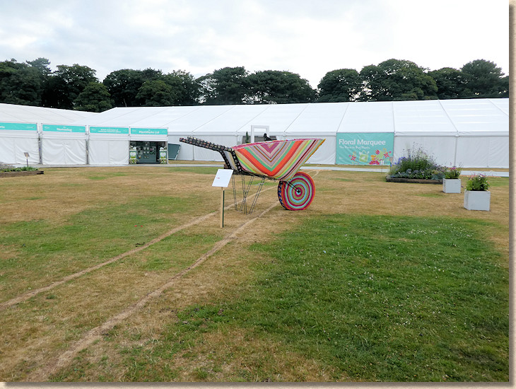
Could it be the relatively poor coverage the show receives? What has previously been Press Day, a whole day for the rag-tag assortment of togfers and scribblers to wander around and develop a story, has now been curtailed to a very early morning 3 hours before the RHS members flood in en masse and ruin any chance of getting a good story or a decent photie. And look at the PhotoCall sheet, the official listing of appearances and activities that could, should or would provide an interesting feature for many a writer. No disrespect to those on the list for 2018, but it’s not likely to have many of us dropping our complimentary coffees to rush out and get the story. Where Chelsea and Hampton Court have so-called celebrities and Christopher Biggins scratching one another’s eyes out for a bit of media attention, Tatton gets some poor girl that’s had her breasts….err….breast-painted!

I know the bigger shows (ie: those based in that London) have also seen a drop in numbers for the Show Gardens, but not to this extent, surely? What happened to those regular exhibitors that turned up year-in-year-out back in the day? Where’s the support from Manchester’s fabled financial and Media City businesses? I can understand the southern press are weary after Chelsea and Hampton Court, and scared of whippets and flat vowels, but what about the north?
We deserve more than this, but we shouldn’t be expecting ‘darn sarff’ to provide it for us. It should be coming from us. This should be a display of northern pride and gumption. As one of the Back-to-Back gardens put it, “We do things differently here”, but differently should NOT mean "less effectively".

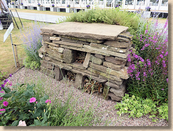
There’s much to admire, and it’s still a great day out, but it can be and should be so much more. Perhaps the new RHS garden at Worsley (they’re calling it RHS Bridgewater as that sounds better than RHS Salford) will give Tatton a kick up the derriere when it eventually throws open its gates. I do hope so. Hopefully I’ll be back in 2019 and so will the thousands that attend faithfully. This is the north’s show and I wouldn’t miss it for anything!

