Stonemarket 2011
And now for the last of my Christmas presents, or second, I should say, given that only my elder daughter bothered with the strange notion of gift-giving this festive season. Husbands/fathers/brothers/uncles are *so* difficult to buy for, aren't they?
Errr: no!!! All I need is a lavish publication stuffed to the gunwales with groin-achingly gorgeous photos of the latest models tastefully arrayed in all their finery, teasing with an occasional glimpse of exposed back side, all wrapped up with a guide to getting them laid, and I'm as happy as a Gloucester Old Spot in a quagmire.
So, after the dizzying excitement of ripping open the now-statutory birthday-and-christmas iTunes gift card, I can pour a large Jamesons, nestle into a comfy sofa, kick off the hob-nailed boots, and try not to drool too much over the 2011 edition of the Stonemarket catalogue.
Except, the bumper fun pack with which the postie managed to struggle all the way to my letterbox just before the end-of-year break is so much more than a brochure. It is, according to the accompanying explanatory letter "marketing collateral". I'm fairly certain that doesn't mean brochures that have been accidentally shot by US troops in Afghanistan, but I could be wrong. I'm guessing it's more likely to be marketeer bollocks-speak for “promotional material”.
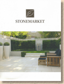
Along with the sumptuous 140 page A4 format full-colour brochure, there's a DVD-sized “New Products” photo-booklet complete with DVD, a four-page double-sided fold-out guide to driveway paving, and a very tasteful calendar that will grace the walls of my office for the next 12 months (alongside Britain's Got Biking Talent and the one made by my grand-daughter at nursery). Obviously, the DVD-booklet combo and the calendar will not be made available to the general public, but the booklet is a very useful aide for saddoes looking for what's new and what's changed since last year, and while there is a tendency to be bombarded with calendars at this time of year, this one is very, very welcome, if only for the quality of the images.
The main brochure is exactly what we've come to expect. The format has been changed from the quirky almost-square shape used over the last few years, to a standard A4 which makes for easier filing on the over-stuffed shelves that surround my desk, but he familiar, clean, white, crisp cover remains, decorated with a simple logo and a classic Stonemarket photo which makes clear its intent: this is serious upmarket garden landscaping.
Inside, so little has changed, style-wise, since the previous edition that there's a sense of being overwhelmed by déjà vu as the pages are turned. So much looks familiar: yes, a few of the photies have been around for a while, and the text is as low-key as ever, but the reliable, comfortable reassurance of acquaintance remains, so much so that it really is only the new products that jump out and demand a more thorough assessment.
The lead item, as far as Stonemarket are concerned, is Haüs, complete with umlaut (the two little dots over the u, so beloved of heavy metal bands). This is a new "handmade reconstituted stone" (aka 'concrete') flagstone range that comes in two colours and two surface textures. Dune is said to be a creamy buff, while Ebony is not, as you might expect, a browny black, but plain old Charcoal. Actually, I would quite like to have seen a genuine ebony colour – I saw Ebony coloured block paving many years ago from a European manufacturer and it was gorgeous.
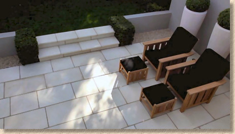
The texture options are smooth or lightly riven, and all colour options and textures come as a standard 450mm gauged width and four lengths, which limits it to transverse broken bond coursed laying. Normally, I prefer paving with a high level of versatility, and limiting the laying patterns severely curtails that feature, but with this, the aim is very much what is referred to as 'contemporary' and 'chic' so random layouts or varying course width would be too 'traditional' or 'cottagey', which this paving very definitely is not.
This urge to offer contemporary and chic pavings is gaining momentum and it is both interesting and educating to see really well planned and installed examples. Simple, unfussy, uncluttered pavings like this rely on the setting, the styling, the ambience to set them off. Their intrinsic, undemanding, understated good looks only really shine through when contrasted against something bold and resolute. Far too many of the installations that I see are sorely lacking in imagination and consequently the paving often looks plain and flat, when it should be the mill-pond calm foil to an inspiring statement. The 'case study' provided by Stonemarket via the YouTube thingy is a fine example. The key feature of this garden is, as it should be, the two-part offset granite water feature. The paving needs to be low-key and subdued, and Haüs fits the bill perfectly.
Next, it gets a bit confusing. Vintage Stone Abbey Silver is a bit of a mouthful. It translates to mean the silvery option of the Abbey flagstones offered as a part of the Vintage Stone range. And just to make sure you really are confused, the original Vintage Stone Abbey is now to be referred to as Abbey Earthen. Got it? No: me neither!
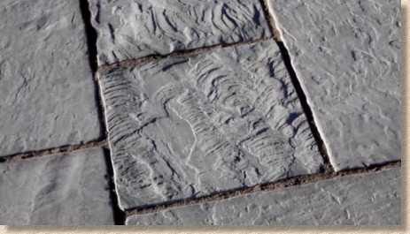
VSAS is, essentially, an antiqued-by-brushing silver-grey quartz-rich sandstone with some of the flags exhibiting a heavily rippled texture similar to the Rossendale flags of Lancashire. The mechanical brushing process smoothes away the excesses leaving a good-looking flag with plenty of character. Not one for the low-maintenance crowd, as all that rich texture is the ideal spot for accumulating every type of garden detritus, so a good quality sealant could be a sensible post-intsallation option.
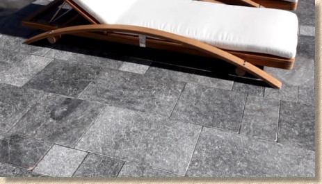
Zephyr , according to the brochure, is new, but the covering letter states that "a beautiful replacement for Zephyr has been sourced". I'm sure we've seen this before – a veiny mid- to dark grey marble. Thos aforementioned over-crammed shelves will not give up my 2009 Stonemarket brochure, but I have a strong recollection of seeing this at their final, or maybe their penultimate visit to the much-missed Glee extravaganza.
Regardless, it is, as said, a dark marble in five 30mm thick sizes based on a 200mm module, so plenty of scope for patterning, although the busy surface colouring combined with the recommended close jointing will tend to make patterning more or less irrelevant.
It's a bit sombre and funereal for my taste, but if we go back to the earlier comments on 'chic' and 'contemporary', it will probably find a few admirers.
There's a word much used in this part of Lancashire (or the occupied former territories thereof, as we now are) to describe a thing or person that is hard work for the eyes. It's virtually impossible to convey the vowel sounds into print, as they are peculiarly Lancastrian, but the nearest I can manage is “Fow” to more-or-less rhyme with 'how”. It's a corruption of the word 'Foul”, I suppose, and is usually applied to your mate's new girlfriend when he's well out of earshot.
Timberstone. Fow!
One of the ever-popular topics that comes up when discussing imported stone with those involved in that particular part of the trade, is the burgeoning piles of rubble: the offcuts, scalpings and everyday waste stone which amasses when flagstones, kerbs or setts are produced in large numbers. Millions of tonnes of little bitty pieces which are too small for paving but too big for aggregate.
What about if they could be arranged into pretty patterns, stuck onto a sort-of backing mesh, a bit like a pre-assembled mosaic, and sold off to the general public? Could it be done? Would it be possible?
Well, yes and yes. And yes –it's pretty damned impressive! I'm all in favour of maximising the square metreage of usable stone produced from each tonne of quarried block. It makes the most of our resources whilst minimising the damage we inflict on the planet, and while there have been very similar ideas in the past, I'm delighted to see a major supplier take up the idea and promote it as part of their immensely influential brochure.
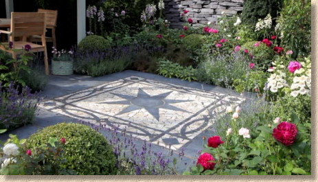
The Truslate Star is basically a 1800mm square multi-piece kit comprising a central eight-pointed star in dark grey set into a cream-with-tan-highlights field, with a swag-like border and diamond-motif corner units formed using the same materials. The edgings are 300mm wide, leaving a 1200mm square, which isn't all that big for a garden feature, barely big enough for a two-person table, but as a feature within a more formal garden, it should look fantastic.
Finally, for the flagstones at least, the well-established Yorkstone Riven range of wet-cast paving has been given a minor makeover to slightly ease the riven surface, making it more foot-friendly. There are changes to the circle kits and to pack sizes, too, the most notable of which is the availability of a so-called "top-up" pack which is essentially half a standard pack, making for less wastage and more precise ordering.
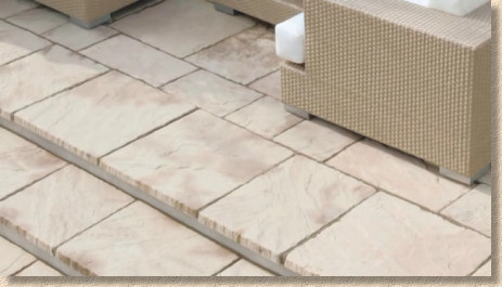
Just two more new products to check out, and the first is a new block paver, Applesby Antique . This is a smooth surface paver with a heavily fettled edge, although the fettling arises from the moulding rather than from any secondary process. It comes in the usual Marshalls/Stonemarket 3-size format (160 x 120/160/240) and three of the most popular colour options (Burnt Ochre/brown multi, Brindle/red multi, and Charcoal).
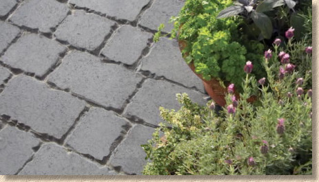
I've not seen this product in the flesh, but those heavily emphasised joints remind me of the blocks produced in the early 1980s, with their ankle-snapping chamfers which rapidly fill with all sorts of crud just before the moss moves in. As with one of the previous products, this would not be a good choice for the maintenance averse. If anyone is installing this, I'd love to know so I can see it for myself and watch how it copes over the first 12 months or so.
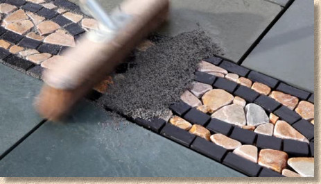
And so finally finally, the new jointing system which has been a long time coming. Fast Point is a resin-based mortar but, sad to say, it's not quite as good as the best resin mortars for all sorts of petty technical reasons. However, it's several leagues ahead of the comedy jollop that is the current market leader, and is more than adequate for patios and light-use driveways. Pricing will be a key determinant in its success or otherwise, so let's see what the greedy merchants do to it once they get their evil claws into it.
Expect to see several other imitators in the coming months. After almost a decade of this website extolling the virtues of resin mortar jointing systems, all of the major suppliers seem to have simultaneously seen the light and are bringing their own version to the market as quickly as they can. What's that they say about imitation and flattery?
I sometimes wonder how sensually gratifying it must be to open a Stonemarket brochure for the very first time. Like many other pleasures in life, it's never quite possible to regain the intense rush that comes with losing one's virginity to a new sensation. For those of us that popped our collective cherries some time ago, it's good to slip into something warm and familiar: for those who remain chaste and untouched by the Stonemarket magic, prepare to discover a world of delights!
Stonemarket 2011 Collateral - available from usual stockists any day now!


