Bradstone 2011
What a difference a year makes, as Dinah Washington once very nearly sang. This time last year, the decidedly underwhelming Bradstone 2010 leaflet (I can't bring myself to refer to it as a brochure) was unleashed on a disbelieving public and many of us wondered if the plot had finally been well and truly lost by the Hulland Ward massive.
Fast forward 12 months and the newly revitalised Bradstone has emerged with a clearer vision and fully re-charged batteries. The world is back on its rightful axis, it would seem!
Behind the scenes, there has been a huge amount of frantic effort to effect major changes to the brand and its relationship to other AI brands.
The big news is that StoneFlair is no longer a separate trading style targeted at independent garden centres and the like, but has become a 'marque' within the expanded Bradstone brand. Many of the better StoneFlair paving and hard-landscaping products have been transferred to Bradstone where they are sold as Bradstone StoneFlair, while the more esoteric items have been foisted upon Border Stone, the AI brand now devoted (or is that demoted?) to looking after the garden centre trade.
The result is that, suddenly, Bradstone 2011 is stuffed to the gunwales with products, old and new.
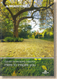
So: the 2011 brochure runs to exactly 100 full-colour, A4 pages in the familiar spine-bound format. It immediately commands more authority that last year's feeble effort and the overall feel and styling is more akin to what we should expect for a major player in the British paving and hard-landscaping trade. It's also fairly and squarely targeted at gardens: the brochure is entitled "Garden Landscaping Collection", although the legend 'Here to inspire you' is given prominence via a bigger and bolder font on the cover, while the Bradstone logo, and a low-key AI logo are pushed to the edges.
There's a mood board feel to many of the pages, and the show kicks off with a description of three key garden styles: Urban, Cottage and Small Space. The flag products are then grouped into one of two distinct collections, described as Contemporary and Traditional. Block paving, walling, edgings and aggregates are kept separate.
I like the grouping. Given the product range, expanded as it is, it feels natural for what I count as 30 different flavours of flags to be organised into logical camps with very little overlap. There has always been a tendency to differentiate between natural stone and concrete (err…reconstituted stone) but the ever-advancing development of exciting secondary processing techniques means that many natural stone products are now anything but 'cottagey' while the ability of concrete to recreate the very best looking old stone flags is sometimes unbelievable, so why not mix the materials and group them according to their styling?
There is a lot of new stuff, it has to be said, and if I had a couple of days to spare, maybe they could all be crammed into this review, but time is against us, and so the highlights will have to suffice.
StoneFlair Vogue: a smooth polished sandstone in two colours which comes in a 9m² pack comprising square, rectangles and L-shaped pieces. Very modern, but limited in how it can be used. Desperately under-explained in the brochure.
StoneFlair Ventura: another Silver Grey polished sandstone, in 500x500mm modules with 3 non-parallel grooves, aka dirt collectors, etched into the surface. Very contemporary and stylish, but, I suspect, very limited appeal.
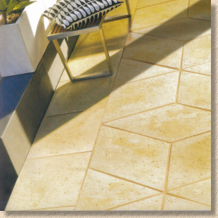
StoneFlair Tuscany 3D: Lozenge-shaped imitation travertine claimed to reproduce a three dimensional illusion. Maybe, for about 20 seconds, but after that, it has one dimensional versatility.
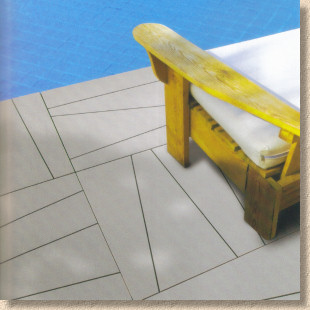
Polished Natural Sandstone: increasing in popularity now customers have come to realise these polished/ground/smooth stones are nowhere near as slippery as they'd like to imagine, and the good news is that the Bradstone offering is now available as 'long aspect' 900x150mm strips that look simply fantastic.
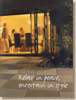
StoneFlair Finesse: lightly textured Kota limestone in six modular sizes. One of the best products to come out of India over the last decade. It's better at resisting algae, lichens, dirt and mosses than the over-used sandstone, while its colouring is eminently sympathetic to Cotswoldian tones. Finesses seems to have sawn edges, which is no bad thing, but I do wish the descriptive text was a little more helpful.
Panache , which now seems to have been tagged with the StoneFlair brand despite it being a pure Bradstone line for several years, has been augmented with three gorgeous coffee tones, the dark brown "Chocolate", the self-explanatory "Cream" and the caramel-hued "Fudge", all available in smooth ground or the algae-attracting textured finish. This is probably my favourite new item in the whole brochure. I've long admired Panache for its versatility and quality, and now these new tones just make it even more delicious. The only fly-in-the-coffee is that they come in just the one 450x450mm size. Please, please, please make this in modular sizes for 2012.
Moving on to the Traditional products, StoneFlair Cloisters is the natural successor to the now-departed Cathedral. Maybe they come from a slightly different part of the church grounds, eh?
Fantastic moulding and three subtly varied colour tones make this a seriously top-of-the-range reproduction reclaimed flagstone in a very generous nine (yes NINE!) different sizes based on a 200mm module. There's even 30% recycled/reclaimed aggregates in the mix, so bonus points for the environment and your conscience.
I think this is a wonderful product and the only fault I can find is the parallel grooved etched into the 800x200mm modules. As mentioned in regard to the Ventura above, grooves equate to crap-collectors, so they need to be filled with jointing material. I can't figure out whether all of the 800x200mm units are groovy, or just some of them. Features such as this are fine as occasional items, say two or three on a 20m² patio, but if the reality is, as the layout sketch suggests, there's 18 of the buggers in an 11.56m² patio pack, then that's over-egging the pudding, to say the least.
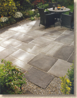
Many of the remaining Traditional offerings are much of a muchness. They are all reproduction old flagstones of various sizes, colours, textures and pricing, and it becomes quite confusing as to which is which and what are the salient points of each. How a homeowner can be expected to choose which is the most suitable for their project from the frankly bewildering array is beyond me. I expect to see this roster trimmed in the coming years, as offering customers too much choice can be almost as bad as providing too little.
So let's jog along to block paving.
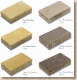
This section seems to be more about consolidation rather than innovation, although the woefully underrated StoneMaster, which is the best new block paver seen in the UK for a decade, is now available in a three-shade grey mix to complement the existing yorkstone buff version. I suspect the grey will lend itself to driveways in those parts of the land where a buff-multi would not sit easily, so I'm all in favour of that, but I'd like to see a 'jumper' block, too, so that we can break away from the over-used transverse broken bond pattern that dominates this type of paving product. It also needs a complimentary kerb if it's really going to take off in the residential market.
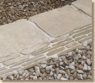
Walling and edgings are pretty much as you'd expect. The best Bradstone products remain, while some of the better StoneFlair products have been shanghai'ed into the team. The one new product worthy of a mention is the intriguingly named Slate edging tile. This is a 600x150mm edging, 40mm thick, which is intended to be laid flat, much like a mowing strip. It's produced in the now familiar garden green/grey tone, and appears as four higgledy-piggledy strips of what is alleged to be slate-on-edge. I think it looks good, but I'd much prefer to see staggered ends so that the joint between adjacent units wasn't as obvious.
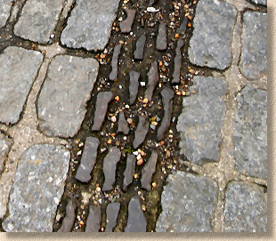
Also, compare and contrast with genuine slate on edge, and the ironstone edgings strips that are used in parts of Kent and East Sussex. For me, they missed a marketing opportunity here. If this was to be produced in a grey multi, with staggered ends, and sold as, say, "Wealden Edging", it could appeal to a wider audience.
Oh look! There's also a new 'ready-to-use' jointing product. Who would have thought! It seems to be mandatory for larger suppliers to have their own version of a resin jointing mortar this year, and like most of the others from the better end of the market, this is, at heart, a pretty good product, but still not quite up there with the very best. How will it compare on price with the German imports?
The final 18 or so pages are given over to technical information which has varying degrees of usefulness and relevance. The five pages of laying patterns are excellent, but I'd like to see examples of how multiple packs can be integrated to cover larger areas, and how the layout can be altered so that we don't see the exact same patio in a dozen different locations.
The "How To.." information couldn't be any more elementary without vanishing completely and then there's 10 full pages of so-called Technical Data which is essentially order codes for merchants. This was explained to me as a simple logistical exercise meaning that one single publication could be used for customers, contractors and retailers, and so avoid the need to produce the 'Trade Directory' which was supplied to BM and some contractors over recent years. Fair enough, that makes sense, but, bloody hell, it ain't half boring!
So: where are we with Bradstone? The absorption of StoneFlair makes sense. Whereas there used to be two brands covering much the same market, there is now the one, and it's all flying under the stronger name, Bradstone. The peripheral fripperies have been hived off to Border Stone, and, if you ever need a chuckle, get hold of a copy of that brochure to see just what sort of horrors some parts of the British public want to put into their gardens. You can't blame AI for manufacturing this nonsense: if there's a market for it, they'd be daft to ignore it on the grounds that it's a bit tacky. The people that buy this sort of stuff really shouldn't be allowed to have their own money, so Border Stone are providing a valuable community service by taking it away from them.
What's left for Bradstone is, by and large, the genuine quality items. However, there are a lot of them, and while offering at least 10 different reproduction flagstone ranges may seem incredibly comprehensive and generous, the truth is it's confusing and some, sadly, will have to go. It's good to see a dash of genuine innovation and risk-taking with the Ventura and Panache, and while both really are superb products, I suspect only one of them has any sort of a future. The Cloisters range is glorious and I'm eagerly looking forward to designing with it later this Spring. This is one product that is guaranteed success and deserves a place in the premier league of reproduction paving.
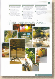
However, the most positive thing of all is the renewed enthusiasm of the Bradstone team itself. The appetite seems to be back. There's a sense of purpose when talking to the new products team and a sense of direction from the marketing crowd. This come through most strongly in this new brochure, which I'm so glad to see return to form. There's work still to be done; I love the mood board feel of this edition, and the photography is unerringly classy, but the descriptive text is…well, not very descriptive, especially for some of the more important new products. I know a picture is worth a thousand words, but sometimes it helps to explain just what it is the picture is portraying.
Overall, a good return to form and, for the first time in a couple of years, a sense that AI have got their cards stacked correctly and are ready to raise.
Want a copy of your own? The general release is scheduled for this week (January 17th onwards) and so they should be available at your local Bradstone stockist.
Alternatively, call the marketing team on 01335 372222 or you could try emailing them via the following link:


