BorderStone 2012/13 Collection
BorderStone were a major presence at last month's Glee dudfest and part of their assault on the pot-buying masses was the launch of their new brochure which is intended for next season, if truth be told.
As mentioned in the Glee coverage, BorderStone deliberately target the garden centre shoppers and the independent builders' merchants, so their offering is….well….different. There's paving and decorative aggregates but there's also lots of silly ephemera such as faux Greek statues and bird baths.
It's difficult not to have my head turned, in the wrong direction, by these delights when appraising the brochure as a whole, but I'll try my best.
In appearance, it's very similar to the last few Bradstone/BorderStone issues, in that it's an A4-size, folded-and-stapled, full-colour brochure with the corporate blue back cover of parent company, Aggregate Industries.
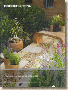
The cover image really does set the tone for what follows, showing the ultra-gaudy Rainbow Sandstone in planter and bench forms, with basic riven sandstone flags edging a panel of inoffensive decorative aggs. Very wisely, they've elected not to feature one of the cutesy wet-cast cherubs or gurning Easter Island heads on this cover shot.
Inside, the contents page offers four main sub-sections: Decorative Stone; Garden Features; Paving; and Landscaping Features. There's the obligatory bit of guff about sustainability and ethical trading, but it's mercifully limited to a single page. I don't mean that to sound dismissive: sustainability and ethical trading are important issues, but in all the decades I've been talking about paving, I've never yet had a domestic client ask me about either subject. When it comes to choosing a new patio, it's aesthetics, durability and price that matter. Different in the commercial sector, of course, with the BREEAM and PAS 2050, but then, the commercial sector is not where BorderStone are aiming, so keeping the 'guff' to a minimum is understandable and much appreciated.
Anyway, on with the goodies, and these start with decorative aggregates, over which it is not easy to get over-excited. A flick through the following ten pages suggests all boxed have been ticked: sands, grits, gravels, mulches, cobbles, big angular lumps, big rounded lumps, sandstones, limestones, granites, slate, flint, recycled, fish-friendly, grave dressing…it's all in there, somewhere.
In a conversation with a competing supplier of hard-landscaping earlier this week, it was claimed that, no matter how much you loathe deco gags, no matter how far from your core interest they may be, you are now expected to provide them as part of a package for many stockists, and that it's a no-brainer, because if they are buying your paving, they will gladly take your aggs if only to keep the procurement paperwork to a minimum.
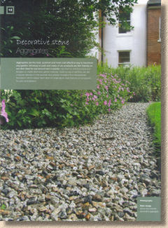
To be fair, BorderStone, as it used to be, was a bit of a specialist with deco aggs, far more so than with flagstones or fountains, so it's good to see that some things don't change. Having said that, though, it does seem that the range of aggs now offered to the general public is but a fraction of what is what a decade ago. Whatever happened to the spaghetti stone and the banded pink stuff that looked like overgrown liquorice allsorts?
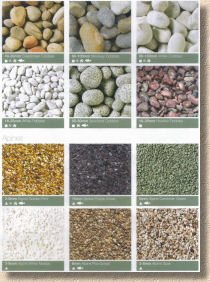
I do like the way that BorderStone have been generous with the swatches. 50mm (ish) squares of each type with a simple symbol guide to indicate suitability and pack sizing makes it incredibly simple to pick just what you want for any project.
It's never easy to make gravels and rocks look interesting to the general public, but the accompanying images are, largely, very good. There is one close-up where the togfer has skilfully managed to get not a single piece of gravel in focus, but that's probably regarded as "arty".
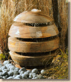
Oh 'eck! It's Garden Features next, starting with the usual assemblage of Indian sandstone and Chinese granite spheres and associated nonsense.
Not my taste at all. Don't get me wrong: there's nowt more refreshing than the trickle of water in a garden on a balmy summer's day, but I'd prefer it to emanate from something with a modicum more taste than these lumps. That bloody rainbow stone may well look attractive when wet, but the damned stuff goes green with algae as soon as you turn your back on it!
Brace yourselves: it's statuary next.…least said, soonest mended!

As I did mention to Messrs. BorderStone at Glee, just because I don't like something, doesn't mean it's a bad product. These nightmares-in-concrete sell phenomenally well, making a good profit for both manufacturer and retailer, and so help keep both in business. If we want to take a benign view, then consider that the eejits buying this sort of nonsense obviously can't be trusted with money, so it's actually doing them a kindness to take it off them in return for a concrete lump.
Anyway, here we go with the good stuff: the paving. Given BorderStone's business model, we should know that there's not going to be anything stunningly original, radical or innovative. It has to be judged on its target market, which is simple, nowt-fancy garden paving in user-friendly packaging and at reasonable prices. And working on those criteria, it's not a bad little offering.
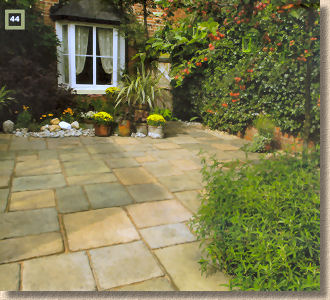
All the items that need to be there are actually there. The riven sandstone, the decorative circle feature, the chic'n'sassy granite, the traditional wet-cast yorkstone wannabes, and the inoffensive 450mm squares in textured, smooth or riven effect. This is what sells at garden centres and independent builders' merchants where hard-landscaping is a sideline at best. It's the day-to-day stuff, the loaf-and-a-pint-of-milk. Just as they don't look for a leather suite at the local Spar or Centra, customers wanting border-etched Vietnamese Blue Limestone in linear format don't look for it at the sort of outlets that BorderStone is serving. It's horses for courses and it's fair to say that the BorderStone horse seems particularly well-suited to the GC/BM course.
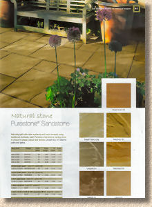
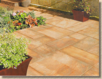
But what about the brochure itself? How good a job does it perform at promoting the paving, at providing the right sort of information in a legible and logical manner? It's nowhere near as flashy as might be expected in a more upmarket offering, but the photies are well-taken, well-staged and well-chosen. They are quite flattering to many of the products, but surely that's what they pay a professional togfer for.
In general, it's one page per product, which allows for a half-page main photie, a simple table of sizes and weights, a handful of swatches and a couple of lines of text.
It's definitely a catalogue rather than a portfolio, and there's almost nothing in the way of design details or combination ideas. And maybe it's me, or possibly the printing process, but there does seem to be a darker setting for the lighting: many images look autumnal rather than spring or summery. Shadows are long and fuzzy, like an October afternoon, although the (obviously brought in) planting tries to suggest it's earlier in the season.
Finally, it's the so-called Landscape Features, by which they mean walling, stepping stones, planters and edgings. There's a huge range of taste here, from the clever sleeper-effect planter spotted at Glee to the truly awful 'squashed trainers' stepping stones. Again, it's horses for courses. Someone must buy this stuff or they wouldn't make it!
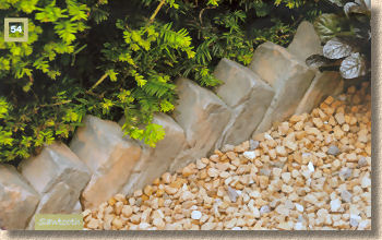
Of all the items in this last section, the one that I get asked about most is the sawtooth edging. I don't know why it is so popular when the 'original' was always something knocked up in cottage gardens using salvaged house bricks, and no matter how battered and tatty and mortar-spattered those house-bricks may have been, they always look better than the wet-cast version which is inexplicably popular. Despite having a page on the website showing just how ridiculously easy is this form of edging to construct, the garden DIYers of this land seem to prefer the bought –in cumbersome 18+ kg concrete version. Borderstone: take their money quick before they wake up!
The brochure finishes off with a couple of pages of project pack layouts which they have re-jigged to eliminate the crossed joints that blighted previous incarnations, and then a page of caveats all rounded off with three full pages, that's six sides, of allegedly "Technical Information" which has to be aimed at the retailer rather than the consumer. I mean, which weekend DIYer wants to know the barcode number for a 600x300mm Fieldmoor flagstone?
Unlike some of the competitor brochures, catalogues, portfolios and collections, this publication doesn't set out to be inspiring or entertaining. It's informative, and it delivers the necessary information clearly, consistently and with the minimum of fuss. It's highly reminiscent of the catalogue from its big brother Bradstone, which was reviewed earlier this year. The layout is similar, if not as grand, with smaller photies, sparser text, less inspiration. In that respect this brochure reflects the brand's relationship to Bradstone; it's a 'budget' selection for the financially discerning.
I often recommend that contractors get hold of a copy of these brochures and use them as sales aids. In all honesty, this isn't a sales aid. It's a basic guide to what's available from BorderStone; nothing more, nothing less. It does what it is supposed to do, it does it well, but it's never going to turn any heads.
As far as I can tell, this new edition is not quite ready to be unleashed, but you could put in an order for a hard copy via this webpage


