Marshalls 2013 Collection
This feels strange. It's almost mid-February but only now am I putting fingers to keyboard regarding this year's essential Marshalls' Collection Brochure , which has been on my desk since before Christmas unofficially, while the Marketing Department sanctioned copy, complete with New Products supplement, has been here since the New Year.
The reason for this tardiness lies with that most elusive of characters – opportunity. The aforesaid Marketing Department suggested, and I agreed, it might be better to leave off scribbling my worthless opinion until I'd been given a guided tour of the new stuff on a day trip over to the Marshalls' Portacabin in that Yorkshire, and consequently, what with taking The Register, sorting out the UN, and sheltering in the warm until the rain stopped, it was last Wednesday before the opportunity was finally nailed.

In keeping with brochures from most of the other serious players in the residential paving game, Marshalls seem to have settled on a brand identity for their annual exposé and so the front cover is immediately recognisable as Marshalls, or at least it is to those of us sad enough to own a collection of such items dating back to the late 1980s.
My anally-retentive library reveals that the first appearance of the highly distinctive A4 format, Forest Green Banded edition emerged exactly a decade ago, and although I would entertain a case that the previous year's 2002 edition was pretty much there, it is only the 2003 vintage that bears the definitive green spine. Oh, for the heady days when Drivesett and Heritage were cover stars!
Anyway, as I've said before in these reviews; if it ain't broke, don't fix it.
Looking back through the brochures spanning that decade of excess and austerity, it's noticeable how the front and back cover feature those products of which, one assumes, the company is most proud. This year, the front is given over to the Golden Sand Multi King Size Fairstone flags, while the rear depicts the Cobbletech sort-of block paver system.
Now, back in the damp days of September, if I had been asked to guess what product would be the cover star this year, it would have taken less than three nanoseconds to come up with Cobbletech , because it seemed to be the sole topic of conversation amongst Marshalls' pet installers, those who would like to be Marshalls' pet installers, and those who would like to be Marshalls.
The whole residential paving trade was obsessed with a block paver system that has been used on the continent for a good many years and one which I personally never thought would catch on in Britain. Shows how much I know!
The key phrase in that previous sentence, though, is easily overlooked. Cobbletech is a *system* . It's more than a block; it's a combination of a particular block with a very particular jointing medium and a fairly critical sub-layer. You can't use the blocks without the jointing, and you'd be daft to use the jointing for anything else (although you could if you wish, but it'd be a waste, and an expensive waste at that!) You could use the sub-layers with other block pavers, and they would benefit from it, so it's not as exclusive as the surface components.
Most of the naysayers had one major concern – that resin mortar in the joints. It's taken us twenty years, but we are now in a happy place where even white-van-man paving teams understand that using rigid joints on a flexible bed is a recipe for disaster. Flags laid on sand and pointed up with compo *always* failed. Setts laid on cinders and brushed-in with a wet slurry lasted about a week. So why would Marshalls want to turn back the clock and use a block paver with a resin mortar? Maybe if the block were to be laid on a bound laying course, say a 4:1 mix, well, that might work, but you very definitely cannot lay on sand.
You can understand the very valid concern, but the point that had been missed is that the resin mortar is NOT rigid. It's anything but rigid. It's a purpose-engineered flexible mortar, intended to move with the paving, to absorb to crushes and the stretches, to twist and bend and flex as loads pass over the surface. It is NOT Weatherpoint or any of the other standard resin mortars that are now available. It's summat a little bit different.
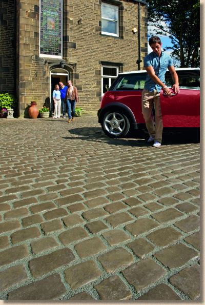
And that's why Cobbletech has to be thought of as a system, not a paver. The blocks simply could not function without the resin mortar.
Innovation aside, what Cobbletech has in its back pocket is versatility. Anyone with a bit of imagination can see where this goes from here, the variations, the accessories, the feature kits. In fact, some of these are already available in that Europe so as along as Cobbletech proves viable in the British market, expect to see them making their debut on this side of the Channel in the next year or two.
Producing the individual blocks in five different sizes, with five different moulds for each size helps ensure there is plenty of perceived variation in the paving when installed, especially when you consider that individual blocks can be laid in either of two directions, giving a nice round figure of 50 possibilities.
Cobbletech has a lot going for it. To say the installers love it would be an understatement. I've never yet come across a product which has received such widespread approval amongst members of the Marshalls' Register. I'd guess that 85-90% of discussions range from positive to fanatical, and while the dissenters may be few in number, their primary gripe certainly has validity. Cobbletech is not cheap.
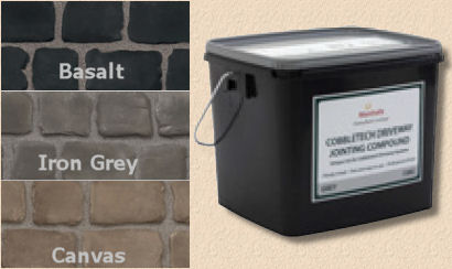
Fair enough, it's not as pricey as genuine stone setts laid with mortared joints, but it's head-and-shoulders above the price of standard block paving, even more than the premium products such as Argent.
So, despite its aesthetic appeal, and despite the admiration from installers, the price is going to be critical in determining success. Are there enough customers out there willing to pay that sort of money for a concrete sett when the real thing is only a few quid more expensive? Probably just, but despite the installers enthusiasm, this is not likely to be the sort of product used every week.
Against a backdrop where most other paving manufacturers and distributors are playing it safe, Marshalls have really pushed out the boat when it comes to new products. OK, so like many of their rivals, not everything labelled new is completely new; a good few are variations, adaptations and mutations of existing products, but in an age when innovation is scarce, we have to take what we can.
Very helpfully, Marshalls have produced a 'New Products' supplement which is available to pet contractors, preferred suppliers and those of us who pester sufficiently, so I'll follow the order therein.

And first up is Fairstone Sawn Linear . Lovely product, lovely idea, lovely projects done with it, but we really have to do something with the name used for this style of paving. Linear? WTF? It's meaningless. Admittedly it's way, way better than 'Planks', and more succinct than 'Long Aspect', but it's soulless and unimaginative. I don't have any suggestions, by the way, but I'm sure there's a better title out there, somewhere. Any suggestions?
Maybe a change of name would help push this product group in general, and the superb Fairstone Sawn version, which comes in four familiar colour options, in particular. These are crisp, clean, chic pavings which offer a whole alternative dimension to modern design, if they are given the chance.
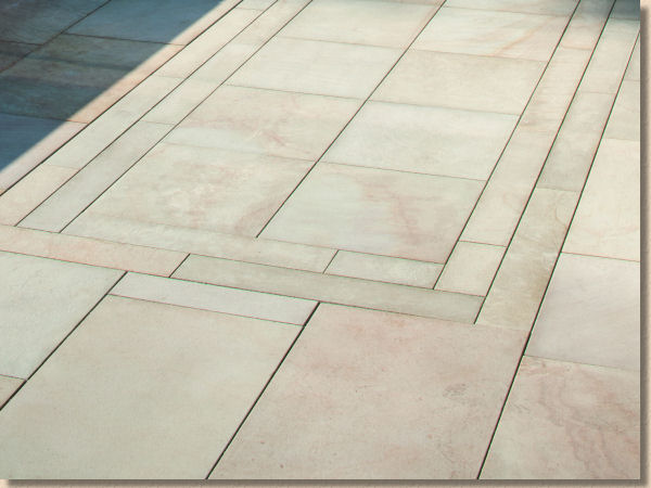
Flaming is a fantastic technique for adding character to what might otherwise be a plain and uninspiring stone. Not all stone can be flamed, and amongst those that can, not all that are actually benefit from the process.
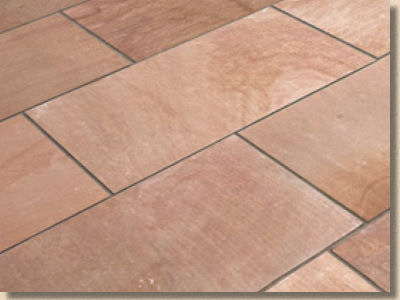
Luckily, the Fairstone Autumn Bronze Multi (ABM) can be flamed, and it very definitely benefits from the process. Unflamed, ABM is just another warm-hued, fine-grained, seen-it-all-before sandstone, but scorching the surface turns a plain duckling into a swan. The texture exudes tactile confidence and actively glistens in the light, which seriously enriches the colour and gives it a sense of richness, of luxury. It's not for the faint-hearted, as it's very strongly coloured, but on the right project, it would be a real head-turner.
However, the sizing is doolally! 450mm gauged width and four non-modular lengths (475/575/675/775mm) means it can only be laid as courses. I'd love to see a modular version, so individual pieces could be rotated through 90° and so get a different perspective, a different luminance when the sun is low, or there is ambient lighting on a summer's evening.
Rustic Ochre Limestone , by contrast, is modular, and so is instantly more versatile. If there is one type of stone that is underused in the British residential paving market, it is limestone. Forget for a moment the fade-to-grey black stuff that is overused in unimaginative ways, and look at the variation in texture and colour with this cool,-as-a-cucumber flagstone. Treat yourself: next time we have a warm day (it's rumoured we are due one this year) kick off your shoes and socks and walk on this stone barefoot. It's like a Reiki massage.
For those customers who want the darker tones, the Sapphire Storm version has echoes of the indigo Ballinasloe limestone from the west of Ireland, although it's actually from Vietnam. It's flecked with pale shell remnants which give it character and prevent it being too funereal. It comes in the same sizes as the Rustic Ochre, but I'd like to see a "linear" version, or even rectangular setts, because these two colours really work well together, and if you had panels of the lighter option edged or contrasted with the darker Sapphire, it would be pretty stunning, I reckon.
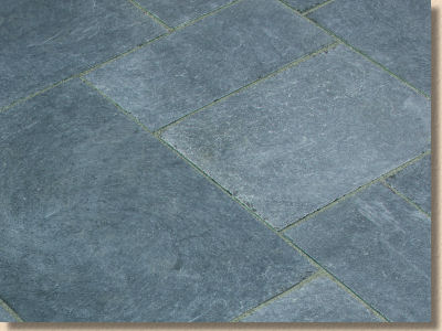
Perfecta: you know it's a bloody good product when it's been around for 20 years or more before it's considered for updating. I was laying Perfecta in the early 1990s to various commercial schemes in Liverpool, and simultaneously recommending it to private clients as a more modern, lower maintenance option to the Saxon textured flags which were unreasonably popular at that time.
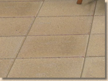
Perfecta often deceives clients into thinking it will be slippery, when it's anything but. That smooth ground surface exposes incredibly hard yorkstone aggregate and gives a subtle terrazo-like appearance.
The addition of a bevelled edge – well, maybe it adds definition and it should certainly reduce spalling caused by incompetent installers butt-jointing instead of keeping to a close joint , but I'm concerned that the widened, sunken joint will only serve as a home to garden detritus, and where there is detritus, there will soon be weeds.
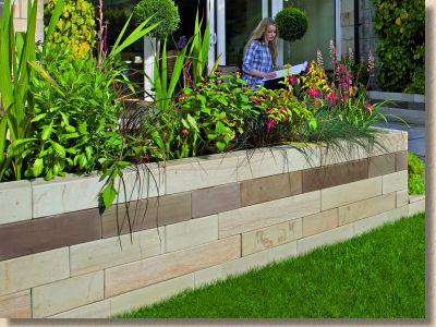
Fairstone Sawn Walling leave me cold. I know it's modern and chic, but to me it is stone stripped bare of almost every last vestige of character. All that is left is the colour, and with this series of imported materials, I don't think that is enough for a walling stone.
I can acquire smooth, barely coloured walling blocks in concrete (or reconstituted stone as they call it in such circumstances) for a lot less. I can understand that, for some clients, the fact that the paving and the walling are cut from the same natural material will be regarded as a plus, but it all looks a little bit too Lego-like for me. In contrast, I think the copings, cut in the very same way from the very same stone, are wonderful....as long as they were put on top of a wall with a bit of character, maybe a pitched face or even just a shot-textured face. But diamond sawn copings on diamond sawn walling with, most likely, diamond sawn paving strikes me as being the sort of thing only an OCD sufferer would enjoy.
Finally, block pavers and a triplet of new colours for established block pavers.
Natrale , the embossed block which inexplicably sells and thereby proves the adage that there's no accounting for taste, is to be made available in a multi-grey with hints of reddish-earth. I like the colour, but the blocks themselves are not my taste, and that applies to all embossed blocks, regardless of who makes them.
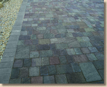
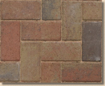
At the other end of the likeability scale lies Tegula Drivesett , which can do no wrong in my eyes. Unlike Natrale et al which try (and fail) to emulate the riven surface of natural stone, Tegula Drivesett makes no attempt to deceive. It is what it is: a tumbled, coloured concrete block, and I've loved it since first laying it over 20 years ago in Ormskirk.
The new colour? Well, it will certainly suit some properties. It's a tad warmer than Traditional, but not as 'garish' as some of the Deco colours (Yes, I mean Terracotta, which is obnoxious in anything more than string courses).
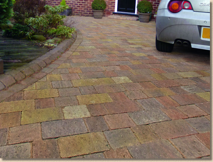
The new colour for standard (NOT Driveline) blocks, Sunrise : Unlike everything else that's new, I haven't seen this in the flesh, but the very small swatch and its near absence from the main catalogue worries me. I hope I'm wrong but it looks like a mish-mash of leftover colours from manufacturing all the other blocks that Marshalls produce. I'll reserve full judgement until I've seen it laid to a reasonably sized area, but it doesn't look like the sort of colour option I'd want to inflict on a client.
So that's all the new products covered, and even for a company with the market dominance of Marshalls, it's a pretty impressive roster. Now we turn to the brochure itself, and I know there has been a lot of thought put into this edition, even more than usual. There's a noticeable 'austerity package' been applied with regard to the trumpet-blowing and aspirational nonsense that all too often dominated the first 30 or so pages of too many brochure over recent years. I'd like to think I played some part in this, but it's pretty unlikely that anyone, not even my own family, pay that much attention to what I say or think. Whatever the reason, it's a hugely welcome change.
Browsing through the 164 pages that have somehow been squeezed into this year's catalogue, it really struck me what a phenomenal range of products Marshalls' residential section puts out there.
It's truly mind-boggling just how many different products, different materials and different colours are offered from just one supplier. If it wasn't for the fact that I have a very full and fascinating life, it would be an entertaining waste of an afternoon to tot-up just how many different lines they have. Excluding size options, it definitely runs into the hundreds – how is anyone supposed to remember all of this?
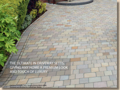
Setts laid by Brew Cabin Irregular, Mick G of CrystalClear
Also striking is just what a superlative range of job photos they've amassed over the last few years. It's not all that long ago that many, if not most, publicity shots were set-up in one of their own yards, staged for the camera but look now. The staged shots, which to be fair are an essential component of any manufacturer's armoury, are by some considerable quantity in the minority, while the dominance of 'real job' photies has swollen to immense proportions, and very welcome they are too. It really is a product portfolio to die for.
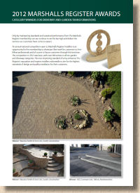
I do like the fact that winners of awards at the annual Register Members' bashes have been recognised in a double page spread, and that several big-spread photies are credited to the installer on the relevant page itself, rather than being shepherded off to a minimal listing tucked just inside the back cover. The gangs designing, managing and installing these projects deserve every bit of recognition they get – let's show the general public that there are plenty of good 'uns out there, and their work is a joy to behold.
So: the brochure. I notice that it's been branded as the 2013/14 Collection - is this another bet-hedging tactic, seen with other manufacturers over the past 12 months, to give them the option of stretching the publishing window in case they've nowt new or no money next year?
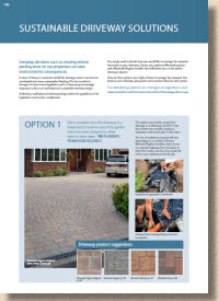
I like the balance in this edition. It's heavily visual, with minimal waffle. Where text is needed to explain concepts such as 'Choosing an Installer' or 'Sustainable Driveways' it's done simply, cleanly, clearly and with no extraneous verbiage. It has stuck with the traditional Marshalls' feel, but cleaned it up by trimming away the excesses, which has resulted in a clearer sense of what the company can offer.
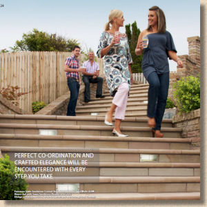
The wealth of photies has been mentioned, but the quality is pretty good too. I'll admit to a slight shudder at the sight of all those aspirational, toothsome thirty-somethings having a whale of a time in five-figure gardens seemingly unaffected by the crappest summer in living memory, and that black Range Rover has clocked-up a fair few miles to put in an appearance on so many far-flung jobs, but who else could even take on such an expansive and eclectic product range?
And then when you take into account that many of the best photies are real projects, where the Togfer has had to contend with the fickle weather and unpredictable lighting while capturing the perfect angle to show off the paving and the craftsmanship – well, that's some undertaking!
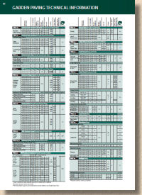
If there's one thing that seemed uncomfortable, it was the technical information. Removing it from the page where a product is featured creates the clean, uncluttered look which is so evident in this year's publication, but what to do with it? Do you stick it all together at the back of the brochure to create a block of dry tables and outlines, or do you put it at the end of each section, as Marshalls have opted to do?
On balance, they've probably got it right, but there has to be some better way of presenting this vital info in a manner which doesn't scare the horses.
As a guide for homeowners, there's certainly enough to whet the appetite and plenty of links to further sources online, be it the web, the various anti-social media options, or Pinterest (where did that spring from?). I think one of the comments from a rival supplier earlier in the year summed it up perfectly: none of the big companies really want the trouble and expense of producing these annual brochures, but without them, you have almost no credibility with the homeowners. They are a necessary evil.
Contractors, especially those with a batch of badged copies touting their own name, will increasingly use the brochures as a giveaway, something tangible to leave with a potential client. However, more and more of the serious, professional contractors are tooled-up with tablets, and will take a client straight onto the 'net, to show either their own website or dive headlong into the extensive online galleries of products, swatches and design ideas.
If you need me to tell you that Marshalls' is one of the three absolute essential hard-landscaping sacred texts, then you're either new to this lark or you need someone to feel your bumps. Without it, you are naked and uninformed; with it, you are armed with what is probably the best portfolio of contemporary British residential hard-landscaping I've ever seen….so far!

Download PDF version of brochure

Request by phone 0845 820 5000

Email to request copy sent by post


