Marshalls' 2006 catalogue
Thud! The new 2006 Drive and Patio catalogue from Marshalls lands on the doormat, and at 156 A4-sized pages, it must be the biggest ever. A brief scan of the table of contents on page 3 reveals that it's been sub-divided into six sections: Pages 1 to 23 are given over to what I refer to as trumpet-blowing and lifestyle envy, followed by 53 pages (24-77) devoted to "Garden Paving", which is essentially patio flags. A short, ten page section (78-87) looking at "Paths and Edgings" gives way to a much expanded section for walling, weighing in at a chunky 21 pages. The "Driveways" section, by which they mean setts and block paving products, is awarded just 37 pages (pp 110-147) and at first glance that seems niggardly when compared to the amount of space given over to patios. The final pages, just eight of them, contain information on the Marshalls Register, acknowledgements and essential contact details.
The overall impression of the catalogue is that it is a follow-on to those issued in 2004 and 2005 - a very familiar look and feel.
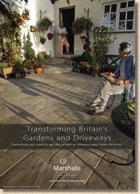
My feelings regarding the use of human models in brochures and catalogues are well-known and I've expressed them on numerous occasions on this website and elsewhere, so I don't think it's necessary for them to be re-stated to any great extent just now, but suffice to say that my opinion remains as trenchant as ever: models detract from the overall image; they cause us to decide whether we like the model and that, in turn, colours our opinion of the paving. All of the better photos I've ever seen, without exception, have been completely free of human models. I prefer to let the paving speak for itself and my cynical nature resents the attempt to sell me a "lifestyle" when what I actually want is a patio or a driveway.
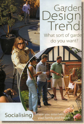
That's why the opening pages disturb me. The stated aim is to prompt the homeowner to question what it is they want from the garden or driveway, and to this end, a select range of designer layouts created in “upmarket” homes and adorned with fluorescent-toothed models are offered as possible answers. However, although the root question is posited ("What sort of garden/driveway do you want?") it's not developed sufficiently and the essential subsidiary questions (How do you use it? What style is your property? Are you a daily user or a weekend visitor? etc.) are not broached, but instead a selection of Marshalls-associated paid-for services and publications are touted.
Given 24 pages and a brief to show how Marshalls products can be used to create a limitless array of styles suitable for a wide range of uses, tastes and budgets, too much effort has been focussed on aspirational lifestyles rather than sound advice, thought-provoking questions and plain common sense.
Enough! On to the products. The "Garden Paving" section starts with the natural stone products - the Haworth Moor Indian sandstone with an imaginary link to the Brontes, a creamy Travertine that looks good enough to eat but comes in only one size, and a selection of imported slates and granites. The light and dark granites are a long-standing favourite of mine, and the 4:1 plan size of the Eclipse Granite is intriguingly different, but it needs a supporting cast to show it off to best effect. A complementary sett-sized unit, say 200x200mm, would make this very attractive product so much more versatile.
From the natural to the naturally inspired: Marshalls have linked up with the National Trust and persuaded them to endorse a small range of high-quality wet-cast flagstones modelled on flags and pavements that can be seen at two of the NT's more celebrated properties, Polesden Lacey in Surrey and Lacock Abbey in Wiltshire. The P-L flags in particular are as good as any wet-cast product in the world, and a damned sight better than most. As revealed in last September's Glee review , the new Bonding-in Kit for use with circle features is an immediate classic and is certain to be copied by everyone else within the year. I'd like to see a wider selection of sizes, and a touch more variability in the colouring, but these are very good flags and well worth considering for use on older properties.

The remainder of the wet-cast range is pretty much as was. Chancery is as good as ever, but nowt new; Heritage will undoubtedly maintain its popularity; and the Firedstone offers a lighter-toned option for those not taken with the earthier colours.
The association with Diarmuid Gavin also continues. I couldn't see the point of the "Luna" patio feature when it was launched last year, and the intervening period has not mellowed my opinion. It's an over-priced portion of uninspiring, insipid tat. It has zero-versatility and can only appeal to those poor souls who naively believe a celebrity endorsement is the ultimate in cool. They deserve to be parted from their money.
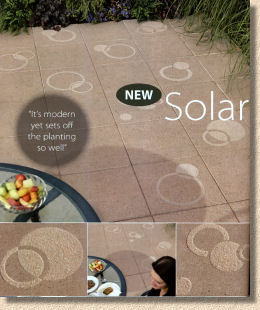
The new "Solar" range of textured-branded flags isn't quite as bad. It does have a degree of versatility, and the contrasting texture of the patterning and the surface is definitely attractive. However, I'm struggling to see the appeal of this particular format. Other manufacturers have used this "stencil-etched" technology to create flags that offer greater versatility, in a wider selection of sizes and colours, and I would have thought that someone with the obvious talent of Mr Gavin would be able to see the shortcomings of such an simplistic and basic paving product. If this was selling as a budget product, there'd be no problem, but it's being sold at a significant premium and I just can't see the added value.
Woodstone: wet-cast concrete paving with the texture and colouring of wood. Why? I seem to have a blind-spot when it comes to this type of product, regardless of the manufacturer. I've heard the arguments concerning better traction and ease-of-installation, but it still doesn't make sense to me. Even they very best imitations, and you would have to include the Woodstone products in that classification, struggle to achieve a convincing level of authenticity, so why do people buy them?
Firenza - one of the better "I've been to Spain for me holidays" terracotta-inspired pavings, but I urge anyone considering this type of product to think long and hard about using it in conjunction with a more muted paving. 20-odd square metres of bright-orange tiles don't do much for a migraine! Less is more, as a wise person once said.
Argent - go and buy some now. If you're a contractor, bully your next client into using this paving; if you're looking for a paving for your own garden, you simply cannot find anything with as much understated style and the classic good looks of Argent. It is the best product in the catalogue and deserves wider acclaim. It works with any style of home, with any scale of budget, in any sort of setting. It's simple, unfussy, subtle, cool, chic and timeless. Fold over the corner of page 62 when you get your own copy of the catalogue. Make it your New Year's resolution to get at least one client to use Argent this year.
Saxon and Perfecta: been around for donkey's, and will probably outlast many of the newer innovations. You just can't beat simple and straightforward. The shot-textured Saxon can be prone to algae, especially in shady and/or damp areas, but it's a doddle to keep it clean and in pristine condition - just swill it down with diluted bleach two or three times a year and it will continue tolook as good as the day it was laid.
Overall. There's not a great deal that's new in the Garden Paving section. The National Trust Paving is a variation on a theme, and the Solar stuff is, at best, a missed opportunity.
Moving on in the brochure, I'm not sure why "Paths and Edgings" has been hived off into a separate section – maybe because it spans products from both the patio range and the driveways. Regardless, there are a couple of new items here that need the once-over from a beady eye.
Cobblestone Setts were THE big feature of the Marshalls' stand at Glee and were not particularly well-received. Basically, they are a mesh-backed wet-cast sett-effect (running out of hyphens!) paving identical in concept to all the other mesh-basked products. Marshalls are relative latecomers to this type of product but they do seem to have learned from the mistakes of others, in that they've produced a convenient size that doesn't require two people to lift each mat and it can be easily manoeuvred to achieve interlock without causing a hernia. Visually, they are reasonably attractive, with a riven-textured surface and a good colour blend. However, having walked across them at Glee, I found the surface to be quite uneven and the joints relatively wide. I'm not the most agile of people - a back injury and a reliance on a walking stick make uneven surfaces a bit of a challenge for me - but I found these to be even more unnerving than genuine cropped granite setts. They'll make a good-looking informal path in a cottage garden setting, but I'd be wary about using them where children, the infirm or senior citizens are likely to venture.
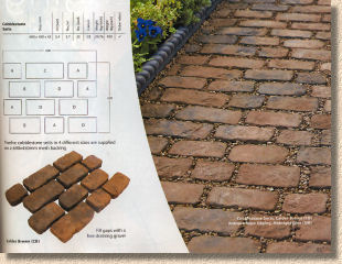
The catalogue claims that the edgings are new, but I'm sure these have been around for ages. The rope-top is a long-established product: the terracotta-red and Staffordshire-Blue are traditional colours; the corner dollies are well known; there doesn't seem to be anything new about the dimensions, so I can't say what it is that entitles them to the “NEW” logo. The same can be said for the "Country" edging - have a look for yourself; I'm sure you too will swear you've seen this a million times before!
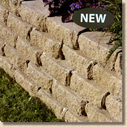
Walling - not really my thing, but I should make mention of the new Croft walling, another debutante at Glee 2005. This is similar in concept to the Secura Walling from Tobermore: a pitch-faced block with a protruding lug on the lower rear edge that is used to lock each unit in place. The blocks are 100mm deep and Marshalls reckon they can be used to construct walls up to 6 courses high (600mm). It's a simple, proven idea and the two colour options (Weathered - a sort of reddy-browny-buff - and Buff) make it suitable for use on all sorts of projects.
The other walling products featured in the catalogue are familiar to all, and most are documented as only really being suitable for relatively low walls, up to around a metre. What's not mentioned is that wall-building is a totally different skill to paving and a specialist tradesperson will be needed. Obviously, the better contractors out there will know this, but many clients assume that the ability to lay block paving automatically confers previously unknown brick-laying skills. It doesn't; so if you're building walls of more than a metre high, check the skills of the contractor.
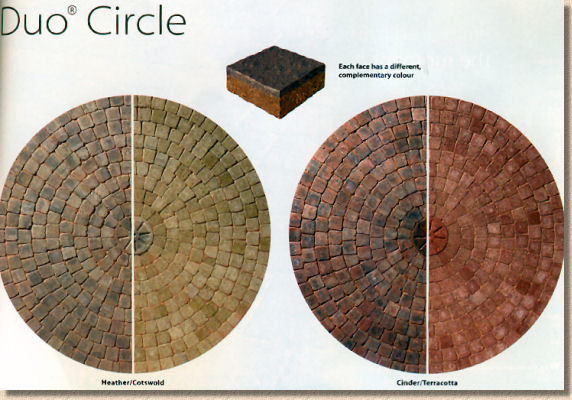
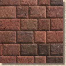
Finally, on to the driveway products, and again there's not a lot that's new. Last year's Duo block, the one with a different colour on one face, is now available as a circle feature, and the raised profile Elite ® block now comes in another colour option: Firebrick, a sort of red brindle multi to complement the Heather option which is more of a reddy-brown colour.
Everything is pretty much as it was last year. To the relief of many contractors, there no massive range of new products to memorise and familiarise oneself with, just a couple of straightforward additions to existing themes that simply extend the range of portions without overly confusing the client.
As mentioned at the outset, the last few pages are given over to extolling the alleged virtues of the registered contractors scheme, and there's nowt new to say about that. Over the last few catalogues there is a growing sense that this scheme is being too heavily promoted and that those contractors choosing not to hand over a sizable wedge of money to Marshalls each year simply to have their name added to a list feel aggrieved that some clients are being misled into believing that Marshalls' products can only be laid by members of the club. There are plenty of good contractors out there that are not part of any manufacturer-sponsored list. There are many and varied reasons why they choose not to join, not least of which is the belief that any list of "approved" contractors should not be tied to a single manufacturer but should be independent and impartial.
Obviously, any serious contractor should and will have a copy of this brochure, and it would be foolish for anyone intent on having a new driveway or patio installed over the coming year to omit the Marshalls' catalogue from their consideration. As we have come to expect, the photos are of the highest standard and many have been very cleverly staged to present a particular feature or item in a way that explains more than words ever could. The use of lifestyle models is a minor distraction, but annoying nonetheless. The text is a little too sparse – I would like to see more typesetting devoted to how the products can be used and a little less wasted on meaningless buzzwords such as "rustic" and "Psi". One thing that has puzzled me throughout is the use of unattributed quotes. - is that a quote from Diarmuid himself or just some waffle from a marketing drone?
One notable exception is that there's no laying advice, which reinforces the sense that they want you to use one of the Register contractors, but on a positive note, it's wonderful to see that the silly spot-bedding method that blighted Marshalls' publications for so many years has at long last been banished completely. Far too many self-taught installers have used the illustrations in previous Marshalls' brochures as an excuse for their shoddy workmanship, convinced that a sketch in a manufacturer's catalogue carries more weight that the British Standard. Perhaps 2006 can be the first year I don't have to fall out with mis-informed flaggers convinced that their Blue Peter standard of flagging is acceptable.
There's a lot of very good material in the 2006 catalogue, but much of it is familiar, reassuringly so in most cases, and there's an unnecessarily generous portion of waffle. Those 20-odd pages filled with lifestyle clichés and marketing speak could have been used for something of more lasting value, something that wouldn't be skipped over by busy contractors and over-faced clients more concerned with finding the actual information they need. Hundreds of contractors rely on this catalogue as their primary sales tool for a whole year, but it's accepted that it has to be accessible to the DIYers and the browsers as well as those of us in the trade – there's a sense that too much of this years' offering is magazine style: Paving Lite?
Order your very own copy of the 2006 Marshalls' catalogue here
 ...or download a PDF version by clicking
