Acheson & Glover 2012
Acheson and Glover (A&G) are a bit of a conundrum. They are a significant force in the Irish paving market but their interest in the British side of things seems to wax and wane over time. A few years ago, they were in regular contact and I had a very good relationship with some of their sales staff. I visited their plant at Dungannon and then....nothing. Not a peep; no updates, no news, not even a brief email to let me know they were still trading.
I knew they were still active in Ireland, but it seemed that their GB ambitions had lapsed. The next time I encountered them in England was when I stumbled across someone claiming to be their British sales manager at a trade show in Birmingham. Oh yes, he'd definitely be in touch and wanted to re-build the relationship, and had I seen their new products and then….nothing. They done disappeared again.
Next, I heard that they'd given up on trying to sell paving in Britain but were focussing on their suspended floor systems and shipping in to Cardiff. As interesting as suspended….yawn….flooring might be, it's not really within the remit of this website, so I didn't really pay much attention.
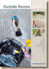
Now, allegedly, they are back with their paving range and have a brochure to prove they are back. The brochure has even been dubbed with an official title: Outdoor Rooms 2012 . God I hate that phrase. I hated it when they started using it on bloody GroundFarce over a decade ago, and nothing has happened during the intervening period to convince me that it is anything other than meaningless marketing bollockese.
The brochure comes in PDF format. It is, apparently, available as a hard copy on request, but I've been sent the PDF which makes it awkward to review on the same terms as all the other brochures that cross my desk in these early months of the year. I can't tell you, for instance, how big it is (68 virtual pages according to the PDF but not sure if that holds for the hard copy and it has an A4 sort of look), or whether it is printed on posh paper , cheap Izal (one for the teenagers there) or even laid vellum. The PDF is certainly economical, but how useful is it to contractors looking to sell paving, or to clients looking to buy?
Despite living in this age of marvellous technology, and despite most contractors now having a laptop or even one of them fancy tablets, there's nothing quite like handling a printed brochure. The picture quality is in a different league for a start, and then there's the riffling, the joy of flicking through to find the page you want, a sensation that just isn't matched by scrolling or depressing the up/down arrow for 15 seconds.
And it's the picture quality that worries me most. At the correct resolution, the photies are a bit small, and when you zoom in, they become blocky and pixelated. Annoyingly, you can tell that they are bloody good photies, well staged, well lit and showing off the product to good advantage, but the resolution just isn't there. I can't tell whether the surface is smooth or textured.
Even more annoyingly, there are two new products for 2012, and you can't really tell anything about them, either! Plaza flags are described as having a " mellow rustic character ", which tells me precisely nothing, while Canterra (isn't that the capital of Australia?) is said to be " stylish and attractive " which is equally devoid of any meaning whatsoever.
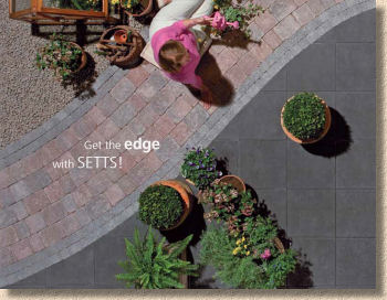
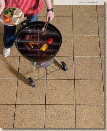
It turns out that Plaza is actually a washed/exposed granitic flagstone that comes in a solitary size (400x400x50mm) and three colours: Slate (dark grey), Silver (light grey) and Sandstone (buff). I'm a big fan of this type of product and a firm believer that we don't use it enough in Britain, whereas it's wildly popular in continental Europe and a firm favourite for modern properties in Ireland. But a single size? That's not likely to have customers stampeding to place orders. It needs combining with something else (and to be fair, there's plenty to choose from in the A&G range) to show it off, but as a single sized, monotone option, it's versatility is limited.
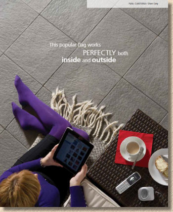
Canterra looks like a moulded product with a gently rippled texture. I can't tell whether this is wet-cast or face-mix but it is reminiscent of the textured bathroom tiles which purport to replicate worn limestone. I may be doing the product a huge injustice, but I just can't tell from the PDF images. As with the Plaza, there are the same three colour options, but a whole two sizes, the 400x400x40mm (and the 40mm thickness hints at wet-casting) and a rectangular 600x400mm unit. Slightly more versatility, but still lacking.
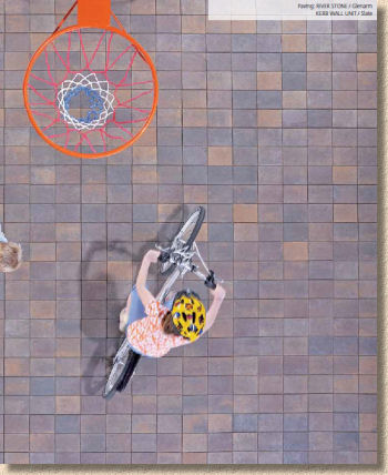
Anyway, I'll just have to ignore the picture issue and focus instead on text, technical info and the other gubbins that is used to flesh out a brochure. As already said, it is obvious that the photies are, generally speaking, of a very good quality, and I'm very much taken with the "Bird's Eye View" of many of the shots. The accompanying text is sparse but probably just enough to give a taste of the product and suggest possibilities. The sizing and packaging info is presented in an open table format and can appear seemingly anywhere within the section for that particular product. Again, the scrolling PDF format doesn't give the best impression of the true layout so perhaps it makes more sense in hard copy.
What is evident is that the whole brochure is bursting with ideas. There are suggestions for layouts, for product combinations, for colour matching and all supported by those great photies. The last time I saw a publication so crammed with design inspiration was the first 'magazine styled' Brett brochure from three years ago. It looks absolutely fantastic.
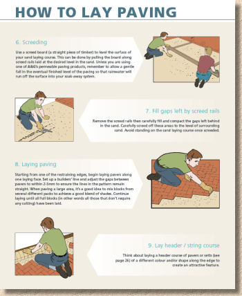
The installation guidance is also pretty good. At a time when most manufacturers are shying away from How-To guides, it's good to see a return to sensible, well-written and easily-understood instruction. Yes, it's a bit generalised, but it's simply not possible to present comprehensive installation guides in such a brochure – I know: I've tried (and failed)!
Similarly, the section on aftercare and maintenance is very good and will surely help homeowners understand that the concept of Zero Maintenance Paving is an urban myth, promulgated by cads and coves who will be long gone by the time your paving starts to green with algae or suffers from accidental staining.
One noticeable theme running throughout the brochure is the innumerable references to consulting your local Builder's Merchant for further advice. This worries me. If truth be told, most of the builder's merchants I know would be the very last place I would look for advice. Spotty Daz and his creepy mate Johnno behind the counter know the sum total of buggerall about installing paving. If they knew owt, they'd be out laying it for a living instead of hiding out of the cold and the rain for little more than minimum wage.
I know the company is making a push for the independent merchants and look to involve them closely in developing and promoting the product, but there is a limit. I'm a firm believer in manufacturers having their own dedicated technical help line, or even employing bozos like me to answer the more awkward questions. It's unfair to expect a general salesbod to know which type of sealant will give a non-gloss but hard-wearing finish to a tumbled concrete paver: we all know they are just going to sell you whatever their manager has told them to sell.
I do hope A&G make a proper go of it in Britain this time. They have some good products and deserve a wider audience. All the Irish contractors, both north and south of the border, will acquire a copy of this brochure because A&G are such a major player in that market, but I would heartily recommend that the British contractors get hold of a copy too, if only to admire the photos and pick up a few of the very clever design ideas. The products might not be as widely and readily available as some, but for the right project, they are well worth tracking down.
Download your own PDF copy of the A&G 2012 Outdoor Rooms brochure


