Marshalls 2015 Brochure
Some brochure reviews write themselves because the brochure itself, and the products therein, are so straightforward, and some brochure reviews write themselves because there is almost nothing to say, at least not in public. Conversely, some brochure reviews have a long and tricky gestation because the message the publisher had hoped to convey is muddled and confusing, and then some brochure reviews are just a chore because the content is so formulaic and uninspiring. And then there's Marshalls .
The now-annual review of Marshalls' new season offering is 50% sheer pleasure and 50% mammoth slog because it's not just a review of a brochure, it's an assessment of an entire business model. So complete and rounded is the Marshalls' production that it's essential to take at least three rather large steps back to be able to appreciate all that it encompasses.
Oh yes, on the surface it's all about the brochure, but look what lies beneath and behind that brochure. There's now an app, for gawd's sake, which links the brochure content to a seemingly limitless library of online resources, images, suggestions, tips and recommendations; there's an enhanced contractor network via the Register scheme; and there's the ethical commitments, to stone quarrying in India and to Unicef, and so much more.
And all that's before the new products are considered. We all get excited at the prospect of new products, but over recent years there's been precious little innovation that has genuinely driven the industry forward. There's been plenty of toe-dipping and minor tweaking but not very much that we'll look back on and reminisce about how primitive the world of paving was before we had....whatever it was. However, with what's on the menu from Marshalls in 2015, this just might be the year of a major redirection on how we pave and what we pave with.
Of course, the "Big Thing" for 2015 is porcelain paving . Yeah, yeah, yeah, but most of the other major suppliers have a ceramic/porcelain/vitrified (delete as appropriate) paving, don't they, so what makes Marshalls' confections so notable?
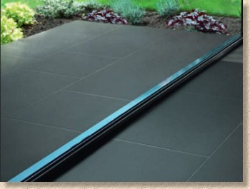
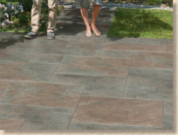
The short answer is the sheer scale of their ambition. They've dubbed it "Symphony Vitrified" and this isn't toe-dipping: this is a full body plunge. They have really gone for it with a bedazzling selection of no less than eight, yes eight different options and a bewildering array of sizes. Not for them a conservative offering in one size – when they decide to run with a product, they fully commit.

We have to assume (and with it being Marshalls it is a fairly safe assumption) that the quality is just as it should be, and there can be no doubt that the range of colours, styles and textures is unrivalled on the British market at this time. The Symphony Buff is almost a perfect match for Donegal Quartzite, but in sizes that are virtually impossible in the natural stone.
It's a little overwhelming, to be honest. You have to admire the cojones it takes to commit so fully to what is a radically new paving product for us in Britain, but who other than Marshalls could do it? There is no-one else with the market share or dominance to effect such a strategy. You do have to feel a little sympathy for the other suppliers of porcelains: they must be cursing at Marshalls' ability to be so bold, but they should also be grateful that a force as strong as Marshalls have committed so much in time and resources to developing this new market in which they will, almost inevitably, share.
For almost anyone else, bringing in an extensive range of porcelain-vitrified-ceramic paving would be enough, but this is Marshalls, so they also have an entirely new wet-cast concept flag which will labour under the name of 'PaveSys' . Yes, it's a sister product to the DriveSys (nee CobbleTech) idea, only scaled up to full flag size and re-engineered to give it the necessary strength at relatively shallow thicknesses.
In essence, it's a four-size modular wet-cast concrete flag in the style of a riven stone, but with a base that is larger than the surface. The flag thickness is consistent, unlike the traditional wet-cast flags, and the idea is that they can be laid on a screeded bed with the bases of each flag just touching, which will create the perfect joint width at the surface. This joint can then be filled with a suitable jointing medium.
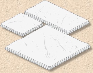
Possibly a good idea, and one that could have real potential due to its versatility, but there are a number of issues that may well stymie its uptake. While it's great to have two colour options and four sizes, the fact that three of them are squares (600x600, 450x450 and 300x300) and just one oblong (600x300) makes for awkward layout design. Then there's the problem of joint balancing: there will be instances where what should be tight joints at the base will have to be spread to accommodate layout variations (two @ 300mm does not always = 600mm, when you allow for jointing). And then there's the really big problem of twisting falls.
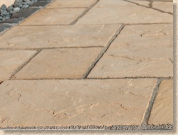
It's all well and good laying flags on a screeded bed when the plane of the bed is uniform, but as soon as it starts to twist or change fall or deviate from flat in any way, the flags won't sit snugly and securely on the bed. On areas that are humped, they'll rock, and on areas that are valleyed, there's a real risk of them snapping because they are not fully supported.
Marshalls' solution, which they gamely accept is less than ideal, is that for such areas, the screeded bed will have to be abandoned in favour of individual bedding. Once you switch back to individual bedding, any advantage offered by relying on the screed bed is lost.
The claim that installation time could be as much as halved also needs to be taken with a rather large, cardiac-threatening pinch of salt. On absolutely basic rectangular projects involving no cutting and where there is just the one plane of laying, it might, and I stress might, be possible to double the laying rate, but that really would be the exception and never the rule. Screeded laying is almost always quicker, but twice as fast? I don't think so!
So, that's two radically new, innovative and interesting products that could well change the world of paving for ever, which is plenty isn't it? Can we go home now? No! This is Marshalls, so the fun has only just begun.
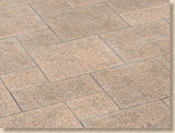
There's a new flavour in the Fairstone Granite Eclipse range – two new shades of pinky-brown (Terra and Corona), each with a gently flamed and "clear blasted" surface (a highly secret treatment I'm sworn not to reveal upon pain of death) to subtly accentuate the texture. Four sizes (three modular and one linear), so plenty of design potential, and a very warm addition to the existing Eclipse Granite range.
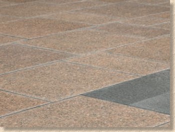
At the other end of the budgetary scale, there's a new 'utility' flag, although referring to it as utilitarian is a little unfair. Leyburn is a flag-manufactured-as-if-it-were-a-block flag, so you get the economy of pressed mould manufacturing, with the ability to blend colour along with a damned hard-wearing paver. Two colour options, Buff Blend (Buff/Marigold/Brown) and Weathered (Grey/Buff), which look really good, but just one unhelpful size: 450x450x40mm. Another candidate for screeded bed laying?
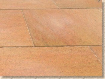
Moving on to the driveway section of the brochure, there are four newbies highlighted on the index page, so we'll work through them in the order in which they are listed, starting with Fairstone MagnaSetts .
Dead simple idea: it's an Indian sandstone sett that's bigger than the familiar 100/200mm dimensions, but not quite as big as the flags. Anyone familiar with the sett-paved back roads of the Pennine regions, especially the Rochdale-Huddersfield-Halifax axis of hilliness, will have seen summat similar – bloody great stonking gritstone setts laid in tightly jointed courses weaving and wending up hill and down dale, often hemmed in by row after row of terraced housing.
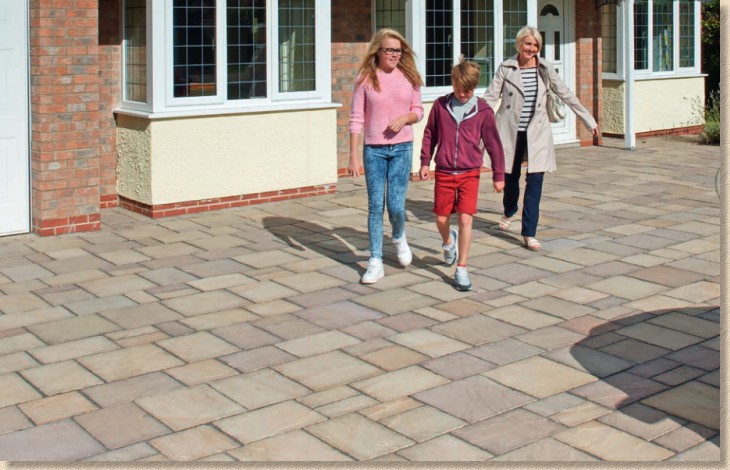
The MagnaSetts borrows from that idea, but with four strangely sized units found in each 7.9m² project pack: 400x400 (nearly a flag), 400x265 (hefty), 265x265 (chunky) and 265x127 (just weird!). The sizes do worry me. The big 'uns are almost too big and the little 'uns are too narrow. All the photies I've seen all seem to show the little 'uns being paired to make the equivalent of another 265x265mm unit (when you allow for the joint) which rather mars the overall effect.
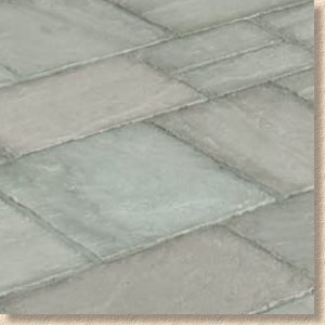
I love the idea, but for it to work really well, we need to be able to create more than two course widths (400 or 265mm). The clever installer might spot that you could, if you were sufficiently masochistic) create a random layout with these sizes, but that's not how setts are traditionally laid.
Laying patterns aside, this is the ideal solution for clients wanting Indian stone on their driveways. At 50mm thick, these MagnaSetts are more than capable of dealing with the family 4x4s, let along the smaller Fiat Dinky Cars. I know we can use Indian sandstone flags for driveways (as long as they are properly laid, obv!) but this is a much better idea, and offers a very tempting alternative neatly positioned between flexibly laid sawn setts and buying-in 50 or 65mm thick heavy-as-hell flagstones.
DriveSys, the system-laid ersatz sett that I just can't bring myself to love, has a new member in DriveSys Riven Stone , which, as that clever name suggests, replicates….err….riven stone, in either a very warm, almost glowing Golden colour or the much more staid Silver Grey. Credit where credit is due, they are fantastic mouldings and it's a damnably clever idea with plenty of admirers amongst both clients and contractors, but I can't get past the fact that, to my eye, it all looks a little too much like pattern imprint concrete.
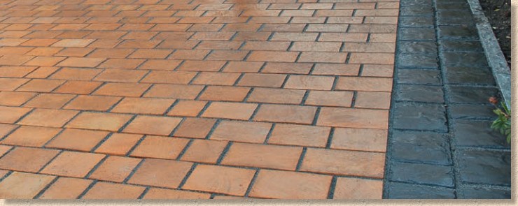
The new Riven Stone option will, no doubt, attract even more customers, and if they like it, then that's all that matters, but for me, if I want summat to look like stone setts, I'll use stone setts, thanks.
And almost tucked away unnoticed is the new complementary Drivesys edging kerb, which is a yard-long (915mm) and 50mm wide (at the top) kerb that has its top and sides coloured and textured to match the Basalt or Grey-Green Drivesys Split Stone or Cobble-that-isn't-a-cobble options. What's weird is the kerb is flared in cross-section, so that it's slightly wider at the base than at the top, which means it's heavier than your normal concrete edging kerb.
The wide base will make them less prone to falling over during the laying process, but I can't fathom out why these new kerbs should be flared. It was explained to me that the flaring ensures a sufficiently wide joint between edging and DriveSys unit no matter how much upstand, if any, is used with the edging. But surely, given the wider base on the DriveSys units, there would be an open joint even if the edging was truly square with straight, as opposed to flared, sides, wouldn't it?
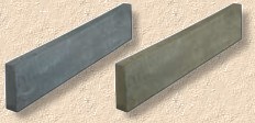
I have my own theory as to the real reason for the flaring, and it's nowt to do with joint width.
Finally, the last of the newbies is Driveline Metro , an exposed aggregate concrete block paver that's a chunky 80mm deep and have a distinctive 'plank' look, being 480x130mm in plan. Just the one size, but four colours: two pinky-browns in Maroon (darker) and Rose (lighter, as well as the essential greys, cunningly named Light Grey (light grey) and Dark Grey (dark grey).
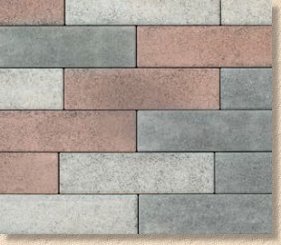
This is a variation of the StoneSpar idea being pushed by Marshalls' commercial side, where 'long aspect' stone pavers in a blend of colours are laid to create uniquely styled pavements. With Metro, there is no colour blend: colours are available singly or in ratios to suit each client. This would allow, say, just the pinky-browns to be used, or even just one of the greys, if desired.

I love the idea, and I love the individual blocks, but I can't take to the publicity shots where all four colours have been mixed. It just looks like a mish-mash of leftovers. I'd love to see a third colour to each palette, a reddy-pink, say, for the brown palette and a mid-grey for the other, and as I have said previously regarding the StoneSpar product, the whole idea desperately needs additional modular sizes. As it is, all that potential, all that versatility is being held back by the rigid uniformity of a single size paver.
So, that's all the new products covered and I'm already over my word count limit before I even get to consider the brochure itself, but that's Marshalls for you!
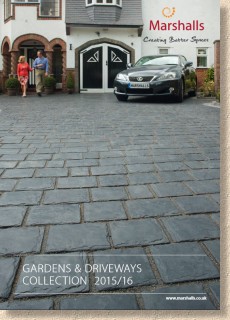
The brochure maintains the consistent theme that has been used over the last few years. Same size and more-or-less the same page layout, but a few minor tweaks. After 13 years of a green spine, we now have a coppery-coloured spine for some reason, and an embossed cover intended to suggest the texture of the front page star, DriveSys SplitStone in Basalt. Not sure why. Marketing team with too much time on their hands, I reckon!
Logical layout inside: a few pages (well, 23 actually!) of trumpet-blowing, followed by three fairly obvious sub-divisions of Gardens, Driveways and the oddly hived-off "Standard", which seems to be the budget products deemed unworthy to appear in one of the other two sections.
There's an index at the start of each sub-division, with every product listed and new products marked as such, and each sub-division has a colour coded sidebar on the open edge of the page to indicate whether you are in Gardens, Driveways or "Standard". It's a wonderfully simple and effective navigation system.
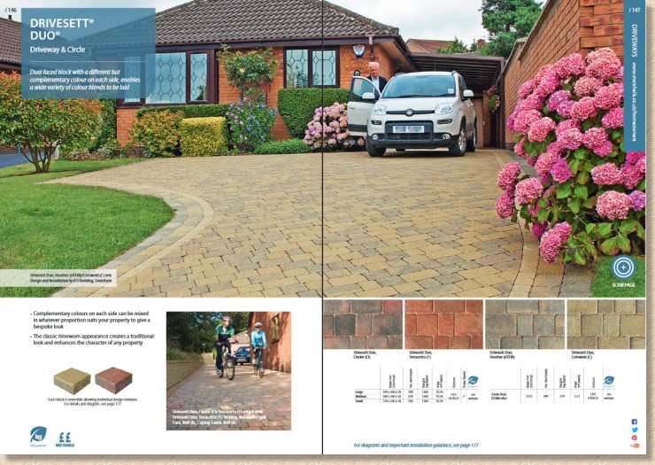
As has become the norm for nearly all of the better quality brochures, products are afforded at least a full page, with most major products given a full double-page spread. Generous colour swatches and basic size/pack information fleshed out with sparse, bullet point text all serve to give a spacious, uncluttered, unhurried feel. The photies are, almost without exception, just as they should be, cleverly considered to show off the paving to best effect, but there does seem to be far more models cluttering up the scenes than there have been in recent years.
I do hope we're not drifting back to the bad old days of phosphorescent toothy smiles and up-their-own-arses middle class utopian idylls. I know I'm not the only person who can be put off a product, even a paving product, because the model(s) used to sell the product irritate me in some way. Good paving speaks for itself. Humans should only be included to indicate scale, otherwise they should be kept firmly behind the camera.
On a more positive note, it is heart-warming to see even more credit given to contractors this year, with a few pages given over to award winners and, where appropriate, the responsible contractors acknowledged on each product shot. I know from talking to these winners that they truly beam with pride at being included in the brochure and their work acknowledged for its quality. Of all the changes to brochures over the last few years, this recognition of contractors' worth is the one that cheers me most.
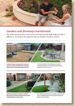
On the subject of contractors, there are significant improvements to the Register scheme for 2015. Admittedly, many of these will not be apparent to customers, but indirectly, they will benefit. Contractors will be given more assistance with marketing their businesses and there'll be price incentives and enhanced rewards, including once-in-a-lifetime holidays in places that aren't quite as damp and chilly as Britain. I have to admit I was somewhat disappointed to learn that training to improve skills didn't rank as highly on the contractor wish list as freebies – the contractor who believes they have nothing to learn and can't improve is a deluded fool.

Expect to see more of a push for Register members in the coming year. New logo, new advertising, more of a presence, all of which means it's going to be harder than ever for those not on the list.
That's enough. It's almost 3,000 words, far more than many of you will have the time and patience to read, so I'll shut me gob now.
Think you don't need a Marshalls' brochure? Think your business can manage by using cheaper products from other manufacturers? Think you can get a full overview of what's available for your new driveway or garden paving without looking at the Marshalls' brochure and/or app and/or website? Think again. It's Marshalls – you have to be in on it!
Marshalls' Customer Helpline: 0845 820 5000


