Global Stone 2012 Collection
Mid-February and the new season's brochures are beginning to pile up in front of me. I'm usually quite diligent at reviewing these as soon as they land, but for some extremely welcome but totally inexplicable reason, this year has been rushed-off-me-feet busy right since the very first day after the Christmas break, and so a situation has developed where the brochures are eagerly and voraciously perused as they come in but then it takes a month or so to find an afternoon or a train journey when there's the time to actually collect my thoughts and compose them into something vaguely intelligible.
So, over the next few weeks, it may well be nothing but brochure reviews on the News Pages, but as they always seem to be a popular item, that's probably no bad thing. There has already been one national supplier review this year, but to start what, hopefully, will be an unbroken run of reviews for the next month or so, we'll cast a beady eye over the sumptuous publication from Global Stone.
As the range of products offered by various manufacturers and suppliers has grown, there has developed a problem regarding how to organise the various items into some sort of order. It used to be simple: they were either driveway products or patio products, but then we witnessed the resurgence of natural stone and so we had a further distinction between concrete (or reconstituted stone as some forked tongues would have it) and stone, and then someone started doing 'traditional' and 'contemporary', followed by someone else creating 'chic' and 'cottage garden', only to be further complicated by the addition of internal flooring products, and pretty soon there was no real sense of organisation any longer. As a regular use of these brochures, you would be in a position where you could see in your mind's eye which product you wanted to check, but could you bloody find it in the brochure? Could you buggery!
So, it's a huge relief to see that Global Stone have had a bit of a sort-out with this, and I quote, "2012 Collection" and it's been organised into colour-coded groups based largely on type of material (sandstone, limestone, granite, etc.) and then further identified by what style group it falls into (Traditional, Contemporary, Driveway, etc.) and also by suitability, ie, is this an outdoor paving product, and indoor flooring product or could it be used for either. And then *every* product is listed on a well-laid out contents page where, if you can't find what it is you were looking for, there's no-one to blame but yourself!
Each product is then given a page or so to sell itself via a number of generously-sized and well-composed photographs with a couple of lines of clear, concise and legible text contained within a translucent overlay panel. The overall effect is that they've managed the available space (some arses in the brochure design business refer to it as “page real estate”) supremely well, and each page is well-balanced: they are full, but not busy, and informative without being boring.
Where necessary, swatches are used to good effect, and supplemented with additional information such as sizes and pack quantities in simple and easy-to-read table. This may seem a minor point, but when you rely on these brochures to aid in the design of paved areas, having swatches that actually show enough of the product to give a real sense of its colour and texture is vitally important, and then having sizing information which doesn't need a hand-lens to read and a highlighter pen to make sense of the rows and columns is a real boon.
In Managing Director Shirley Spittal's covering letter accompanying the new brochure, she very kindly lists those products which are new for 2012. In the actual brochure, they are not identified as such, but are discreetly slipped in as part of existing ranges. I'm sure this is of no consequence to the typical customer, but for the contractor and designer, it can be inestimably useful to have the new products highlighted in some way so we can make a mental note to bear them in mind for those customers wanting something their neighbour's won't already have.
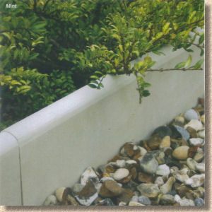
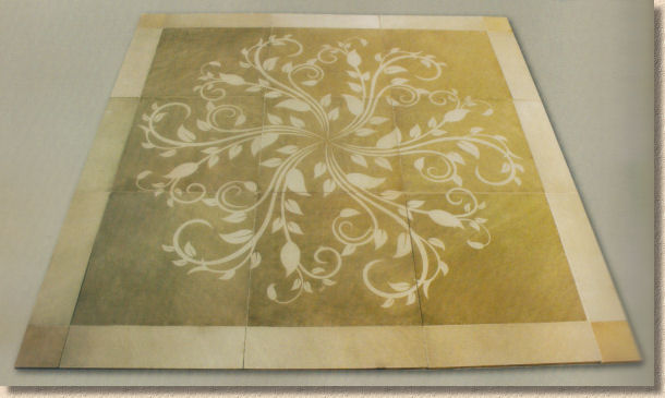
Anyway, to rattle through the newbies, we start with a basic round-top sandstone edging kerb. 560mm long but a slight 32mm wide they seem to be formed from a pale grey sandstone, but the only actual colour info in the panel says "Mint". Please: no! In contrast to such a simple edging is the Mirage Phantasy Vine (no: I don't know why they've spelled it that way, either!) which is a 2m x 2m feature containing nine Greeny-Brown square flagstones etched with a leafy vine design and edges with what seems to be a contrasting edge band. It's all calibrated at just 20mm thick and looks quite attractive, but I always fret that these etched features need a lot of maintenance otherwise the perennial damp of the British and Irish climate soon buries then under a cloud of algae and lichens.
Elsewhere in the Mirage Collection (the smooth/honed sandstone range), there is a new line of setts in two sizes (100x100x20 and 200x100x20mm) and three colours (Modak Rose, Mint and York Green) which as a splash feature on the page points out, are very useful for creating contrast bands within larger areas of flagstone paving. To round off the additions to Mirage, there's a new colour in the flagstones, Sea Breeze, which is only shown as a swatch and I'm guessing is a sort of bluey-grey.
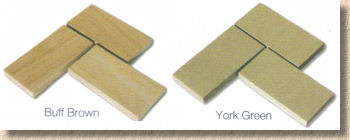
New setts too in the Serenity Collection (smooth but textured for that sense of extra non-slippiness). Same sizes as stated above but only two colour options: Buff-Brown and York Green.
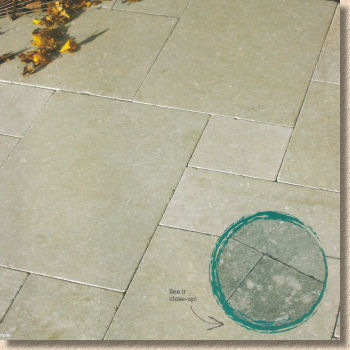
Neptune is a completely new stone in the Limestone offering. It's a speckled, smooth-finished stone with a cool grey/green-cream sort of colouring. It comes in four modular sizes (200x200, 200x400, 400x400 and 400x600mm) calibrated to a generous 30mm (generous by modern standards, that is!) and is being marketed as a contemporary styling. I've said it before and I'll say it again: limestone is vastly underused and undervalued in the British market (slightly different in Ireland for geological and historical reasons). In general, it's less prone to algae than sandstone and easier to clean when it needs it. It can be a bit pale for some peoples taste, but in a garden setting, it's very neutral and a perfect foil to strong planting. Definitely worth looking at!
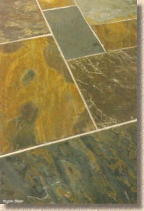
If limestone is too pale, then maybe a richly coloured slate is the answer. The new Rustic Slate is certainly not backward at coming forward in that department. It's a dark grey and iron-rust coloured stone in four modular sizes (305x305, 305x610, 610x610 and 610x915 or what we used to call 1'x1', 2'x1', 2'x2' and 3'x2') and due to the nature of slate comes in thicknesses of 25-30mm. This colour of slate seems to be more popular for internal kitchen floors rather than external patios where I feel it is too heavy, too demanding, too powerful for the average garden and really needs an equally strong planting scheme to challenge it and prevent it dominating. In the right scheme, and I have seen one or two, it can be a genuine wow-factor, but it's not for the faint-hearted.
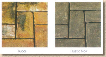
Last of the newbies are further additions to the clay paver offerings, to be known as Tudor and Rustic Noir . Again, these are only shown as swatches at the moment, so my colour judgement may be slightly off, but the Tudor looks as though it's a yellow and orange-red with burnt bits, while the Rustic Noir is a grey-brown tone very reminiscent of the sort of thing that's very popular in Holland and, as I now know from personal experience, works fantastically well with silvery-grey granite flagstones.
As ever, Global Stone have pulled together a comprehensive selection of flags, setts, walling and accessories and presented them most attractively. It's good to see there's still room for a native stone (the Yorkstone - page 42) but the Welsh Slate seems to have been quietly dropped, possibly on the grounds of cost. There are some cheaper indigenous slates as well as many other types of stone available, and I'd love to see one or two of them included within a collection that brands itself as being Global.
There genuinely is something for everyone and every project within these seventy-six A4 pages. The bog-standard riven sandstone is there but there's also a huge selection of the 'higher-end' stuff, whether it's a classier texture, a more modern format or a completely different type of stone. The photos offer many design ideas, but I'd love to see more of the combination designs, where two or more products are used to complement each other, such as the two granites on page 56. This sort of photo turns a sales brochure into a genuine design aid, and that's something all of us so-called professionals like to have in our own collection.


