Marshalls' 2005 Catalogue Review
Better late than never, we come to a review of the latest catalogue from Britain's largest paving manufacturer, Marshalls . The catalogue has been 'on the streets' for a couple of months, but due to one thing and another, this is the first chance there's been to commit my thoughts to html.
Not so many years ago, the best of the catalogues put out by manufacturers comprised perhaps forty or so pages of well-composed photos backed up with a few paragraphs of sales blurb and a bit of technical information. This year, it seems that all the "Big Players" have produced tomes rather than catalogues. They feature semi-rigid, glossy covers; they have a glued-and-bound spine rather than a couple of staples, and they take a good couple of hours to wade through. The 1999 Marshalls' catalogue, just 6 years back, was an A5 booklet - the 2005 catalogue runs to 144 pages of high-quality A4 paper, plus the front and back cover. What's happened over those few years that has resulted in such a change of tack? Paving, and particularly residential patio and driveway paving, is now a "lifestyle choice", and that involves serious money.
As catalogues, and product ranges, have grown in size, the ability to locate information quickly and accurately becomes more and more important. The obvious solution is to create separate sections for patios, for driveways, for other bits and bats, for technical information, and it's a relief to see this is, more or less, what's been done here. Page 1 - Contents: Excellent!
This catalogue has been sub-divided into 5 sections. The first 30-odd have been given over to marketing and 'inspiration', followed by 50-odd pages for 'Garden Paving', which includes the wet-cast products. There's a relatively short section for 'Paths and Edgings', and then a 20 page section for Walling. Finally, 35 pages devoted to driveways, rounded off with just a couple of pages of Small Print. All the new products are clearly marked with an icon on the table of contents - 3 new items in the Garden Paving, 3 in the Walling section, and just 2 for the Driveways. I'll get to these later.
Marketing and Inspiration:
This first section is obviously aimed at the homeowners and designers. There's an elementary introduction to so-called "trends" or themes in patio and garden use, and plug for a book by a TV garden bodger. Four of the ten themes are then expanded over a couple of dedicated pages, with photos of completed projects that have used particular Marshalls' products, and "words of wisdom" from various alleged celebrities of the TV kind. The presence of any celebrity endorsement always causes a violent awakening of that part of my limbic system responsible for cynicism - what is it that a product lacks that the manufacturers believe can best be hidden by the grinning fizzog of some self-important meejah numpty?
The second half of this first section is the marketing; the added value products, the warranties, the "register" of approved contractors. Six whole pages are given over to pushing this concept, yet nowhere is it acknowledged that these 'approved' installers have paid to be on the list, and although there are some useful tips on how to avoid the cowboys, no mention is made of the best recommendation of all - word of mouth. There are hundreds of highly professional contractors out there that, for one reason or another, choose not to be a part of a paid-membership list. Quality workmanship is not the exclusive preserve of any approved list.
Garden paving
The section is rounded off with some info on ordering, an introduction to the Driveway Visualiser that was featured in the News column a couple of weeks back, and a two-page feature on the winner of the Amateur Garden Designer Award for last year. And then it's on to the real meat…. There are three new products in this section: A Travertine flagstone, a feature from then design pad of Diarmuid Gavin, and, first of all, an extended range in the Imported Sandstones. All the colour options are now branded as "Haworth Moor", including the forthcoming new colour, 'Golden Sand Multi'. There's a 'Patio Pack' containing 10 square metres in a mix of 8 different sizes, and a choice of 2-ring or 3-ring circles, both with squaring-off kits.
Despite never having seen Yorkshire until they were unloaded from the cargo ship that cariied them all the way from India, the Haworth Moor range is one of the better imported sandstones but the two full-page images used in this catalogue don't do it justice, and it's not the stone that's at fault - it's the mortar used as pointing. All too often, an insipid browny-pink mortar is used, as in these photos, which doesn't provide sufficient contrast. A dark mortar 'frames' each flagstone, making them stand out, emphasising the individuality of every piece. A non-contrasting mortar causes the flags to blend into each other, creating a bland, homogenous, monolithic mass rather than a palette of contrasting tones, shapes, textures and sizes.

The Anatolian Travertine is another milky-white travertine, only available in the one, 400x400x30mm format, which rather limits its design possibilities. I can't help feeling this has been added to the Marshalls' range because everyone else has a Travertine. There aren't sufficient size or colour options to make it useful for anything other than a conservatory floor.
For some reason, the next item in the catalogue is a new product that hasn't been flagged as new, which I find all the more strange because it is actually the best new "patio" product they have! The ways of the Marketing Executive are not those of normal people, but let's focus of the paving.
The National Trust range are reproduction, stone-effect flags created from master moulds taken from flagstones on two NT properties: Lacock Abbey in Wiltshire and Polesden Lacey in Surrey, and that venerable institution receives commission for each unit sold. The Lacock Abbey flag is a reproduction Cotswold stone, and while the colour and texture are better than average, there's only one size - 450x450mm. Obviously, there's more than one mould, so there is some variation, but not enough to mask the repetitive nature that's inherent with any single-size flag.
Thankfully, the Polesden Lacey flag is much, much better. I'm not sure what type of stone forms the original flagstones, but these reproductions appear as a fairly worn york- or gritstone. The colouring is much more muted than that of the Lacock Abbey flag, which I feel adds to its authenticity. Similarly, the texture is more varied, with remnants of tooling marks and a definite aged look and feel. And the usefulness is massively increased by having the flags available in 3 different sizes, which enables more interesting and even random(ish) layouts to be created.
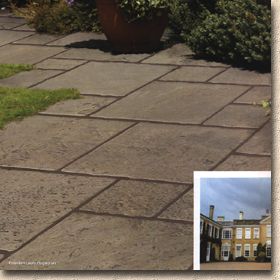
The Polesden Lacey flag was shown at GLEE last autumn and was well received by more or less everyone that saw it; rightly so! It is one of the best repro- flags currently available and offers a subtly different look to products such as Chancery and Stonemarket's Millstone. I'm not sure how well it will sell: will punters be prepared to pay a premium because the NT stands to benefit? I'm sure some will, but whether there numbers will be sufficient to sustain production remains to be seen. Marshalls deserve some credit for exploring this new avenue, and, if it does prove to be popular, then there is a wealth of potential candidates in this sceptred isle.
One final note - the full page image used shows the flags pointed with a much darker, contrasting mortar - and doesn't it work wonders!
All the old favourites are still there: Chancery in the two colours; Heritage in three; Saxon, Perfecta and the wonderfully stylish Argent paving are all supported by top quality images that are skillfully composed, perfectly executed, and all portraying a smiley-happy world of beautiful people leading enviable lifestyles. Is this a paving catalogue or a colour supplement from the Mail on Sunday? The longevity of some of these products shows that simple, understated concepts offering unlimited design potential and boundlessly versatility are what most if us look for when it comes to a patio.
And then there's more unannounced new products - Eclipse Granite, which comes in a silver-grey or a charcoal colour, but only in one size (800x200mm) and a selection of imported Slate Tiles in three forms (Dark Jade, Midnight Blue, and Burnt Copper). Neither range features anything stunningly new, but I'm quite taken with the granite because the 4:1 plan size enables some interesting design options, particularly for awkwardly shaped plots.
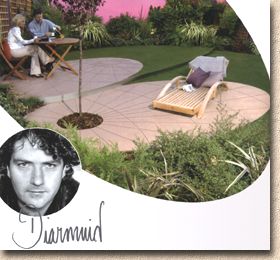
The final new product is the Celebrity gimmick - the Diarmuid Gavin Lunar Paving, a 4.5 x 2.5m ellipse of ground paving (think of the Perfecta flags). This, too, was shown at Glee, and the man himself was there on one day, engendering fevered speculation amongst other exhibitors as to the amount he was being paid to turn on the charm for the benefit of the star-struck.
I don't like this product. To me, it's a one-trick pony. It's an ellipse and is incapable of being anything else. Paving should be versatile but this is a 'feature' that can't be put together or used in any other way, it can't be readily incorporated with other pavings, and it's quite expensive, for what it is. It will appeal to those for whom the fact that it hails from the sketchpad of a TV celebrity is far more important than its form and function. It's something to show off to the neighbours and the sister-in-law, but it's not actually that attractive. At only 2.5m across the minor axis, it's too small for a family-sized patio table, and, be honest: if you'd spent all that money would you want to risk kids spilling Vimto on it, or the overly-familiar neighbour sloshing the Shiraz and dripping burger fat onto the smooth, concrete surface? The clever images show tiny, two-person tables strategically positioned, and I feel that's where this product will sell - the younger, child-free, design-savvy couples with more money than sense.
Paths, Edgings and Walling:
There's nothing new in the Paths and Edgings section, so I'll skip on to the Walling section, which, from the contents page, boasts three new lines. The Haworth Moor (Indian branch) paving now has a matching walling stone that comes in either pitched or tumbled format, and three lengths. There's only one depth, 65mm, which means no jumper courses, but I daresay these may appear if the standard walling proves popular.
In contrast, the new Tegula walling does include a 140mm jumper block that can span two courses of the standard 65mm deep units. Again, there are three lengths available, but only one face is dressed, so features incorporating corners, such as returns or pillars, will need careful consideration. It's currently only available in the 'Traditional' colour blend, but then; that is the best colour Marshalls produce, so it makes sense to stick with that for now. This is, in my opinion, the best of the new walling products and the one I can see being continued and expanded over the years.
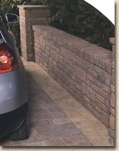
The last of the new walling products is the Argent block. Now: as much as I like the Argent paving, I can't help feeling these walling blocks are too…too…too blocky, too concretey. They look too similar to what we call CMUs - Concrete Masonry Units, the cheap but effective blocks used to build retail outlets and internal walls. Maybe it's the colour - having two shades of grey isn't all that attractive for a wall - or maybe it's that there's only the one size of block available, making any wall look even more like a CMU construction, but I just can't see this one being all that popular.
As with the patio paving, all the old favourites are still available: Ryedale, Fellstone, the ever-popular Marshallite, and even the iconic 1970s Superscreen blocks, are all still doing the rounds.
Driveways:
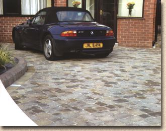
And so we come, at last, to the driveway products. Only two new lines are mentioned on the contents page, but, you never know, maybe they've slipped in a few surprises, as they did with the Patio Paving section.The Natural Stone setts lead off this section. Granite cubes in Silver Grey and the Haworth Moor (Indian branch) setts in split or sawn finishes. These are the most expensive driveway pavings and therefore not the biggest sellers, which makes me wonder why they were chosen to lead the parade. And I've seen better photos too; in fact, Marshalls sent some to me just a couple of months ago that I feel really do show off these setts to their very best, whereas the two main images used here seem pale and bland.
The first new driveway paver is the Drivesett Duo, the face-mix block previewed at Glee, which features differently coloured face and base mixes. The idea seems to be that two colour options are available from one block, but, without exception, every Contractor with whom I've discussed these blocks has been underwhelmed. Having differently coloured upper and lower faces means dirty, stained or damaged blocks can't be inverted; blocks can only be laid one way up, requiring extra sorting during the laying process; and there's been several comments about the "face-mix face" being of a more consistent texture than the "base face".
While it's good to see new colour blends introduced to what is a winning brand, the double-faced approach has left many contractors puzzled as to what the benefit is supposed to be. Yes: it is now possible to mix two different colours from one pack, but a couple of experienced contractors have told me that they'd be reluctant to get involved in laying a mixed-colour driveway because, no matter how well the colours and sizes are randomised, the client is quite likely to complain there's too much of one and not enough of the other, and just getting the laying operatives to appreciate the need to stand back and assess the 'blend' they're achieving, to prevent "blotching" or simple alternating colours and sizes, will be a major effort.
I'm confident Drivesett Duo will sell, because some of the colour options are only available in this format, and it's good to see Marshalls producing a face-mix block after several years of negative comments about this particular production method. The new colours have definite regional appeal and are almost guaranteed to improve sales in 'awkward' localities where the more usual paving colours are perceived to be a little brash or uncomfortable. I look forward to reviewing the success of otherwise come next winter, when the lads and lasses on site have had a season to get used to the concept, to play around with it, and to explore the new design possibilities it offers. Given the inherently conservative (small c) character of the natives of these islands, I can't help feeling that we'll grumble about it for a few months and then wonder how we ever managed without it!
The more familiar circles and octants are all still there, in the more 'traditional' Drivesett Tegula format. I still don't like that centre stone for the circle, though. Last year's "Next Big Thing", the Volcano blocks from the Stein&Design stable, have slipped down the pecking order and now merit only a couple of pages. I'm still waiting to hear from someone who actually likes this block and is chuffed with the results. It's been around for a year or so now and I'm fielding several questions each week about how to clean off the algae and lichens that seem to go out of their way to colonise the relatively open-textured surface.
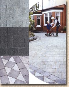
Hopefully, the new Argent blocks will have more success - in fact, I'm sure they will, because they're simply damned good blocks, with understated classy looks. The two colours (light and dark) really do need to be combined on a project to bring out their best, but that's no bad thing. Drives always look better when there's a contrast between edge courses and the body of the paving, and it wouldn't be too difficult to incorporate intermediate contrast courses to break up larger areas. They'd look great on the sort of inter-War period houses that are never completely comfortable with the bog-standard Brindle'n'Charcoal standard pavers, and have been overdone with the tumbled, Tegula-style blocks. Argent offers a distinctive but elegant compromise - the restricted tonal palette won't grate against the style and colouring of this type of property, while bringing all the benefits of quality block paving that, until now have been limited to choosing either bog-standard or tumbled. A complementary kerb would be nice, if you're listening there at Marshalls' Halifax HQ.
The Elite and Excel are still there, offering a useful alternative to those looking for summat a bit different, but I've never been able to get overly excited about these. Clay paving is still there, too, even though Marshalls have recently flogged off the Clay Products division, a move I hope they don't come to regret. The tumbled Chapelgate paver is one of my all-time favourites, and one I regularly recommend when asked to suggest a contrasting paving for Indian Sandstone. The strong, warm, orange-red tones and distinctive texture of an Accrington brick against the muted colours of a riven sandstone is, to me at least, the paving equivalent of bacon and eggs: some things are just made for each other!
As we come to the end of the Driveway section, and the end of the catalogue, it's almost sad to see Driveline 50 relgated to a couple of pages tucked in at the back. Maybe it's because we are all so familiar with this format now that it's become tedious to commission new images or write a few well-chosen words about what is still the biggest selling range of blocks, and most direct descendent of the pavers that started it all, way back in the late 1970s and early 1980s. Familiarity breeds contempt, as they say, but it would be good to see a few new design ideas and some talking-up of what is still the standard fare of many paving gangs. Perhaps a few piccies of "bloody good jobs" done in the previous year by different Contracting gangs; of novel or intriguing uses of these "bog-standard" pavers, or just some images of the sort of driveways, patios, paths that we all see, and many of us build, for most of the year. It's all well and good to be offered steak and caviar, but most of the time, you can't beat the simple pleasure of good old bread and butter!
Final thoughts:
It would not be too difficult to produce a 144 page publication packed with pretty pictures and inanities as part of a "mine's bigger than yours'" marketing strategy. The trick is to produce 144 pages of quality material that is worth the paper on which it is printed, one that will perform as a real sales aid to both Stockists and Contractors, while still being a useful Buyer's Guide for the homeowner. Have Marshalls managed this or have they produced a White Elephant?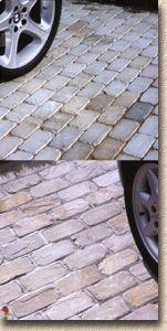
Overall, this year's catalogue is what we've come to expect from Marshalls, but more of it. The photos are generally very good, and a vast improvement on the blurry-figure madness that pervaded the 2002 catalogue. The text, though, is minimal and I'm not sure whether this is a good thing, in a catalogue running to 144 pages, or a bad thing. Technical info is similarly minimal, and there's no laying advice other than the occasional comment recommending mortar bedding or sand jointing or whatever. I wouldn't have minded losing some of the incessant plugging of the Approved List Register if we could have had some good quality construction guidance, showing homeowners what to expect as a minimum from their contractor (whether they're on the Pet List or not).
Comparisons with the oeuvres from other manufacturers are difficult to avoid, but I don't want to create a Hit List or Top Ten. I prefer the single catalogue format, even though it is relatively weighty, to the multi-catalogue approach favoured by Brett. While the photos are good, they lack the "wow factor" that I found with several of those in Stonemarket's brochure, and there isn't the handy "project advice/how-to" pages that are found in the Bradstone book. However, it's still a very good publication, and one that is a must for any serious contractor. If you haven't got a copy yet: why not?

