Natural Paving 2013
More or less this time last year, relying on my amazingly powerful psychic powers, I predicted we probably wouldn't see a new brochure for Natural Paving until 2014, and so the one thing of which you could be absolutely certain was that there 100% definitely would be a Natural Paving brochure in 2013. If I pick a nag for the Grand National this weekend, it's as good as a bullet to the head straight after Becher's Brook.
So, the Natural Paving 2013 edition has sat on my desk for over a month now, patiently waiting it's moment in the spotlight, and during that time, it has been regularly perused, browsed, consulted and admired. It's also been given the big talk-up by Natural Paving boss. Paul Shephard who was keen to point out that they really appreciated my review of last year's offering (?!) because it gave them a third party viewpoint and guided them enormously in the design and styling of this year's edition. Whoa! Don't blame it all on me!
No, seriously, if my wittering have in some small way helped Paul and his team fine-tune what was already a pretty good effort, then my work is done. Natural Paving have always been one of the more responsive businesses in accepting my comments as they are intended, as constructive criticism, and not as petty nit-picking, which some other (lesser) suppliers suggest whenever I make even the slightest suggestion for improvement.
Anyway, enough of the self-congratulations and on with the review. The first thing you notice is a 90° rotation: the 2013 brochure is landscape rather than portrait. This looks promising!
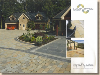
It's a friendly, cheery presentational style, with plenty of colour-block boxes to differentiate content, splashes of a hand-writing style font to emphasise the informal, naturalistic styling, and considerably more text that we saw last year. The double-page contents section reveals only two new products for the coming season, which is positively parsimonious when you recall an overwhelming 14 new lines in 2012, but then, this is now a mature 'collection' of well-chosen materials which cover more-or-less all bases. Consequently, any additions must, first of all, be able to hold their own amongst such august company, and also they need to offer something distinct, something that is more than just a shade or size variation.
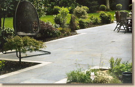
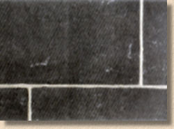
Ebony Limestone , new for 2013, offers a more upmarket version of what has proven to be an incredibly stone over recent years. Black limestone is more commonly seen as a simple hand-cut riven finish flagstone (or sett) and is still available in this format from NP (Carbon Black), but the new Ebony, as part of the Cragstone range, features softer arrisses and corners thanks to the gentle 'tumbling' process which results in a more aged, time-worn looking flagstone. It's still black limestone though, so the usual caveats apply – if you want to keep those dark, brooding tones, you'll need to invest in a top quality colour impregnating sealant.
The other new addition is such a logical move that the only real surprise is that it wasn't done years ago. It certainly makes more sense than the toe-dipping experiment with concrete blocks which has, mercifully, been put out to pasture. When it comes to paving, natural stone rarely combines well with concrete. It even struggles with the very top-end exposed aggregate concretes which come within a whisker of fooling us into thinking they are real stone. However, let it share a space with other natural materials and both will shine. Weathered oak sleepers or fencing, steel or bronze palisades or lighting fixtures, decorative aggregates – all will complement the natural charm of quarried stone, bask in its reflected glory, and repay the favour by enhancing the tonal and textural qualities of the stone. So, when looking for a compatible but contrasting natural paving material, how could you not consider clay pavers?
Clay pavers in Britain (they are almost non-existent in Ireland for geological reasons) are having a tough time. Many of our once-proud native manufacturers have been swallowed up by European mega-glomerate facing brick manufacturers who have no real feel for the subtleties of the British market, and almost no empathy whatsoever for the esoteric world of clay paviors. Sadly, the home-grown palette of clay bricks for paving is more reduced than ever.
However, this dearth of native choice has prised opened a door for some of the more charming imports from the natural home of clay paving, The Netherlands, and in particular, the delightful, earthy tones of the Vande Moortel range. Oh, if ever two brands were destined to work together, it is Natural Paving and Vande Moortel!
The first hint of interest came 12 months or so ago, and so I told Paul of a project I had designed near Southport using a better-than-average silvery granite textured flagstone with break bands and detailing in a reddy-brown Vande Moortel pavior. I thought it worked phenomenally well, as did the client, and so I sent some photies and a few months later, here we are!
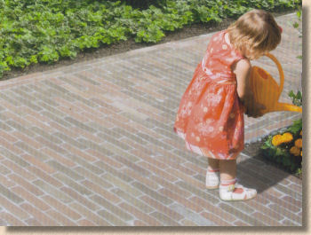
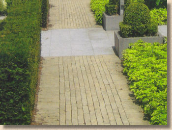
As you'd expect, NP haven't run with the whole VM range, which extends to hundreds of options, but have carefully selected four key colours, one of which would suit most schemes. Of course, you could use the clay paviors on their own to create paths, patios or driveways with immediate olde-worlde charm, and this is probably going to be their biggest use, but if you're looking at using natural stone flags or setts on a project, and need a contrast for definition, then take a good look at these lovely, slender, subtle little bricks.
Elsewhere, everything is pretty much as it was 12 months ago. There are a small number of name changes, so Lunar has become Moonlight , Argent is promoted to Platinum , and Thistle has somehow lost its prickles and re-emerged as snuggly Cashmere .
So what about the brochure itself? Oh, I do like this! The landscape format lends itself to better use of images, even if it does take up more desk space. The balance between images and text is also vastly improved from last year, with good, clear descriptions of the stone (or clays), genuinely useful comments and suggestions on combinations and complementary products, and essential size information there on the page in front of you, with directions to the relevant page for the more in-depth technical info on pack sizes and quantities.
There aren't many swatches, as the larger photies tend to show the colour options, but where swatches are used, they are a tad on the small side. I'd be much happier if customers would buy paving by viewing actual samples, but when swatches must be used, let's have something bigger than a second-class stamp.
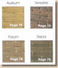

There's a little bit of trumpet-blowing at the beginning, but it's nowhere near excessive – just about enough to establish the company's credentials without ever risking boredom. The individual pages are consistently and logically styled, with simple colour coding for flags, blocks, walling, etc., and the aforementioned technical information is succinct but clear.
Throughout, there is a light and airy feel, nothing too formal, nothing too outrageous. There's an enjoyable mix of projects from grand designs to small back yards; courtyards, cottages and castles, all can benefit from Natural Paving's products.
It has to be said that there is a noticeable amount of variability in the quality of the installations featured. I'm old enough and smart enough to suss out where it's just a matter of a lovely job let down by a mediocre photie, but on some of the images, the workmanship isn't quite showcase standard. Too many instances of crossed joints, bitty infill pieces, pointing of variable hues, and dodgy-looking lipping. This is a shame because it is NOT an issue with the product, but with the installation.
So why make such a fuss about it? Well, I believe that when you are one of the leading suppliers, there's an inherent responsibility to showcase best practice. When small detailing or construction errors are shown in the very best brochures from reputable companies, it allows the less-skilled and unskilled out there to claim that their own work is satisfactory because it shows it done that way in the brochure.
I accept it's unfair to pile this responsibility for standards onto manufacturers and suppliers, but in the absence of properly recognised and valued qualifications and a nationally acknowledged trade body, it is the Natural Pavings and other top suppliers to whom we look to show the way.
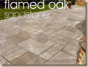
Thankfully, many of these minor errors will slip by the vast majority of clients and not deter them from appreciating the fantastically wide selection and top-of-the market quality being provided by Natural Paving. Have no doubt: this is just about as comprehensive a selection of what is being used on the nation's patios and driveways as it is possible to see in a single volume.
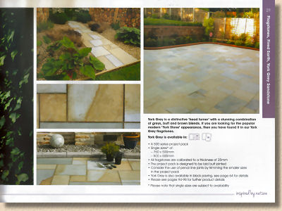
The brochure is more-or-less spot on as a sales tool. It contains all the information needed by clients and contractors alike, with ample photies of both products and inspirational ideas. It oozes quality and charm; it projects NP as a genuine top-of-the pile supplier; and it is a joy to share with clients. Watch their faces when you place it in front of them and they flick through, page by page, smiling with pleasure as they see the possibilities unfold before them. That's when you know it's a bloody good brochure!
Just why more companies don't take advantage of the obvious benefits proffered by a landscape format has always baffled me. I know there are additional production costs, but they're not astronomical. Some people say that a portrait format handles better, is less floppy, but let's be honest: how many people read these brochures unsupported? They are nearly always laid flat on a coffee table, design desk or even just someone's lap, and when you see what landscape format can do for the photies, you have to wonder "What's not to like?".
If you've not already got a copy, you're missing a huge treat. Everyone considering a natural stone patio, pathway or driveway this year really needs to look through this to get a full overview of the market. Contractors need it not just because it has some wonderfully inspirational ideas but mainly because it is a truly wonderful sales aid. I dare you: browse the Natural Paving 2013 brochure and try not to be impressed!
Obtain your own copy of the Natural Paving 2013 brochure
0845 072 1150


