Castacrete 2019 Brochure
As time hurtles by with a callously mocking disrespect for what might be considered a sensible pace, the more one notices how the things we assumed were permanent fixtures of our life and times are, in fact, temporary phenomena, mere human ephemera that can, and do, change, turn-about, and even disappear completely. Who, 25 years ago, would have imagined a British High street without Woolworths, or that PJ and Duncan would be major TV celebrities, or that there could possibly be an audience for a website obsessed with paving?
This bout of nostalgia was prompted by the cover of the latest brochure from paving manufacturer and distributor, Castacrete. Businesses often have names that must have made sense at some point in the past, but, confronted with evolution, can now seem a little contradictory, and there are numerous examples in the world of paving. Castacrete, a name that screams ‘concrete’, a name that fuses the casting action of placing the material with the latter half of the name itself. Castacrete – solid, reliable, permanent, concrete.
Except it’s not, or, at least, not so much concrete anymore. Like Natural Paving which no longer majors in natural paving, Castacrete don’t do anywhere near as much casting and use far less concrete nowadays. The business has changed, but the name remains. Is this a hindrance? Does this give potential customers the wrong idea?
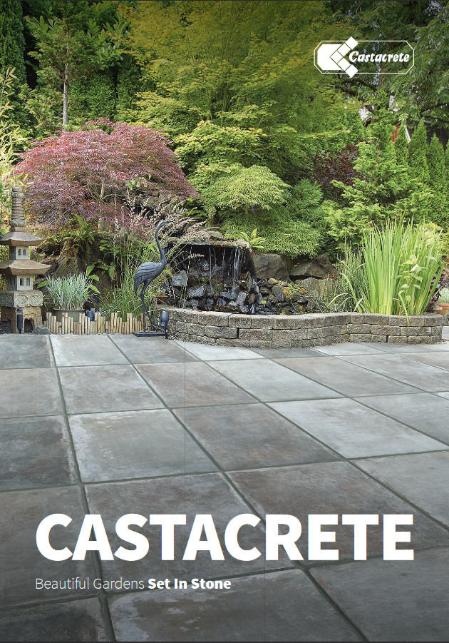
Darwin tells us that successful evolution relies on appropriate and timely adaptation to a changing environment, and there can be little doubt that, as the market for residential paving has moved on from simple riven-effect wet-cast flags churned out from a handful of pretty basic moulds on a vibrating table, it has been those with more nimble feet that have stayed the course, by adopting Indian sandstone in the 1990s, exploring the Chinese stones a decade later, and by taking on porcelain in the last few years.
This evolution is actually addressed in the opening comments on page 3 of the 2019 brochure. From a tradition of casting in concrete there has been steady and sustained evolution. Over a fifty-year period, a local reputation for above-average competence in concrete has been successfully gamed to become a mid-sized yet significant national presence in the wider paving and hard-landscaping market, and that is an evolutionary path that has seen so many others decline into extinction. The " Where are they now? " book has countless pages.
Castacrete have avoided having their own addition to that book by doing exactly what’s on show in this very attractive A4 full-colour brochure which eschews the current fashion for landscape format and firmly sticks with a traditional portrait alignment. 152 pages of appealing products, well-displayed and well-suited to contemporary taste.
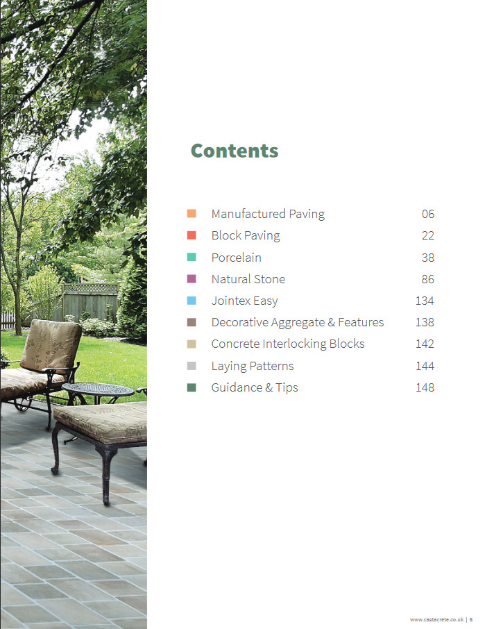
Contents page gives prominence to concrete paving
The concrete heritage has not been forgotten, which is good to see. Too many others following a similar evolutionary path have adopted a state of denial regarding their past, with concrete products, and wet-cast in particular, expunged from their repertoire. So: credit should go to Castacrete to standing by their history and putting their "Manufactured" products right up front.
They lead off with their original core, the wet-cast range, and 16 pages covering all the key product lines. Traditional riven effect, naturalistic, with a generous range of colour and sizes, and finishes to suit almost everyone. There’s also a pressed and shot-textured flag in there: four modular sizes, three popular colours, and an attractive exposed limestone aggregate finish.
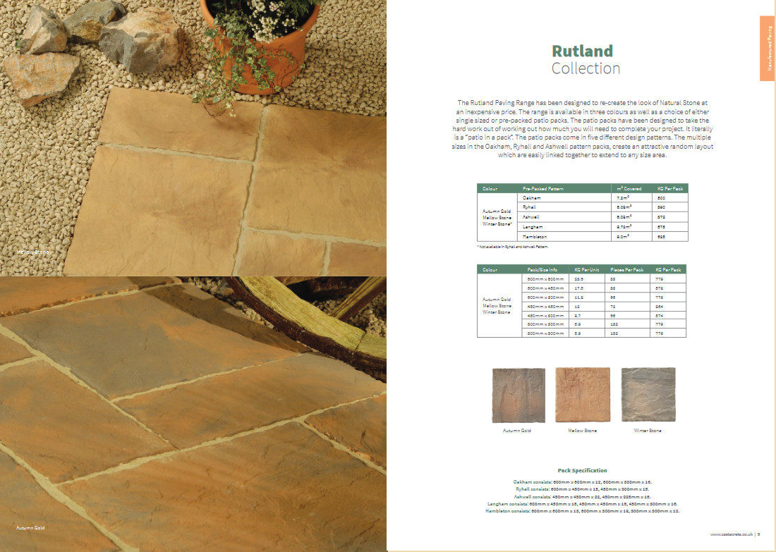
Rutland Paving
This is followed by the Block Paving range, which covers all the essentials, from standard basic blocks and kerbs, through tumbled larger formats, a pencil-edge block for smoother passage, and a new "Aged Effect", which they claim offers cleaner, less-damaged edges whilst retaining a distressed overall appearance. To my eye, there is little to separate this new offer from the more familiar conventionally tumbled blocks. Yes, the edges are, by and large, intact, and this gives a slightly less timeworn appearance to a finished pavement, but it’s a minor thing, one that may well only be really noticeable to those of us that spend our days poring over paving. Would a residential client really be able to spot the difference?
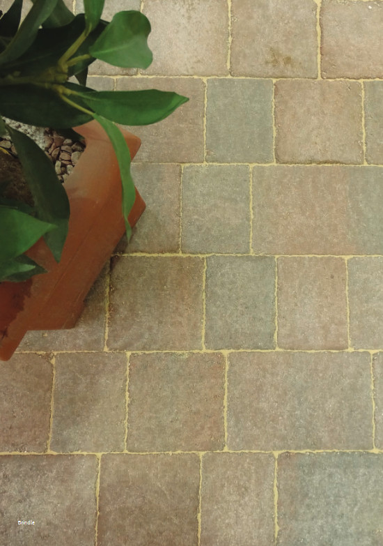
Castacrete aged-effect block paving - can you see the difference?
Next up, and it really should come as no surprise because it is the current in thing, is the Porcelain. Forty-eight pages thereof. What can be said about porcelain that hasn’t been said a thousand times before? You either like it or you don’t, but if you do, then it’s fair to say the Castacrete offer is respectably comprehensive, with all the usual suspects in terms of colours and textures. There are good size options too, with single sizes, modular, planks and large format. Just about all bases covered.
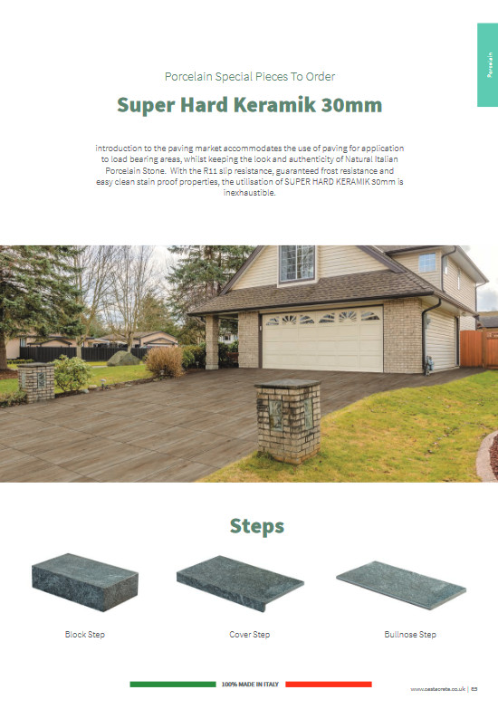
The bulk of the range hails from Italy, with a small number of products from Spain: the two most respected nations of European manufacturers. All seems to be R11 slip-rated (the minimum acceptable), and 20mm thick, so none of the penny-pinching thinner stuff, although there are 10mm options for particular products that may have an indoor application. Steps units, as blocks or bullnoses, are available as " Super Hard Keramik, " 30mm thick as standard and complete with garbled English introduction. It isn’t clear whether this Super Hard Keramik is available in just the one finish/colour/texture, or whether it is available to match the other ranges. Apparently, its "utilisation is inexhaustible" – straight from the BabelFish!
On to the predecessor to the Porcelain Preoccupation which was, of course, Natural Stone. This section matches its kiln-fired competitor by being given an identical forty-eight pages. Again, it’s all the usual suspects, led by the on-trend Sawn Six Sides and Honed options. I’m always a little wary of these stones as the tendency is for processors to work with the softer stones, and so keep milling costs to a minimum, a fact borne out by the presence of celebrated moisture sponge and every lichen’s favourite substrate: Mint.
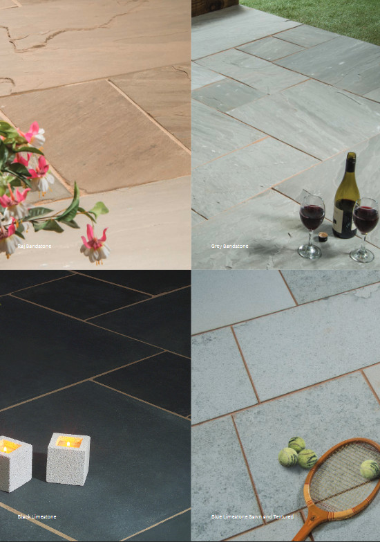
Sawn square edge paving
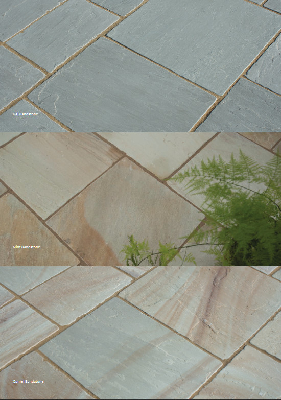
Tumbled sandstone
Elsewhere, there are the mandatory slates (Black and Rustic, naturally), a light and darker granite, the more popular sandstones and Kota limestones in various formats, including tumbled setts, calibrated flags, and a budget range of thinner (18mm) flagstones. Walling blocks, copings, bull-nosed step treads, edging kerbs – it all seems to be there.
Personally, the most interesting product is the Textured, Tumbled and Sawn Edged limestone setts, in yellow or blue options. Two sizes: 240x160mm, which would be great for herringbone layouts or courses, and a 200x100mm option, which could be used similarly or as edge courses, but then there’s a Mixed Pack, which seems to contain unknown quantities of both sizes. Admittedly, they could be used one-for-edge, one-for body, or as alternating/random courses of each, but the two sizes aren’t modular, so mixing is not practical, and the lack of quantity information severely limits the potential interest to designers, who would, naturally, want to know just what it is they would be given. Is it 50:50, or just a matter of whatever goes into a bulk bag to make up the numbers? Nice-looking product, though!
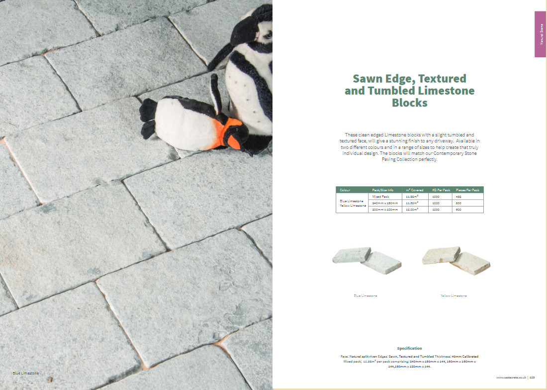
Textured, Tumbled and Sawn Edged limestone setts
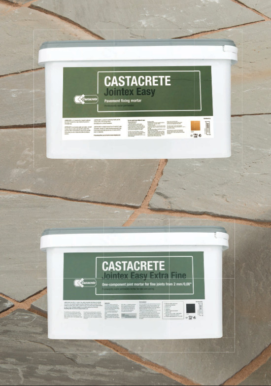
To round off the brochure, a few ancillary products. There’s a one-part jointing compound with ambitious claims regarding its performance, a fairly obvious selection of decorative aggregates, and a couple of pages given over to the giant ‘interlocking blocks' better suited to civils projects than garden makeovers. This latter item seems a strange inclusion, but you never know: someone out there may need a 1800x600x600 concrete block retainer wall for their patio!
A handful of laying patterns, most of which feature the amateurish and aesthetically awful crossed joints, and some elementary installation guidance that is sufficiently vague to be of any real value, but that’s the way with almost every supplier nowadays. The more basic the info, the less chance there is to be blamed for contractor cock-ups.
That’s the content dealt with, but what about the layout, the styling, the format and the general appearance?
This is not a lightweight, made-on-a-shoestring-budget publication. It looks and feels classy, with a semi-stiff cover and back, and an embossed logo. I’m not sure I’d have chosen that particular image of a porcelain paving for the cover. From reading the brochure, I now know it is actually the Contrada Buna porcelain, but at first glance it looks like stack bond 3x2 with added mortar stains.
I know it’s a matter of personal taste, and someone, I assume, must like the look of that particular porcelain, but they have plenty far more attractive products within the brochure, ones that would, in my worthless opinion, have a wider appeal. A cover image can set the tone for an entire brochure, and that one, for me, looks dark, messy and unappealing, I’m sorry to say. The only real plus is that, once you venture inside the cover, what is found therein comes as a very pleasant and uplifting surprise.
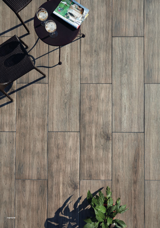
The basic format is to have a full-page image of the product on the left side of a double page spread, and a white page opposite with minimal text, basic sizing and packaging info, and swatches if applicable. It works well enough and is easy to follow. As discussed above, the products are logically grouped, but the lack of names can sometimes be a little confusing.
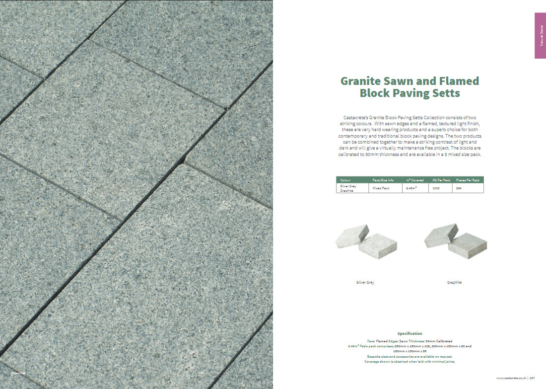
Granite Sawn and Flamed Block Paving Setts
As many readers will know, I’m not averse to mickey-taking when it comes to ridiculous names for paving products, but a good, simple, and possibly meaningful name can be of great benefit at times. When someone mentions, say, Tegula, or Old Town, or Geo-Ceramica, we sort-of know what to expect, but what about "Granite Sawn and Flamed Block Paving Setts"? Is that two products, one sawn and one flamed, or is it just the one product that is sawn AND flamed? And is it a block paving or is it a sett? A single name would have been less cumbersome, and the text could have explained the concept far more elegantly.
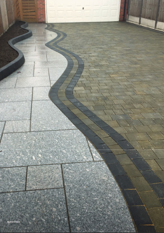
Overall, the photography is good quality, but sometimes the content is worrisome. It’s not every image that’s afflicted, not even a majority, but enough to be notable. A close-up image of the aforesaid multi-talented granite paver features one with a chipped corner; some of the installations feature glaring, starkly glaring, examples of bad practice. Gaping joints, tiny cut pieces, and the like. There’s poor layouts, sloppy cutting, varying joints widths….on it goes. Someone with a more critical eye should have vetted these images, and either rejected them out of hand or, at the very least, set PhotoShop onto them and airbrush out some of the worst defects.
Again, I accept that these ‘issues’ are, perhaps, the sort of thing only an anorak such as I might spot, but they do set a tone, and, of more concern, they give the impression to both customers and the less clued-up contractors that this standard of workmanship is the norm. It isn’t, and it should never be seen as such. Brochures should, as far as practically possible, be a showcase for fantastic products and exemplary installation.
While the basic double-page-spread format of photo and text works perfectly well, occasionally a sequence of pages will be given over to nothing but photography, and while we all love looking at pretty pictures of paving, a bit more definition and “setting” can make a good photie into a great photie. Instead of having the images cover the entire page, a little bit of white space could frame them, give them independence and a stature that is lost when they are crammed, literally, onto a page together.
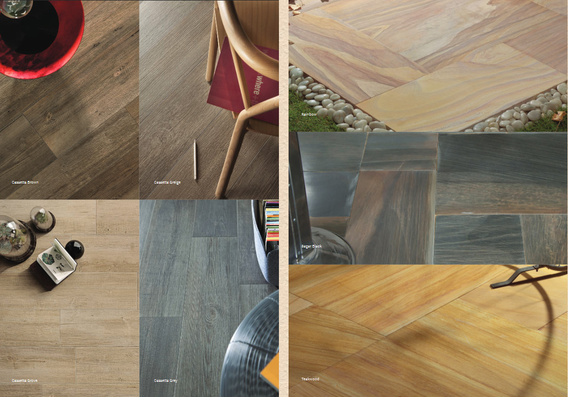
A little bit of white space around each image would have given added definition
Constructive criticism over. I don’t want to give the impression that this is brochure is a disappointment in any way. Far from it! It’s a genuine credit to the company. To have a mid-sized manufacturer-distributor producing such a quality publication is no mean feat and they rightly deserve acclamation.
There is plenty to admire. The products are well-selected and generally well-displayed. The collection is ideally curated for the typical patio and driveway client, with all of the essentials included, and enough of the little extras to pique the imagination. There are original ideas to explore in here, and some unique products that truly deserve wider attention. Get yourself a copy today – you won’t regret it.
Castacrete Helpline: 01634 729 900
Brochure Download: Click Here

