Stonemarket 2015 Brochure
Most of the brochure reviews that are posted on this website feature two main components: a look at the new products and their potential (or lack thereof), along with an assessment of the overall look, styling and general usefulness of the brochure itself.
Over recent years, Stonemarket have completely buggered-up this meticulously planned review format by revealing their new products several months before unveiling the latest incarnation of its virtually-impossible-to-beat catalogue, and because their new products are, without exception, always exciting, it would be silly to withhold comment upon them until the hard-copy brochure became available, so the new products for 2015 were reviewed back in October and, although the brochure has been on my desk for a couple of months, it's only just reached its turn in the annual roster of what gets reviewed and when.
Some brochure reviews are a chore; some are a pleasant surprise; but with Stonemarket, it sometimes seems futile to attempt any meaningful review because we all know what to expect. The photography will be exceptional, the layout will be clean, unfussy and ever-so stylish, the whole thing will ooze with quality and panache, so maybe I could just wind-up this review here and now so that I can sod-off outside and make the most of the warm spring sunshine.
But that might not be fair on those new to the paving game or to the homeowners and DIYers who are considering what to include on their shortlist for the new driveway or patio they are planning as this year's project, so the sunshine will have to wait awhile, the grass remain unmown, the bike still attached to the trickle charger.
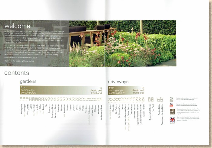
So, here we go. It's the familiar Stonemarket styling: a plain white cover with a stunning main photie, a basic logo and an understated title of " garden and driveway collection ", all in lower case to emphasise the understated style (and annoy English language pedants everywhere!). The classy cover opens to immediately reveal a contents page, which, for some unfathomable reason, has the page numbers and products arranged on their side, requiring the brochure to be rotated anti-clockwise by 90° or for the reader to endure a serious amount of neck twisting. New products, and there are lots of them this year as revealed back in October , are notated, as are tweaks such as the new colours for Vecta Block Paving and new Project Packs for Trident Paviors.

Annoying as the sideways content layout is, it does actually look really good and effective. There's something ultra-stylish about it running across two pages rather than a single page listing, something very Stonemarketish about it.
There then follows a few pages of blurb, which seems quite un-Stonemarketish as prior editions have strictly resisted the tendency to trumpet-blowing which afflicts several other brochures, and thereby spare the browser from the tedium of wading through page after page of well-intentioned waffle before getting to the goodies. Admittedly, the Stonemarket blurb hasn't got to be too much just yet, creeping up to three pages for 2015, but it would be disappointing to see it expand any further. While the fluff regarding new products is arguably essential, and the notes on garden trends an interesting exercise in pushing customers towards particular product lines, anything further would detract from the overall classiness of the brochure as a whole.

One thing I can't see mentioned in the blurb, and I really feel it should have been afforded the space despite my previous comments, is this concept of the Stonemarket Stone Standard, based on BS7533 (not sure which bit!). It's a home-made quality mark which takes Stonemarket sandstone products one notch up from the Ethical Trade Initiative (ETI) basics which more-or-less every reputable supplier now supports. Note this only applies to sandstones at the moment. In essence, Stonemarket are pledging that all their sandstone is 'above par', in that it will have a very low water absorption figure of not more than 1.7% which means it is less prone to algae and other surface greenery than some of the more sponge-like stones supplied elsewhere. Further, all sandstone will have a minimum flexural strength of 12.9mPa, which means is basically stronger, and all will be frost resistant. This effectively renders Stonemarket sandstone just about as good as it can get, and for some customers, this will be an essential requirement.
Anyway, back to the brochure. The whole publication is split into two parts, starting with "gardens" (lower case), and then "driveways", with a smidgen of technical stuff tucked in at the back. I'm not sure how clear cut this distinction can be. Some of the avowed garden products could (with the correct sub-layers) be used for light driveways, and many of the driveway products could very easily be used in a garden setting if so desired, so perhaps we should regard the separation as suggestive rather than definitive.
Lovely photography, selected to fulfil a tick-list comprising 'overall view' with close-ups to illustrate texture and jointing. And with this being the garden section, each double page spread has to include a completely unnecessary photie of a plant. Not sure why, but possibly to emphasise the horticultural ambition of the chosen paving. I love my garden, and I love good quality plant images, but I think I'd rather see an extra image of the paving maybe *with* the chosen plant included, rather than an uncredited image of, say, a Tiarella or a bearded iris.
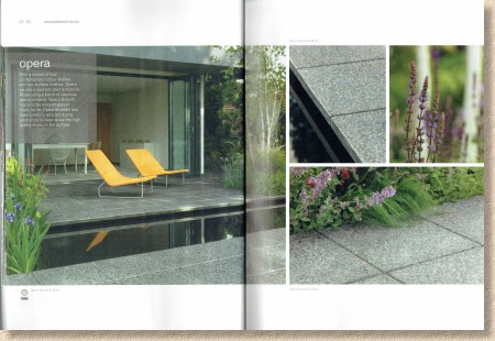
Technical info is kept to the absolute basics: sizes, pack quantities, and colour swatches. And on the subject of sizes, the practice of including a potential joint width in the stated size of a flagstone is bloody annoying. Design clients come back to me complaining and demanding a re-design because, they claim, I've got the paving sizes all wrong. Stonemarket clearly state their flags are 855x570mm and I've drawn them at 845x560mm. Even though there is a faint bit of micro-text in the brochure admitting that the stated sizes are 10mm over, clients never read that. Instead, they are adamant it's me that's wrong.
If you're going to pretend the flags are bigger than they really are, allegedly to allow for the jointing, why not claim they are 65mm thick, or at least they are when you allow for a 40mm bed?
If you buy a 1 litre tin of paint and then find out there's only 950ml because the manufacturer has included the 50ml air gap at the top of the tin, you'd be complaining to Trading Standards. So why do we tolerate it with paving? I've ranted previously about manufacturers claiming project packs cover such-and-such an area in total, but that area can only be achieved when you allow for joints of a particular width. What's to stop a less scrupulous manufacturer claiming their pack covers 15m² when that area is only possible if you include 150mm wide joints? It's misleading and it's borderline illegal, so stop it!

Enough! Stonemarket are not the only ones doing this, and are by no means the worst offender, and it shouldn't detract from the quality of the products or the beauty of the brochure as a whole. Oooh! Look at that. I think it's a Phyllostachys nigra ! Nowt to do with the paving, but it is very pretty.
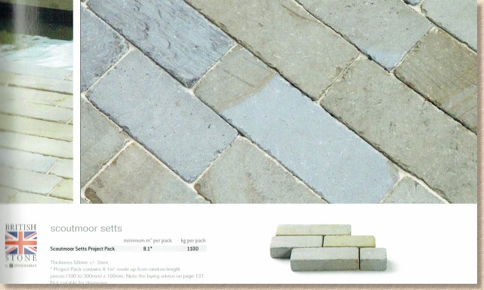
Good to see native stone prominently badged as British. There is a bit of a thing amongst some clients at the moments about using 'homegrown' stone for authenticity. There is some truly wonderful paving quarried in northern Britain and it is rightly highlighted so that customers are more fully aware of origin of the products they choose. Native stone helps maintain that unmistakeable British character and colour palette, so is a much better choice for heritage or traditional gardens than many of the imports or manufactured modern pavings.
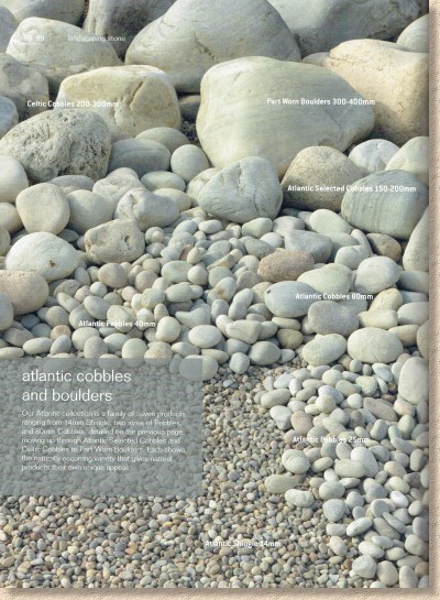
Also refreshing to see something a little bit more imaginative when it comes to promoting decorative aggregates. The stacked swatches are a tired if hard to replace idea and they never really give a true sense of the aggregate, other than basic shape and perceived colour, so the full page image of boulders, cobbles, pebble and "shingle" on page 98 is a delicious step forward. It clearly shows what sort of texture and scale to expect with several of the rounded decorative aggregates. Great idea, well-presented and so simple why didn't someone think of it earlier?
The driveways section opens with the visually-stunning but migraine-inducing Rhombix diamond-shaped block paver. Well, it's one way to attract attention, but I still don't like it on larger areas. Too busy, too fussy, and the lack of edge detailing on the 'money shot' photie really doesn't help it.
Much the same image tick-list for driveways as there was for gardens. A big 'overall view' picture to sell the idea then several close-ups to feature the texture and jointing detail. No plant photies, though! I wonder if shots of cars, tyres or cans of oil were considered as inserts?
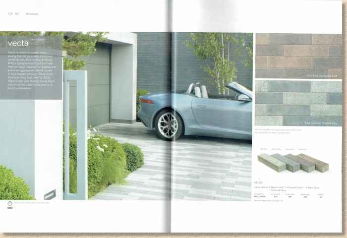
And that's about it. The technical info remains much as it was with some useful layouts, a couple of cross-sections (including a 3D isometric cross-section for the Ampliar Driveway Edging with completely unfeasible concrete bed and haunch, obviously drawn by someone who has never backed-up a kerb in their life!), and possibly the most concise laying guide ever published by a reputable manufacturer.
Despite all my petty niggles (and they really are petty when everything else is considered), the Stonemarket brochure remains the one to beat. It's little short of sublime. Top products expertly presented and impeccably photographed, with so many ideas and evocative settings that it verges on being a coffee table book rather than a paving and hard-landscaping brochure. If I were ever stranded on the fabled desert island, my one book choice could well be the latest Stonemarket brochure….it really is that good!
Stonemarket Customer Helpline:
England & Wales: 0345 302 0603 Scotland & Northern Ireland: 01555 770 555


