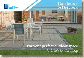
Brett's 2015 Brochure
2015 sees a familiar format turned, if not quite on its head, then very definitely on its side. The accustomed " Gardens and Drives " magazine-like brochure from Brett Paving has been rotated through 90 degrees and is now a landscape format publication!
Marketing main man, Andrew Gill, claims it's because they listened to my comments this time last year about the format having become 'tired' (did I really say that?), but I reckon he's just trying to flatter my already over-inflated ego. Whatever the truth, this re-formulation does seem to have injected new life into the format without being too radical or breaking that link of continuity.
So, the title remains: it's still 'Gardens and Drives', but that has been given reduced prominence now, with more emphasis for the Brett brand top left and a couple of bland 'mission statement' type phrases strap-lining the lower edge. Immediately, that magazine-like styling and chatty ambience is dispelled, this is very definitely a paving brochure. But is that necessarily a good thing?
So, the title remains: it's still 'Gardens and Drives', but that has been given reduced prominence now, with more emphasis for the Brett brand top left and a couple of bland 'mission statement' type phrases strap-lining the lower edge. Immediately, that magazine-like styling and chatty ambience is dispelled, this is very definitely a paving brochure. But is that necessarily a good thing?
One of the stated aims of switching to landscape format is that it makes it so much easier to use gob-smacking photies. Think about it: most of the paving and hardscape images we snap on our digital cameras or smartphones are taken in landscape format, so why are these then shoe-horned into a portrait-format brochure with too much blank space above and below, or heavy-handed cropping to zoom-in on what's considered to be a key feature?
And this becomes immediately apparent on opening the cover and being confronted by a page-and-a-half width photie of a huge concentric arc driveway in Silver Fleck Aura block paving. This is just the type of image that wouldn't work in portrait orientation. It's the spread and the scale of the image that impresses. If the rest of the brochure is like this, then we are in for a treat!
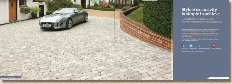
The very next page introduces us to the new products for 2015, many of which were previewed at the Brett Approved Installer (BAI) Conference 12 months ago , but have now been promoted to full official status which includes a snazzy marketing name and fresh, new photography. So, what have they got lined-up for our delectation and delight in 2015?
The big name is 'Lugano' , which has two entries, as textured flags and as textured block paving. Meanwhile 'Varano' is a modular concrete flag in either polished or textured finish. Maybe the cave-dwellers who came up with these names thought they suggested chic Italian styling, but to me, they sound like the answers in a Vic Reeves style TV quiz!
Anyway, Lugano is a granite-alike textured flag (or block) with quite a high proportion of recycled (secondary) aggregate, which is achieved by using the much more sensible Face Mix technology which is, thankfully, becoming much more common in Britain after years of nay-saying about its alleged failings. The flags come in two colour options: Silver (yawn) Grey and Graphite (mmmm!) Grey, but only two sizes, and both are sodding boring squares (450x450 and 600x600mm) which makes creative design all but impossible.
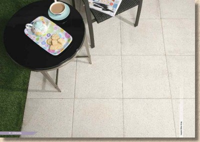
I've been assured that, if it proves popular and rectangular unit (what's the betting that it will be 600x450mm?) could be made available, but until such time, it seems we are stuck with soul-numbing stack bond or stretcher bond layouts.
The block version is far more interesting and is showcased with some stunning project images. There'll be two thicknesses for a start; 60mm for residential projects in 3-size packs, and single size packs of 80mm for heavier applications. Same two colour options, naturally enough, and three plan sizes: 105/140/210 x 140mm.
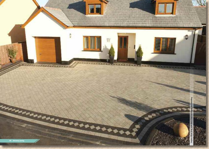
The flags, as already stated, offer limited design potential so will need to be combined with summat else to generate anything vaguely eye-catching, but the blocks are almost certain to engender interest, as have several similar products from rival manufacturers. My only concern, and this applies to ALL light-coloured texture blocks, is that they do tend to mark quite easily, especially on tight corners or turning heads. But look at that harlequin edge course. Bloody gorgeous!
Varano (you find yourself saying it in your head using a deep voice with lots of reverb, for some reason!) is the premium decorative flag that comes in polished, textured or, wait for it, stripey options. The stripes are, essentially, alternating 50mm wide bands of textured and polished surface, which give an interesting detail to larger areas.
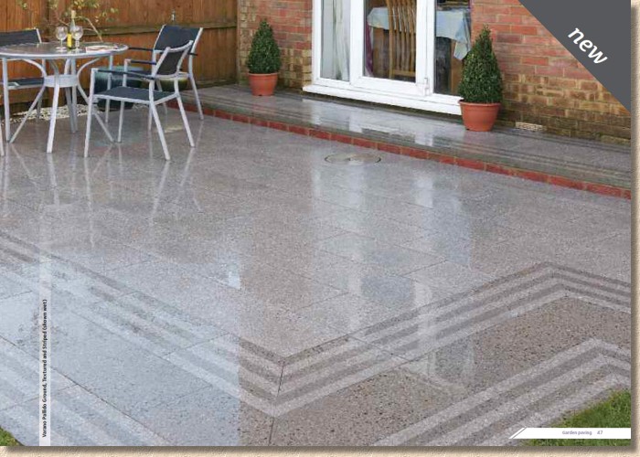
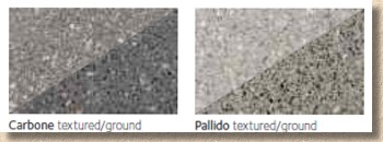
Two colours with stupid names, obviously. Carbone is the darker grey, while its paler, maybe pallid, sibling is Pallido. The colour seems stronger in the ground versions, especially when wet, but the real beauty shows up to best effect when used in combination, mixing either or both the colour and the finish to highlight the effect.
The only thing that lets it down is the alleged 'modularity'. There's only one pigging size! How is one size modular? Modular with what? Other than itself: buggerall!
Again, additional sizes may (or may not) eventually emerge from the bowels of Brett's manufacturing plant, but for now it's just the 600x300mm, so even stack bond seems out of the question!
Brazilian Slate has been brought in to supplant the previous Chinese offering which, as many of us know, could be a tad variable, to say the least. The South American stuff, by contrast, is regular, reliable and damned tasty. The only trouble is, other suppliers have been doing this for years and unless there's a real price incentive, why would anyone switch to Brett and dump their existing source?
As an addition to the Brett range of natural stone, it's a sensible and more-or-less foolproof offering. It complements the rest of the range and offers a contrasting, classy option that is genuinely versatile. Four sizes based on a 300mm module, projects packs, circle kits and all in the two familiar colours: Olive Black (dark indigo) and Woodland Grey (steely blue-grey).
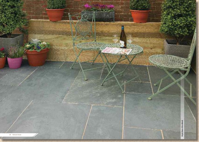
The photies are a bit off. The full page Olive Black shot doesn't look black and seems to have some streaking or brush marks on the surface, probably from the resinous jointing medium used, while the smaller Woodland Grey image on the opposite page seems to have been half-sealed. Very strange!
Anyway, it's a proven winner and a stone that doesn't fade, doesn't attract every bit of algae or moss from miles around, and doesn't cover itself in grime. It can be a git to lay (needs a bond bridge – see here) but a true classic paving option for those with a low maintenance requirement.
Two other new (ish) block products before we're done. Beta , the ever popular untumbled block, is now available in a Trio Pack, which essentially means a mix of all three sizes (105/140/210 x 140mm) in the one pack. This is sold on the premise that it minimises waste, which may or may not be true, depending on how you work, but it's definitely true that it imposes a laying ratio that may or may not be to your liking.
And the continue the Brett heritage of using the Greek alphabet as names for its blocks, we now have Delta (what happened to Gamma?) which is a "Large Format Paver" that is said to be compatible with the existing Omega range (the standard 200x100 block) despite it having plan dimensions of 266x133mm. Compatible how? Compatible in the sense that it looks just like overgrown Omega, having the same 2:1 plan ratio and chamfered edge? You certainly can't mix the two formats. You could, as the accompanying photie shows, use one format (Omega) for the edge course, and the other (Delta) for the body, but that's not really compatibility. If it was, then we could say that reclaimed gritstone setts are compatible!
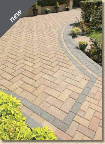
Only three colours (Omega has eight at the last count) but they are the popular ones: Autumn Gold, Brindle and Charcoal, so shouldn't be too difficult to find viable projects. Those 80% heavier blocks will jar on the layers' wrists and this might dissuade the lazy installer, which would be a shame as the bigger format can be very useful when trying to play tricks with scale – bigger blocks tend to make smaller 'postage stamp' sized driveways and patios look so much bigger.
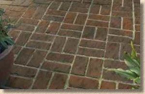
Final newbie is Rochester Brick , which is, in effect, a re-vamped Olde English Brick, the unconvincing, pretend brick-inna-flag that still appeals to some gardeners for god knows what reason. Available as an imitation edge course one brick width or the full horror of basketweave. The moulding is new, with what looks like fewer holes and voids on the surface, and better colour-mixing throughout, but it's still the sort of paving I never want to lay. I have my reputation to consider! (YMMV)
So, that's the new products out of the way, what is there to say about the new-look brochure in terms of style, layout and usability?
The most obvious thing is the photies. The new orientation has been used to the max, with glorious full-page, seriously good quality images. Every major product is afforded the same honour, a full page 'money shot', with support from a half-page (or thereabouts) subsidiary image. There's a reasonably sized swatch of the various colour options, and just enough text to explain what it is we're looking at.
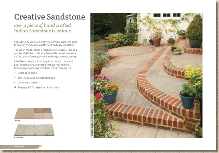
Pack and size info has been shifted to the back, which I'm not convinced is a good idea. I can understand pack quantities, weights and layout options being hived off, but I do think basic size choices needs to be shown on the relevant page. This is made amply clear by the fact that several of the imported flagstone offers have circle kits available, but unless they are included in the photies, you wouldn't know, and that could affect a client's buying choice.
Not too much trumpet-blowing in the Introduction at the start of the brochure, but a generous six pages given over to the BAI scheme and its more illustrious members, which can only be a good thing, but, with the exception of an exceptional and habitual prize-winner, the other worthies featured in this spread are treated only to a miniscule photo-credit. There are a couple of follow-up features showcasing the best patio and driveway winners in the relevant sections, but there are images used throughout of work that won or was nominated for an award, but the omission of an on-page credit for the responsible contractor is a missed opportunity, I feel. Credit where credit's due, please.
The brochure has been sensibly divided into six sub-sections: Natural Stone, Garden Paving (the latest euphemism for concrete flags), Driveways, and Bits and Bats (they're referred to as 'Finishing Touches) are top and tailed by the aforementioned Introduction and Product Info. Logical, easily understood, dead easy to find and colour-coded for added convenience.
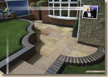
There's also a generous sprinkling of brand new photies, which are always welcome, even if there are one or two naughty bits of bad practice on show. The colour reproduction is excellent, as good as anything else I've seen, and genuinely representative of the product colours. I do like the little paragraph about why colours are perceived differently – it answers many of the questions which are regularly sent in to this website, so anything that save me time must be welcomed.
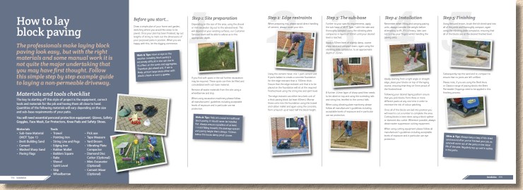
Installation advice is sparse, but that is probably not a bad thing. Other than genuinely competent DIYers, if someone is relying on a page and half of bullet points and stamp-sized photies to guide their patio or driveway installation, they should have their bumps felt. Much better to leave installation to the professionals. I'm not sure why the required materials list for laying block paving includes "paving flags", "building sand" and an edging iron, but completely omits jointing sand – looks like a copy'n'paste from the list given for patio construction!
Having spent a couple of days perusing the new-look brochure, what can we conclude? The new orientation has most definitely been well-used and exploited to the maximum, and the whole look is clean, uncluttered and logical, but much of that friendly informality of the previous magazine-style brochures is missing.
That doesn't mean it's wrong as long as what remains is presentable and capable of selling the products therein, which it certainly is. Navigation (if that's what we do with brochures) is a doddle and my only minor gripe is that separation of sizing information. Other than that, this is one of the 'must have' brochures for anyone in the trade and for homeowners looking to invest in a new patio or driveway, well you'd be daft not to give serious consideration to what Brett has to offer.
Brett Advice Line: 0845 6080 577


