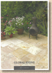
Global Stone 2011 Collection
It's a brand that has become a byword for quality, value and innovation. Such a thing doesn't come about by chance, of course, but by bloody hard work, tungsten-edged determination, and having an unfailing eye for what's happening in both the domestic and the worldwide markets. And so, it was a source of enormous delight to find the Global Stone 2011 Collection on the doormat a couple of weeks back.
The format of last year's impressive catalogue has, largely, been retained. An A4-sized, semi-stiff covered, full colour assemblage running to 74 pages stuffed to bursting with generously proportioned photies, easy to follow sizing and packaging info, and extensive practical advice. It's hard to find fault (if you overlook the sodding travertine on the front cover, obviously!)
The abiding image that one will carry away from the 2011 Collection brochure is the very strong use of photies. There's been a reining-in of the fashion for white space, and instead, the delicious images have been allowed to run riot, spreading to within millimetres of the page edge and wowing one and all with their undeniable good looks.
As a wise man once said, "it's pictures wot sell paving"i. A good image is worth a thousand words (probably two thousand words if they are the sort of airy-fairy fluffy nonsense used by too many promotional brochures) and there's no shortage of good images in here. But more than having good images, it's the combination of images that impresses. There's a neat mix of scenes and landscapes with close-ups that act as subtle swatches for showing colours and textures.
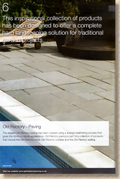
There are a small number of bloopers – the smack-bang-in-the-middle crossed joint in the first full-page photie on page 6 doesn't augur well, as it develops into a theme that can be seen with several subsequent products – but it would only be pedants and anoraks such as yours truly who would spot these amongst what are, in essence, well composed and well executed scenes.
So: what are they offering us for this pre-Olympic year? Well, there is the standard fare of imported modular sandstone flags and pavers (which are still not cobbles, no matter how long the misnomer persists) and a reasonably generous sprinkling of new stuff.
It's easy to be snooty about Raj rectangles, Modak circles and the like; they are fairly commonplace nowadays, but this is what the general public wants and if that public wants a simple 20m² of Fossil Mint with a central circle, they might as well have quality materials rather than the bottom-of-the-container ballast dross that is often sold via ads in the free 'papers and internet auction sites.
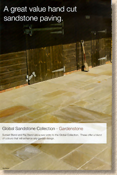
And to address that interest in popular but cost-effective paving, Global Stone have launched "GardenStone" , their imprint for providing value-for-money versions of the more popular imports. To start, they are offering two colour blends, Sunset and Raj. Sunset Blend features slightly redder or ochre tones while the Raj Blend is closer to olives and earthy greys. Five different modular sizes in each blend, and, as you'd expect, available as 15.87m² Project Packs, GardenStone offers a lower-cost option for those areas where budget is key.
Bull-nosing has been a popular 'added extra' over the last few years. Homeowners and designers have greatly appreciated the value of a neatly finished edge for steps, bringing, as it does, a level of detail that you just don't get with a plain fettled edge, but why stick at steps? What about wall copings?
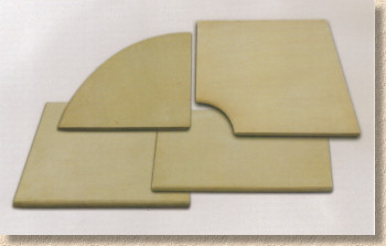
The thing about walls, especially the low walls often encountered within gardens, is they tend to be used as bum perches, and so a nice bull-nosed detail will considerably enhance the comfort factor. Now, all our wishes are fulfilled with a full complement of smoothed coping components. Internal and external corners along with single- and double-edged straight pieces allow any wall to be finished off with real style and elegance. I'm not sure if the copings are available in the four stone options provided as steps (Mint, Modak, York Green and Buff Brown) or whether it's just the York Green shown in the photies, but this addition to the range is a guaranteed winner.
Meanwhile, the parent range of Serenity Paving with its gently textured surface, is augmented by adding the increasingly popular York Green sandstone to the existing Buff Brown option. This range is one of those squarely targeted at the indoor/outdoor market, for those with the desire to have matching paving both in the kitchen and on the patio. How practical this is when you've a family and pets and limited time for cleaning is debatable, but I've seen it done to magnificent effect in what I call 'show homes' and it looks fantastic.
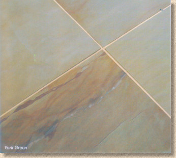
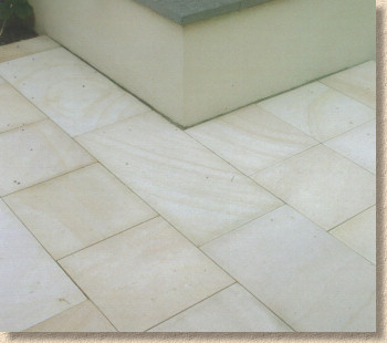
On the subject of indoor/outdoor paving, the super-smooth Mirage Sandstone range has also been extended to include the York Green sandstone, which, for some reason, is shown as a not very green example in the brochure. York Green is, normally, uncannily reminiscent of the bluey-greyey-buffy tones interspersed with iron veining that is found in some of the native Pennine stones, hence its success over the last two or three years, but for me, the swatch shown on page 35 isn't really representative. Maybe it's that one big piece of iron-rich stone that's distracting me.
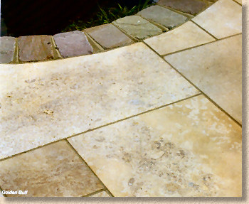
Before shuffling on to the next new entrant, a quick word about limestone paving: why isn't this used more widely? It's a far superior product to the Indian sandstone. It's tougher, it's easier to clean, it's less prone to colonisation by algae and lichens, and I think it's actually easier to lay because it's less prone to breakages. Yes, I know the so-called Black colour (sold as "Midnight" in the Global Stone Collection) fades to steel grey as soon as its exposed to a bit of strong sunlight, but the Kota Yellow/Brown ( Elegance , in the brochure) is colour-fast and a superbly complementary tone for almost any traditional garden. Next time you have a client unsure about which flagstone to use for their own patio, nudge them towards yellow/brown limestone – neither of you will be disappointed!
Anyway, on with the motley, and another limestone (sort of) is the final new flagstone in the Global Stone offering for 2011. Morning Mist is a blue-grey mottled marble (which is simply metamorphosed limestone according to my geology studies) available in 4 modular sizes, starting at a puny 200x200mm unit and climaxing with the not-much-bigger 400x600mm unit.
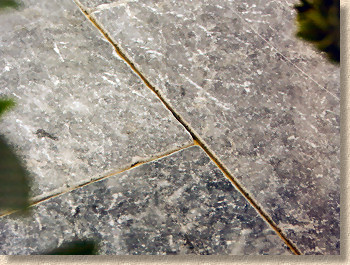
Although I've not seen the Morning Mist laid, I've seen something very similar and I thought it looked great when laid as a relatively narrow pathway beneath a verandah (and wonderfully cool for bare feet), but too busy when laid to a larger area. Maybe that design would have benefitted by being broken up by a contrasting paver, which would have allowed the smaller marble elements to really stand out, but if I say too much, the designer will know I'm talking about her and not invite me to view her next creation. Regardless, marble is gaining in popularity, especially amongst those looking for a more eastern Mediterranean flavour of patio and lifestyle, so this should be a valuable addition to the menu.
I have a reputation for disliking Travertine, and it should come as no surprise that my opinion has not changed (and probably never will) despite the claim on page 52 that the damned stuff has been used since Roman times, as though that gives it credibility. The Romans wiped their collective arses with a stick-mounted rag, but that doesn't mean we should be doing the same two thousand years later!
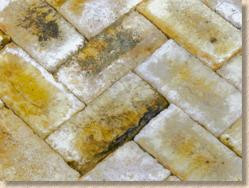
Last newbie for 2011 is a clay paver – Mellow Blend is what I would call a 'London' colour. It's that archetypal buff featured in most of the stock bricks used to build the city in the 19th century. Pale buffs, lemons, yellow ochres and occasional splashes of sooty black create an authentically aged looking paver that is bound to find favour in the southern regions, but should also be considered mre openly in the northern towns and cities where the mild, organic tones are a wonderful complement to the Pennine grits and sandstones.
Overall, this 2011 brochure represents a very competent and worthwhile collection, with all the tried and trusted bestsellers and enough innovation to keep it all fresh. The product range is generous but not top-heavy.
Good to see there's still a place for British stone in the Collection, even though it seems to have been reduced to a token offering of genuine York stone for this year. I know the Welsh Slate was (and is) frighteningly expensive and not the biggest seller, but I thought it was shrewd to include it within the overall collection, as a global brand should offer stone from the whole globe. There are other native stones that could be included in a truly global offering; Pennant Stone is almost as good as York (cue angry emails from the SW region of England) and Caithness Slate is one of Scotland's most beautiful paving materials. None of these can challenge the imported pavings in the current climate, but it is nice to see a British company helping promote British stone.
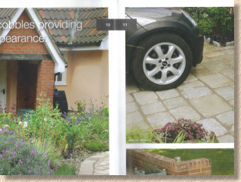
There are frequent references to other pages - for further information see pages 66-67, refer to sizing information on page 23, etc - but most of the pages have their essential numbering hidden away next to the central spine, making them awkward to spot and so it can be a bit of a task to locate just whereabouts in the brochure you need to be.
Overall, this is about as good an overview of the tastes and trends in natural stone paving for the British patio/driveway market as there could be. It's well presented with good photies, although a little additional descriptive text would help, especially with some of the newer products.
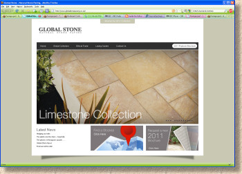
The Global Stone website has also been re-vamped to mirror the new Collection, and features one of the flip-book yokes that many suppliers are now favouring. While the clever technology that allows photies to whizz past without requiring the massive effort of clicking a mouse is all well and good, there is still plenty meat on the website, with good laying guides, a useful stockist locator, and info on the company's ethical trading policy. There's also a news section, but I can't get the links to work for me.
The brochure is an essential for anyone involved in designing or installing natural stone patios and driveways, and it will be an invaluable source of inspiration for homeowners. The website is a useful virtual slideshow but more content is needed to render it indispensible. This will surely come with time, but for now, there's nothing to beat the reassurance that great images on quality paper can give to a prospective client, and so you need to get your own copy if you're in any way serious about making a living from hard-landscaping in the residential market.
To order your own copy of the Global Stone 2011 Collection online, click here


