Chelsea 2011
Some Chelseas hit you in the face, and some worm their way into your consciousness without you realising. Some trigger a river of opinion and some leave you struggling for words. Chelsea 2011 is still something of a puzzle for me, even after five days of mulling over its impact on me after spending Press Day there on Monday last, and on the general public via the blanket coverage provided by Alan Pitchfork and his BBC flunkies.
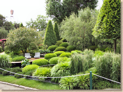
I don't feel qualified to comment on the horticultural aspects and impacts, and I know that readers of this site don't come here for the green stuff, but at the same time it's all but impossible to consider the hard-landscaping without giving some acknowledgement to the herbaceous backdrop. This is even more apparent when we have a show with virtually no new materials or techniques. Rather than it being sufficient to focus on what immediately captures your attention, you are forced to examine how well the chosen surfaces work within the overall setting.
There were two main types of paving on show this year: high-end natural stone or exposed aggregate cast in-situ concrete. No pressed or cast concrete flags (at least not on the show gardens), no cheap'n'cheerful " as seen on EBay " riven stone, no resin surfacing.
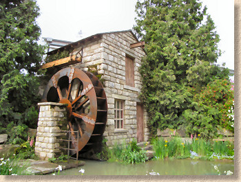
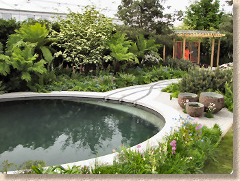
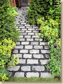
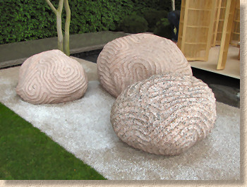
Looking at the stone, there was a mix of new and reclaimed, and by and large the provenance was selected to suit the garden style. So, we get precision cut and milled native silver granite on the modern Cornish Memories garden by Tom Hoblyn, while the nostalgic reconstructed water mill of the Hesco garden by Leeds City Council features well-chosen worn and weathered yorkstone street flags; reclaimed gritstone setts where the joints were filled with crystal black chippings evoking a sense of newly poured pitch grounded the Winds of Change garden firmly in the last century while the carved granite boulders and ironing-board smooth Portuguese limestone on the Laurent Perrier garden place it very much in the 21st century.
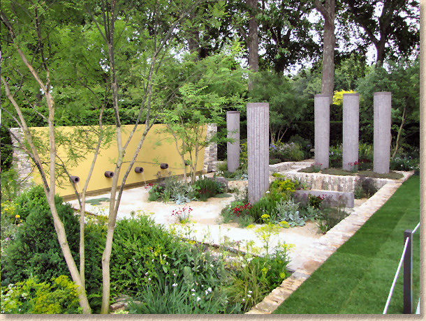
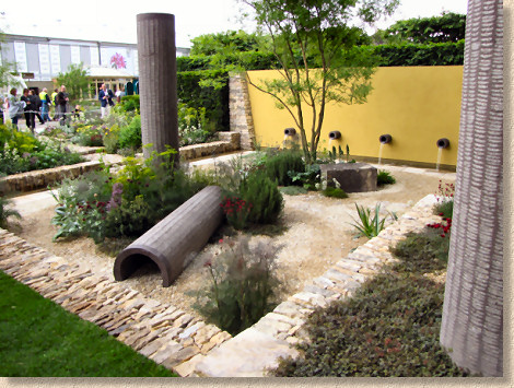
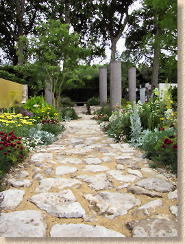
A couple of gardens mixed old and new with fantastic results. Cleve West rightly won a gold and best in show for his Daily Telegraph garden which featured chip-textured coloured concrete pipes echoing ancient Mediterranean columns set amidst low retainers of Cotswold limestone walling, rough crazy paving and creamy self-binding limestone pathways, with dreamy planting in silvers, whites, yellows and splats of deepest red. Smaller diameter outfall pipes punctured a soft yellow wall and emptied water into a shallow flagstone-edged ditch.
Meanwhile multi-medal winner Bunny Guinness used sawn and honed pieces of delicious cream-gold and blue-grey Clipsham oolitic limestone from Lincolnshire to form sills and steps defining boundaries around woven willow hurdles filled with veg and herbs in her garden for M&G which won just a silver-gilt due, allegedly, to the narrow paths which were felt to limit access and movement.
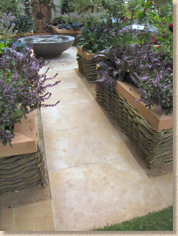
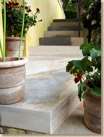
M&G garden by Bunny Guinness
Once the sun struggled through during the early afternoon, it persuaded a touch of efflorescence to make an appearance on the surface of the stone, which rather spoiled the look, but we all know that eff is temporary while class is permanent, and this stone just oozes class. It's not the hardest material and so tends not to be used for paving, but in light traffic applications such as a garden, its longevity shouldn't be too much of a problem.
The Cancer Research Garden is one of those that 'tells a story', a description that usually urges me to steer well clear, but if you ignore the metaphors, it's actually a delightful depiction of a coastal transition, from gravelly foreshore and tough salt-tolerant planting such as Thrift and Sea Kale, via reclaimed deck planking through to feathery Tamarisk trees, a wonderful driftwood inspired carved oak bench and a shady slatted summerhouse set atop a gorgeous flight of orange-tan sandstone steps.
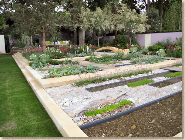
I couldn't take to The Times garden, and it seems the Judges were of a similar opinion, parting only with a sparse Silver medal. A big wasp's nest-like summerhouse structure with dark grey gravel paths edged with light-coloured timbers of various widths and criss-crossed with the same to maintain the social insect theme, but it all looked unfinished, and, even for me, there was too much hard-surfacing and not enough of the green stuff.
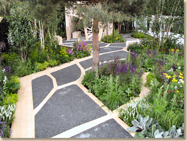
James Wong's Malaysian Garden was just the opposite: almost no paving but a slice of jungle air-lifted into West London. There was masonry, in the form of a stunning water drop and a slatted summerhouse, but it was all overwhelmed by the rich tropical surround complete with Hollywood-esque taped jungle soundtrack emanating from hidden speakers. It may well have been a fantastic garden, but for me, it was too reminiscent of the sort of 'habitat' they create in zoos in an attempt to con the public and the penned-in animals that it's not a cold grey day outside.
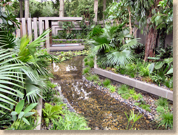
Diarmuid Gavin returned to exhibiting at Chelsea with a completely over-the-top entry that required a 25m crane to lift a planted-up steel gondola over the Irish Sky Garden. The planting looked great from a ground level viewpoint, but despite spending almost an hour trying to make sense of it all, it seemed that the only place from where the garden could be genuinely appreciated was that suspended hanging basket, and entry to that was strictly limited to favoured media types, wandering zelebrities and chums of the sponsors, so the rest of us had to rely on the images on the telly later in the evening. I had sorely wanted to like this garden, feeling that it was partly my patriotic duty, but also a sense that the horticultural world needs maverick talents such as Gavin's. However, built as it was onto a rising bank, much of it could not be seen from the low-level path so just how it won the People's Choice is beyond me.


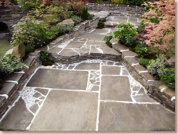
Ishihara Kazayuki recreated a gorgeous Japanese garden, with a stepped pathway formed from roughly rectangular dark grey sandstone flags pieced in with small panels of crazy-paving and small pebbles, all set into a white mortar, which gives excellent contrast, but white mortar never, ever remains white in the garden, not unless it's washed clean on a daily basis.
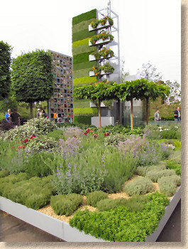
The B&Q garden promoted a sound ecological and environmental agenda, but what paving there was lacked any real presence, except for when it was adorned by some perma-smiling actress flogging her book on how to have the perfect life. I'm guessing that there's slightly more to it than simply having a disgustingly fat bank account and being wed to a multi-million selling pop/rock singist. A main path of sawn and honed sandstone square-cut flags was almost devoid of character and it struck me that, if the message is self-sufficiency and all things green, wouldn't reclaimed stone have been a better option?
I particularly liked the use of salvaged granite kerbs as transverse stepping stones in the New Wild Garden garden. It gave a fantastic orthogonal alignment to contrast against the circular overspill water storage ponds of this purpose designed rain garden. Interplanted with soft herbs and drought-tolerant thymes, there was just sufficient texture remaining on the ancient kerbs to confirm their natural origin without presenting too much of a pedestrian challenge. This garden also featured very tasteful standalone dry stone walls with inbuilt bug hideaways, which always seems such a wonderful and environmentally friendly idea until said bugs emerge en masse to feed on your exposed limbs and face.
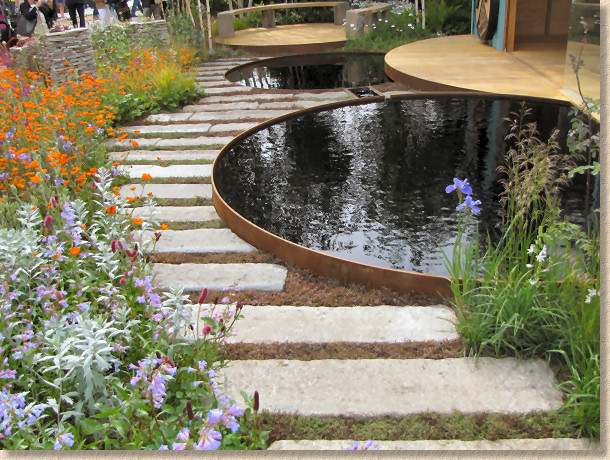
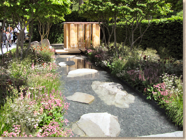
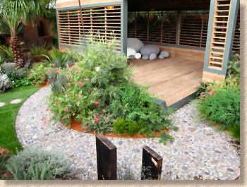
Rough hewn stone as architectural statements within the gardens were represented by the semi-submerged flattish boulders in the rectangular water feature of the Laurent Perrier garden, where they contrasted sharply with the sawn 40mm wide oak staves used to create the deck separating the wooden open style gazebo and formal area from the more rugged part of the garden.
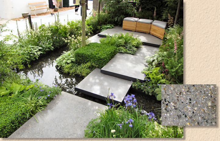
Two gardens in particular showed off the possibilities for exposed aggregate concrete. The subtle charcoal grey stepped blocks of the Land's End Across The Pond garden appeared to hover amongst the planting and it took a trained eye to spot the clever, underplayed use of the concrete in this Frank Lloyd Wright inspired garden.
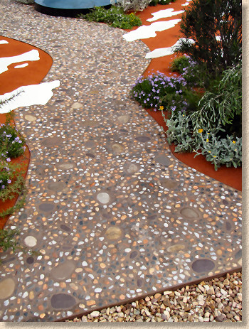
Meanwhile it was virtually impossible to miss the red-tinged dry river bed which wound through the Melbourne Royal Botanic Gardens Australian garden. This was a near-perfect execution of the art of using surface-dressed exposed aggregate concrete, with pale quartz pebbles with larger feature flattish cobbles set amidst a matrix of reddy-brown mortar and then given a judicious wash-down with acid to remove any trace of cement bloom and enhance the contrast between aggregate and matrix.
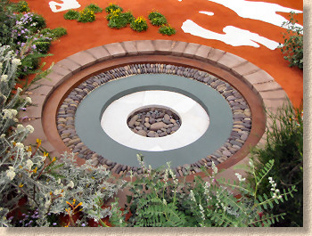
The "Outback" feel was augmented by the use of swathes of striking burnt orange spray-on sand texture to wave-patterned walls and larger horizontal surfaces with flashes of white salt deposits and a boomerang-shaped azure pool. A superbly detailed circular sink-hole was spoiled somewhat by tatty taper-cutting of the edge course stones, which stood out mainly because of the excellent detailing everywhere else in the garden. The deep pink sandstone chimney forms a stunning focal point amidst the sparse, silver-green planting.
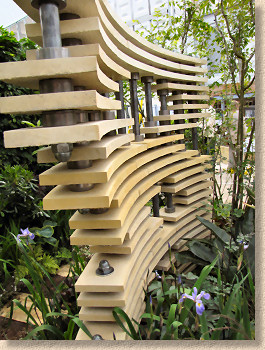
One of the very few gardens to use what we might consider to be more traditional cast concrete was Chris Beardshaw's Bradstone Fusion garden as designed by Maria Luisa Medina as part of the mentoring scheme. This was a garden that genuinely fascinated me because it had that essential element: the more you looked, the more you saw. Dominating the garden are two curved vertical walls formed using stacked but spaced concrete layers, which provide an intriguing and varying pattern of shade that changes as the sun moves across the sky. The concrete castings were purpose made for this project, using the new Cloisters moulds which are based on actual Blue Lias stone from Somerset, and prepared in five subtle tone variations with the holes for the vertical steel pillars formed within the castings. These are then set off against dense, intricate planting and further delicate cast pieces strewn throughout the garden.
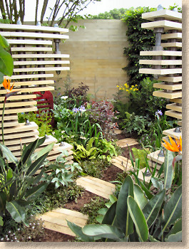
The same Cloister stone is used to create the walling to the rear of the garden as well as the stepping stones that wind through the garden, emphasising the versatility of concrete as a material and the Cloister product as an ideal hard-landscaping product for the entire garden.
The Chris Beardshaw mentoring scheme has been running for a few years now and is really beginning to have results. Mentored designers from previous years are now showing their own gardens at Chelsea, evidence of the value and effectiveness of the scheme as a whole.
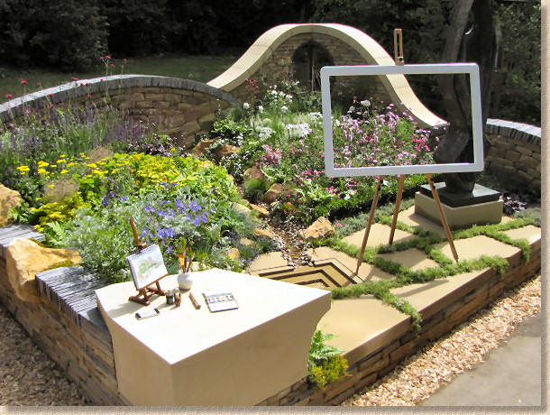
The small gardens, previously labelled as "Courtyard Gardens" were this year subdivided into two new categories: Urban and Artisan. The Urban group were largely in keeping with what we might expect from a small but stylish back garden in any of our towns and cities, while the Artisan Gardens were more esoteric, more of a reflection on what might have been. I found it harder to relate to these Artisan gardens. Yes: they were clever and authentic but I kept asking myself what could be taken from them and adapted for use in an everyday garden. The sole exception, and as one raised in Lancashire it pains me to say this, was the "Art of Yorkshire" garden which was a celebration of yorkstone in all its forms. Pitch-faced walling, sawn six sides paving, rough blocks and honed quoins – just about everything. A truly worthy winner of the People's Choice Award.
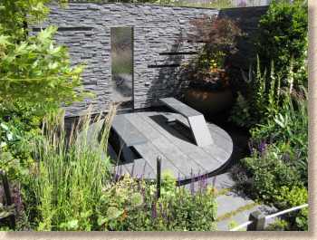
The Power Of Nature was an Urban garden said to illustrate the potential for renewables. I struggled to see that, but I was impressed by the effective use of slate to create an unmissably rugged backdrop and two gravity defying dark slate benches that seemed to have been prised out of the circular slate patio beneath. Very impressive, but I worry about how hot those perches will be on bare legs when we have a sunny spell.
And on the subject of renewable greeny eco-vironmental stuff, the RHS chose Press Day as the ideal moment to launch its latest salvo in the long-running war against urbanisation. A respectable scientific review paper was presented by Dr. Tijana Blanusa and Dr Roger Williams, Head of RHS Science, which claims to show that gardens bring major benefits to both the built and the human environment.
The good doctors had identified four major areas where gardens provided both tangible and intangible benefits: urban heat reduction, flood management and control, enhancing bio-diversity and human health and happiness.
There's nothing here that's revolutionary or stunningly new. Many of us have been aware of much of this for most of our lives, but there's no harm in seeing it all made to stand up straight and proper. I can't help feeling, though, that sometimes the RHS prosecutes its anti-paving message with a little too much relish. The last time they rattled their water-butts in the cause of that London being paved over because folk needed somewhere to park outside the house, we ended up with the ridiculous 'permeable driveways' legislation, which was amongst the most crass and ineffective pieces of legislation drafted by the previous government, and that includes the il-fated oil-seeking sorties in the Middle East.
Humanity need gardens, but we also need paving and infrastructure. Growing our own food is a perfectly sound message, but being able to get to your front door, to the shops, or to your place of employment without having to wear waders is a reasonable expectation too. It's about balance. Landscapes work best when there's an equilibrium between the hard and the soft, and that applies equally to small back gardens, to urban plazas and to commercial shopping malls. Too much of one or the other does none of us any good. By all means promote urban cooling and source control of surface water, but don't kid yourselves that horticulture alone can be the answer to all of humanity's problems.
Also, there was no significant presence from any of the national paving and hard-landscaping manufacturers. Bradstone sponsored the small urban garden mentioned above, and Marshalls had unlabelled product here, there and everywhere, but it's a long way from the heady days of a few years back when at least three of our bigger companies would be jostling for attention. That strikes me as the pendulum swinging too far in the opposite direction. As I've said before, a garden without paving isn't a garden: it's a field. Gardens need paving and Chelsea needs the paving industry to show what we can bring to the party.


