Chelsea 2012
Most years, a review of the hard-landscaping used at Chelsea almost flows unaided from the fingertips with consummate ease. Some years, I have the piece written in my head before the train back from that London lumbers into Bank Quay Station, but this year….well this year it has been a chore. Just marshalling thoughts and opinions and suggestions has been a major task that has already taken the best part of a week, and I'm not sure I'm any clearer now.
This haziness stems not from the gardens on show, nor from the event as a whole, but from the shocking discovery that almost every garden of any significance had used limestone as the dominant hard-landscaping material. Different types of limestone, granted, and in differing formats, but British and European limestone was everywhere!
We've had years at Chelsea where a particular material suddenly becomes popular and we see three of four garden using it in some form or other. In 2008, it was the lovely Vande Moortel Clay Pavers from Belgium that adorned several gardens, and a decade or so ago, we had the Indian Sandstone Blight, when every designer in the land seemed to go made with the stuff that has now become almost the stone-cladding of the 21st century. But for almost every big Show Garden along Main Avenue to feature the same material is unheard of, at least in my many years of making a nuisance of meself at Chelsea.
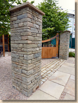
It started with the very first garden, the Brewin Dolphin Garden, designed by Cleve West, which went on to win a deserved Gold Medal and "Best in Show" from the RHS judges. To crassly oversimplify the garden, this was essentially a limestone flagged footpath flanked by a small rill to each side, leading between a pair of limestone pillars with limestone pier caps and on to a scarily vaginal-looking structure comprising a huge slab of limestone erected vertically and backed by a dry-stone effect limestone wall, with a generous expanse of reclaimed granite sett paving in front. There's the inevitable greenery and some staddle stone-like yew topiary obstructing the view, with a beech hedge creating a backdrop and border to the adjacent plot, but for me, it's the limestone that dominates.
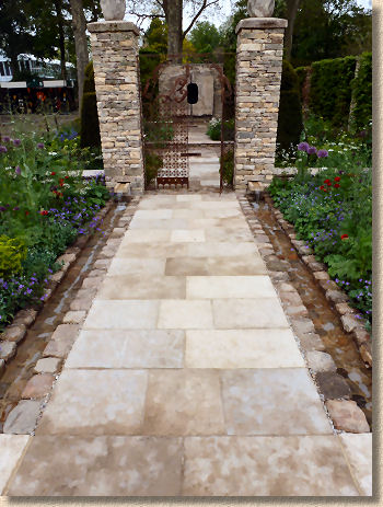
On this garden, it was actually a French limestone, but sourced by a supplier in Gloucestershire, apparently. The flagstones had a gentle surface which had been lightly tickled with a bush hammer to leave the unmistakeable pattern of the dolly points in the stone.
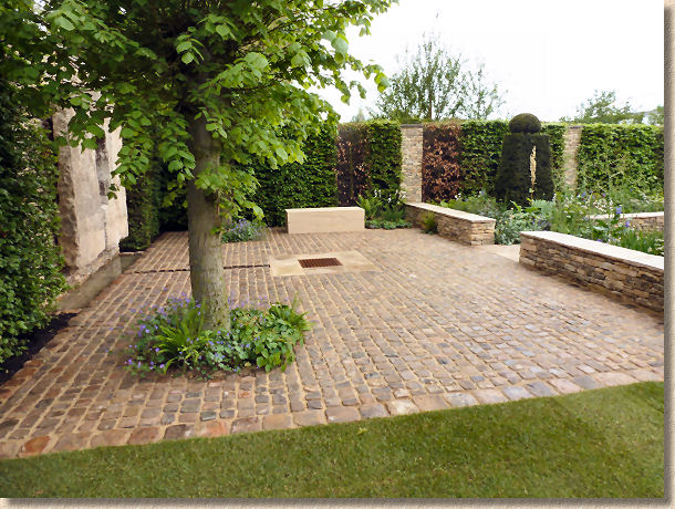
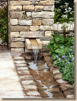
Meanwhile, the reclaimed setts seem to have been pointed using a lime, or at least a lime-coloured, mortar, but there was no-one available to confirm this. As ever, many of the designers and their support staff look aghast when you want to talk hard-landscaping. They are much more interested in blubbering-out Latin names and suggestions for companion plants. The fact that anyone might actually be interested in the stone seems to disappoint them slightly
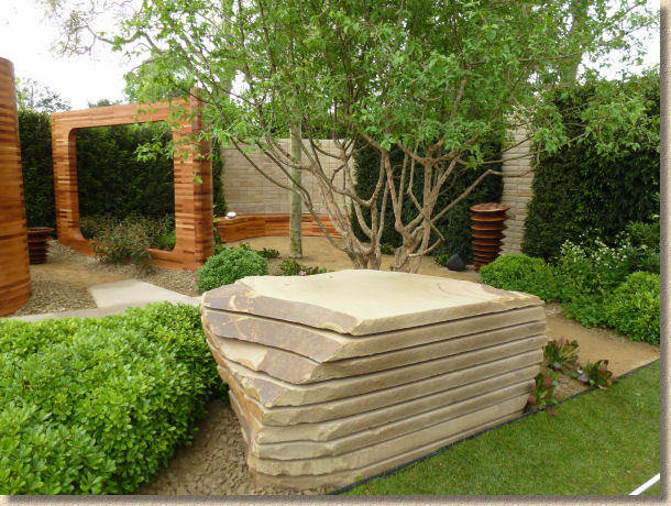
Next door, some-time TV presenter Joe Swift had created a garden for Homebase and the Teenage Cancer Trust which broke the trend by using sandstone, the delightfully creamy sandstone that hails from the Woodkirk Quarry on the outskirts of Leeds. This was used as sawn-six sides flagstone to create an arrow-straight path crossing small ponds and passing through giant cedar picture frames, and culminating in an informal seating area with quarry waste as ground cover, and regularly-sized blocks of the yorkstone constructed as a stackbond screen wall. And to emphasis the quarry-like nature of parts of the garden, huge blocks of freshly-quarried stone sliced into scants as though ready for final trimming into flagstone, although the spacing was created by the very clever insertion of spacers rather than leaving an unsawn stub at the base of the boulder.
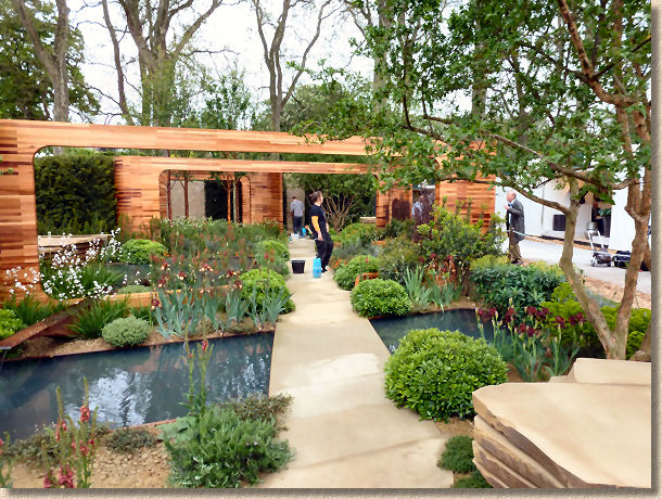
Another Gold Medal, which I hadn't really expected. This garden was, for me, a vision of how a redundant yorkstone quarry might be rescued and annexted into a modern garden, and as such, I thought the pre-dominance of stone and the wood might nudge the notoriously anti-hardscape judges into down-marking the overall effort, so it came a genuinely pleasant surprise to learn, on the Tuesday, that the garden had been given the Gold I felt is richly deserved, and it came second in the slightly anarchic People's Choice awards, too.
Next along was the Arthritis Research Garden designed by Thomas Hoblyn. It seemed that there was always something going on with this garden which prevented me getting a good look until well after dinnertime. At the first attempted view, the judges were deliberating, and so to prevent me or another representative of the hoi polloi having any undue influence on their marking, we got moved along by a rather unthreatening security wallah holding a piece of blue rope for reasons which completely escaped me .
A couple of hours later, and some alleged TV Talent Show clone is caterwauling along to a string quartet for reasons that never really became clear (not that I searched too hard!), and so I trudged on once more, gave my attention to the Artisan Gardens, of which more later, and then returned once I was fairly confident the racket had been brought to a timely end.
So: was it worth the wait? Well, it seemed to please most people because it won the People's Choice Award. It was a sunken garden which, to my limited knowledge and experience, seemed very French, what with all that creamy limestone, marble and travertine, with lavender in the planter beds and great dollops of symmetry everywhere, but the blurb says it's Italian influenced, which must mean them bloody great thin cypresses at the back.
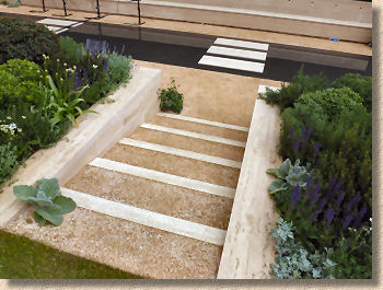
Very calm and very cooling, it's the sort of garden that almost compels you to park yer arse and watch it exist, which is no bad thing, but it was also very clean, and, as the sun was quite high at the time I got a proper look, it was a very bright, almost glaring garden, which benefitted from the partial shading provided by the existing large trees at the back and the clipped box and conifers that formed the boundary to the right.
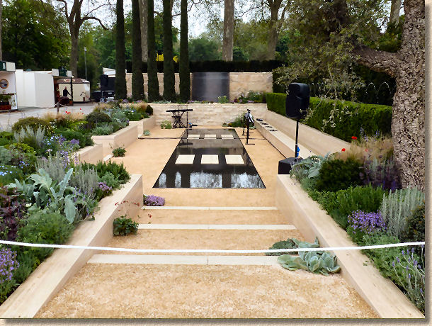
And on the other side of that boundary lay a garden that could have been a brother, or a cousin at the very least. The M&G Investments' Garden, designed this year by Andy Sturgeon, echoed many of the themes and tastes established in its neighbour, with creamy walls, changes in level and all that green stuff. The main pathway was limestone, yet again, this time a sawn six sides Purbeck limestone from the Lovell quarries in deepest Dorset from which descended a flight of deep bulky steps down to the edge of a dark pool and extended into a discreet walled area, formed using chunky blocks of the limestone laid in stack bond (again) with variously-sized black circles painted onto the surface, giving a sort of Travertine-like look (why, for God's sake??)
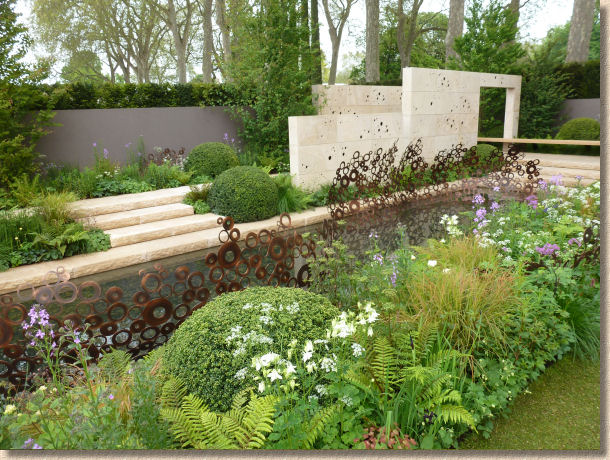
The paving extended as a generously deep coping around the rectangular pool which was adorned with what looked like a series of big copper washers welded together as a sort of curvy mesh. For a garden that proclaimed itself to be "Simple in form, without superfluous ornamentation", there was quite a bit of ornamentation that some might consider to be superfluous.
Another cool, calm, and reflective garden. The bold chunkiness of the steps and the copings and the walling blocks formed an impressive skeleton onto which could be hung the drapery of the sensuous planting which was pale, dreamy and punctuated by simple hummocks of Box topiary.
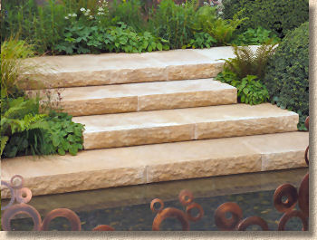
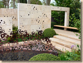
As already said, the stone was bold, and maybe this was too much for those bothersome judges gave it only a Silver Gilt and it didn't feature at all in the People's Choice: is it yet another case of the Main Sponsor Curse? Remember when Marshalls couldn't win a Gold during their sponsorship of the show? Has the unlucky baton been passed on to current sponsor M&G, or is it just because they are bankers?
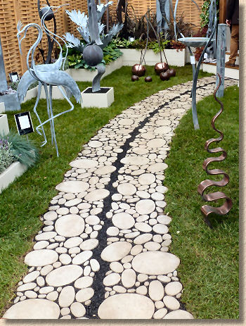
Laurent-Perrier are another down-at-heel brand that somehow manage to cobble together a couple of sixpences each year to pay for a garden at Chelsea, and this year, their hired-in designer, none other than Arne Maynard, created what was possibly the most interesting path at the event. The whole right hand side of his long plot was dominated by an exquisite white-quartz cobble path, which led down between a parade of pleached copper beeches to the obligatory secret corner with a statuary focal point stood atop a limestone pillar and a back wall of massive ashlar limestone blocks. One of the guides revealed that in this garden, the limestone hails from Lincolnshire and is a "Jurassic Malt" which is a new one on me. Looks quite gritty, and I personally suspected there was more than one type of limestone here, but I can't be sure, and in the absence of any other info, I'll just have to accept this "Malt" allegation.
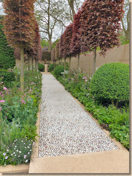
The cobble path was the hard-landscape highlight of the garden, if not the whole show. Those lovely rounded cobbles just begged to be walked across in bare feet, and the inclusion of the occasional pink stone prevented it becoming too homogenous and helped emphasise the natural origin of the paving. Laying small cobbles, barely bigger than pebbles, and keeping them clean and free of mortar is a demanding skill; to do it with white stone is verging into the realms of art. I'm not qualified to speak about the planting and the inevitable topiary, but this garden deserved its Gold Medal for that path alone.
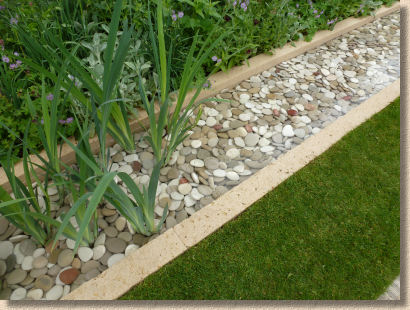
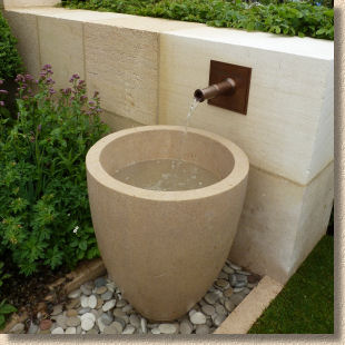
I had a huge problem with the Daily Telegraph garden designed by Sarah Price. This was another plot to which I returned time and again in an attempt to figure out what it was, exactly, that was disturbing me so much, and after the fourth or fifth visit, it struck me: it's those bloody ugly blocks of limestone sat at the water's edge.
They were just so incongruous, with the jumble of riven and sawn sides, odd angles, variously-sized gaps and the whole disparity of it all. The blurb says inspiration was drawn from Dartmoor and North Wales, places not primarily known for their creamy limestones, but here we have monster blocks of Chilmark limestone from Wessex.
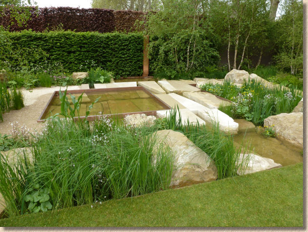
The yet-again dead straight path leading through the garden used limestone waste punctured by grasses and irises, but restrained by rusty steel edgings, leading to a central square pond with the same edging, which was surrounded by limestone boulders weight several tonnes, by partly-sawn deep scants, and sawn-six-sides pieces lying in the water. It was just untidy.
I wondered whether it was an attempt to echo an abandoned quarry, and idea seen earlier in Joe Swift's garden, which managed the idea much more effectively and convincingly. Here, the stone was too good to be a waste product, but would never be sawn to such strange angles other than by special request. The unconformity between natural and sawn edges is standard when preparing stone, but to have some blocks sawn-face up and others presenting their natural split face, combined with the non-orthogonal angles and the changes in angle within a block was disconcerting for someone trained as a streetmason and more accustomed to seeing stone worked as efficiently as possible.
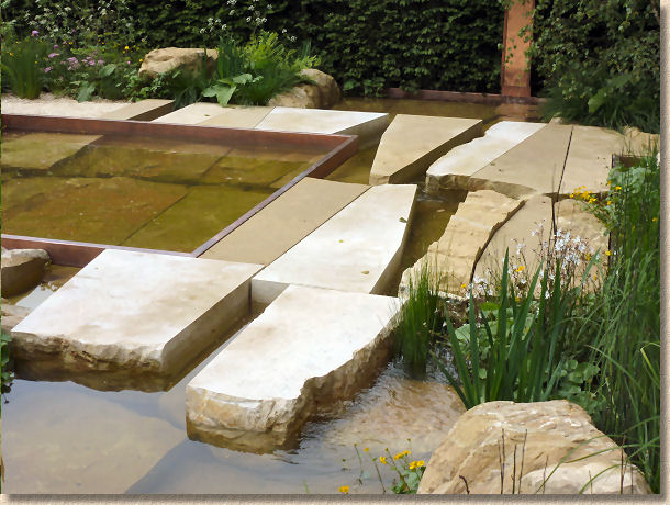
In fact, the effect was so upsetting, the rest of the garden is a blur. The photos tells me there was naturalistic planting, vaguely reminiscent of a worked-out quarry returning to nature, but all my eyes could see was those god-awful blocks of stone. What a waste! If proof were ever needed that the RHS judges don't understand hard-landscaping, the fact that this stone dump won a Gold Medal is one of the best pieces of evidence for their myopia I've seen in recent years.
The final big Show Garden on this side of Main Avenue was the RBC Blue Water Garden, designed by Professor Nigel Dunnet, who looks remarkably like a lad in my class at school 40 years ago, and put together by Mark Gregory and his Landfrom Consultants , who seem to excel themselves with each passing year. I did mention to Mark that I thought this was a restrained garden for him, and he look shocked, or even offended, so I must have chosen my words poorly. It is a very peaceful and subtle garden, rather than the bold designs he's worked with in recent years. I do hope he didn't take offence because it was intended as a compliment, that I felt he was showing a new side to his undoubted talents.
Anyway, the garden is a showcase for urban rainwater management, says the guide book, and once you start to explore how each part works, the ingenuity and design start to blow your mind. However, all the environmental credentials in the world mean little unless it looks right, and boy! does this garden look right!
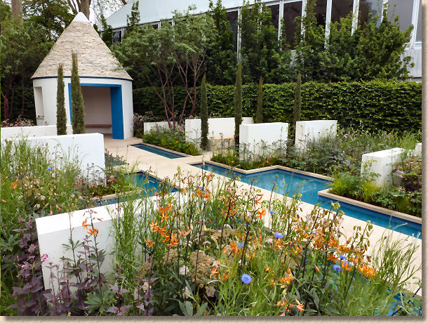
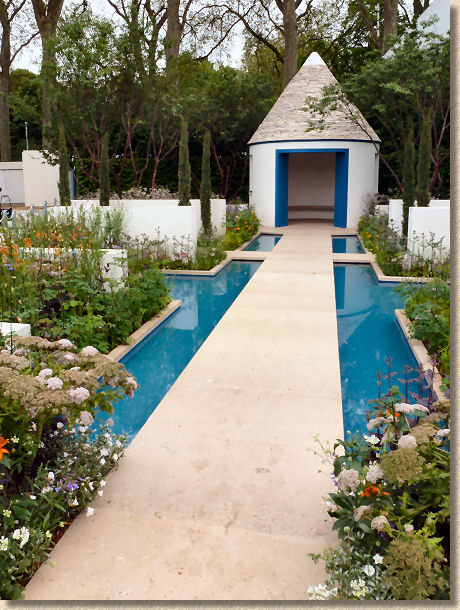
There's the now mandatory straight path, but this one runs almost along the diagonal, with impressive slabs of sawn fossiliferous Portland limestone running through a rectilinear turquoise pool that looked so cooling on a warm day, with the eye being drawn along the path to a round summerhouse, apparently referred to as a Trulli, with rendered walls and a corbelled roof built using 15 tonnes of Purbeck limestone.
Within the creamy rendered dwarf walls, lay swales for water management, pencil cypresses and box-shaped Box topiary with rich planting and multiple views, thanks largely to the cross path running at right angles to the main drag.
I felt this was a lovely, balanced work. It would have been easy to go mad with the limestone and use it for the dwarf walls, but by opting for a simple render, the walls don't demand attention, but instead provide a simple canvas-like backdrop for the planting whilst simultaneously punctuating the garden into distinctive and manageable sections, creating order and alignment to the whole.
I wish I could have got a close-up view of that roof, especially from inside. It looked like the sort of hidey-hole where I would be content to look out on the garden and just enjoy the world passing by. Silver-Gilt seems a little parsimonious, especially when you consider that the ugly stone next door walked away with Gold.
Down at the bottom of the site was Diarmuid Gavin's monument to scaffolding dubbed as the Westland Magical Garden. Seven storeys of mock Hanging Gardens of Babylon – how appropriate for an event largely funded by the allegedly cash-strapped finance industry!
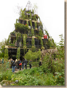
Sorry, but I thought this was utter bollocks. No-one in their right mind wants a load of scaffolding in their garden; you'd never get planning permission; the neighbours would be up in arms; the interior was too dark to support plant life, and the whole thing is one gigantic gimmick.
And maybe that was the point. Every Chelsea needs a talking point, and over the last few years, the RHS seems to have relied on the so-called lovable cheeky Irishman with the twinkle in his eye to create something bloody stupid and impractical, but guaranteed to get coverage in the press.
Giving him a Silver-Gilt might help rein in the madness next year. We can only hope!
Working back up the other side of Main Avenue, and I'm ashamed to admit that I found it hard to see the Chris Beardshaw designed Furzey Garden, which won a Gold, because there seemed to be a constant crowd in front of it. The few glimpses I managed suggested it was a plant-heavy creation, which is Chris's trademark, with a ramshackle wooden building with a thatched roof in the background reached via a path of what looked like warped sleepers.
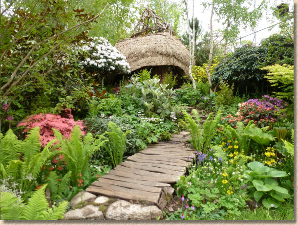
Similarly with The L'Occitane Imortelle , which I couldn't get near despite three attempts. The path is slightly narrower here, which limits good photo opportunities, but when you then add in the non-stop circus going on at Mr Gavin's folly next door but one, and the obscene crush becomes slightly more understandable.
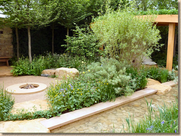
The Lands' End Garden by Adam Frost hedged his bets by using sandstone in amongst the limestone. A long, rectangular pool fronted the garden, with sawn limestone copings disrupted by boulders of gritty sandstone which acted as a sort of stepping stone crossing and looked fantastic. In the background, limestone rubble had been used to create dry-stone walls and partial support for an oak gazebo with a green roof of some description.
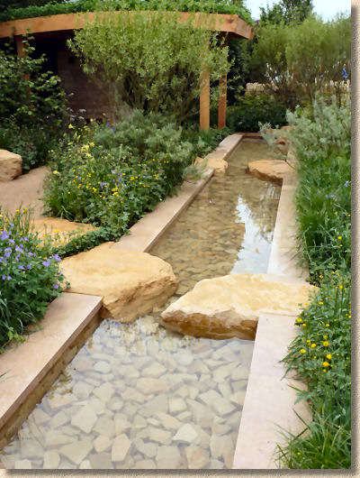
I loved the contrast between the stone in this garden. Both the sandstone and the limestone draw on a warm honey-tinged palette but the texture was used to emphasise the differences, and the juxtaposition of craggy sandstone boulders piercing the smooth limestone copings was a triumph, and then when you begin to absorb the other touches, the partially hidden walls, the quarry waste pathways, the smooth stone firepit and the bum-perfect boulders around it, the whole thing begins to sing.
This was the epitome of an achievable garden, packed with clever touches and sensuous planting, and fully deserving of the Gold Medal it was awarded.
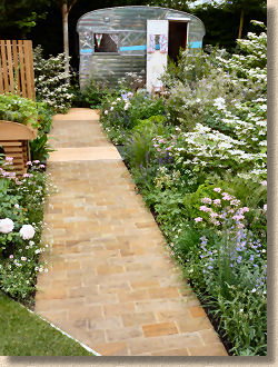
I'll really should recuse myself from commenting on the Celebration of Caravanning garden on the grounds that they are a flaming nuisance on the roads. I've just had a couple of days on my Triumph exploring the highways and by-ways of North Lancashire, North Yorkshire and the Lakes, and these bloody tin boxes on wheels seemed to be doing their best to ruin it for me. The sooner I'm allowed to fit rocket-propelled grenades to my bike, the better!
And so they had a nice bit of sandstone sett paving ruined by having an aluminium shed-on-wheelsat the bottom of the garden. I'm not sure where the stone came from, as no-one on the stand seemed to know. It looked very Pennine-like, possibly East Lancashire or even up Cleveland way, with that strong iron colouring, and the setts themselves had a lovely deckle arris. Close-jointed and filled with sand, the surface is riven, but that would round-off pretty soon if it was actually used as a pavement.
And finally on Main Avenue, The Wold Vision Garden which seemed to be mainly tree ferns and segments of concrete painted black encircling a central pool. Sorry, but it just did nothing for me. If a garden excites me, that's a pleasure, and even if a garden annoys me, such as the paean to scaffolding mentioned previously, at least it evoked a response. This did nothing. I didn't like it; I didn't dislike it. It just existed.
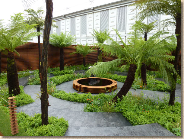
Maybe if they'd done something more creative with the paving, even something simple like an exposed concrete, I would have found something to stir the emotions, but plain, painted concrete? It might as well have been the floor of my local MOT garage.
So, on to Royal Hospital Way with just two show gardens: the usual Trailfinders' Australian Extravaganza on the coveted corner plot, which is always gorgeous to look at but is essentially one big advert for the cushy life they want you to think everyone enjoys over there. It's luscious, it's exotic, it's perfectly executed, it has the furniture, the hot-tub, the al fresco dining, but do we really need bikini-clad dolly birds in the 21st Century?
The saving grace was a lovely....you guessed it....limestone block wall tucked away at the back.
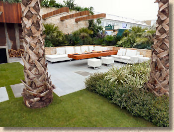
And so finally for the Show Gardens, the Rooftop Workplace of Tomorrow which I honestly thought was a trade stand flogging furniture. It was only when reading up on the guide book while riding home on the train that I realised this was a serious entry in the competition. It actually won a Silver Medal, which means the judges must have been able to look beyond the terribly trendy and chic tables, chairs, pouffes and benches and see something that is allegedly a garden. Sadly, I couldn't, and I couldn't see any hard-landscaping, if you discount the hardwood decking.
Well, we're over the 3,000 word mark and so I'd better restrict myself to summary comments on the small gardens or we'll be here all day. I do want to mention the Bradstone Panache Garden not merely because it's one of the few gardens sponsored or supported by a hard-landscaping company, but primarily because of the excellent work that is done by the Chris Beardshaw Mentoring Scholarship, which year-on-year, supports up and coming young designers and gives them a genuine leg-up into the world of garden and landscape design. The gardens which regularly appear at RHS Shows throughout the country are never less than intriguing and should never be missed, as they often feature nifty ideas from bright, fresh minds.
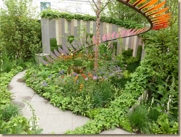
This year, Caroline Butler created an intensely imaginative small garden, rich in planting as you'd expect from anyone being mentored by the excellent Mr Beardshaw, but with a very, very clever use of simple edging kerbs to create a stunning backdrop. By taking three colours of the Panache textured edging kerbs from Bradstone's standard range, Caroline was able to form a sinuous curving wall as a foil to the colourful planting. This was balanced by a serpentine steel and coloured Perspex structure wafting above head height. Very tasteful, very lovely, and very imaginative, I thought it deserved a little more than a Silver.
Global Stone had supported designer Ben Wincott to create a modern garden using custom-cut imported stone to form the trapezoidal paving and the faux-ashlar walling, into which was set a series of lush nest-like seats, surrounded by deep green planting. I couldn't decide whether I liked the stone or not. The paving was interesting, but the odd angles and the homogenous cream colouring made me think of decorative concrete, which it most definitely is not, and the walling looked false, with false joints suggesting random stonework etched into the individual blocks, which were then separated by dead straight vertical joints.
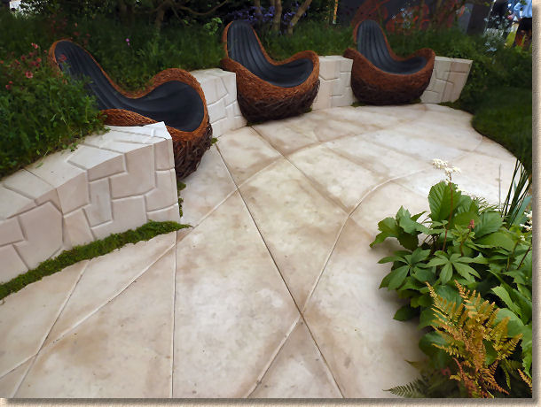
As an idea, it's thought-provoking and opens genuinely new territory, but this might not be the right stone. The pale colour and deep joints of the paving will require a good deal of maintenance, and the walling just doesn't ring true to me eye. I can see it working better with, say, a darker granite, or if there was a contrast between walling and paving. A bronze is about right, I felt, but it should be viewed as positive encouragement. There is potential in this concept: it just needs tweaking somehow.
Finally, a brief mention for a couple of the Artisan Gardens which are little jewels hidden away from the busiest part of the Chelsea site. Nearly all of these deserve more coverage than I can give here, and they are often better than the big gardens which inevitably attract most attention, but Satoyama Life by Japanese design Laboratory, Ishihara Kazayuki, was a masterpiece of rural Japanese life before the Toyotas and Panasonics took over. A garden you could happily watch for hours.
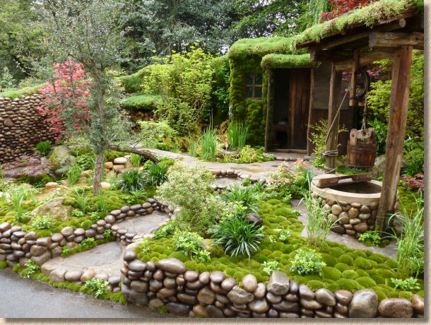
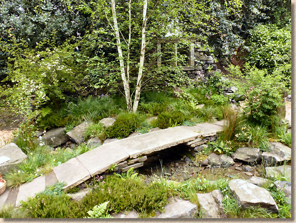
And as much as it pays an adopted son of Lancashire, the Brontes Yorkshire Garden could have been plucked straight from the cloughs that surround Haworth. It was almost too perfect a re-creation of a very characteristic and unique landscape, with weathered gritstone, grasses, sedges and ferns, the little clapper bridge and the tumbledown cottage. Superb and like the Japanese Garden before it, well worth the Gold they both won.
So, to sum up Chelsea 2012, the big story was limestone and topiary. I'm not sure how so many designers alight upon the same combination independently. They all claim it is serendipity that brings about these events, but there must be more to it than that. Surely they casually mention to each other that they were down in Dorset looking at limestone, or had been re-assessing the role of classic geometric topiary in garden design, but however it comes about, when you see so much of the same idea, it does tend to dilute the overall impact. Consequently, only the really striking uses will remain in the memory, and for me, that would be Cleve Wests' evocation of something sinister beyond the gates, and Mark Gregory's corbelled roof will make me smile for many months to come.
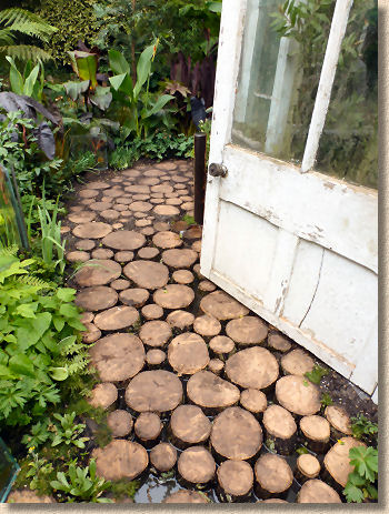
Overall, I'm not sure this will be remembered as a classic year, and that's primarily due to the lack of variety, for which the organisers must bear some responsibility. They selected gardens knowing full well that so many were using the same palette. Looking beyond the Show Gardens, the Artisan Gardens were as strong as ever, and the Fresh Gardens were a nice twist on the Courtyard theme but a number of them were technically weak.
Still, after years of me banging on about how British designers have underused limestone, both the native stuff of which we have an embarrassment of choice, and the excellent and affordable imports from Kota and elsewhere. Hopefully, all the problems with black limestone will pass as a fad, and we'll begin to see more creative use of what is, in the right setting, one of the best hard-landscaping materials known to man.
