Tatton 2006:Paving, plants & perspiration
The grandest garden show in the north of England is over for another year and despite its proximity to the clichéd rainy city of Manchester, for the first time in living memory, there wasn't a drop of rain from start to finish. In fact, on the Friday of my visit, parasols and Pimms seemed to be the biggest sellers of the day, as temperatures stewed at an uncomfortable 90+ degrees.
This year boasted the largest number of display gardens in the show's history. The small back-to-back gardens that cover 16m² or so would not be out of place in many of the homes found throughout these islands, as they tend to be "achievable", whereas the "If I ever won the lottery…" gardens that encircle the now legendary Egerton Clump are more "aspirational", although a handful of this year's entries are far more realisable than some that have graced this wooded knoll over the past decade.
Although I'm a keen amateur gardener, and could bore you rigid by reviewing the gardens from a horticulturalist's viewpoint, the few days that have passed since my visit, have been spent mulling over and mentally re-counting what was seen and what made most impact upon me. My abiding memory is of some bloody appalling paving work. There was some good work on display, and there were a handful of displays of superior quality, which I'll come to shortly, but far too much of what was on show was lamentable. I did wonder whether I should give Knutsford Trading Standards a call and let them know that some cowboys have been peddling their dubious talents around the Mere end of town!
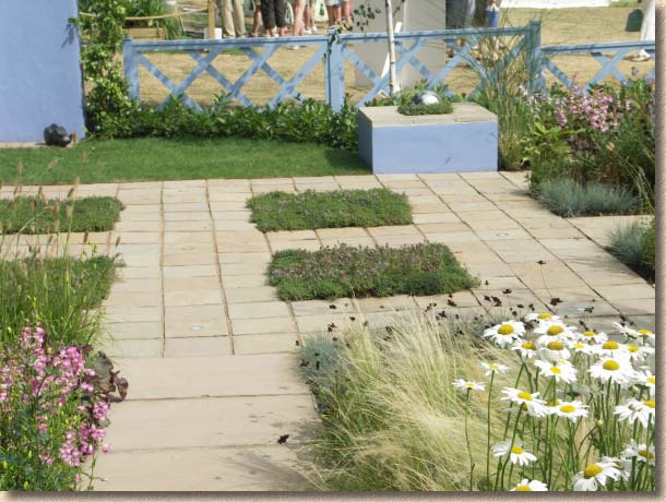
We all know the fettled edges of Indian sandstone are one of its most appealling features, but if you are gormless enough to lay it "stack bond" (think of a chess board), you really do need to ensure the joints are somewhere near straight.
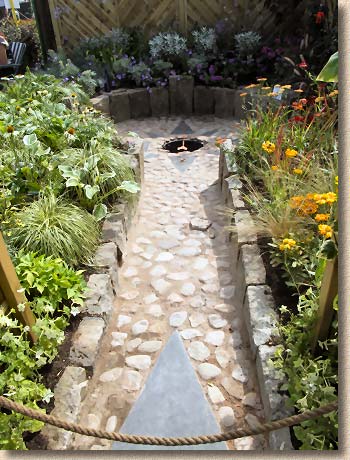
On the left, a cobble path featuring genuinely loose ankle-breakers complete with exceptionally generous quantities of under-strength mortar that was crumbling and falling apart like ice in a heatwave. This path is totally impractical and virtually impossible to walk upon.
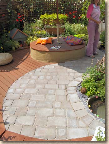
Meanwhile, on the right, the use of paving with decking seemed to be a theme at this year's show. But how many errors can you spot? The cutting-in is pitiful - look at all those nasty little slips at the edges; pieces of blocks that are only 10-15mm in width, and nowhere near the minimum "quarter of a full block" required by the Code of Practice (BS 7533:3 2005). What about that edge course? It uses blocks of different sizes cut to random angles and looking as though it was laid by a blind man on a galloping horse! And the way that the joints of adjacent courses are aligned in the bottom right-hand corner. You probably can't quite make out the glaring mortar daubed around some of the cobbles at the edge of the pond, but trust me: you could see it from quarter of a mile away in real life!
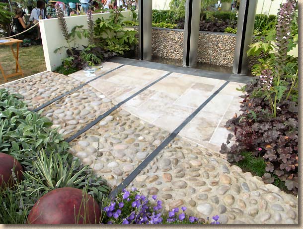
More big cobbles, and although the quality of mortar is an improvement on that in the previous photo, the fact that cobbles are bloody murder to walk across seems to have been completely ignored by the designer, and if you have wide-ish gaps between each cobble, it makes a damned effective deterrent paving.
This was an attractive garden, but the use of widely-separated cobbles for much of the paving rendered it completely impractical. If you must use cobbles as a pavement surface, make sure they are properly laid, with the bare minimum of space between adjacent units, so that there is much less risk of turning an ankle.
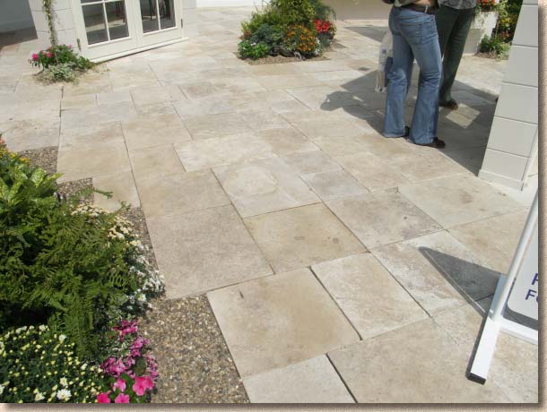
I've never understood how Travertine manages to sell in this part of the world. I know it looks wonderful in the eastern Mediterranean holiday resorts but these islands are damp, soggy, overcast and grey for much of the year, and the holey texture of travertine makes it a magnet for all sorts of crap. But, as I always say, when it comes to matters of taste, it would be a boring world if we all liked the same things, and if some folk think it looks great in the garden, and if it mnakes them happy, then there's no real harm done (until it goes all slippery in the winter acausing them to fall and break their hip!)
For me, it never looks right when it's butt-jointed, which is another "matter of taste", but if you are going to attempt a random layout, at the very least you need to make sure there are no overly long straight, continuous joints, such as the one running from the foot of the signboard in the bottom-right corner.
There were other "issues" with this travertine installation, but limitations of space prevent me showing the misaligned flags, the variable width joints, and the "cut with a sledge-hammer" corner pieces. This display was provided by a company that, among other things, provides homeowners with what they claim is a quality paving installation service - all their best laying teams must have been too busy to get to Tatton.
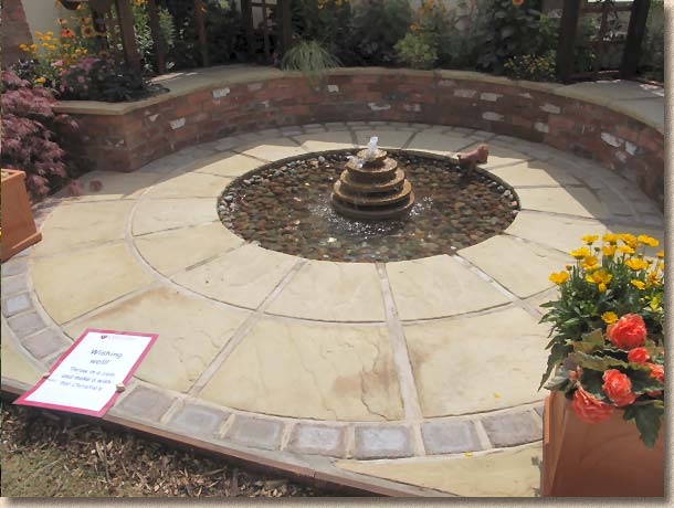
This simple feature circle surrounding a water feature is one of the more common themes in garden design, and this particular example is reasonably well constructed, but is marred by the over-wide joints between the concrete flagstones. I've always believed that, when ity comes to decorative paving, it's the expensive paving we want to see, not the bloody mortar that costs next-to-nowt. Mortar never lasts: it always cracks; it alweays degrades; it always gets colonised by mosses and lichens, so why use more of it than is absolutely essential? And why use it at all with those tumbled blocks?
Shoddy and poorly-considered work at an event such as this annoys me on two levels: firstly, it portrays the hard landscaping industry in a bad light, reinforcing the stereotypical image of our trade as being staffed by barely-evolved rogues. Secondly, I know from friends and colleagues in "the game" that such low standards of work would not be accepted at Chelsea, London's cheap'n'cheerful version of the Tatton Show. If it's not good enough for Chelsea, why should it be tolerated at Tatton?
Aside from the workmanship, I was disappointed by the lack of innovation. Indian sandstone is all well and good, but it's been done to death over the last few years. Where were the new materials, or the new twists on old materials? One old friend referred to the gardens as featuring "traditional Indian sandstone paving" Come again?? What's 'traditional' about Indian sandstone? I daresay it may be considered 'traditional' in Delhi, Mumbai and Kolkata, but it's barely a decade old in Britain!
But it wasn't all doom-and-gloom: there were some examples of innovation, isolated truffles of delight in a morass of uninspired, unoriginal, vapidity. Two gardens deserve to be named and acclaimed for using non-standard materials and for having these materials laid to a standard little short of perfection....
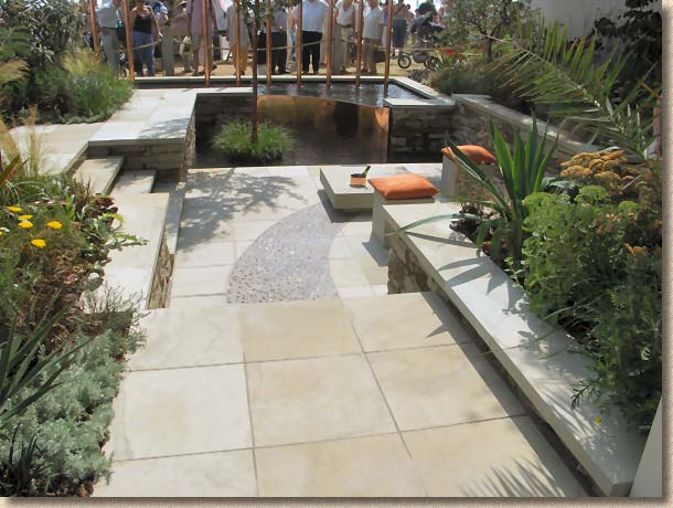
Amongst the big, glamorous Show Gardens given pride-of-place around the Egerton Clump, was the eventual "Best in Show" winner, Peter Ashley's "The Four Elements: A Garden for the Senses".
It's not often that I concur with the judges in their choices and awards, but this was, by some way, the most visually appealling and aesthetically pleasing garden in the show. The overall concept was marvellous, with huge copper tubes spilling water above head height, and a sunken central area all adorned with sensuous and stylistic planting, but all this was supplemented by wonderful stonework, in both the paving and the walling. Honed yorkstone flags were intersected by a sinuous band of cobbles (again!), while the walling and risers featured dry-jointed riven stone with distinctive iron colouring, toipped with more of the honed yorkstone as a coping. The paving was exceptionally well-laid, with regular, neat joints, and perfect levels. If I had to find fault, it would be the excessive use of mortar between the cobbles - the grey cement colouring clashed with the rich tones of the walling and paving and detracted from the colours and textures of the cobbles, but I really am being pernicketty in pointing this out.
One photo can't do justice, but there's a handy "panorama" view available vis the RHS website and it's really worth having a look for yourselves.
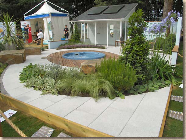
The other delight was the somewhat smaller garden presented by Bezza Nurseries in association with various suppliers. As mentioned earlier, just what goes through the minds of the judges sometiimes baffles me, and how they saw this garden as only being worthy of a Silver-Gilt is beyond me. It was suggested that they weren't keen on the central spa-pool, but we have to accept that, for more and more people, a spa or hot-tub is what they want for their garden, and we have no right to be sniffy about it.
Had this been some cheap and tacky pool, I might have understood the decision, but it's an elegant, understated circular pool, surrounded by an ellipse of decking (well, we can't have everything!) which, in turn, is encircled by a swoosh of the extremely elegant Mayfair silver-granite paving from Tobermore that was laid and cut-in to perfection. The light colouring and grippy texture of the paving perfectly complemented the open and airy feel to a garden that really would not look out of place in many a back garden. The planting was a superb foil to the practicality of the layout, with nothing overly delicate or fussy.
I felt that this was the most realistic garden in the show. It doesn't have the wow-factor of the Peter Ashley garden, but it offers a simple, achievable design that will work for thousands of families rather than one or two extremely wealthy benefactors. Concrete paving has been largely overlooked in recent years as designers and landscapers have become obsessed with the imported sandstones, so it was good to see a quality concrete product contributing to the winning of such a high award.
I know most visitors to Tatton are there to see the planting, but quality paving is essential to a good garden, and while it might not be as showy as the planting (indeed, some of us would argue that it should never be as showy as the planting) its contribution to the balance and accessibility of the garden should never be underestimated. The judges need to apply a more critical eye to the hard surfaces, and the manufacturers that support these gardens ought to ensure their products are laid correctly and shown off to best effect. But it is the landscapers, the lads and lasses that lay the paving, that need to really up their game. Your work is on show to the nation and to the world: you simply must do better!
More Pictures (and no nit-picking) on the next page >>>


