Global Stone 2018 Brochure
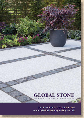
At first glance, the 2018 brochure from the much-respected Global Stone brand looks like more of what we’ve had for the last few years: big photie on the cover; purple strap with text; low-key branding. However, once that cover is opened, right from the very first page, it’s obvious that there’s been a re-think, an upgrade, a reconsideration of how best to display what Global Stone has and, much more noticeably this year, what Global Stone do.
It’s a much meatier brochure, too, primarily because of the brand’s massive commitment to Porcelain. While this burgeoning group of products was treated to a stand-alone supplement last year, it’s now fully integrated into the main brochure. Last year, we had 106 pages of entertainment, while for 2018, this has expanded to a whopping 146 pages, 25% more fun and quality products to enjoy.
However, the changes aren’t radical. It’s not a compete redo, but more of a classy evolution of what’s gone before. The overall feel and style remains as it was, but there’s just a polished, more considered edge to it all, and the photography really does dominate this year.
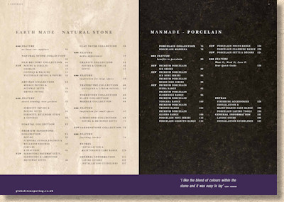
In other reviews this season, the way that products are grouped has been highlighted, notably the large-scale simplification and the move away from subjective groups such as ‘modern’ and ‘cottage-style’. Global Stone have similarly regrouped, creating two main product groups: ManMade, meaning porcelain, and….oh god!...."Earth Made". How awful is that? It sounds clumsy and contrived to my ear. What’s wrong with ‘Natural’ or even just 'Stone'?
Anyway, the crassly-named Earth Made materials include most of the familiar "collections" (Old Rectory, Artisan, Granite, Premium, etc.) but, other than an allegedly " new " Gardenstone Collection (we’ve had Gardenstone for years: why is it suddenly a collection?) there’s practically nothing marked as new. The aforementioned Old Rectory has been treated to a new colour, Castle Grey , but that’s hardly a revolution. And it’s even harder to judge just what this new colour will look like, as we’re given nothing more than a swatch.
I know it can be difficult to get good ‘project pictures’ of new products at what can be ridiculously short notice, but a single swatch is simply not enough. Get a shot of a single flag, if need be. Potential customers need to have their interest tweaked to persuade them to seek out the new option when they visit a stockist or display centre. I’d love to see more, but that swatch does next-to-nothing in prompting me to go hunting for it.
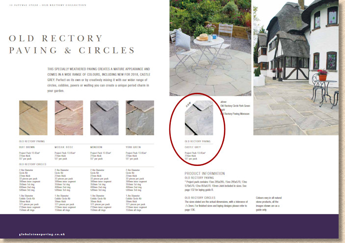
Anyway, it seems that, for now, Old Rectory Castle Grey exists only as a four-size flagstone in a project pack, with no circles, no walling, and no setts (I refuse to call them ‘cobbles’) to augment the design options, but…maybe in time?
Castle Grey re-appears as one of the two colour options in the lightly-textured, large format (1000x750mm) Empire Paving range, but even though it was featured in last year’s brochure, there’s still no photie! We’re shown the same ‘Pearl’ hue that was used in 2017, so we are still none the wiser about the elusive Castle Grey.
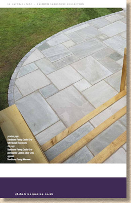
Aha! Here it is on page 36, putting in an appearance as Premium sandstone, albeit interspersed with Modak Rose….and again on page 38.
Is it Kandla Grey? Looks very much like Kandla Grey. There’s nowt wrong with that: Kandla Grey is one of the best Indian sandstones however you use it. It’s as hard as iron; it’s colour variation is subtle; it works well in almost any setting; it’s noticeably more resistant to algae than many of the others; and it can look drop dead gorgeous.
So why not get more photies so we can see it in the Old Rectory format? It’s hardly a rare type of stone!
Anyway: mystery solved!
Oh! Another newbie sneaked in on page 47 – Mixed Tumbled Setts. Why aren’t these new products flagged-up on the Contents page? It would make my job so much easier.
The Mixed Tumbled Setts would appear to be just what it says: a mixture of setts from the other colour options, so that’s Monsoon, Modak, York Gren, Autumn, and, regrettably, Mint. The minimal coverage provided does not make this clear, so I could be wrong – perhaps they skip the Mint? I hope they do!
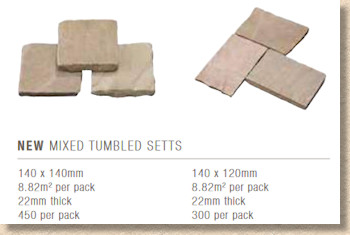
No big picture to show them off and, at only 22mm thick (no 50mm or thicker variant), the blurb advises they are not suitable for driveway use. There *are* ways of making them suitable for use beneath the family car, if a client insists, but I'd urge caution and try to talk the client into an alternative - there is plenty of choice out there.
Finally in the Earth Made section, we come to the newly promoted Gardenstone Collection , which, somewhat disappointingly, turns out to be nothing more than the addition of a single size (215x100x60mm) walling stone which is said to be a “blended” colour, so, again, I can only assume that means a bit of everything.
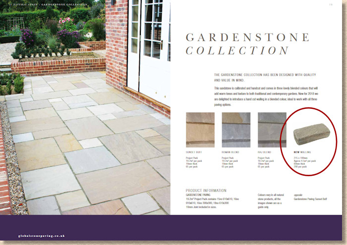
There’s no harm in putting Gardenstone on the same promotional level as, say, the Artisan Collection or the Old Rectory Collection, but I’d sort of expected a bit more than a single walling stone.
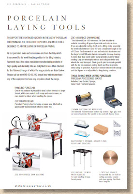
And so we come to the Manmade materials , which is exclusively porcelain. No sign of concrete from Global Stone….yet! A full fifty pages devoted to the current BIG thing in hard landscaping, and no-one can deny that Global Stone haven’t fully committed themselves to the cause of ceramics. They’ve even included a range of rather good specialist tools for installers. Now, that is genuine commitment!
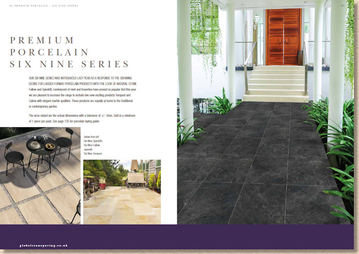
As with many other suppliers, the groupings created for the manifold porcelain options leaves me totally confused. How is it decided that such-and-such a tile is definitely a ‘Moderna’ and not, say, a ‘Siena’? I reckon it’s done on the same principles as names for paint or new cars – just come up with some old bollocks that’ll befuddle more-or-less everyone and defy explanation!
I’ve managed to figure out that the Albero range is the woodeny ones and the Granito range is the….err….granitey ones, but the rest leave me bemused.
There’s a generous addition of new colours/textures but I couldn’t tell you anything distinctive about them. More than any other paving material, porcelain defies description. There are buffs, creams, greys, etc., and there are smooth, rippled, textured, etc., but beyond that, there’s nothing I can say to guide anyone, least of all myself, to what might be the pick of the crop.
What is noticeable, though, is the way the product group as a whole is maturing. Earlier this season. In another brochure review, we looked at steps and edgings in porcelain, and Global Stone offer us an ever-expanding range of sizes, now including 200x200mm setts (or are they Décors, as it says in the brochure?), which, for some unfathomable and installation-complicating reason, are only 18mm thick, whereas all the full-size tiles are an industry standard 20mm. Had they been made as 20mm thick pieces, the opportunity to easily introduce them into clever porcelain designs as edge detail or break bands would have been a real step forward.
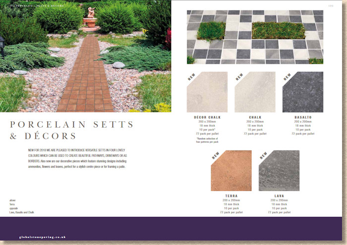
As it is, including them in a design is not impossible, not at all, but it is unnecessarily complicated, as a different bed, just 2mm shallower, would need to be screeded separately to ensure they sit at the correct surface level. This is precisely the sort of bugbear that can be enough to dissuade installers from recommending and using them.
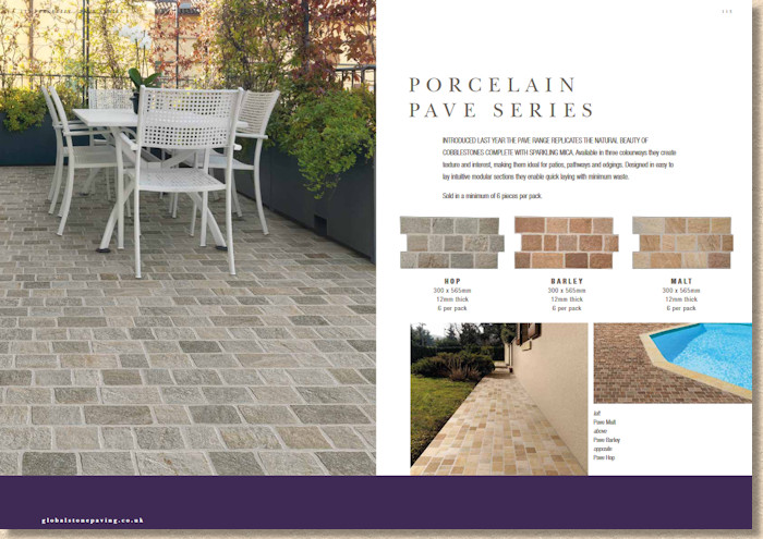
For those who like the smaller sizes of porcelain, then maybe the intriguing ‘Pave’ series of interlocking tiles printed as small 100mm gauged setts will appeal. I rather like them, despite the coincident perpend joints shown in the ‘money shot’ picture. They may not be to everyone’s taste, but they show just what is possible with porcelain and ceramics in general once you apply a bit of thought. Not everything needs to be boring 600mm squares laid in a stack bond layout!
Right back at the outset of this rambling review, I said that this brochure had evolved, that it was a development of what has gone before rather than anything radically new, and so it is. There seems to have been a change of design team and they have obviously taken in what has gone before and then re-cast it with fresh eyes. It is a subtle yet classy improvement on 2017 and 2016, making better use of the page real estate and better photography to show off the Global Stone products. It’s always a risk to tweak a winning formula – as I said in last year’s review, if it ain’t broke…. – but tweak it they have and improve it they have.
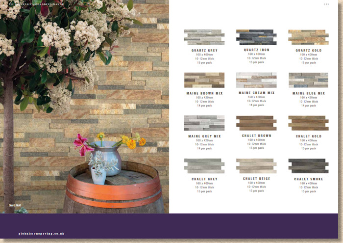
The swatches and photies of individual items are generous and well-proportioned to the page, and almost without exception, give a reliable impression of what each particular product will look like, both in terms of colour and texture.
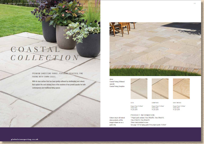
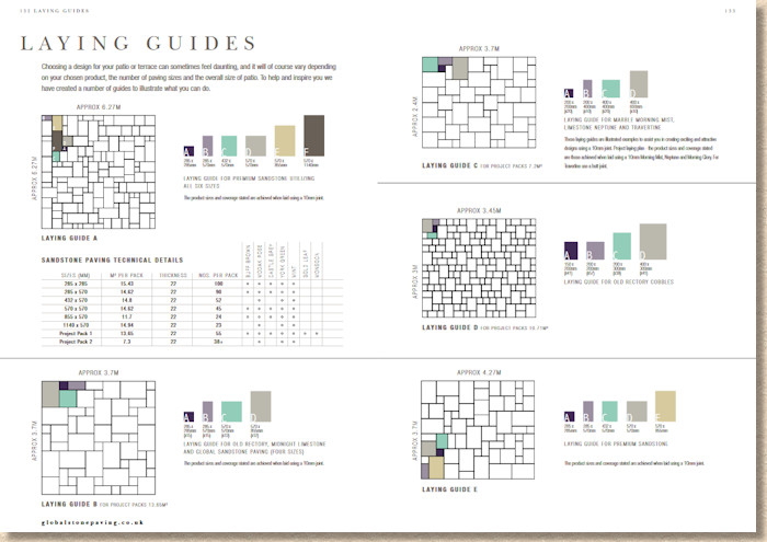
The decision to keep the key sizing and pack information on each page works well precisely because it has been kept to a minimum, while the layout options and other technical info has, rightly, been sent off to adorn the final few pages. The font used for that info is, possibly, a little feint in print terms, but that could well be more down to my aged eyes and it may well look fine to everyone else.
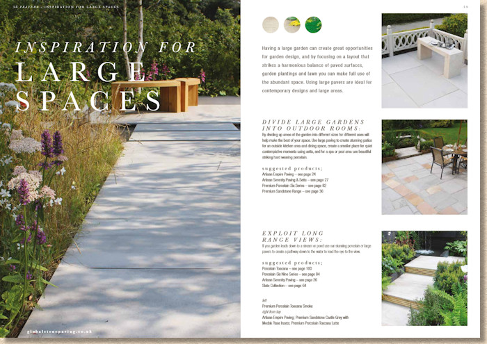
There’s a good mix of full page glory shots and half-page (or less) illustrative shots, and the choice is generally very good. Sometimes, with brochures, there’s a temptation to max out on the big photies and that can, perversely, have the effect of under-emphasising what is otherwise a doozey of an image. It’s all too easy for the reader to become, for want of a better term, photie-blind. You *can* have too much of a good thing!
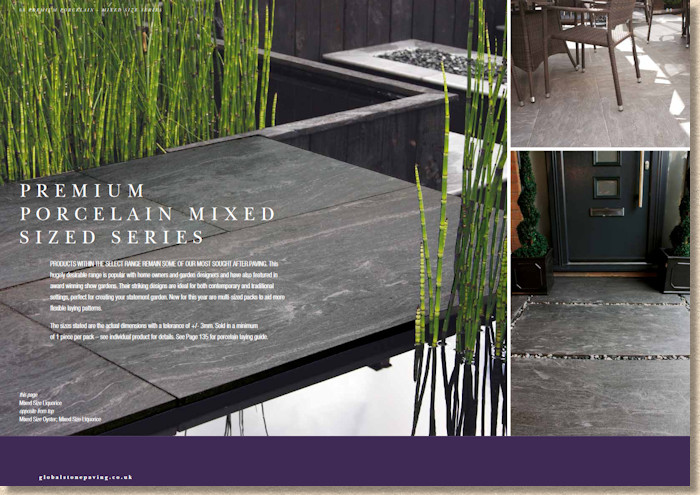
By ‘mixing it up’ Global Stone have managed to maintain interest throughout 140-odd pages of loveliness. The big photies are played at just the right moment, and, in my opinion, with just the right products. This helps emphasise just how glorious some of these pavings can be.
The descriptive text is sufficiently bland and aspirational, but maybe that’s what we want. It’s the pictures that sell the paving, not the blurb, and, to be honest, beyond the product title and photie captions, how many of us actually read what is written?
The ‘feature articles’ scattered throughout the brochure may be of interest to some, but I would hazard a guess that most would skip past them without bothering, which is a shame. These attempts at breaking-up a brochure are always a bit hit-or-miss, and I feel that the best ones are those that are littered with photographic examples of exemplary work. This is how we designed such-and-such a garden; this is how we coped with such a gradient; this is how we resolved a drainage problem; that sort of thing.
Last year’s hand-drawn layout sketches have been replaced with drawings of a more technical feel, but at least a couple of them feature the dreaded crossed joints, and needlessly so. A gain on the presentation, but a loss on the technical accomplishment.
As ever with Global Stone, the installation guidance is extensive and exemplary. Most other suppliers have given up on providing installation guides: some have done so in order to promote their own in-house recommended installer schemes, while others have decided to say nowt and stick to what they do: sell paving. So, having such a comprehensive guide is welcome, but how many will follow it? A good contractor will know most, if not all, of what is written, while DIYers would probably prefer a more diagrammatic guide. Still, I do like to see *someone* documenting how things should be done!
Looking at the 2018 brochure as a whole, it’s another significant step forward by Global Stone and maintains their tradition of being a major brand within the residential hard-landscaping sector. The product range accurately reflects precisely what the British public are looking for in garden design right now, and offers them a superb selection in every material, whether it’s manmade or, err, Earth Made. The brochure sets out to be exactly that: a paving brochure, and it’s a remit it achieves with genuine and impressive style!
Click here to download brochure

