RHS Chelsea Flower Show 2018
After a three year’ absence for reasons best not explored here, I return to the RHS Chelsea Flower Show with a sense of trepidation. Will it have changed significantly, or will it, like so many of the so-called very best of British traditions, resolutely defied the march of time and stayed exactly as it was?

Ah! It’s more-or-less exactly as I left it. Security is even more evident than it was, and the avenue of peripheral business still forms the first thing you see when coming in at the Garden Gate entrance. The Press Tent is still completely disabled unfriendly, requiring the ascent of an epic flight of stairs to reach the essential info. The main show gardens are still on Main Avenue, the Big Tent is still central to everything, and everyone still has to make way for the BBC because they have the biggest cameras.
Not as many of the big show gardens as there used to be in the glory days before austerity forced the bankers and wealth managers to pretend they didn’t have quite as much money stashed away as we suspected, but still ridiculously lavish, and, some might argue, still ridiculous!
The Show Gardens:
The first garden to confront you as you walk in from the tradesman’s entrance is The M & G Garden which is claimed to represent, " a romanticised heaven that celebrates the expressive and sensual language of colour and texture, light and shadow ". Mmmm. Does that mean big reddy-coloured indifferently-cast concrete walls popping up randomly with Type 1 aggregate (it’s rough enough to be SF2, really!) scattered around as some attempt at pathways?
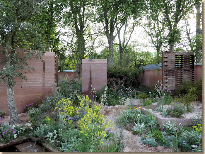
I’m sure the planting was lovely, and that some deeper message pervades the whole design, but, to a philistine such as me, it brought to mind a derelict factory site, albeit with nicer flowers. It also brought to mind Bradstone’s Mars Garden from a decade ago, which also used strong rusty red colouring.
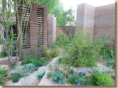
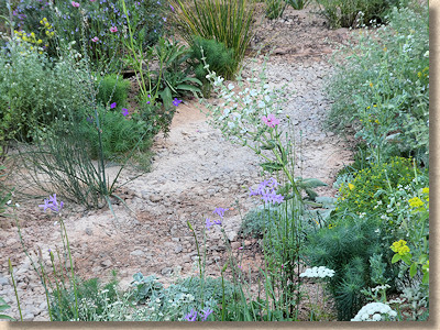
It isn’t ugly, not at all. There is something almost captivating about it, but is it a garden in the sense of a desirable plot in which one could relax?
And it’s not the only garden to use loose Type 1 (or SF2) as alleged surfacing. It’s theme that recurs with disappointing regularity across the whole site.
Next up could hardly be more different, but it raises the same question about what is a garden. The LG Eco-City Garden makes laudable, if barely understandable, claims about being a “…new visionary model for the development of integrated and resilient eco-residents…”, which is all very good, but integrated with what or whom? Not with the good people on the local housing estate!
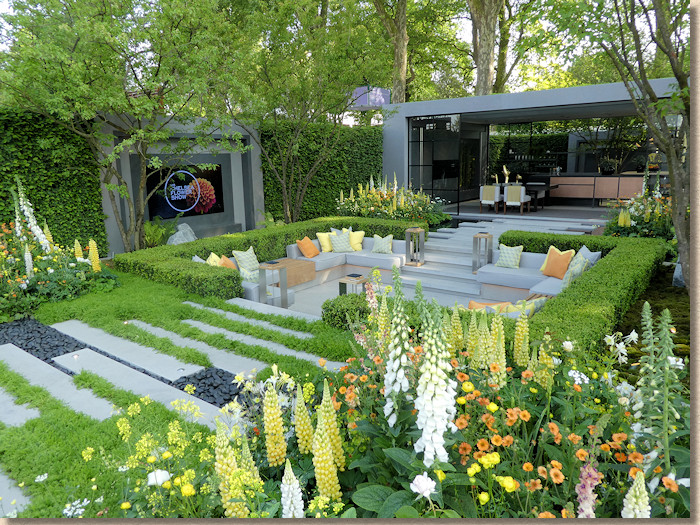
This, it seems to me, is the sort of ‘garden’ that might be found in an over-privileged home where the ‘eco-residents’ are more interested in living-it-up and entertaining rather than actual gardening. It’s one-third garden; one-third outdoor living room with huge telly; and one-third kitchen with sliding walls.
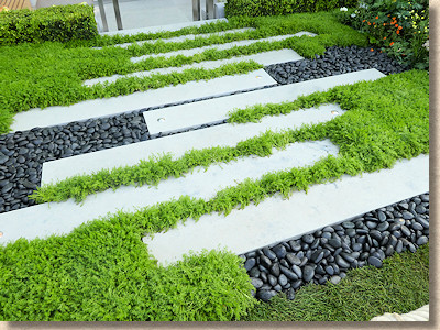
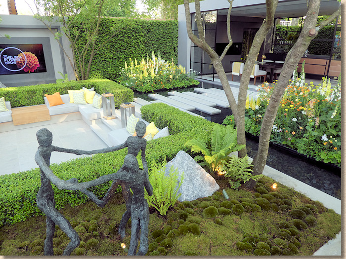
Ignoring the walls, the hard-landscaping comprises transverse linear planks of a light-grey honed limestone separated by black pebbles and soft low-level feathery planting, with more of the stone, in large slab format forming the floor of a sunken pit in which the eco-residents can watch their power-draining big telly while ignoring the garden all around them.
The stone is lovely, but very understated in this set-up, a cool, neutral contrast to the maintenance heavy greenery (obviously looked after by an eco-resident-gardener) and moated islands of lupins (again, very much an ‘in-thing’ for 2018).
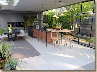
Maybe this *is* how some of us will live in some future, but it will have to wait until after climate change because an outdoor living room with no roof? In Britain? That will come in handy about three times a year!
Another dreamscape forms the third big garden, The David Harber and Savills Garden . There is, as we should expect, an alleged ‘narrative’ to this garden. Being a garden is no longer enough: there has to be a back story, of course, and this is supposed to be about our developing relationship with the environment.
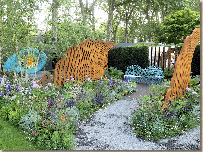
Well, it starts off with some scrappy SF2 which gradually morphs into 10mm chippings and wends its way through some rusty iron arched structures, then suddenly transforms to much nicer transverse stretcher laid narrow browny-black clay pavers (the Dutch/German type that are still popular with designers, for now) and finally on to some giant Lord of the Rings Sauron’s Eye sculpture in turquoise and gold set atop an expanse of what looked like dirty-grey honed sandstone with almost no character.
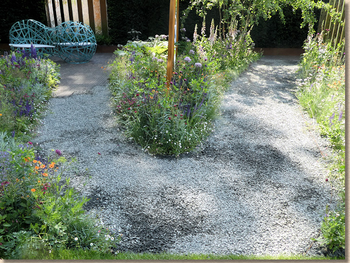
I don’t like SF2 as paving: it’s ugly and scruffy and lazy. I do like the clay pavers: these aren’t my favourite clays, but they are attractive, functional and work really well in this setting by not demanding attention. The hard-standing for Sauron’s Eye is flat and uninteresting, which may be a good thing otherwise it could compete with that dominating feature, but as a paving in its own right, it’s too plain, too neutral. It could have been concrete…..oh! but surely no one would use plain concrete in a Chelsea garden, would they?
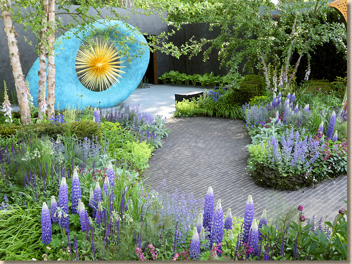
The Morgan Stanley Garden for the NSPCC has Chris Beardshaw written all over it. There’s so much in it that it seems to be an understatement, so well does it combine the hard- and soft-scapes, the form and the function, the colours and textures. It wasn’t really a surprise it won the accolades. It just oozes class.
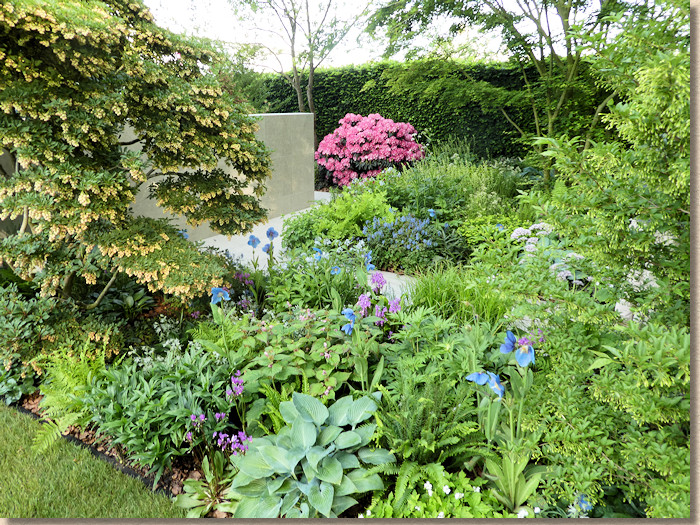
The main pathway in is straight and parallel slabs of what I think is a grey textured limestone which, unfortunately, showed every footprint. A dividing wall of what I took to be huge blocks of the same stone in a honed format marked the transition to a cedarwood shelter and a copper-walled moat.
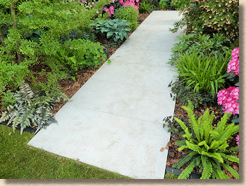
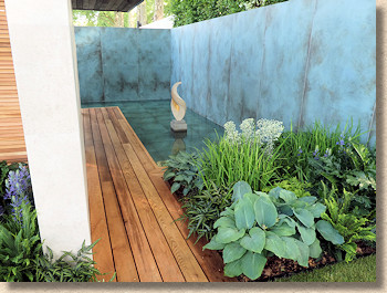
Not very much for the hard-landscaper here, but you have to admire the way that so little has been able to tie together so much, and so effectively. Understatement. That’s the word that sticks with you after viewing this intriguing garden.
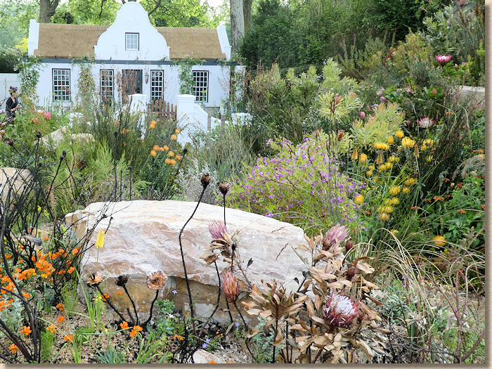
From the cool tranquillity of Mr Beardshaw’s very English garden to the fire and fury of South Africa in the Trailfinders Garden , which evokes the image of a Boer homestead amongst the fynbos vegetation of that Cape and there’s even a recreation of the aftermath of fire in the wild, and how nature rapidly recovers.
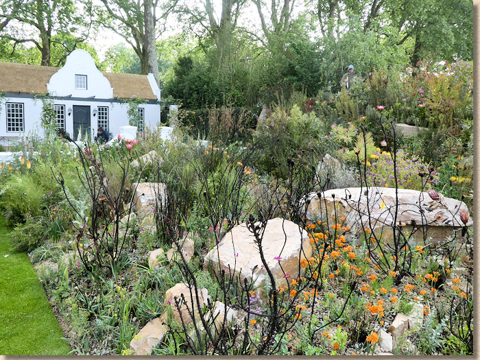
The cottage features stretcher bond pattern terracotta-style tiles, although in modern South Africa these would almost certainly be wet-cast concrete, a transverse stretcher red brick path through a formal garden and then into the wild, with curious plants and unruly paths of…..Type 1, although this is a creamy limestone for a change, all culminating in huge rocks of the same stone.
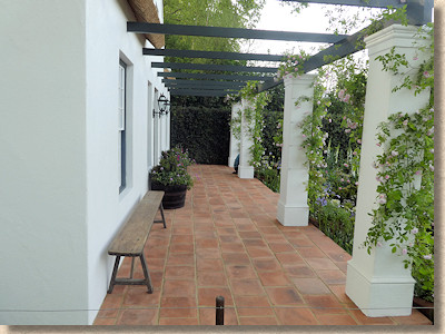
I had the privilege of visiting the Cape a couple of years’ back, and this garden has certainly captured the feel of that place, especially on a hot, sunny day. After dinner, when the clouds rolled in, the heat and the fury of the fynbos garden seemed diminished, yet the cottage remained archetypal and timeless.
Back to the northern hemisphere and Mark Gregory’s love-letter to the fifth best northern county: Welcome to Yorkshire.
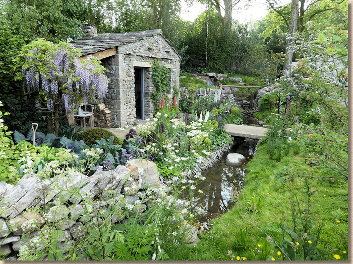
It’s a faithful re-creation of a quiet corner in the dales, with so much that is absolutely spot-on. As someone with a reasonable working knowledge of that part of the world, I could happily convince myself I was back up there, almost able to smell the chippy in Hawes where they cook properly, in beef dripping, and the greens have so many hues.
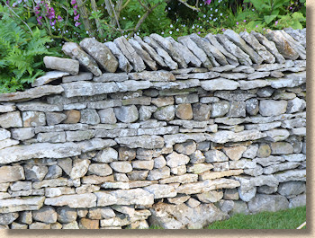
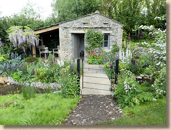
The drystone walls with through-stones tying the faces together are perfect; the little bridge over the beck; the planting eking an existence between chunks of steel grey limestone; the tiny sandstone cottage; the yorkstone flags leading up to its door….and the seemingly mandatory Type 1 dark limestone path connecting it all to the outside world.
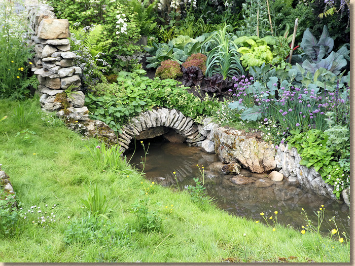
It’s very definitely Yorkshire, down to the tiniest detail. But is it really a garden? I suppose it could be if, as several people have commented on Twitter, it was recreated for exiled Yorkists living in, say, Hampshire or Los Angeles or Melbourne, but how many folk actually *in* Yorkshire would have this in their own garden? Why would they? They have the real thing literally on their doorstep!
From one county to another and the VTB Capital Garden, Spirit of Cornwall .
Cornwall. Granite, slate, tin, pasties and surf. Five things I immediately associate with Cornwall and not one of them was evident in this garden that alleges to evoke the spirit of Cornwall.
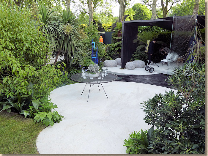
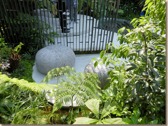
I wouldn’t want to see twee or overworked tropes, but there has to be something, anything, that is undeniable Cornish. The cast-in-situ concrete that dominates this plot, despite all the money thrown at the fancy structures, is, to be brutal, bloody awful!

I could be mistaken but cast-in-situ concrete is not an abiding memory of Cornwall for most people, and, if anyone was likely to remember seeing c-i-s concrete, it would be a paving anorak like me. It’s not that they don’t have concrete in Cornwall, it’s that they have so much more that is a million times more interesting. It’s wrong and unfair, I know, but all I can see is that sodding concrete. If it was well cast, I might feel more relaxed, but it can’t even manage that!
Move on. Quickly, before you need your GTN spray, Tony!
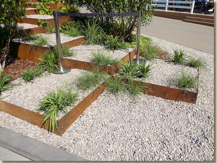
Not sure what this next garden is. A big hill of blousy colour, some gurgling steam vents and no discernible hard-landscaping, other than peripheral gravel and some flaky-looking steps with rusty steel retainers as risers.
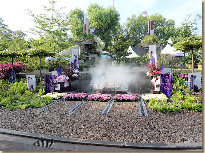
The Wuhan Water Garden seems to be one of those that can only be appreciated when you’re actually in it, and as I’m not one of the chosen few, there’s buggerall to say about it from a hard-landscaping perspective except, perhaps….err…nice gravel?
The Wedgewood Garden is, probably, the most garden-like of all so far. It does actually look that someone other than a billionaire, futurist, nostalgist or corporate HQ manager might have this in their own patch. It’s dreamy. It flows. It’s entrancing and enticing and pulls you in.
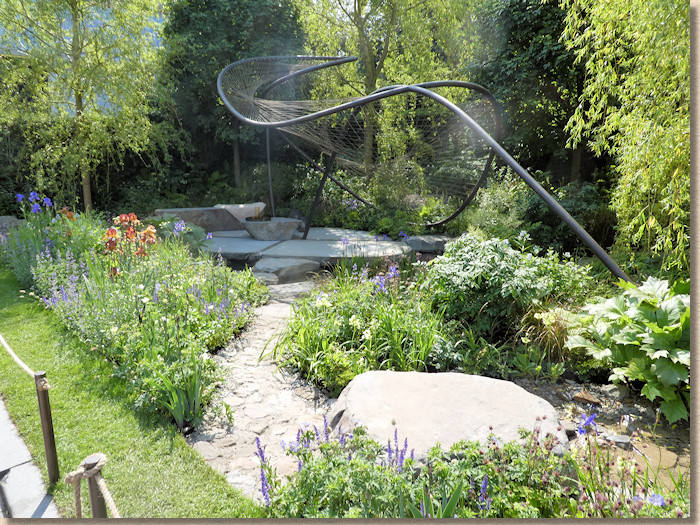
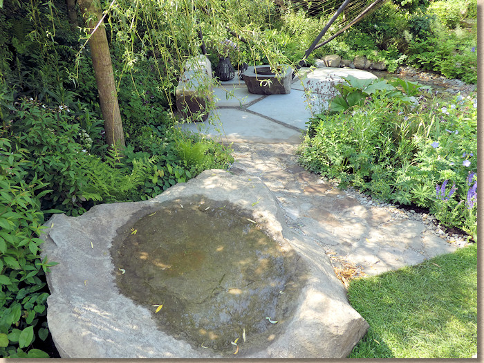
The centrepiece looks like a demented trampoline, but it does actually work with the rest of the setting, which features lots of subtle rocks in the form of boulders, pebbles, cobbles, and stepping stones, with big smooth slabs forming a patio beneath the vandalised bouncing frame. The stone itself looks like a northern sandstone, possibly even Scout Moor, with it’s cool blue-grey sawn surfaces and much more interesting uncut edges featuring rusty browns, reds and purples.
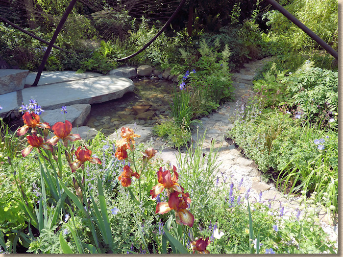
It’s naturalistic, soothing, calming and a garden I wouldn’t mind having myself, had I the space. My only criticism is that I could never find anyone to talk to about it! There was so much more I wanted to ask.
It would be easy to think that the RHS has an unfair advantage when it comes to creating a show garden. It can pick the best spot, the biggest plot, and call in so many favours that they can hardly go wrong. But that’s the rub: because they are the RHS, it *has* to be right. They, of all people, cannot afford a cock-up.
And with the Feel Good Garden produced in association with the NHS to promote the positivity and well-being that comes from gardening, they’ve most assuredly pulled it off. So much to enjoy!
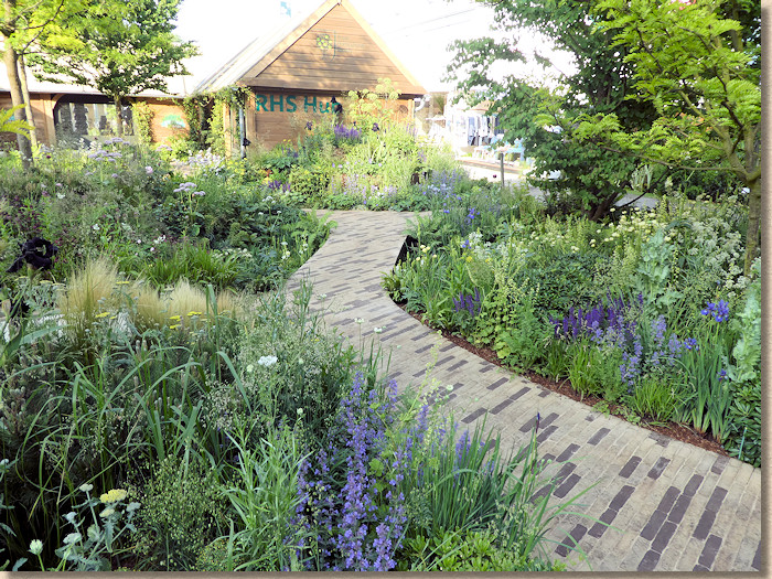
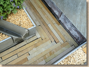
There’s a simply stunning artwork/assemblage/rockpile one on corner, with huge sawn slabs of sinuously-shaped sandstone stacked into a low mound, massive, dock-off smooth-worn boulders, and then paths of brown and beige narrow clay pavers meandering through intense planting.
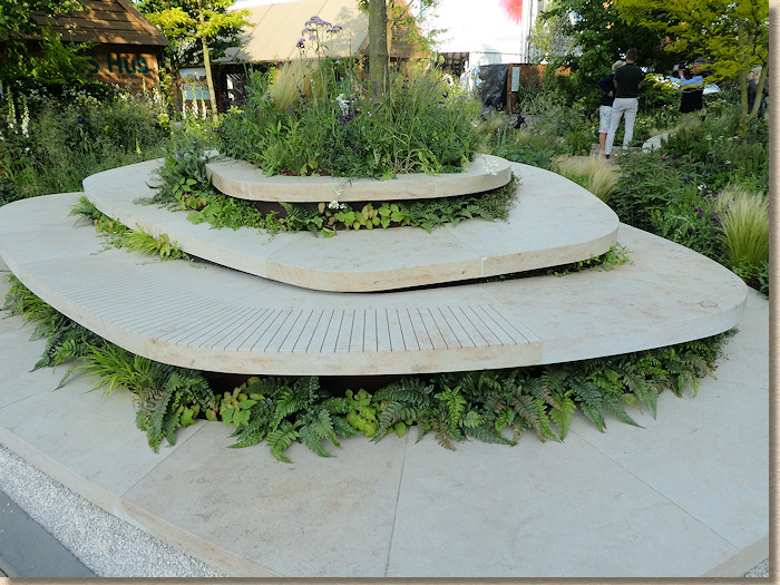
The paler clay pavers show the dirt, but we have to make allowances. This is a show garden, so everything is meticulously clean. In a real setting, everything would be a little bit grubby so the odd footprint would be far less noticeable. In fact, the real problem with these gorgeous pathways was finding a moment when there wasn’t some self-promoting zelebrity posing on it and ruining the view!
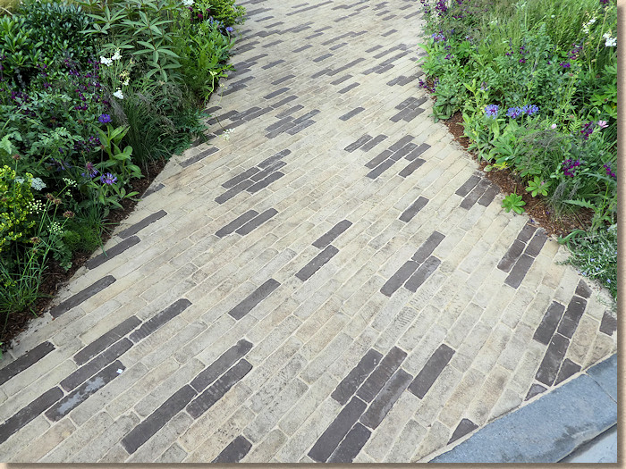
That’s two show gardens making extensive use of clay pavers ….and they are the imported European pavers with 500 shades of brown. What’s wrong with British clays? Why can’t the clay pavers we produce on this island get a look-in at Chelsea? We can do muddy browns. We can also do lovely warm reds and cool blues, but over the last few years, it’s all been about the slim, sooty Rhineland clays. Please, designers, make a bit of effort and take a look at home-grown clay pavers. I know the Germans have bought up most of our bigger manufacturers and stopped production of some of our most lovely colours and shapes, but there are still proudly British companies doggedly turning out distinctive and characterful clays that really need a wider audience.
The final show garden is one that has so much to take in, you could stare at it all day long and still not see all of it. The Lemon Tree Trust Garden is said to be inspired by a refugee camp in Northern Iraq, and it is possible to see the echoes of such a place, but this is anything but depressing or repressive.
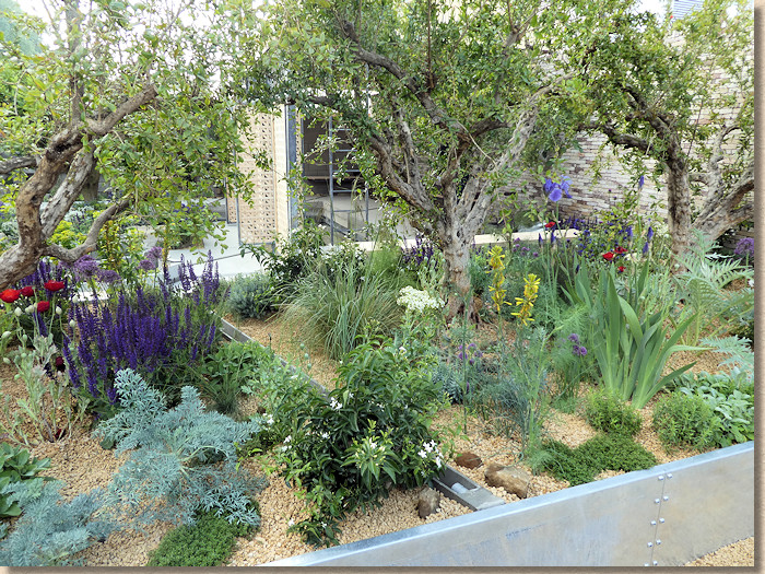
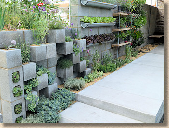
This garden also uses cast-in-situ concrete, but the quality is leagues ahead of what we saw earlier. This is crisp, clean, precise and obviously finished by someone with vast experience in concrete. Chamfered edges, perfectly smooth and hole-free faces, faultless surfaces and a consistency that is maintained throughout. Yet it doesn’t dominate. It acts as a foil to everything else whilst drawing almost no attention to itself. How many observers actually realised they were looking at plain old concrete?
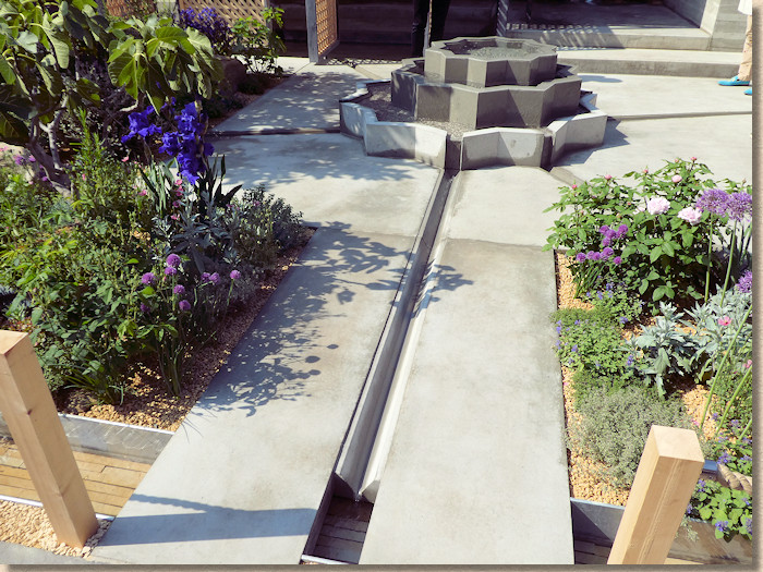
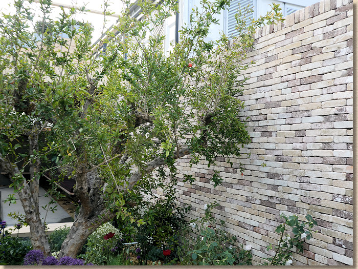
A geometric stepped fountain, again cast in that most versatile of building materials, forms the centrepiece, from which flow a series of rills in perfectly straight concrete channels which drain into sandstone-lined streams flowing towards cool pools of blue-tinged calmness. A side wall of concrete masonry units has been built in such a way to use the frogs as planting pockets for drought tolerant vegetation and the back wall is a stunning assemblage of cream tiles laid as brickwork, with occasional flecks of purple-brown.
Rotating timber geometric screens enable the light and shade to be played with to suit the time of day and the mood, while overhead is a roof garden accessed via an industrial galvanised pole ladder.
The Space To Grow Gardens:
That’s the biggies done, now on to the medium-sized entries, which rarely fail to delight.
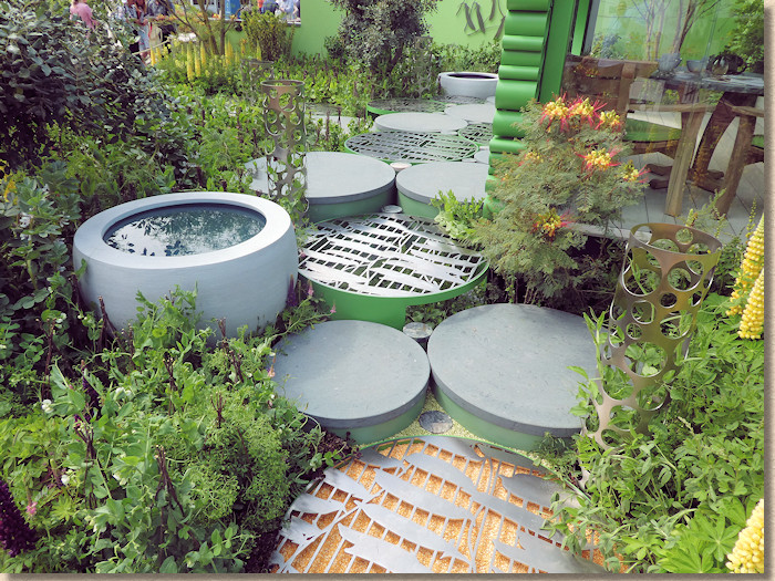
The Seedlip Garden is a paean to one plant family: the peas, Fabaceae. There’s more to peas than you think. Lupins are part of the family, as are Trifolia, along with the obvious Sweet Peas, Sugar Snaps and Birds Eye Petit Pois.
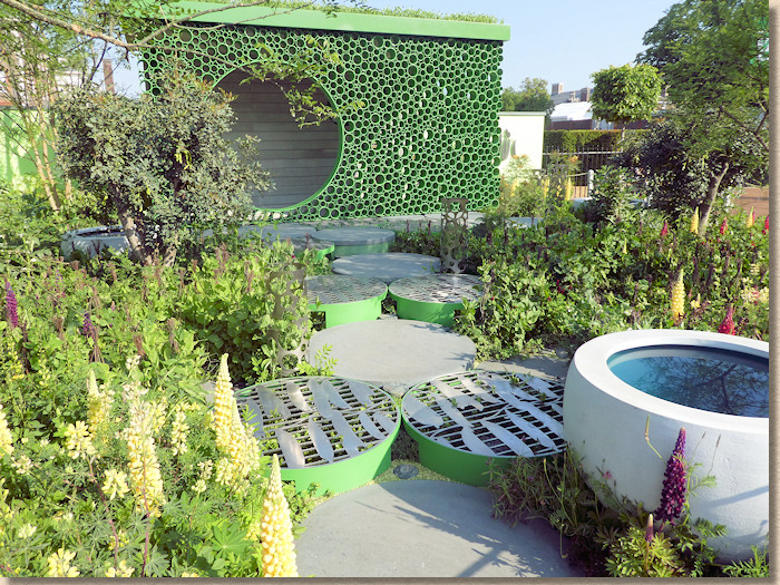
The hard-landscaping is discs of Jura Green limestone with smaller discs of intriguing Manicha (sp?) granite from Brazil leading across to a shelter with walls built from offcuts of green pipes. Green. It’s all very green. The lupins add splashes of colour, but this is a riot of green.
Next door lies The Silent Pool Gin Garden which seeks to emphasise its preference for locally sourced ingredients by keeping that theme going in the garden. Portland stone planks laid transversely and close-jointed, contrasted by Purbeck stone walling.
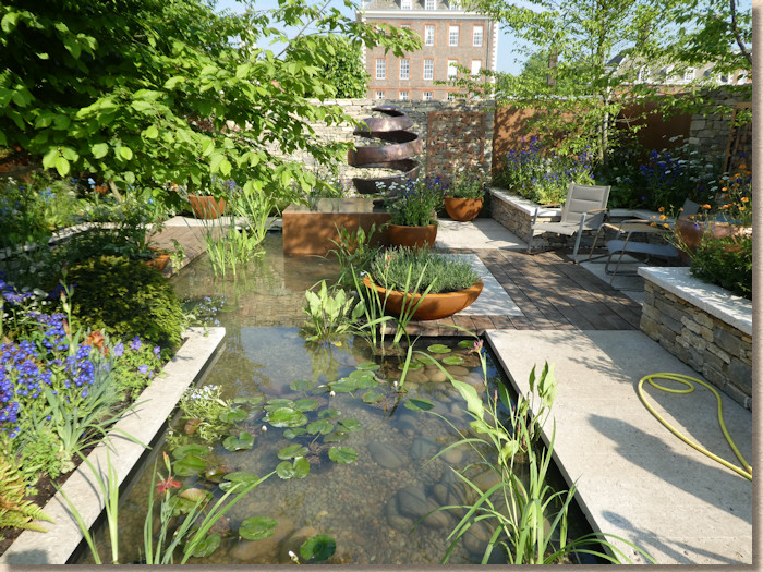
It’s another "real world" garden, eminently achievable in many a garden if you have the budget, but not overly ostentatious or flamboyant, but subtle and very relaxing. The ideal place for a late afternoon G&T, perhaps?
The New West End Garden is about creating a new form of the infamous London Squares, although one ‘up west’ rather than the TV-popular East End.
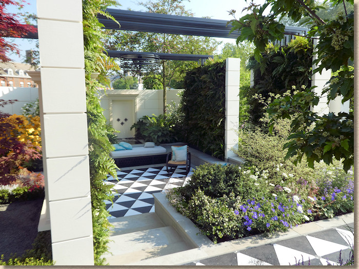
So, creamy Portland-ish stone-ish windows and door frames arise from a richly-planted bed and carry a black timber pergola, while beneath the archetypal London paving flags, Scout Moor Yorkstone lead through and around, with a slightly bouncy section of black and white triangles which I suppose are intended to entertain the kids and launch Granny into orbit. A sunken area of flagstones create a resting place that begs to start a conversation and another, assumedly bouncy, area of black-and-white triangles.
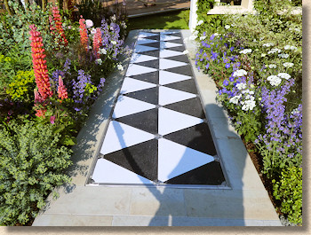
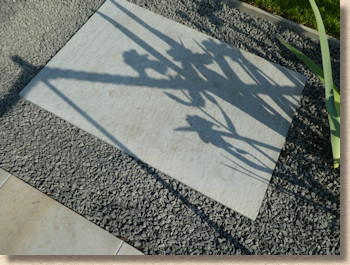
There’s a strange standalone slab of flame-textured yorkstone set in a bed of what looks like Criggion Green gravel. Why? What for? What is it supposed to do? Is it really nothing more than a stepping stone to a teeny-tiny lawn?
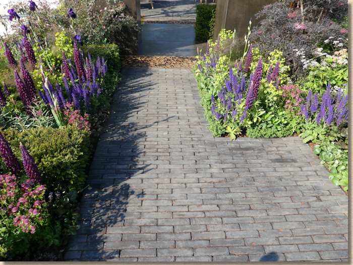
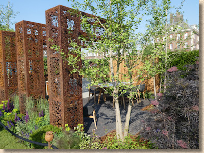
The Urban Flow Garden is al about modern urban living and claims to feature “environmentally friendly landscaping materials”. There’s three big, floral-pattern pierced rusty inverted letter L’s springing from what even I recognise as lovely underplanting, offering some shade over a patio-cum-dining area paved with dirty-brown European clay pavers (are these the environmentally friendly items….shipped over from Germany/The Netherlands? Fired in an energy-guzzling kiln?)
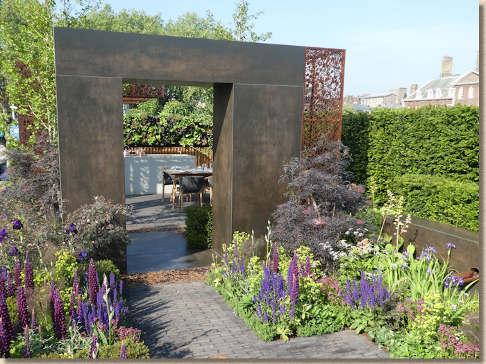
A path of the same pavers leads beneath a square arch of faux almost-rusted steel and, once again, we have a very ‘real life’ garden, possibly without the rusty L’s, but one that would work incredibly well in a smaller urban back garden.
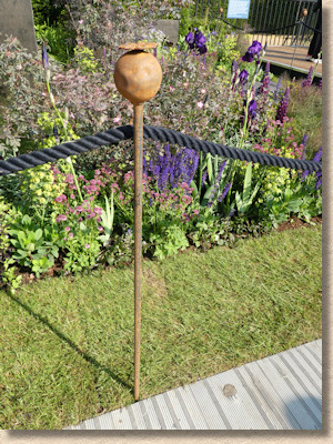
The detail I loved most, though, is the fruit-topped line pins they used to rope off the garden from intruders. Gorgeous! Imagine turning up on site with these and setting out your lines to lay a run of kerbs. The brickies would fall off their scaffolding in a fit of jealousy!
If you’re still with me, you will recall that I’ve mentioned concrete was an ‘emerging trend’ at this year’s show. Well, in the Skin Deep Garden , it’s not only emerging, it’s ruddy well taken over!
This, it seems to me, is a series of concrete boxes stacked somewhat haphazardly to various heights. The concrete is of varying quality, from near-perfect to downright shoddy, and in various tones of grey through to cream.
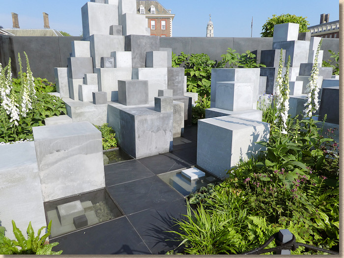
As you will have guessed, it’s a ‘conceptual’ garden, which means it’s nonsense, but it’s said to represent various skin conditions that might need treatment using sponsoring products. Does that include cement burns? Abrasion?
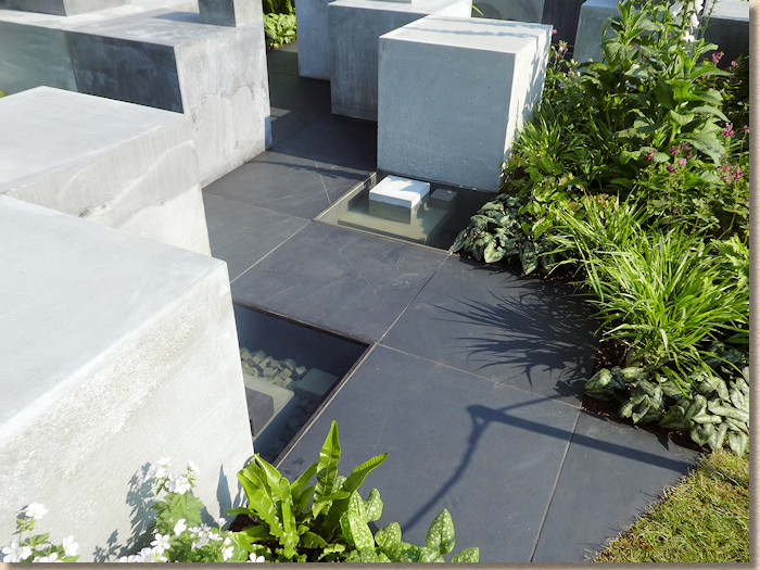
It’s certainly a talking point. If it’s a garden, then I’m a brain surgeon, but there’s no denying it stimulated quite a few discussions along the lines of, “what the bloody hell….???”
From the ridiculous to the sublime and a garden that I returned to again and again and again. And then again. The Pearlfisher Garden may well be a ‘message’ garden aiming to educate but it is simply stunning.
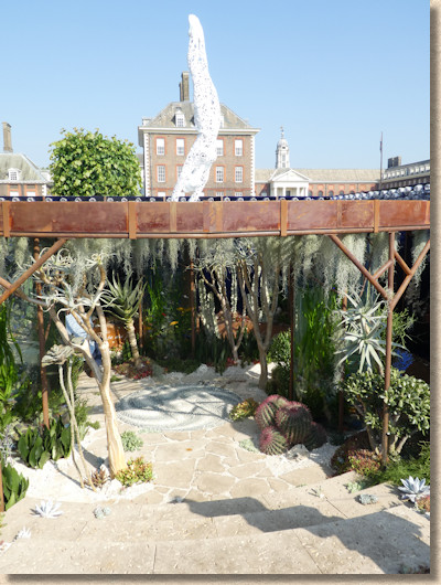
It’s the re-creation of a coral reef….in land plants! It’s amazing. Desert plants, cacti, lithops, agaves and all sorts of strange vegetation stand in for the corals and are totally convincing. The walls feature the now-despised plastic bottles which pollute our oceans threatening all sorts of marine life and David Attenborough.
Above the rusted roof/surface structure, a model diver plunges head first to the underwater world beneath. On the floor is a beautiful mosaic of swirling pebbles which is reached via steps of creamy crinoidal limestone, fossils of seas long since lost, and crazy paving of the same forming the sea floor.
A rusted man in one corner, a vertical fish tank over there, every square inch dripping with detail of what the designer referred to as ‘our biggest and most neglected garden’.
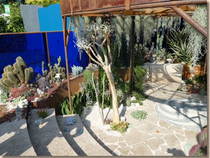
OK: so this isn’t a real-life garden; it’s conceptual; it’s making a point; it’s all right-on and very much the zeitgeist, but this is such a fantastic way of getting the message through to those that might otherwise pass on by. This *has* to be preserved, re-built in a suitable museum or educational location. Our children need to see this. They have to know what it is we are risking everytime we casually drop that empty bottle of water or fizzy pop.
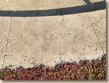
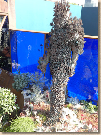
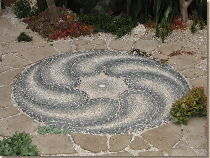
My favourite “garden” of the entire show!
Another ‘message’ garden is berthed alongside. The Myeloma Garden UK is, as you can guess from the name, raising awareness of the life-threatening disease.
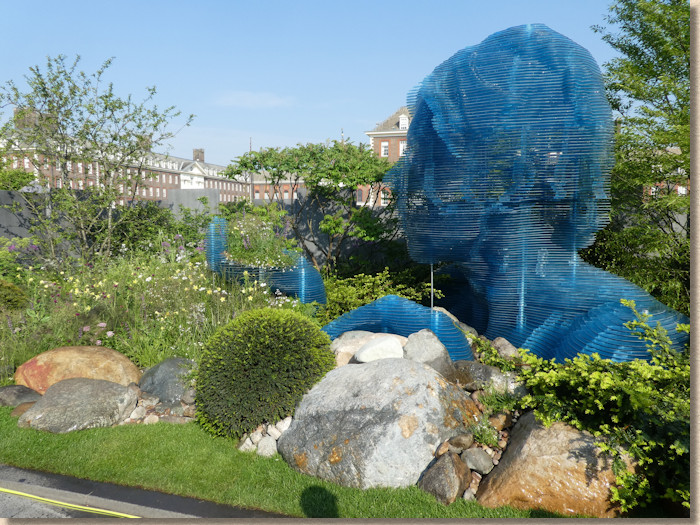
A massive blue plastic sculpture of a head and hands rise up from soft, feathery planting, but the main interest for me was the boulders used to edge the plot. Some very, very interesting rock types in amongst them, not just your usual sandstones and granites.
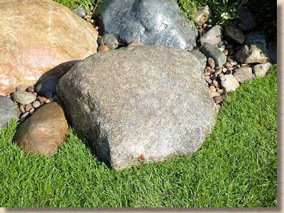
Of course, the only person womanning the stand hadn’t a clue what they were – rock, she reckoned, knowledgeably – but I suspect at least one of them was the weirdly spotty anorthosite last seen at the British Geological Society’s Time Path back in 2012
The last of these gardens is the Cherub HIV Life Without Walls garden, which is, here we go….”a metaphor for the journey a young person with HIV faces today”. Another message garden, then.
It’s not my intention to belittle or demean these efforts, but, sometimes, there’s no sign at all of the message, and the garden makes no sense, relying on the alleged metaphor to excuse poor design, shoddy construction and half-hearted thinking.
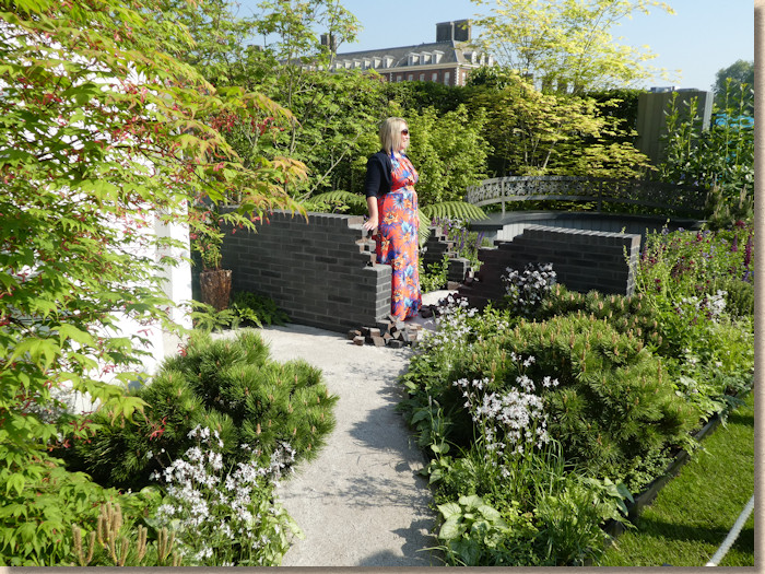
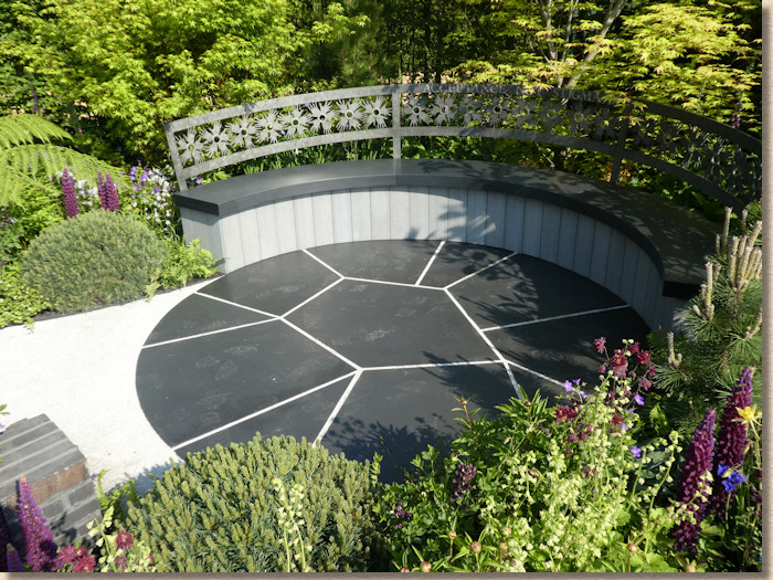
Happily, none of the above applies here. The metaphor must be pretty plain because even a numpty like me could see it. A fractured black stone seating area is linked via a path of granite dust through broken, tumbledown walls of Staffordshire Blue bricks to a pod of serenity. It’s a journey, from one end to the other, from uncertainty to resolution.
I liked the stark contrast between that black stone (wish I could have found out what it was!) and the silver granite dust. I really liked the accuracy of the cutting on the mystery black stone (is it a limestone?) which has the mark of a master mason about it.
Artisan Gardens:
And so, on we trudge, to the final category of garden. The Artisan gardens, where there’s often more inspiration per square metre than anywhere else in the show.
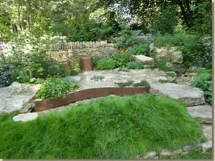
The Warner Edwards Garden is a little slice of rural Northamptonshire, not too far from Kettering, I was told by one of the designers, and very convincing it is. Distinctive Northamptonshire limestone for the walls and the paving, including the almost inevitable Type 1 (or maybe this is 50mm crusher run?). Even the stream bed is limestone.
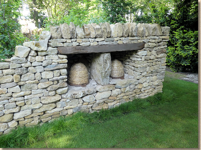
Tucked away on one side are two recesses for woven bee skeps, which deserved far more attention.
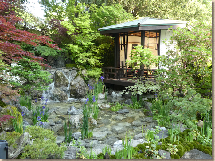
Kazayuki Ishihara has displayed at every Chelsea I’ve been to over the last decade and it’s always a variation on a theme. O-mo-te-na-shi no NIWA is sub-titled The Hospitality Garden, a Japanese cultural highlight and this would be the perfect setting. Very Japanese, with the trademark mosses, rocks, waterfalls, tea-house and stunning acers.
Another veteran exhibitor, Sarah Eberle, created The British Council’s garden – India: A Billion Dreams .
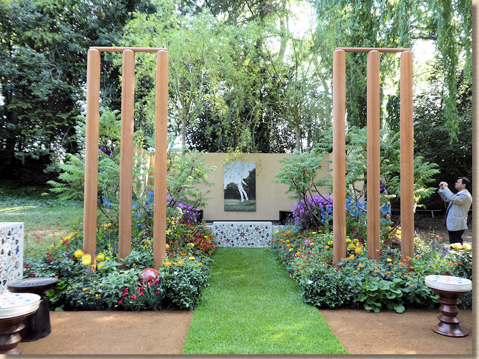
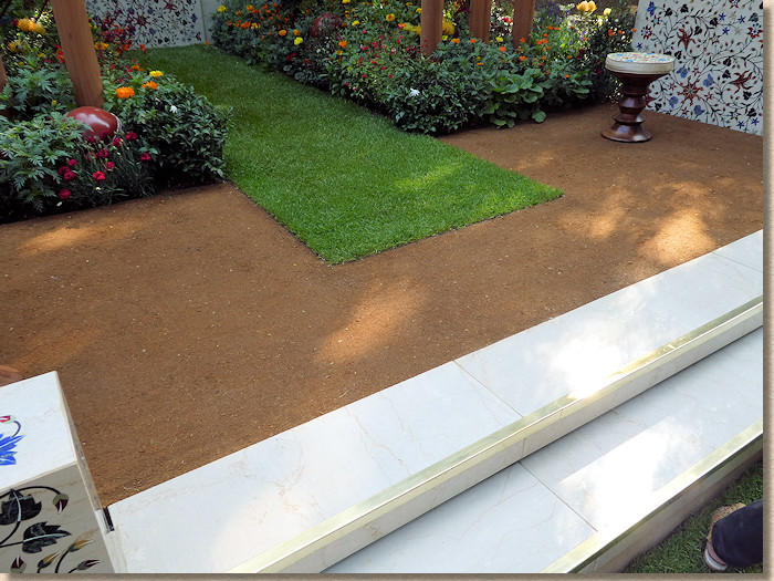
An enormous pair of wickets dominate the garden, towering over a pitch of verdant turf surrounded by an orangey-brown self-binding gravel hemmed in by white marble steps and very Indian tiled walls. I suppose the compacted gravel is there to represent the parched earth of the sub-continent. It’s just about the only hard-landscaping of note in an otherwise plant dominated garden.
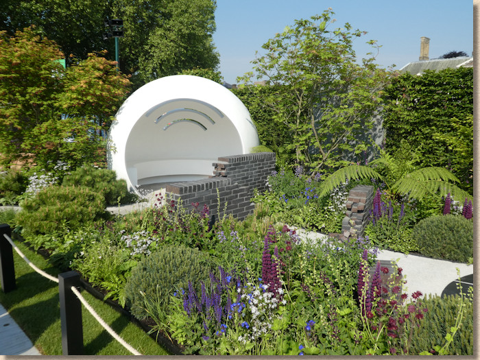
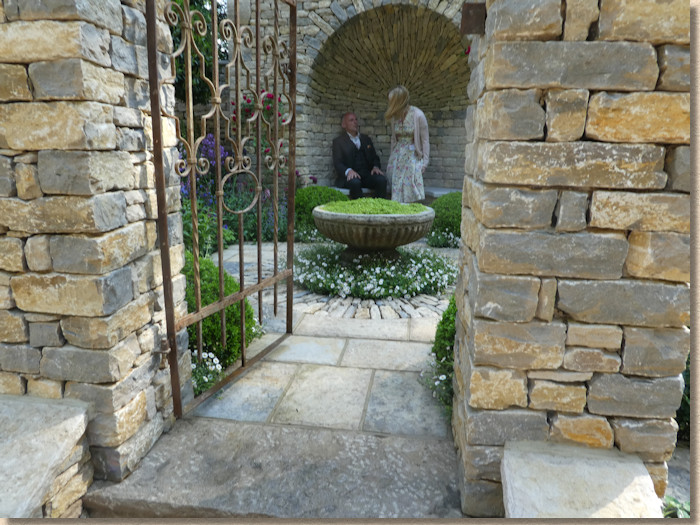
Now: this is gorgeous! The Claims Guys have sponsored what is entitled A Very English Garden and the stonework is just phenomenal. I couldn’t give a literal fig for the planting – just let me gaze upon that masterpiece of a dome!
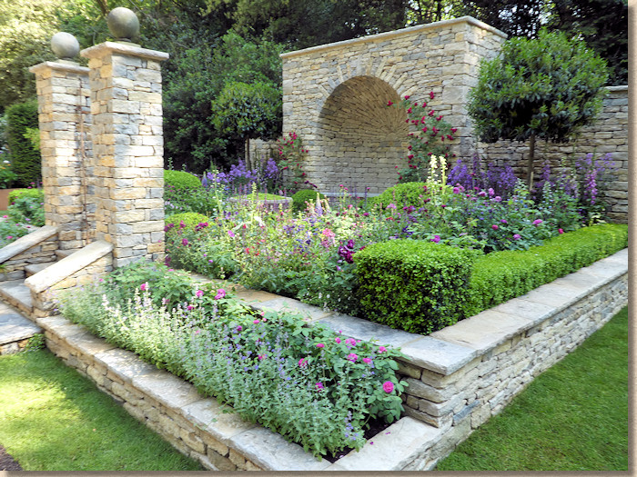
Ashlar limestone walls and pillars, riven limestone flagstones for paving and step treads. This is a garden that would be nothing without the paving and stonework. The rugged texture and creamy grey colours absolutely make this garden, and the quality of the work is exceptional.
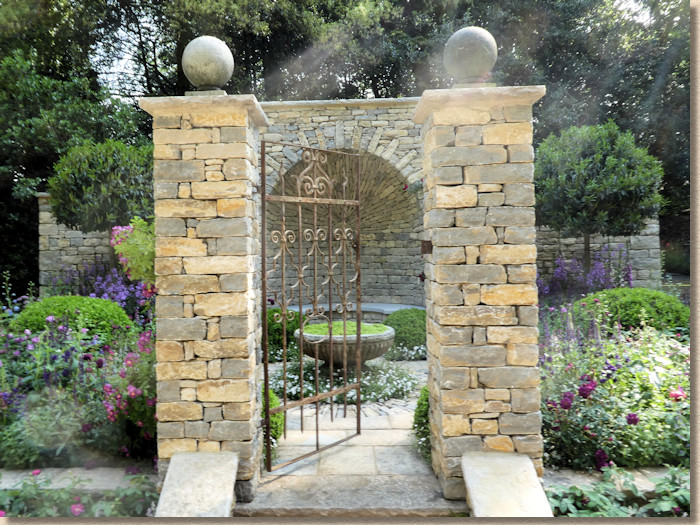
I can see this playing well to the audience. It’s what so many of us think of as an English garden, only more so, and in a much smaller space. It’s a fantastic example of how hard-landscaping contributes to the form and style of a garden and is more than just paths and walls and retainers. It is structure and organisation and backbone.
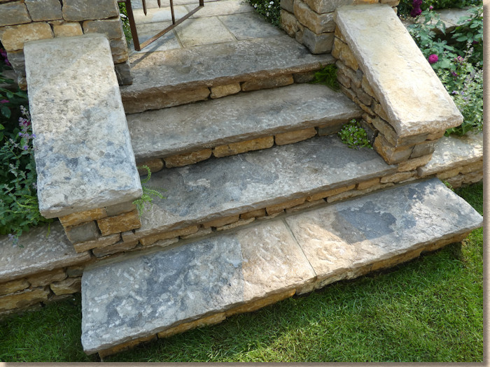
It's no great surprise this won Peoples' Choice for Artisan Gardens. Any other year, this would have been my choice…and it’s a tight run thing but, but this is, without doubt, my second favourite.
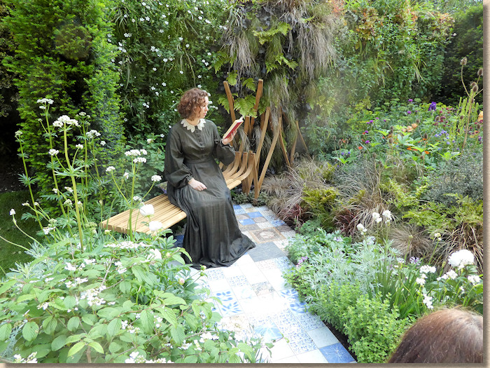
The Embroidered Minds Epilepsy Garden is yet another good cause but this one does nothing for me. To my highly-prejudiced eye, this is nothing more than a decorative tile path with a very nice bent wood bench at the end of it and loads of greeny-flowery nonsense to one side.
I’m the wrong person to pass comment here. It has nothing of interest to me but I’m sure the plan aficionados loved it.
Another charity garden with good intentions lies adjacent. The Supershoes, Laced with Hope Garden tells the heart-touching story of children coping with cancer. Very emotive, and ideally suited for a garden at a hospital or, god help them, a hospice, with its joyously coloured backdrop, the s-shaped bench and chunky crazy paving.
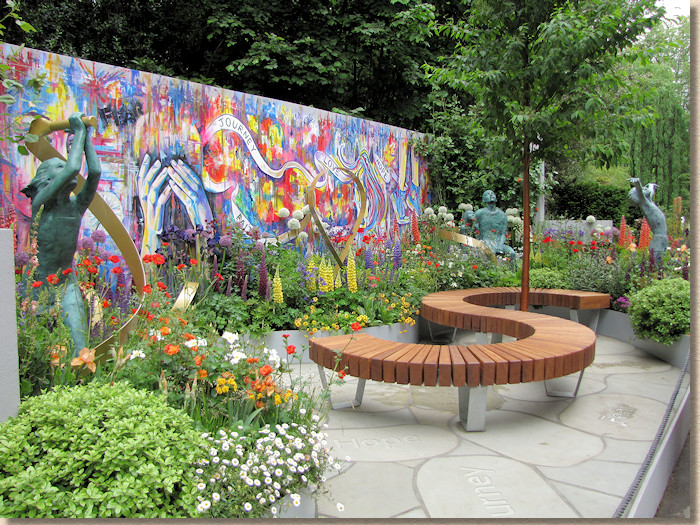
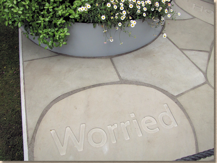
The stone is a sandstone cut into rounded random shapes and emblazoned with words that pinpoint the concerns and outcomes for affected children. Some of the cutting and alignment isn’t all it could be, but the overall effect is passable.
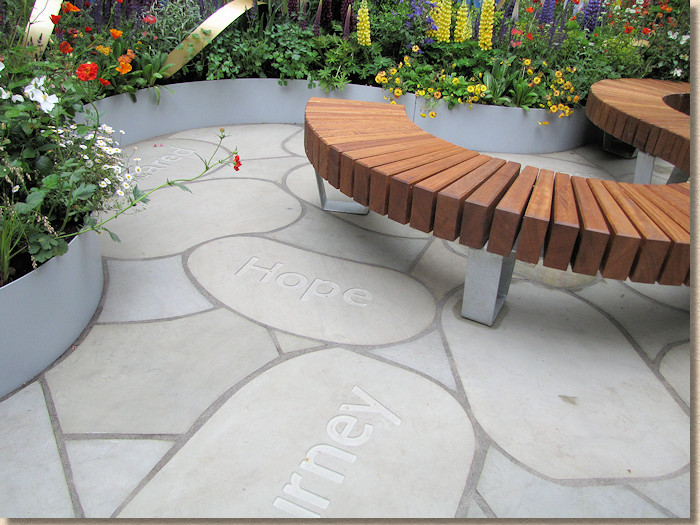
It did seem to be attracting a lot of media attention. It too three visits throughout the day before I managed to get five minutes when it wasn’t being cordoned off to protect the sanitised and precious air surrounding some nameless TV presenter, comedian or actor. They’d obviously got the message out to the media – if only they’d paid as much attention to the workmanship.
And finally, very finally for the gardens, The Viking Cruises Wellness Garden. From a company seemingly dedicated to sponsoring telly channels showing programmes from a golden yesteryear to a housebound audience, a very strange offering.
It was only by watching the telly coverage that I was able to learn that the ‘shed’ is actually a sauna (although I’ve still not a clue what the Husky dogs were meant to represent!). Apart from that, there were some big, blue-grey rocks, some Type 1 (of course!) and that’s about it.
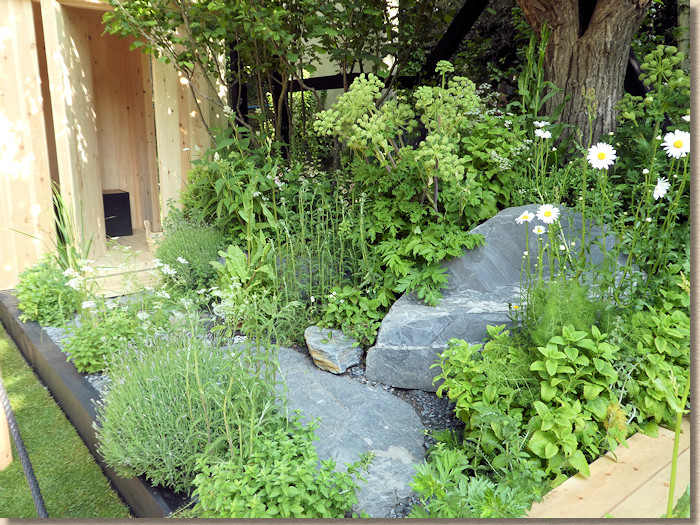
Again, I’m probably the wrong person to pass comment, but I wasn’t sure if this was a garden or just a shed where the tools for the other gardens were kept, surrounded by all the leftover bits of rock, earth and planting. Like Vienna, it meant nothing to me!
Trade Stands:
So, there’s far more to Chelsea than the gardens. There’s that big tent with all the plants, but that rarely contains anything of interest to a now-tired and aching pavior, and there’s the trade stands, some of which go to extraordinary length to draw in visitors.
A mention has to be made of Marshalls very appealing display, and not just because of who they are and their importance to the paving trade in Britain. It was a display that merited being considered as a garden in its own right.
I know the RHS would frown on the lack of greenery, but this presentation would be welcomed in many a garden throughout Britain, particularly by those that prefer functionality to maintenance. It is, as you should expect, heavy on the hard-landscaping, but it’s done oh so tastefully by designer Jo.
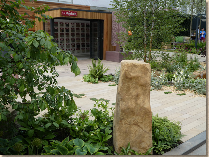
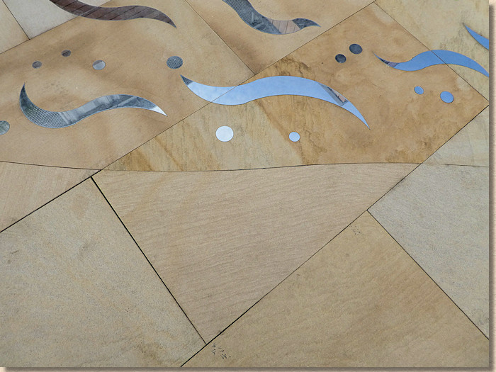
And, to bring joy to my soul, it has no grey paving! At last! We might be able to move on from the insipid monochrome palette that has dominated residential hard-landscaping for a decade. This was a feast of warm colours: soft pinks, rosy oranges, gentle reds, glowing ambers, seductive browns, creamy buffs and cheery corals. The main paving was, unsurprisingly, Marshalls ever-expanding repertoire of natural stone as precision cut honed flags and linear planks, with incised inlays of stainless steel, backed up by a link area of cherrywood porcelain planks that blended seamlessly, and statement pieces of hewn rock with just two sawn faces and riven edges, plus two giant statuesque carved trees in a buff and a red sandstone.
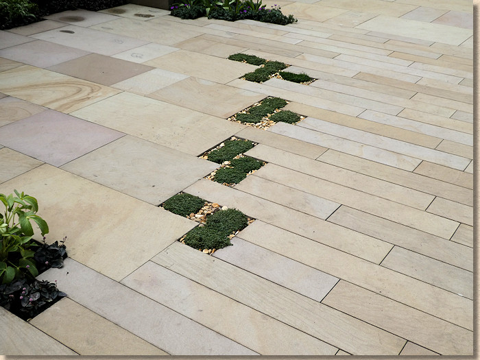
But look at the quality of the work. Look at the cutting. That work is sub-millimetre perfect. The team from the Supershoes garden should be dragged here to learn how it *should* be done. I know part of the brief is to promote Marshalls’ bespoke cutting service, and I can think of no better exposition of these skills. It’s a true joy to behold.
The theme is claimed to be about how Marshalls bring materials out of the ground into your garden, hence the labelling on the big rocks in the corner, and it’s a message that can be easily overlooked. Most, if not all, of our paving materials start life in the ground. They have to be quarried or dug or mined, and then dressed and processed to make them presentable, but it’s a timely reminder that, even for concrete, paving and hard-landscaping is as much a product of the natural environment as flowers, grasses, trees and shrubs.
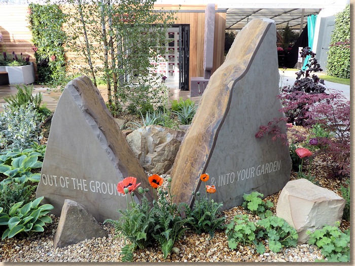
Without a shred of a doubt, the best trade stand by quite some way!
Speaking of sculptures, there’s always a few on display, trying to detect those with deep pockets, but this ‘collection’ grabbed me, in a way that might appeal to The Donald.
Is it me or does this sculptor have a thing for lady parts?
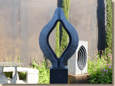
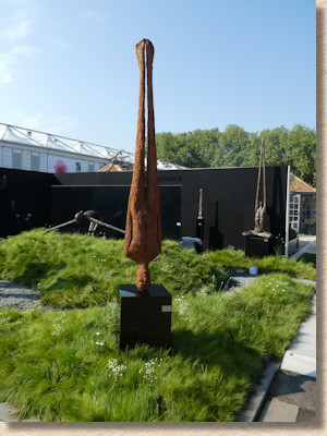
And has this one simply turned Anthony Gormley’s idea on its head?
An honourable mention to Chilstone for their use of Addagrip TerraBase® which worked really well with their mock-up of a suburban front garden.
I know they want to promote their reproduction castings for cills and pediments and pillars, but I felt it was the contrast with the earthy tones of the TerraBase® that really set it off so well.
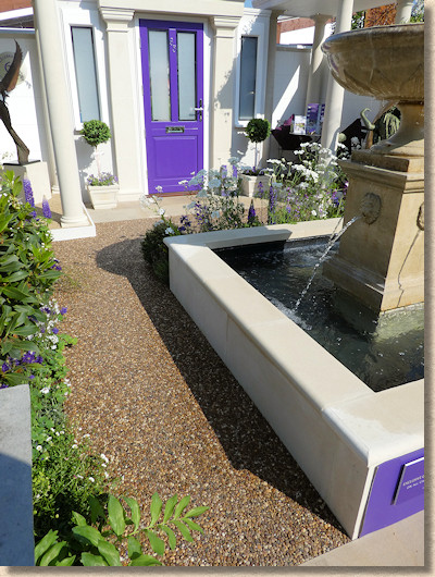
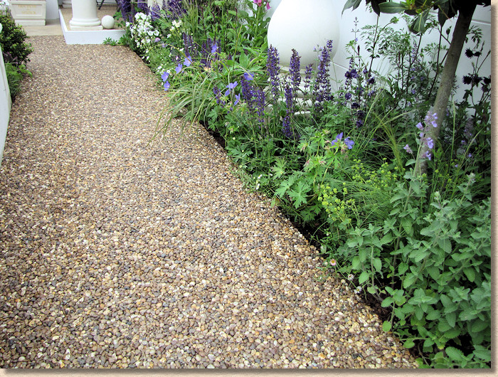
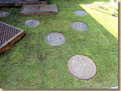
A mention too for the enterprising soul who chose to use manhole covers a stepping stones and patio paving for their display. Novel, certainly! Practical, possibly? Likely to be copied in gardens up and down the land? Not at all!
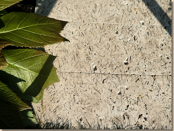
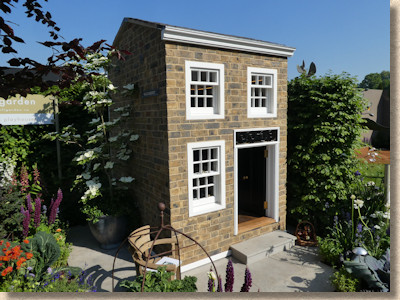
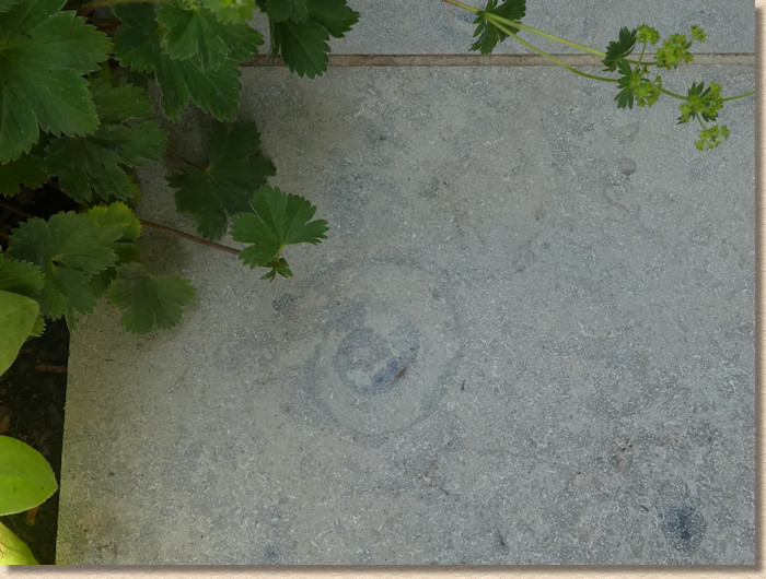
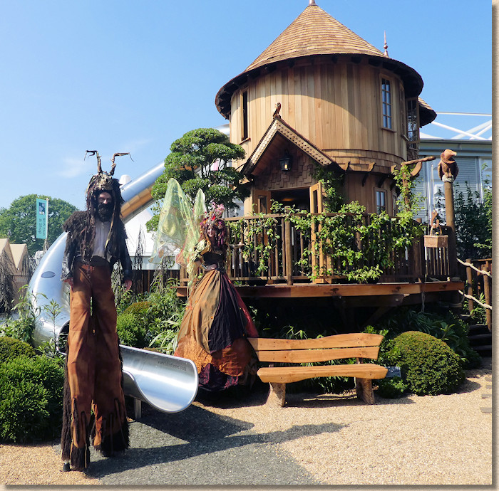
The little playhouse put in show by Wallgarden would be easy to pass by thinking of it only as an overpriced indulgence for over-privileged children but look at the all-too-short path leading up to the front door. That’s Jura Grey limestone with a honed finish and it’s loaded with fascinating fossils, including this ammonite that, for reason that I simply cannot fathom, was tucked around the back, almost out of sight! Why wasn’t this front and centre?
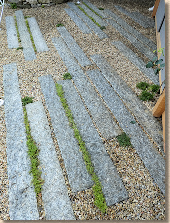
Sunken granite kerbs, or are they shallower and just coarsely textured granite plank paving?
Placed apart with inter-planting they create an effective paving that's part stepping stones, part pavement.
We've seen a similar idea elsewhere in this show, I feel!
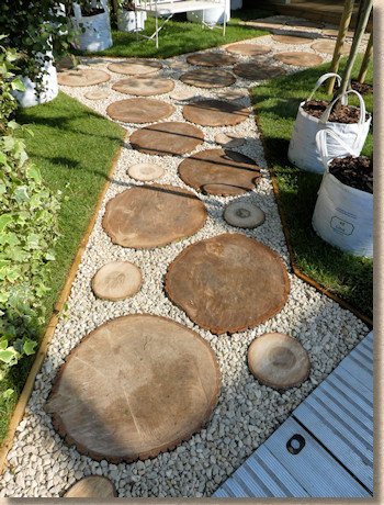
Log slices as stepping stones?
Looks great in the sunshine, but come the wet of winter, and they are a shortcut to A&E
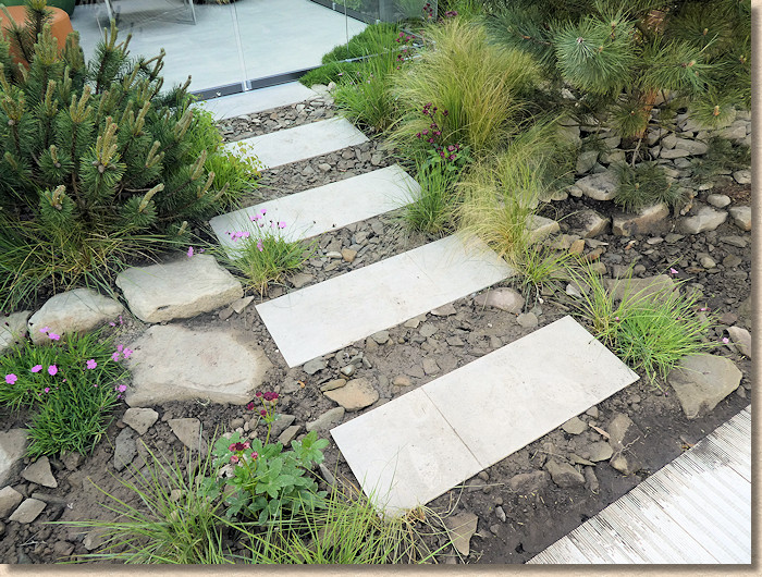
Another variation on stepping stones....sandstone planks separated by crude aggrgate.
Not for these avant garde souls the boring old Type 1 used elsewhere. Oh no! for them, it has to be the full 100mm crusher run!!!
Awfulness, in a single image.
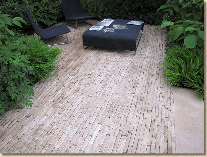
A surprise find in the Big Tent were these delicious limestone slim pavers. They vary in gauge width, which only adds to the charm, and their softly worn riven surfaces just beg to be walked across barefoot.
Legend has it that crazy paving has been a ‘thing’ amongst some designers over the last couple of shows. I’ve always believed that it’s called crazy paving because you have to be crazy to take on the job of laying it!
Any owld eejit thinks they can lay crazy paving, but to lay it well, to make it look good and effective, is nothing short of a work of art, and well-laid crazy paving is a true thing of beauty.
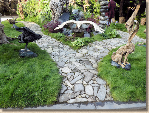
That on show at the driftwood sculpture stand is just about as good as it gets. Barely dressed lumps of limestone and grey sandstone slotted together as though that’s how they landed. The shapes and textures of the paths reflect those of the frighteningly expensive sculptures, so it was fantastic choice by whoever designed this, and a great advert for a dying skill.
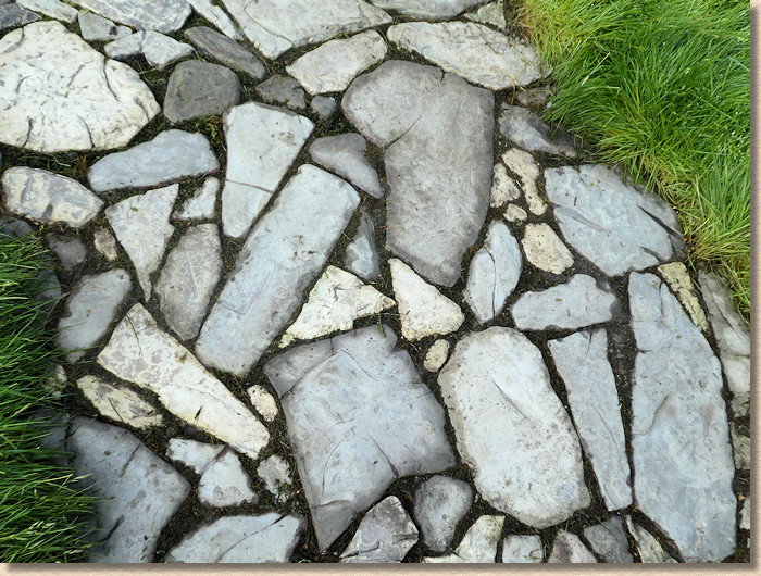
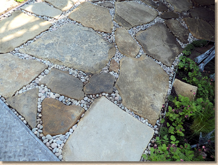
A similar idea, albeit using sandstone and larger pieces.
It's the joint width that makes the difference. Good crazy paving has minimal joints. Opening them out to use 10mm rounded pea gravel as a jointing medium may seem to be a great idea, but it detracts from the finished appearance.
A vast expanse of course-laid silver granite cubes at the Crane Garden Buildings stand, but what a waste!
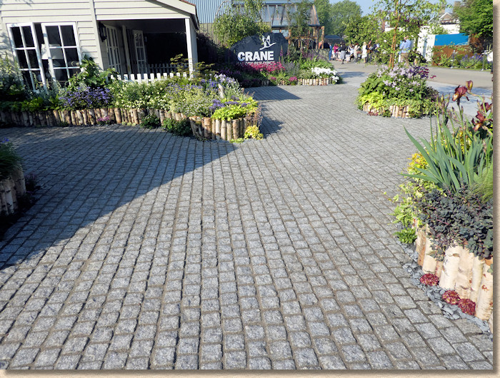
The surface was stained by the resin jointing compound used, masking the delicious glint that comes with this granite, and the layout did nothing to show off the possibilities when working with cubes of this size. It was almost a case of ‘just how boring can granite cubes be made to look?'
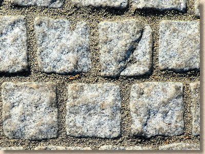
However, the award for worst-laid paving has to go to Agriframes. Wet-cast concrete reproduction riven flagstones, laid wide jointed at more or less any level they landed at. Lips? These aren’t lips! They’re fully gaping mouths!!!
How *dare* you lay paving so badly at the biggest showcase on the planet! Grrr!
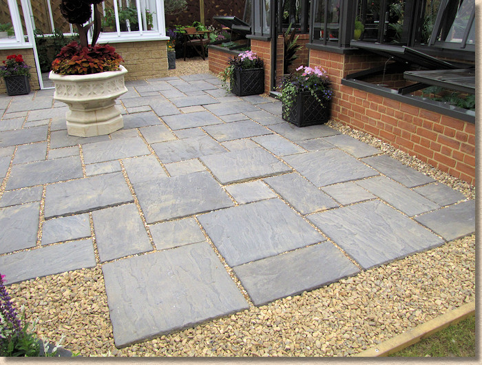
In conclusion:
So: the question that always gets asked is: was this a classic Chelsea?
Probably not, I think it would be fair to say. It has all the elements, all the glamour, all the beauty, and certainly all the right names, but there wasn’t enough to make me drool. The gardens I did love will stay with me for a long time, but too many are forgotten already.
What trends can we detect? What are the emerging themes for paving and hard-landscaping?
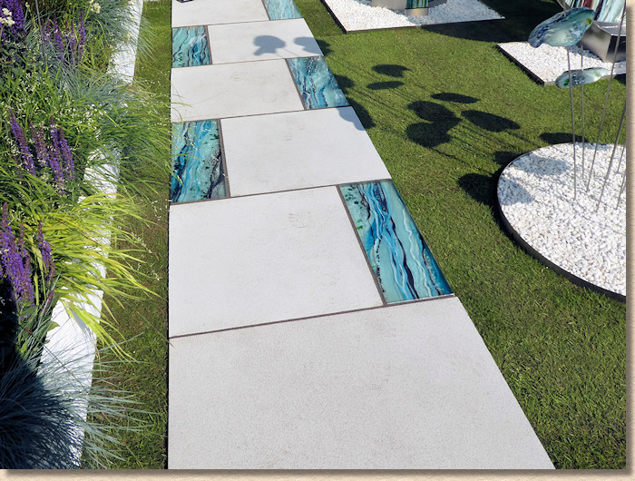
Well, cast in situ concrete is having a moment, and as long it’s being done well, then it is entitled to that moment. Maybe it will lead on to a wider re-appraisal of what concrete has to offer, because there is nothing quite as versatile. We’ve had our heads turned for a couple of decades by the ready availability and low cost of delicious stone from far flung places. Perhaps it’s time to look at what we have at home?
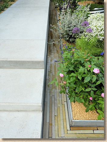
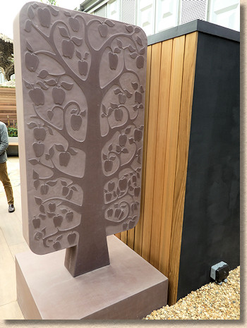
And of the stone being used, there does seem to be an interest to look beyond the familiar, to look for something a little more classy, with understated detail, and, thankfully, a move away from flat greys.
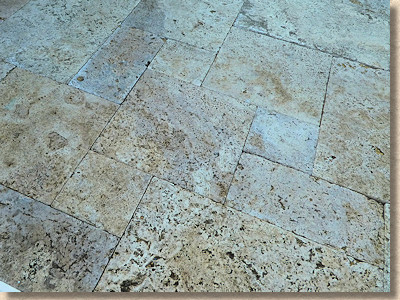
Disappointing, indeed, scarily disappointing, to see sodding Travertine making a re-appearance. There’s no need for that! I thought we’d consigned Travertine to the rusty skip of history along with all the other bad ideas we’ve had in the world of paving, such as cutesey animal stepping stones and rubber block paving.
Stop it now! Don’t let Travertine come back to collect crud, to slowly crumble and fall apart in our British and Irish gardens. Just say No to Travertine!
And the ‘stone’ that was seen on more gardens than any other? Type 1! Yes: crushed rock of roughly 40mm down to dust. It cropped up everywhere. Why? The best place for Type 1 (or Crusher Run or SF2) is a s a sub-base *beneath* the paving. At the surface, it is far too reminiscent of the car parks of struggling bowls clubs or scout huts.
If stone is moving along, then clay pavers seem to be stuck. It’s the same Rhenish muddy browns that we’ve seen for a decade, and the same formats laid in the same way for the same effect. Time for more inventiveness and more imagination. There is so much choice out there, please explore it!
I do hope I’m back for 2019. My appetite has been re-whetted, even if my soul hasn’t been completely lifted. With a bit of luck, I’ll be at Tatton in a couple of months and we can see what the northern fraternity manages to come up with. Bring it on!

