Bradstone 2017
There’s not many things give me more pleasure than slumping into my favourite armchair with a new paving brochure and languorously leafing through at my own steady pace, looking at what’s new, what’s been updated, what’s gone missing and how it’s all put together. Doing all this in the company of one of the people responsible for such a publication so they can explain the thinking and the strategies behind it all makes it even more of a pleasure.
And when that person is a passionate, committed paving professional with years of experience and a genuinely intimate knowledge of the industry, well, it becomes a privilege, not just a pleasure, so being walked through the 2017 Bradstone brochure by the man responsible for the brand is one of the highlights of the marketing year for me.
Having to follow this up by committing to paper my thoughts, feelings and opinions regarding a new brochure is not quite as much fun, but it’s the only way I have of communicating with so many others who share my passion for paving, so on we go.
And it’s a whole new look for Bradstone in 2017 with a landscape format brochure replacing the increasingly staid-looking and restricting portrait format that has dominated the brochure scene (if there is such a thing!) for decades, and boy! Is it chunky! 188 pages in total and easily the heaviest brochure I’ve encountered this year.
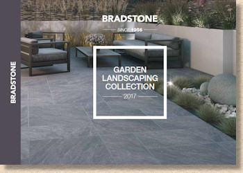
A very grey, monotone cover: white, plain text over a sombre image of a new porcelain product that we’ll come to anon. Good to see Bradstone acknowledging their longevity – “Since 1956” gives customers and contractors alike a sense of permanence. This is a supplier that’s not suddenly sprung up with a couple of containers of cheap imported stone, but has a proven track record all the way back to 1956, just one year more in the business than ourselves (AJ McCormack & Son) as we are celebrating 60 years in the paving trade as of this year.
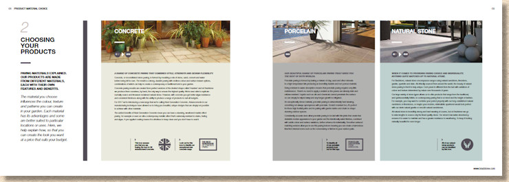
Inside, a simple categorised arrangement of what is a truly huge range of products, now sub-divided into Contemporary, Traditional, Driveway and Landscaping Features, with each section being colour-coded. There follows a short section extolling the virtues (but none of the vices) of the three main paving materials: concrete, porcelain and natural stone. The text here is a little feint and verging towards minuscule, so it would be tempting to skip but that would be a mistake as there is valuable information to be gleaned by those who persist.
Onto the Contemporary section which has been allocated the lion’s share of 77 full colour pages to convince us of its possibilities and potential. This category includes contributions from all three materials but is unashamedly dominated by the current in-thing, porcelain paving , aka ceramic or vitrified.
However, pride of place at the start of the section goes to what is, for me, the most exciting new products on offer, high-tech concrete flagstones which they are referring to as "Next Generation Concrete". I’ve heard other terms for it, ‘engineered concrete’ being one of the most common, but the gist of it is that this is a high-performance ultra-fine concrete using face-mix technology to ensure the good stuff is at the face and just below, and not being wasted lower down in the flag’s cross-section.
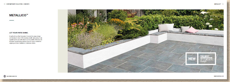
I’ve also seen a few different finishes which have engendered almost every emotion between abject apathy and irresistible intrigue, but Bradstone have gone with just two for now: Metallico is…ermmmm….metallic, sort-of, while Pierra is more like a highly-decorative stained concrete, a style popular in the US but not seen quite as often in Europe.
For anyone not immersed in the world of paving manufacturing, it would be easy to overlook this pair as quaint oddities, but make no mistake, they are representatives of just about the most exciting step forward in concrete processing for over a decade and they herald a whole new generation of concrete possibilities.
The Metallico comes in Opal, which is essentially petrol-grey with rusty patches, Umbra, which evokes the tones of Corten steel, and Quartz which I judge to be akin to weathered galvanising. Pierra, too, has three colour options with Quartz (smoky light greys), Basalt (swirly dark greys) and Pearl (cloudy stone-buff tones). Lovely they might be, and exciting because of the technological innovation that produced them, but only one size for both ranges – 600x400mm – which limits design possibilities, and at 40mm thick, they are twice the depth (and weight!) of an equivalent porcelain unit.
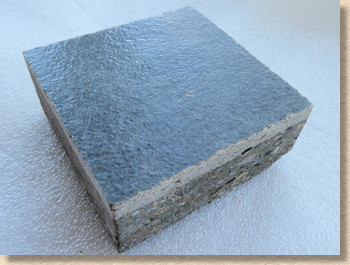
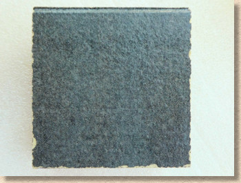
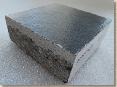
The keen-eyed among you will have spotted the one 'drawback', if that's the right term, with these 'Next Gen' concretes, and it applies whether they're made by Bradstone or anyone else. That very thin micro-topping which is sort-of 'printed' onto the face mix can be a bit flaky at the edges when cut. Compare the manufactured edge at the top of the sample piece on the right above with any of the three cut edges. See what I mean?
A highest-quality diamond blade will minimise any such 'flaking' at the edges, and, although I haven't seen it myself, a contractor I trust tells me they use a particular brand of serious quality porcelain blade (continuous rim) to avoid the same problem with similar product from another manufacturer.
It's worth bearing this in mind if you've a project that will involve a deal of cutting. Either invest in a decent blade or think about how those edges could be 'masked', maybe with a jointing medium?
Enough! After years of apologising for not being natural stone, it’s about time concrete stood proud and trumpeted its strengths, all the characteristics it offers which natural stone never could. Concrete is a damned fine paving material and, hopefully, this "Next Generation" sees the start of a renaissance in its use for modular paving.
There has been a huge expansion of the Bradstone porcelain offer this year, so much so that they’ve very kindly collated all the various porcelain pavings into a standalone mini-brochure so that those who are determined to be ’on trend’ have no need to wade through crude concrete or ner ner natural stone. I can see the sense in doing that, but I can’t see anything in the mini-brochure that isn’t included in this weighty tome, so I’ll say no more about it at this stage.

What we have is, quite frankly, overwhelming and even though I’ve worked my way through it all a dozen times or more, it’s a struggle to remember what’s what, and which is which, and who is who, and why? To be frank, the chosen names don’t help. Manzano, Aspero, Vetusto, Causse, Pautia….they’re not exactly evocative or even memorable, and that’s not even all of them! Here’s the crib sheet I prepared to help me figure out where we are:
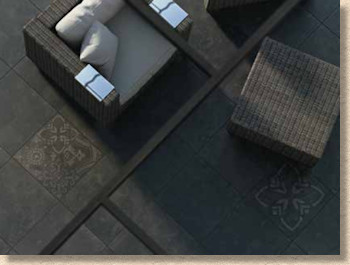
- Manzano – the mosaic-y one, with clever use of printed motifs to break up the monotony
- Aspero – the one with vague diagonals
- Vetusto – the wannabe slate-y one
- Causee – the dark grey one aiming to replicate Belgian Blue limestone
- Pauta – the light grey one that’s a bit like granite
- Mode – the one that’s been around for a couple of years
- Tordillo – the off-white marble-y one
- Andana – the plain one
- Madera – the weathered timber planky one
- Bollockio – the one I made up
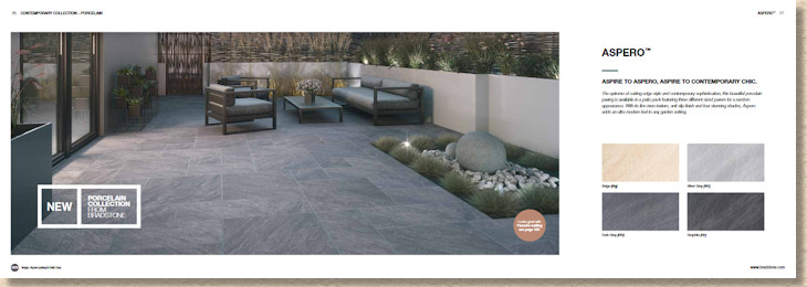
For me, the standout product is the Manzano solely because of the option to use ‘mosaic’ tiles to introduce apparently random motifs that will, genuinely, add much needed interest to what can be an expanse of meh. That’s the problem with porcelain: it’s just too bloody predictable, too timid, too inoffensive, too tile-y. In larger areas, it desperately needs summat to give it oomph, and these little mosaic pieces just about do that, without ever being too flamboyant.

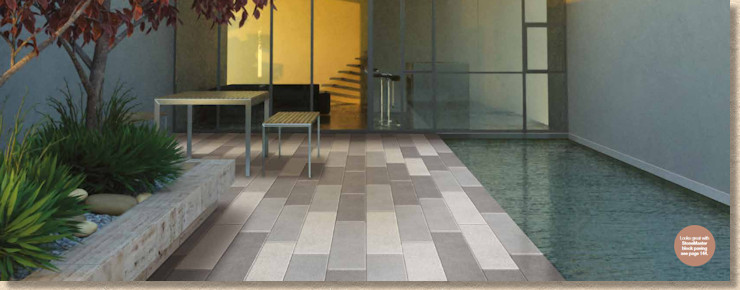
Great to see StoneMaster is still on the books. I love this product but it’s not been developed quite as I imagined it would be. It’s become stuck in a rut of just two colour groups, grey or buff (albeit with three shades of each) whereas I thought we’d see so many other hues tried out. Still, with the contemporary palate being obsessed with monotones maybe its day is yet to come. Still, for my money, the best concrete paver made by Bradstone (Charco/AI/Holcim/etc.)
Lots of choice, too, with the other ‘on-trend’ paving of the 2010s, the smooth or honed sandstones. I know they look nice, and they feel wonderful under bare feet, but I am seeing so many problem installations with this group, regardless of supplier. While there are some damned good versions on the market, too many are soft, mega-permeable, also-rans that need intensive maintenance to keep them un-greened and looking good.
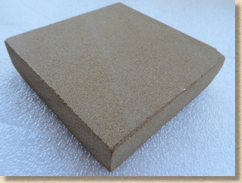
The new Fine Grained Sandstone from Bradstone looks and feels better than many. It seems dense and I’ve had a piece in a water bath for a couple of weeks where it’s resolutely resisting the worst effects of saturation, which is a good sign. This is a product which comes as a project pack of 15-and-a-bit square metres, with two colour options, Ochre, an olive-browny-buff, and Buff, a grey-blue buff. Very reminiscent of some of the best Yorkstone and it’ll be interesting to see how it fares in the perma-damp of the British climate.
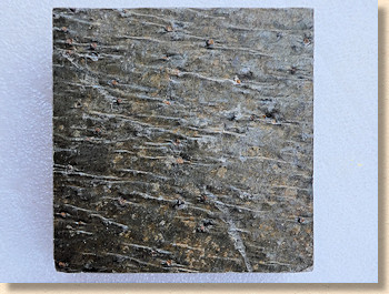
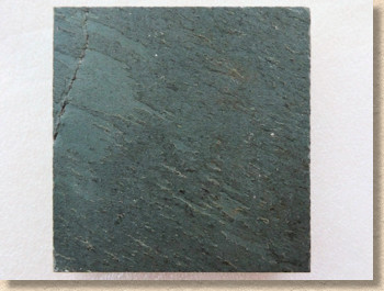
Natural Quartzite is another patio pack product but is quite dark. The only colour option is Twilight, a dark, dusky tan-brown enlivened by the unmistakeable glint of mica. It could be overwhelmingly sombre but, in the right setting, with the right accessories and sympathetic planting, this will be a bloody stunning statement patio. One for the more adventurous but needs careful planning to get the best from it.
Everything else in the Contemporary section is known to us, some of them for many a year, which shows they have legs and, more importantly, that there is a steady cohort of consumers looking for reliable, contemporary styling without falling for some of the more esoteric high-fashion items that have their brief day in the chic style sun and then fade away, never to be seen again.
That’s not something you expect from a Traditional collection, is it? Here we have the time-honoured favourites, the tried-and-tested garden pavings that have seen us through decades of flighty garden design yet remain firmly attached to the heart of what we think of as a British garden.
Here we have the comfortable, unchallenging concrete and natural stone products that so often form the understated and undemanding soul of a garden. None of that flashy porcelain or overly-engineered finishes. Just good old-fashioned paving that our Grandparents would recognise.
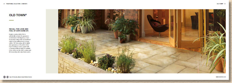
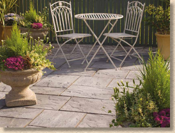
Nothing new to report here, as far as I can tell. It’s a solid, predictable line-up of all that’s great about the Great British Garden Paving. Proven natural stone with natural stone textures and colours, be it sandstone, limestone or slate, and a comprehensive range of wet-cast that covers every niche from high-end country cottage to utilitarian bin-store area, from barely perceptible texture to obviously riven, with colours toned to suit the various palates of different parts of the country.
People have been predicting the end of wet cast for the past 20 years but flicking through the Bradstone brochure reveals it’s still got a role to play despite all our engineered concretes and pristine porcelains. There’s something reassuring about good wet-cast and there are few, if any, who do it quite as well as Bradstone. After all, they’ve been at it for over 60 years, so you’d expect them to have the hang of it by now!
The Driveway section, too, shows nothing new. Concrete block paving (CBPs) remains stuck in the doldrums for reasons that are many and varied, but a huge part of the problem with CBPs has been shoddy installation. Cowboys pretending to know what they are doing and then, when the driveway sinks, shifts or gets a covering of vegetation, they blame the product and not their own incompetence. Well-laid block paving remains the best value for money driveway surface bar none – it’s getting it well-laid that’s the problem.
So, if everyday CBPs are struggling, why not look to the alternatives? Where are the setts and cobbles ? Where are the larger-format CBPs? Where are the new, exciting textures? Maybe Bradstone isn’t the brand to bring these to the fore, but other brands are at least making the effort, so are Bradstone missing a trick?
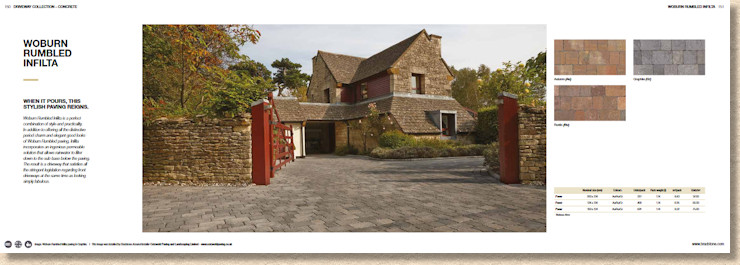
There used to be setts in the Bradstone offer. Admittedly, nothing exciting, mostly the over-subscribed silver-grey granites and similar, so maybe they didn’t sell and, with every part-time market trader flogging these setts, that’s understandable, but to not have a natural stone alternative in the Driveway section strikes me as a glaring omission. There are plenty of interesting stone setts available, even some from British quarries, so, if only for appearance’s sake, it can’t be that difficult to find something to round-out the all-concrete offer.
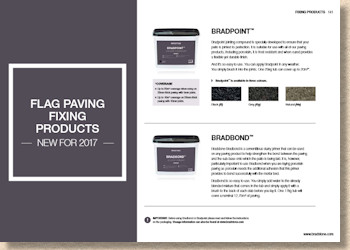
Tucked in amongst all this no-newbie nonsense is the long overdue appearance of a Bradstone own-brand jointing medium and a primer . The jointing jollop, with the highly original name of ‘BradPoint’ is a British-made one-part polymeric which it claims is suitable for use with all of Bradstone’s products. I’d be wary of making so bold a claim for a polymeric! If some eejit uses it on a driveway, it won’t last for long, polymerics never do.
The primer, ( BradBond – you could probably have guessed that!) is a pre-mixed slurry-inna-tub. It makes sense to have such a product, particularly if you’re majoring (as the Merkins say) on porcelain paving, but why has it taken so long?
Returning to the BradPoint: if you are going to throw your hat into this ring, why go for a technology that is 10 years out of date? While one-part resin mortars and polymerics might be OK-ish for lightweight patios and mortarphobic DIYers, any sensible contractor is using the far superior two-part resin mortars , particularly with porcelain, because it costs pennies more but can withstand the inevitable power-washing that porcelain patio owners seem to think are necessary on a fortnightly basis.
You wouldn’t buy a Porsche and fill it with supermarket petrol, so why spend good money on superb porcelain paving than fill the joints with so-so jointing?
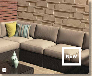
Final word on products goes to a new walling block. Apparently, having used up all the available comedy names on the umpteen new flavours of porcelain paving, Bradstone have been obliged to re-use an existing name for a lovely new walling system. Mode is a three dimensional, ultra-chic cladding for internal and external walls. Just one colour, which continues the exciting name theme by being ‘Beige’, but you can see the potential here. Very, very interesting!
There are a few other bits and bats of newness; a walling block here, and edging kerb there, but nowt to get overexcited about. All the efforts, it would seem, have been poured into porcelain, and, to be honest, given the condition of the market for paving in 2017, that makes helluva lot of sense.
So, what about the brochure itself? Well, the change to a landscape format has certainly helped, particularly with the ability to use full page images. The choice to use quite so many images that spill over onto half of the adjacent page is less understandable. Yes: a big picture makes a real statement, but when you’ve a stonking great fold running through it, that sorts of kills the buzz. Maybe this stems from the burgeoning reliance on online, downlaodable e-brochures, with no seams or folds to, as it were, spoil the scene. However, many contractors and customers will still rely on olde-worlde paper brochures (if they didn't, the manufacturers wouldn't make them - they cost a fortune!), so hard-copy presentation remains critical.
The clarity of each of the main sections is exemplary. The arbitrary division of products into these categories is so straightforward and logical, the colour coding, while useful, is barely necessary. The layout of the pages is clean and crisp, with good balance between imagery and text. Swatches are adequate but pack and sizing information is minuscule. When there’s only one size of a particular product, does that really warrant a table format?
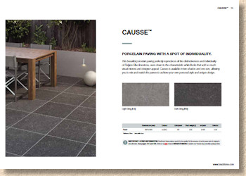
The photography is generally excellent, although some of these shots are now well-known to seasoned brochure watchers. They’ve coped well handling colour balance and resolution in those shots where gardens are bathed in both sunshine and shadow. The paper on which it’s printed seems to be of a quality that allows the photos to have a sheen without being overly shiny, if that makes sense.
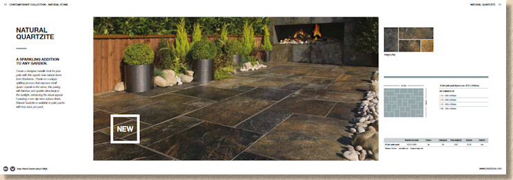
The overall feel is of an image-rich, lush and luxurious brochure that oozes charm and quality. The sheer weight of it tells you this is a publication from a company of means, and the whole way in which they quietly and calmly extol their own virtues and those of their ‘Assured’ pet contractors seems far more measured and reasonable than in some other brochures.
The only thing that lets it down is that feint text. I like the simple sans-serif font itself, and the use of that bold, plain ‘square’ motif, but the thin, anaemic, grey text is damned hard to read. I accept that I’ve been having eye problems of late, but even my 20/20 lady-friend reckons it’s awkward to read in anything but strong light. It shows up fine in the e-brochure, but in pactual print, it's a bit of a strain!
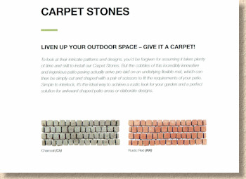
Hey! If that’s all I can find to whinge about, they’ve not done too badly! This is the best Bradstone brochure to date, and by quite some way. This makes a no-nonsense statement of intent. Bradstone are now a company of both vision and heritage. After too many years of not seeming to fully know or understand their direction, 2017 looks like being the year when they’ve very definitely nailed their colours to the mast and set off with purpose, that purpose being to establish themselves as the leading supplier of contemporary style whilst not forgetting their roots. Exciting times ahead!
Without a doubt, this brochure will have many of their competitors sitting up sharpish and paying attention. If you’ve used Bradstone products and brochures previously, you’re in for a very pleasant surprise; if you’re new to them, buckle up! You’re in for a real treat.
Bradstone's Customer Helpline: 01335 372 289
Click here to download a PDF e-brochure

