Bradstone 2012 Collection
It's been a long wait for this brochure. Its arrival on the desk here at Borlochs Hall was originally mooted for January, but it never quite managed the arduous journey from deepest Derbyshire all the way to the Occupied Former Territories of South Lancashire. In April, direct negotiations with Aggregate Industries took place at the humungous EcoBuild event in that London , but the forces of darkness must have been at work yet again, as nothing made it across the border, and so we have to thank the very nice people at Brett , of all places, who managed to sneak a copy through customs a couple of weeks back.
Anyway, regardless of which circuitous route it took, a full copy of the Bradstone 2012 Garden Landscaping Collection is here in front of me. I swear the titles given to these brochures get longer and more convoluted with each passing season. Is a 'collection' really any better than a 'catalogue'?
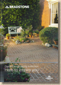
So, it's roughly A4, full colour as you'd expect, and running to a chunky 100 pages, including the semi-stiff covers, the front of which bears a full-size image of the often overlooked Carpet Stones. A Table of Contents is provided on page 2 but there's no immediate indication of new products, so we'll have to root about and see if any are there to be spotted. The 'collection' has been divided into five sub-collections: Contemporary Paving, Traditional Paving, Block Paving, Landscape Features and Decorative Stone, which makes sense, I suppose.
There's an opening salvo about the Bradstone Assured scheme of allegedly competent contractors, of which much has been whispered but nothing actually witnessed. I did meet a contractor who claimed to be on the scheme, but when I pressed for more information, he just shrugged his shoulders, and said he didn't know anything other than the cost of joining.
There's also a feature-ette regarding the absorption of some of the StoneFlair range into Bradstone, which just further complicates the incestuous relationship between the various Aggregate Industries brands. Is StoneFlair a standalone brand or is it now part of Bradstone, as seems to be suggested by the title "StoneFlair by Bradstone"?
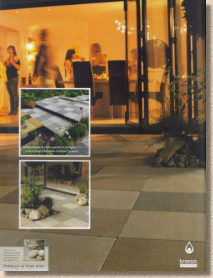
Ay up, here we go: the grandly titled Contemporary section starts with a subdued announcement about Urban Gardens, and inspiration before launching into the coverage of products that used to be (and may still be) Bradstone, but which are now badged as StoneFlair. Leafing through the section, I can't spot anything distinctively new, although there may be new sizes and/or colours that escape my attention without doing a compare-and-contrast exercise with last year's brochure. There are some fantastic photies of incredible-looking jobs, but no sense of products being fully explored. Text is sparse, and it feels that some of these items would really benefit by having their USP's and characteristics more clearly defined.
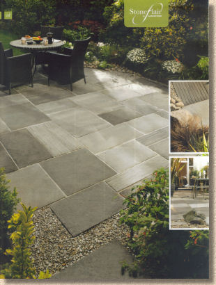
Before you know it, we are in Cottage Garden Traditional , and the confusion continues. The StoneFlair branding used for the Contemporary section has been dropped from some products, but what's this? Didn't Yorkvale used to be a StoneFlair product? I think I need a lie down. Hang on: StoneFlair is back all of a sudden. The Antique Natural; Sandstone is a StoneFlair item, apparently. Is it that natural stone products are StoneFlair, and the concrete items aren't? No, it can't be because the Restoration paving on page 32 is natural stone, but not StoneFlair, nor is the run-of-the-mill riven Indian stone on page 49. Nurse! My medication, please!
All of a sudden, we're into the block paving/ Surely this will be simpler to understand, and it starts with a cracking photie of the StoneMaster in its three-hued grey form. Gorgeous! Pity about that corner kerb, though; they must have run out of external angles.
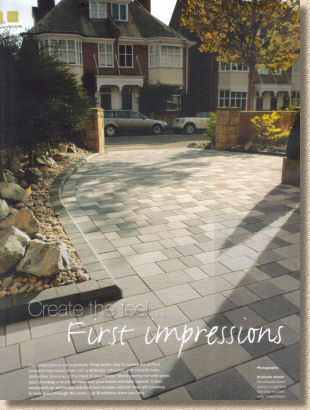
StoneMaster is still the best thing in block paving I've seen in years. I loved it from the moment I saw it, and now that its portfolio has grown to a reasonable size, I'm even more impressed with what it can do, how it can create such stylish projects, giving tone and atmosphere to a job that you just don't get with any other block.
The grey option is uber-chic and bang on the money for the current monochrome fashion, while the sandstone option (they call it buff) is just sensational for more sedate properties, especially anything with a hint of northern grit in the building. I know I'm going to be talking more and more of my design clients into using this superb paver over the coming months.
All the other block paving products are pretty much what you'd expect. The Woburn would be seen as the best seller, although Monksbridge has a strong regional following. When talking to those contractors specialising in driveway block paving, rather than, say, patio flags or natural stone setts, the Bradstone blocks are rarely mentioned as being a favourite, which is strange as their quality is spot on and the prices, or at least those I've seen, are reasonably competitive. It seems to be more an issue of brand awareness; the blocks from two other national manufacturers are nearly always mentioned with the Bradstone blocks acknowledged more by product name (Woburn in particular) rather than by manufacturer.
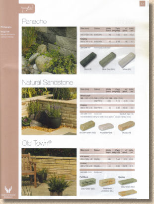
StoneFlair reappears sporadically amongst the walling items in the Landscaping Features section, but I'm still befuddled by the accreditation. The first three featured walling lines are, it seems, StoneFlair products, but two are concrete and one is natural stone, and the same illogicality applied with the edgings. Maybe it's a lucky dip, with product names pulled from a hat and branded as StoneFlair – that makes as much sense as any of the other reasons I've considered! In this section, the descriptive text has been pared down beyond sparse; in fact, it's completely absent. It's simply a photie along with size and colour options.
The final section on Decorative Aggregates is little more than three pages of swatches and a page shared by the useless DanSand rubbish and the underwhelming own-brand joint filler, which is marked as being suitable for setts! Not on my planet it isn't!
It all wraps up with sketches of possible laying patterns and circle layouts, and is minimal but functional. However, the How-To section doesn't tell you how-to at all, but refers you to the website, and gives another plug for the nebulous Approved scheme. Perhaps the web is the best place for How-To advice (this website seems to have done quite well based on that premise!) but I can't help feeling the DIY fraternity would like a couple of simple cross-sections to give them a rough idea.
Overall, I'm bemused by this brochure more than by any other published this year so far. There's no sense of product development, only of treading water, but that water has been somewhat muddied by the strange StoneFlair/Bradstone which-is-which thing. The products are, undoubtedly, of the very best quality and offer a range unmatched by anyone else. Many are truly original, and that fact alone deserves to be trumpeted much more loudly.
Some of the photies are genuinely stunning but there is no sense of drama. In other brochures, photies of lesser products are occasionally granted the honour of a double page spread, but in this edition, the really good images are all too often overlaid with smaller sub-images or crushed into a third of a page. Nothing sells good paving better than good photies. The good photies are there, but they are not afforded the opportunity to shine which they more than warrant.
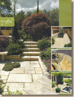
The Bradstone/StoneFlair split personality crisis is bloody confusing. Of the two, Bradstone would be regarded as the premier brand, so why has it been subjugated to StoneFlair? And why was last year's marketing message all about how StoneFlair was now to be the brand targeted at independent merchants and garden centres? I don't like to kick a brand when it's down, but this does seem symptomatic of what's been happening at AI over the last few tears. No cohesive plan, no sense of strategy or definite direction, no feeling of confidence, no path forward with new products. I find this to be really annoying because the products are as good as anything else on the market, and in many cases, better than most.
In fairness, any contractor or DIYer who does not consider Bradstone products when looking at a new project is doing themselves a massive disservice. There are gems in here that you'll find nowhere else, and so the brochure is an essential component of the complete library for this year, but there's not a lot within those 100 pages that will grab a customer and make them think: I want that! I think this has to be marked down as a wasted opportunity.
Get your own copy of the 2012 Brochure....
01335 372289


