Chelsea 2014
The annual RHS shindig at Chelsea is regarded by many as the start of the social season, and as the new blooms emerge, so do many of the more delicate flowers that flitter around the London salons, desperately convincing themselves that they simply must have such-and-such a possession otherwise their poor, undervalued lives might as well be over. Why mention all this nonsense when I know most readers are only interested in the hard landscaping to be seen at the show?
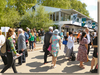
Well, in an otherwise lacklustre show this year, the sheer number of dilettantes and debutantes parading up and down the Main Avenue at the Royal Hospital Showground in the hope of being spotted by the camera-wielding pepperonis was one of the more notable sights. They've patently no interest at all in the paving, and little if any, in the flowers and planting, but they do like to be seen affecting an interest and generally getting in my way. The fact that I even noticed these ephemeral creatures reveals just how underwhelming the whole show was this year, and I'm really not sure why. Usually, there's at least one show garden that's a wow. It's not necessarily a good wow, but a wow in that it provokes a strong reaction, love or loathing, delight or detest. For whatever reasons, most of this year's gardens just left me feeling underfed, unsatisfied, wanting something more.
Oh, there were some very good gardens, and two in particular stood out for me, as I'll disclose shortly, but no wows and far too many mehs.
Two themes also stood out. It's probably something to do with the year. As it is, I'm sure you've noticed so hardly need reminding, 2014, and one hundred years since the outbreak of the previous century's first multi-national meaningless mass killing championship, and then the withdrawal from whatever it was the British thought they were doing in Afghanistan, other than killing and being killed, there was a tangible militaristic overtone to several gardens. Not open celebration or glorification of war, which no-one on the saner side of politics could realistically countenance, but a recognition that far too many young women and men have paid that " ultimate sacrifice " for causes worthy and just, and causes political and nonsensical.
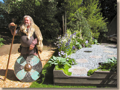
It is probably right to acknowledge these passing anniversaries at such an internationally important event as Chelsea, but their presence was verging on domineering. One really good tribute garden would have been a powerful statement; two decent gardens could have explored differing facets of war, its need for sacrifice, and its impact on our development as a society, but once you get into three, four and more such gardens, it all becomes too diluted, the message lost in the greenery, the relevance obscured by rich planting.
The second theme is one of taste, taste in materials used to create these showpiece horticultural creations, and the long overdue demise of cheap Indian sandstone from all but a few peripheral gardens and sponsored features.
This has been coming for a number of years now. Looking back over which hard-landscaping materials have crept to the fore over the past five years, there was a brief dalliance with exotic (and expensive) imported stone, some of which, thankfully, remains with us as it is truly world-class paving and walling, but more and more of the better considered gardens were using quality native stone, sourced from these very islands and blended with the depth of horticultural knowledge that, it seems, only the British and Irish garden designers fully understand, combining the two to create works of genuine wonder.
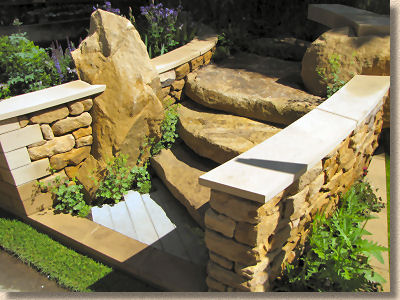
I'm not going to bore you with my dubious two penn'orth of opinion on every garden at the event, and several of them really don't deserve the oxygen of publicity (Yes! You Gucci! WTF???), but I'll pick out just a few that really caught my flagger's eye, mainly because they'd done summat a little bit special with the paving and hard landscaping.
Adam Frost's Gold-winning garden for Homebase and The Alzheimer's Society heavily featured the glorious Chicksgrove limestone. As Simon Hart, MD of stone supplier Lovell Purbeck, told me,
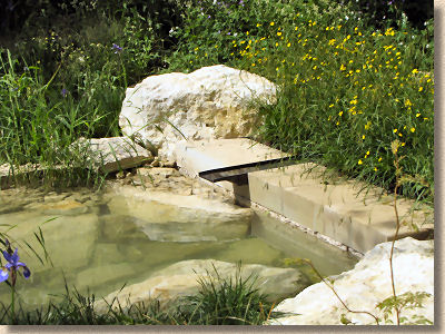
"All the stone for this came from our Chicksgrove Quarry near Salisbury, and was processed at our factory in Langton Matravers, Dorset. We worked closely with Adam Frost the garden designer and started looking at different ideas at the end of last year. In total over 60 tonnes of Chicksgrove stone was supplied. A water feature runs through the garden, the source of which is a two tonne block of Chicksgrove stone which had a hole specially drilled through. As well as features stone, Chicksgrove paving, radial steps, walling and Architectural masonry was supplied."
What I found fascinating was how different processing techniques, different lighting and even the effect of vertical or horizontal placement can have such a dramatic effect on the appearance of what is, essential, all the same stone. And I'm so pleased that Adam and his team will be taking home a Gold because I thought the bold presence of all that stone might just scare the judges as they traditionally don't "get" hard-landscaping as a garden component.
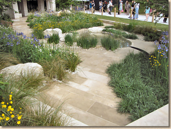
I'm not qualified to comment on the planting, but the hard-landscaping is a dream. A very high standard of execution with the best quality materials and a superlative showcase for what is possible with natural stone in a contemporary garden.
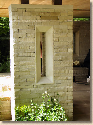
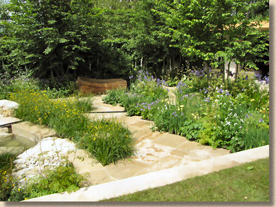
I should declare in advance that I am genetically pre-disposed to favour the Vital Earth - Night Sky Garden simply because it's sponsored by Bord Na Mona, the Irish peat producer, but even without that inbuilt prejudice, I did like the random stone sett paving….or I did until I watched the installation team re-bedding a couple of loose stone sand packing the joints with…..soil! FFS! That is simply not excusable, not even by an Irish team.
Pitched stone paving or random sett paving is a tricky look to pull off well. It's one of those skills like crazy paving which everyone assumes is a piece or pi….errr…cake because it's so haphazard, but in reality, to get it looking haphazard without incurring gaping joints or running the risk of breaking someone's neck with the unevenness is quite a skill, and, momentarily overlooking the jointing sin, the installation here is pretty good. In fact, it's pretty *and* good!
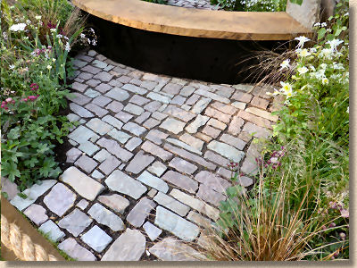
As with other gardens, it's refreshing to see stone being used in more unusual ways. There are plenty of installations using ultra-smooth honed and polished paving, but when you see a pitched stone pavement like this there's a greater sense of its character and it lends an authentic rustic feel. Just don't joint it with soil!
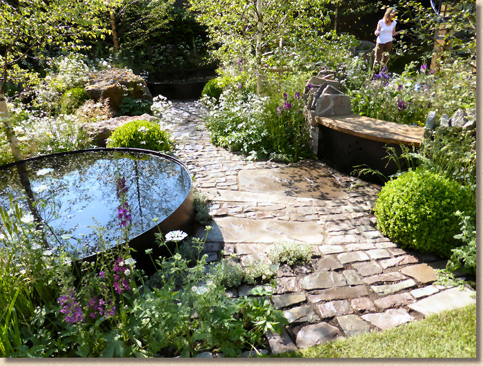
The RBC Waterscape Garden has, since my return, caused quite a stir mainly because of the relatively tender age of its designer, one Hugo Bugg, who I last saw exhibiting at Tatton a couple of years back. I'm not sure why someone's lack of years should preclude them from creating great designs. There's no doubt that with age comes experience, but youth has vitality and idealism and passion and fresh ideas aplenty, all of which sing out from this Gold winning garden.
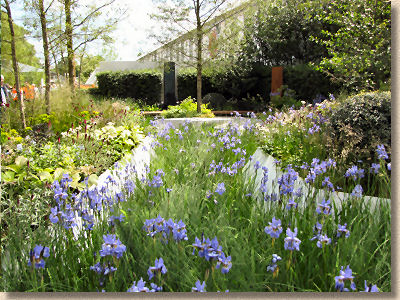
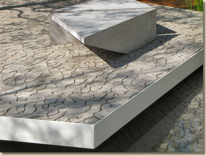
The iris-filled concrete-sided channels remind me of the drainage ditches used on the Pennine moors to direct excess water away from the roads, pathways and vulnerable areas, but the real joy for me is that stunning crazed paving which looks like sun-baked mud, cracked and shrunk by the heat into a chaotic surface of random organic polygons, yet offering a perfectly serviceable walkway.
At first glance, I thought the surface was stone, but it intrigued as to how much work would be involved in cutting stone into so many perfectly interconnected individual pieces with no sign of 'tiling'. I managed to get a quick word with the young lad himself and he revealed the paving is actually a bespoke cast concrete, from Kaza Stone in Hungary, of all places.
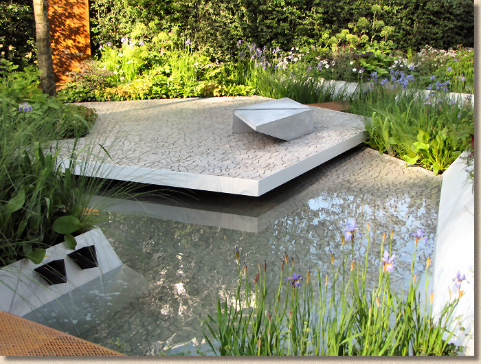
Visually stunning, I just know this is an idea that will be adopted and adapted by other designers, landscape architects, and, quite probably, certain manufacturers keen to exploit an innovative style. I'd have given him the Gold for that paving alone, but even a very amateur gardener such as me could tell that the rest of the garden was summat special, so I'm really chuffed that such fresh ideas and youthful self-confidence has been properly rewarded.
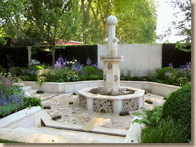
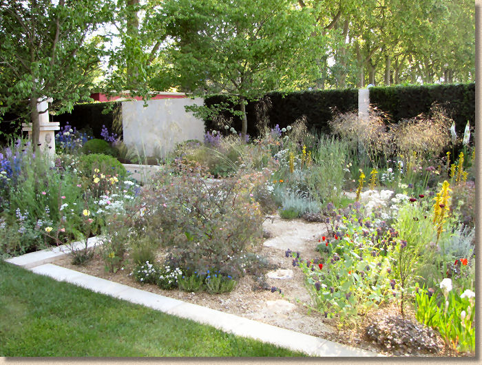
Cleve West's garden for overly-wealthy show sponsors M&G Investment s blagged prime position right on the corner of Main Avenue, and while it did feature some lovely native Bath limestone with split flint panels, seemed to lose itself. The central octagon feature seemed ill at ease with the seductive planting and I couldn't quite bring myself to be fully charmed as I normally am by the great man's endeavours at this show.
Even now, a week or so later, the imbalance irks me so. There's something about that heavy-handed lime mortar work in the flint panels distracts me far too much. I can only see the mortar and overlook the flints, and when that same effect is repeated as horizontal paving, well you might as well have used a concrete hardstanding because all character is lost, smothered in a blaze of off-white messiness.
Brand Alley's Renaissance Garden really puzzled me. I honestly thought it wasn't finished. There's a lot of space been dressed with a lot of self-binding gravel surrounding a rectangular pond with a pavilion at one end. And some planting, obviously. Other than that, there's not much to say.
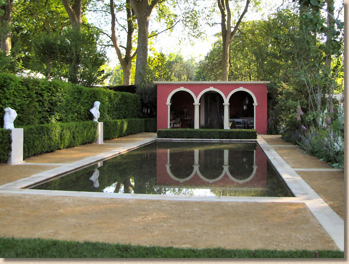
I did like the stone setts laid at the bottom of the pond, but unless you had polarising sunglasses (and a polarising filter on your camera) it wasn't particularly easy to pick this out in the bright May sunshine. Lovely neat cutting of mitres on the pool coping, too, but the award of a Bronze, effectively a " thanks for coming " certificate, tells its own story. There's just not enough here to do it for the Chelsea judges, or for me!
Self-binding gravel, albeit of a slightly paler hue, also made an appearance in the Telegraph Garden , teamed up with some Travertine. Seasoned readers will know what's coming: I don't like travertine: never have; never will.
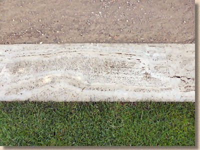
Thankfully, on this Italian-inspired garden it can be just-about justified and it's been used relatively sparingly as edge courses and narrow pathway, but then there's a stonking great wall of it to one side. If travertine has a saving grace, it is that it looks and performs better in the horizontal than it does as a paving, so I will let it pass…..just this once.
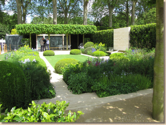
To be fair, the whole is a very relaxed and relaxing garden, with plenty of shade provided by pleached trees, a cooling central lawn, and that loose limestone gravel to reflect the heat of the day. I could quite happily sit down here with me Prosciutto butties and a bottle of Lambrusco to enjoy a very chilled lunch!
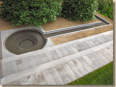
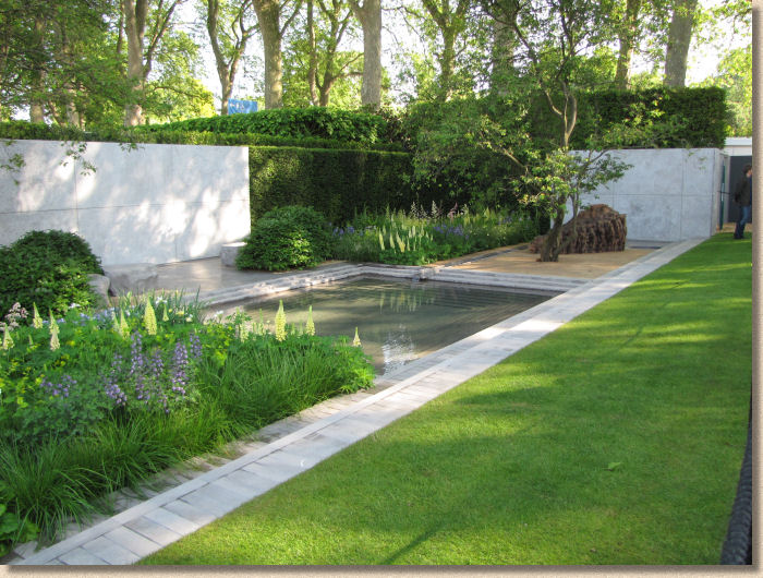
Another hard-up company in the form of Champagne Laurent Perrier (I'd love to see a Vimto garden one year!) continued the Italian theme by employing Luciano Giubbilei to fashion this gorgeous garden of formal shapes and informal textures. An intriguing waterscape of rills and a shallow pool are edged with a deliciously cool stone, which Luciano told me (about thirteen time because I struggled with his accent as he, no doubt, struggled with mine) is Pietra Di Fossena (I bet I've still got it wrong!), a seductive grey-blue marble which has an ice-like presence imbued with savoury veining and an air of sophistication which perfectly suited the whole setting.
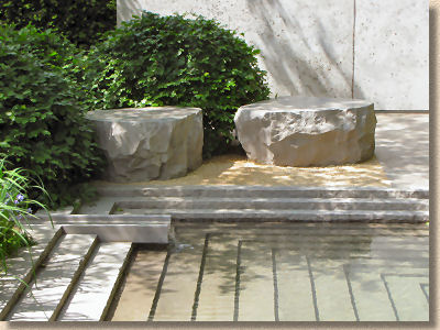
The detailing, as we should expect with Italian marble, was sublime and a showcase of just what can be done with top quality stone when you have the tools and the training. If I had my lunchtime butties in the previous garden, I'd be sneaking into this one to dangle me poor owld hot'n'bothered feet in that pool come mid-afternoon.
The more you look, the more you see, and the more you see, the more you appreciate. This is a garden of genuine class and style that is probably out of place in Britain or Ireland. It needs a warmer climate; it needs scorched, arid afternoons and sultry evenings to get the best from it. It's a genuine slice of Italy in West London.
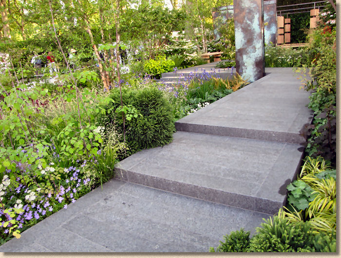
Oh look! Another "wealth nurturing" company, Brewin Dolphin , sponsoring a garden. If they are, as they claim, nurturing your wealth, how come they've enough left over to pay for a garden as sumptuous as this? And it really was a glorious garden, particularly the flamed dark granite, which always looks good, but looked exceptionally good here because of the exacting installation, which was, as far as I could see, millimetre perfect.
Plenty of level changes allowed the stone to be shown off by elevating it and presenting vertical faces via the step risers, so that the subtle sombre hues could be seen in varying degrees of light and shade. This flamed granite is finding more and more fans amongst designers and contractors because it is so simple and undemanding yet deliciously textured and the neutral colour works with so many schemes, whether it's an unassuming pathway through a lush garden or as a contrast to other stone where it can provide that essential definition for edges or band courses. It's also unbelievably good value because it's readily available at less than 50 quid per square metre. Bargain!
The No Man's Land Garden left me in No Man's Land. It was one of those gardens where the message overrides everything else, and I found almost nothing to interest me.
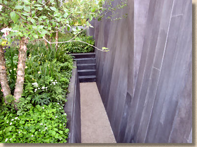
Yes, it's an important message, and I do 'get' all the symbolism, but I kept looking at it trying to spot something that was worthy of comment from a hard landscape perspective and found nothing other than a big, grey, sombre, funereal back wall. I couldn't even work out what you could do with a garden so heavy on sorrow and sentiment other than place it in a memorial site.
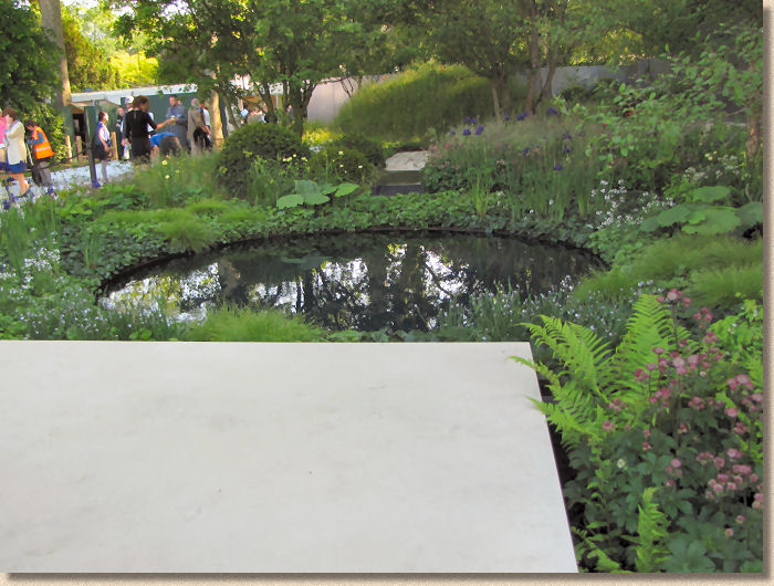
It's calm and reflective admittedly, and maybe that's as it should be. Maybe it's intended to provoke reflection rather than provide inspiration and maybe that's why I found it all too forgettable.
Up at The Triangle end of Main Avenue is where you normally find the show-stoppers, the bonkers stuff, the making-a-massive-statement gardens, and that spot was taken by the city of Stone-on-Trent Garden this year, along with some bloody great robot which was actually quite entertaining.
I've never quite figured out what towns and cities and nations expect to achieve by sponsoring a frighteningly expensive garden at Chelsea. I know what they think they are reaching for: recognition and status, but I've never been convinced that this is ever actually achieved. Will anyone genuinely be convinced to move their business to a particular location because they did a garden at Chelsea? Will it ever recoup the investment by attracting trade or new residents or improved infrastructure?
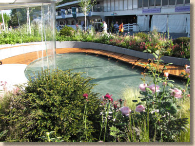
Obviously, the good burghers of Stoke seem to think so, and they will be in a far better position to judge than me, so I'll assume they know what they're doing. The garden itself, almost inevitably, aimed to showcase Stoke as a city of the 21st century while fully acknowledging its history. And the hard-scape was very much what we see nowadays in redeveloped city centres: water sculpture (in the form of an overhead chute), pale clean granite paving with matching low walls retaining the planting, rich hardwood decking around a pool, and plenty of polished steel and glass.
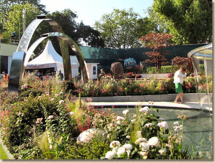
I hope the get what they wanted, but there wasn't enough of interest to hold me there for more than a few minutes.
Up on the bank, behind the Stoke garden, First Touch showed the almost inevitable terraced garden in support of premature babies at St George's Hospital. The sloping site here always offers designers a challenge and I always look forward to seeing how they will cope with it. This year, it's relatively straightforward, with simple gravel terraces retained by rusty steel edgings.
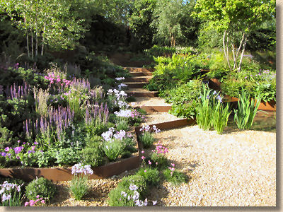
This use of rusty, or to be more accurate, rust coloured steel edgings is something I've seen more and more of over the last couple of years. I'm not sure why rust in various forms is trendy, but there are other touches to be found here and there throughout the show gardens, from patinated copper to bleached lead. There's probably some deep cultural significance that just goes completely over my head, but it can look quite fetching.
However, gravel as the tread for steps or terracing is rarely a good idea. There's only one place for it to go: downhill!
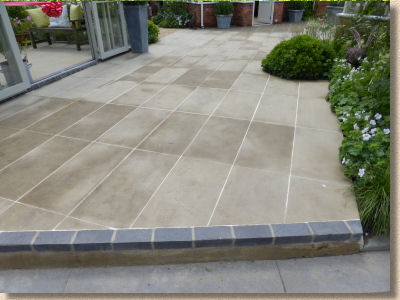
I wouldn't normally comment much on a display area as they tend to be functional rather than aesthetically pleasing, but my attention was well and truly grabbed by the paving layout for greenhouse supplier, Hartley Botanic. The usual fare here would be a bit of Indian sandstone and limestone chippings, but look at this! Honed Darley Dale yorkstone, as supplied by London Stone, and laid to a precise stack bond pattern by Mark Gregory at Landform Consultants.
This is not just a step upwards, this is a giant leap forwards. This is paving worthy of any of the show gardens. Rich buff tones, geometrically perfect and precision pointed with a contrasting pale cream Mapei mortar. Wow! Hopefully, this will encourage a few more greenhouse owners to give more serious consideration to how they pave around and inside their upmarket acquisition. It looks *so* much better than the usual cheap, no-though-given DIY shed flagstones that are dropped haphazardly around the glass house.
Heading back towards the Main Avenue and it's the big showpiece from professional Yorkshireman and part-time gardener, Alan Titchmarsh , who loves the county so much he's built a garden celebrating its manifold charms. It should help remind him of the place while he's living away down south somewhere.
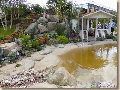
Nothing to see here. It's a stage set. It tells some twee story from his life and probably works as an homage to the places he regards as important in his 'journey', but from a hard-nosed hard-landscaping point of view, there's nowt much for t'see, as they'd say in that celebrated county. Nice dry stone walls, but I can see them near enough every day.
Cloudy Bay Sensory Garden claims it takes its inspiration from the "tasting notes" of their wines. Oh FFS! Can we please have a ban on pretentious bollocks-speak like this? It's enough to put me off even visiting the garden, which would be a real shame because there's some delightful limestone paving from those people at Lovell Purbeck (again!) which steps down to a sunken garden with creamily delicious complementary walling and a charming rill-cum-wine cooler.
So much to admire here. The stone itself is just fantastic, and it's so heartening to see that native limestone seems, at long last, to be having a bit of a moment in the sun. The workmanship is equally wonderful, and the design, despite it running away from the eye by being a descending garden, is delightful. OK, it might not look quite right up here in Upper Britain, but anywhere south of, say, Birmingham, this little slice of sunshine would work phenomenally well in all sorts of gardens.
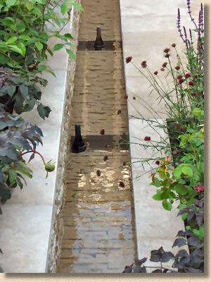
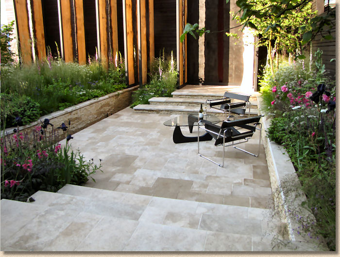
Finally on Main Avenue, the Extending Space garden references some place in Switzerland. It's quite an eye-catching layout but annoyingly, the least eye-catching part of the whole scheme is the paving. A Swiss granite so subdued and unspectacular it may as well have been trowelled concrete. I kept looking at it and looking again, and coming back an hour later to see if the changing light helped at all, but no. It's just an insipid, don't-give-it-a-second-look stone.
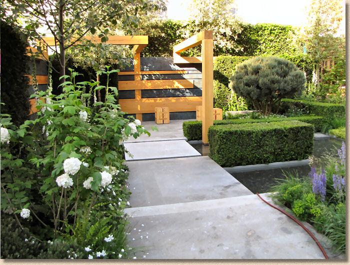
Perhaps that's what the designers wanted, something that wouldn't distract the viewer from the lovely contrasting wooden pergola-like structures rising elegantly from the ground and the very middle-European planting. I sort of suspect there was a different granite in the background but I could get close enough to check and no-one seemed to be able to tell me anything about it, so there's nothing more worth saying.
On to Royal Hospital Way and the last couple of Show Gardens, the first of which is, I suppose, The Massachusetts Garden . Similar to the Stoke garden, the objective here is to sell a place, but this time it's a tourist destination, so there's a taste of the state, and it all loks very appealing, despite that strange backdrop. For me, the most interesting aspect is the crushed shell or 'crag' path.
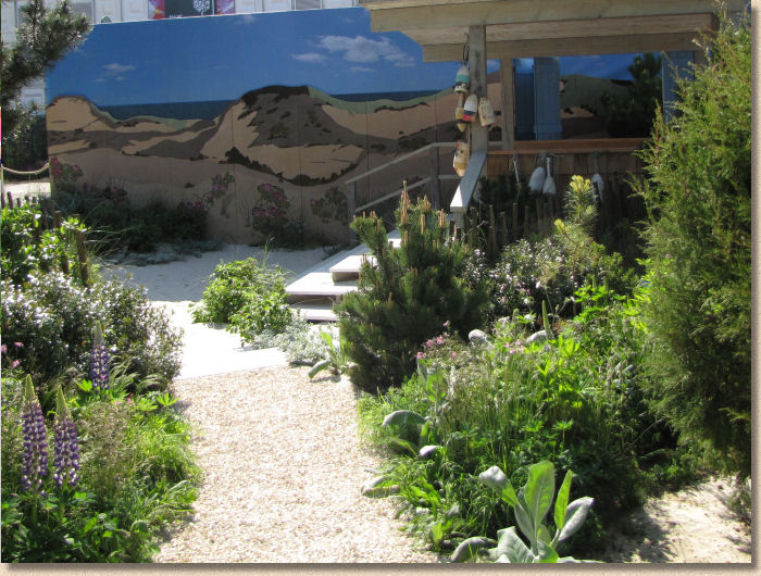
Are those genuine Massachusetts shells or just some they've found at Southend? I don't know, and neither did the young lady to whom I spoke, but it matters little. What I find interesting is that in coastal areas with sparse access to hard rock, they make paths using what they do have, so whether it's Norfolk. England or Massachusetts, New England, when you've nowt else, you'll make paths using shells.
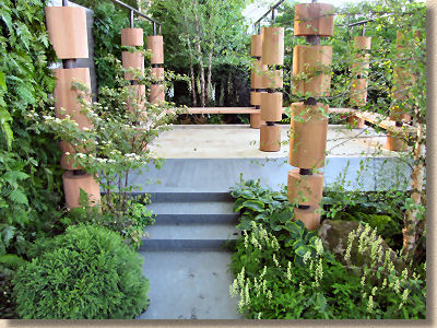
Finally, Hope On The Horizon is another garden offering more than a passing nod to the military and its repercussions, with a focus on the Help For Heroes charity. There's much in common with the companion gardens: that air of calm reflection and respect, and the almost inevitable in-yer-face symbolism which, as previously mentioned, I personally find tiring and insensitive when there is so much of it.
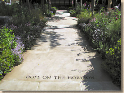
And there's the almost mandatory " journey " involved. Oh! How tired am I of being told that everything, from a garden commemorating the dead of a century of conflict to some vacuous talent void caterwauling on a Saturday Night TV Show has undergone a 'journey'? This has become so-o-o-o tedious.
I did like the granite block motif. There is something compelling about them, and unlike the inscribed worthy phrases or iconic re-creations of trenches or shell holes, they invite a very personal level of reverence and consideration, so each viewer will read something slightly different in their significance, putting a personal perspective on what war and loss and service means to them, rather than being served up a prescribed version requiring no individual thought.
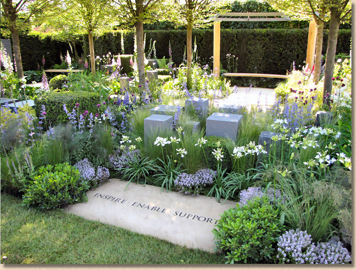
The paving, over which the interminable journey must have taken place, is a creamy Yorkstone, but, as always is the case, the 'guides' can tell you the name of every plant on the plot but have no idea about the footprint be-smirched stone other than it's "stone". Thanks for that!
Despite my own misgivings, the garden obviously does something right, because it won the award for Peoples' Choice. Is that because it genuinely is a great garden or is it an act of solidarity with the cause? I genuinely don't think it was a great garden but then we each have to take something different from a garden and its pretty obvious that plenty of folk found something in there that I simply failed to spot.
Time forces me to skim all too quickly through the Artisan and Fresh gardens, picking out just a few of the many delights that were to be found. I fervently wish I had a less hectic schedule and could devote more space and time to these little gems, but this review is already a week late and if it doesn't get finished today, it might not get finished at all. So, on we go….
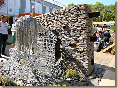
The Reachout Garden might not be what many would think of as a garden, and it might be more appropriate to think of it as a sculpture or art installation. Whatever you want to call it, there's no denying it was one of the most compelling and intriguing exhibits with its tilted pillars of stone and simply stunning metal figure emerging from a stream.
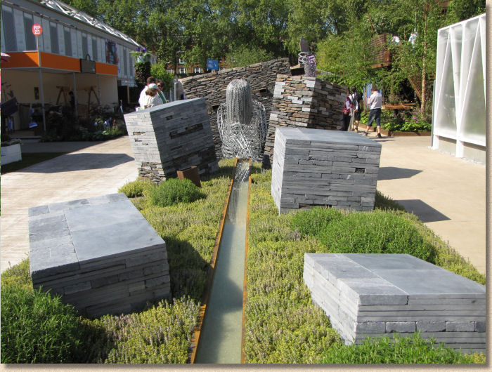
Naturally, there's some arsey 'journey' taking place here, but as a piece of hard-landscaping it's just amazing and deserves a place in some town centre where it can be more widely appreciated. I really wanted to explore this installation so much further but every single time I went back to it, some bleeding TV crew were making yet another comment piece using it as a mesmerising background, and as TV trumps all other forms of media, I missed my chance(s).
Schellevis , the Dutch concrete paving manufacturer, launched themselves upon an unsuspecting British market at EcoBuild back in March and here they are again at Chelsea! It's not, perhaps, the most obvious platform to make your products more familiar to a wider audience, but I've no doubt the strangely textured and interestingly coloured pavers, flagstones, edgings, palisades and steps will have attracted much attention from visiting designers looking for something new and different.
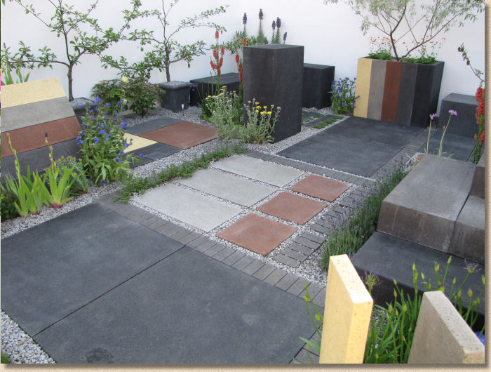
If this was EcoBuild or a similar construction products event, I'd be praising the display, but for Chelsea, it really does need to have more of a garden feel, even if that garden is little more than a collection of your products gently separated by some greenery. Even so, the feedback from the company following the show is very, very positive and they believe it was all a worthwhile exercise.
If they needed to see how to get your products seen without being too obvious, then they could do a lot worse than taking in the lessons from Global Stone's Himalayan themed garden. Here's that missing Indian sandstone, but not as you will be accustomed to seeing it.
Hey! It's the Himalayas so what stone should they be using? Themes, motifs and patterns derived from the elevated cultures of northern India and fashioned from a mixture of the familiar sandstones of the Indian plains and more brightly coloured rock from lesser known regions.
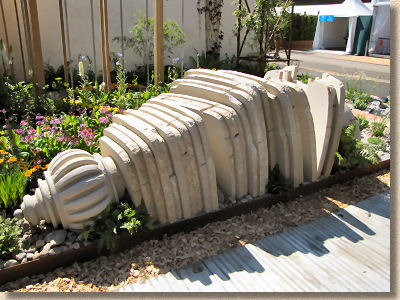
The killer piece, if it can be described that way, though, was the tumbled pillar. I thought this was a strikingly original way to show the stone. It was obvious to an eye as cynical as mine that this was all newly quarried rock, but the presentation as an upturned gate column was just so damned clever and allowed the stone to be seen in an unfamiliar but compelling way. Loved it!
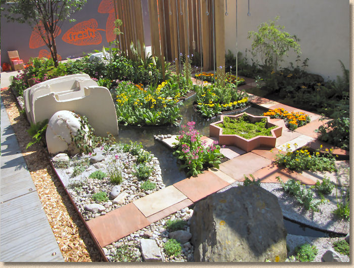
And right next door, the Mind's Eye Garden for RNIB was not only a visual treat, but had been designed to please all the senses, with sound and smell and so many tactile surfaces crammed into such a small space. The organic squiggle granite carving of a water feature was possibly the one thing I most wanted to take home with me.
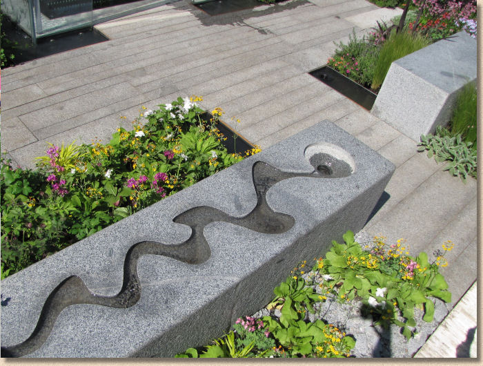
I know most people were taken with the watery glass box set upon soft beige granite plank paving, but the texture and form and shape and sound of water trickling along this truly exquisite sculptural piece was the subject of even more interaction from visitors, even though most weren't even aware of their gentle stroking of the sensuous curves or dipping of fingers into cool running water. A genuinely magnetic piece of hardscape.
So much more to see and talk about but my time is up. 2014 won't be regarded as a truly great Chelsea, at least not by me, but it wasn't a bad one. Other than Hugo Bugg's genuinely superb RBC Waterscape Garden and the delicious stonework of Adam Frost's Alzheimer's garden, there wasn't much more about which I could get excited.
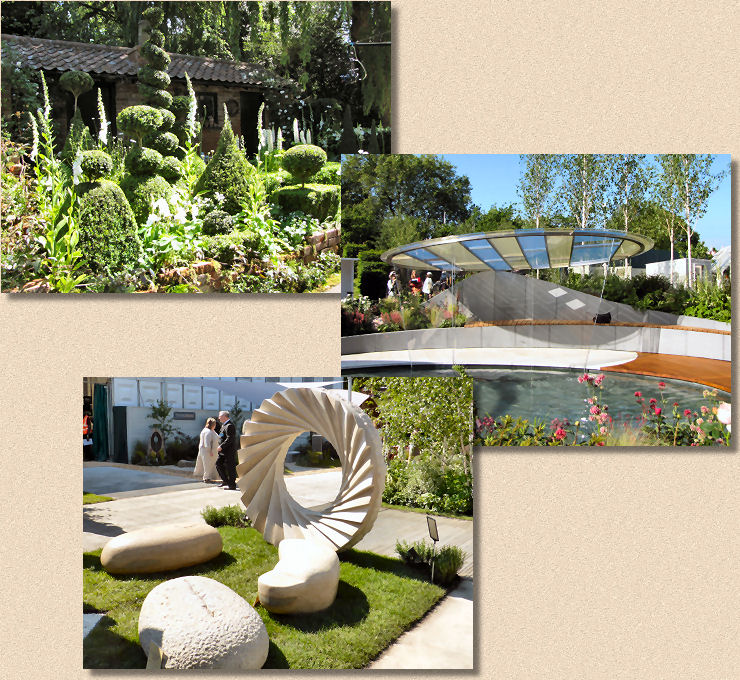
Quality stone is very definitely the 'in-thing' for 2014. Everyday Indian sandstone has all but gone, seen only on a rather gaudy display area for garages or garden sheds or summat - if you must use Indian sandstone, why go for the blousy Rainbow stone? It's awful! The lovely Vande Moortel clay pavers which were all the rage just a short while ago have similarly all but vanished, but in their case, the near total absence is painful, so to spot a few square metres on one of the display plots is a real fillip for the soul.
I'll be back. Over the years of writing these reviews of the hard-landscaping, I've become a genuine Chelsea addict, so for 2015, can we please have something genuinely outrageous? 2014, possibly because of the centenary hanging over it, has been very calm and safe and softly reassuring. What we need now is a right good boot up the arse to remind us that gardens should inspire and instigate a reaction other than restfulness.
