Brett 2013 Brochure
The new season is almost upon us and the steady trickle of new brochures has become a bit of a flood. In fact, there's now a backlog on my desk and I don't know which should be considered first and which should wait until next week or the week after. Let's go alphabetically and start with Brett .
There's been a few changes in the marketing team at Brett since the last brochure, but the styling of the 2013 brochure remains pretty much the same as has been used to great effect over the past 4 years, with the informal, chatty, magazine-like look and feel. Hey! If it ain't broke, don't fix it!
A quick flick through reveals much that is familiar, nothing radical or shocking, but a number of things do grab ones attention. First of all, there is a much greater promotion of the Brett Approved Installer (BAI) scheme but it's done with a degree of subtlety and finesse which has to be admired. Secondly, there's an interesting new flagstone which has been quietly released without adequate fanfare. And then there's a new option for an established block pavior.
So: the BAI thing. I've long believed that the paving installation trade suffers unfairly because of the antics of a few who somehow manage to come to the attention of sensationalist TV programmes and so-called 'exposes' which would have the general public believe that most of us are con-men, charlatans or downright rogues. In fact, there are a lot of highly skilled, conscientious and hard-working contractors out there who hardly ever get a mention. " Bloke lays stunning driveway " is not deemed to be sufficiently newsworthy.
For 2013, this sorry state of affairs has been redressed, at least in part, by trumpeting the achievements of a few of the good guys, the contractors from the BAI scheme who won awards for their work in 2012 . Each Spring, BAI hosts an allegedly friendly competition to find the best projects from the previous 12 months. It's judged independently – I know because I'm one of the judges – and so the winning projects are selected for their quality workmanship rather than to suit an undeclared marketing wheeze.
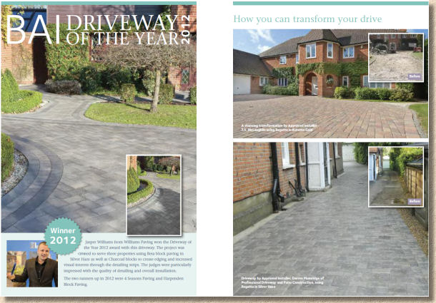
And now, not only do they get a certificate and a trophy and a nice bit of blingy kit such as an iPad or digital camera, they get to show off their work in the 2013 brochure.
I think this is a wonderful move – real contractors being given the opportunity to show- off their skills on a national platform. It's well-deserved recognition for their work, of course, but it's also fantastic advertising for them, and should bring them even more work. However, it will also act as a spur to the rest of the trade.
Those who only just missed out on awards in 2012 will push themselves that bit harder in 2013, and those who really should be questioning their participation in this trade will be confronted with some awkward questions from potential customers, particularly as to why their work doesn't seem to be in the same league as that shown in the brochure.
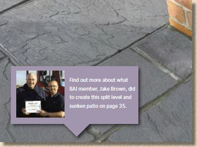
I've already congratulated all those featured in the brochure at last year's awards bash, but I've no hesitation in saying, once again: well done. You show the best of our trade and promote all that's right and good and deserving in the residential paving industry. I hope to see many of you again at this year's awards later this month.
Enough of the back-slapping: what about that new flagstone? Well, Texitone ECO is a shot-textured pressed concrete flagstone based on recycled slate waste aggregate which is said to account for at least 65% of the bulk. There are just two colour options: natural (pale grey-blue) and Charcoal (darker grey-blue) and three sizes (600x600, 600x300 and 450x450mm) which rather limits the possible laying pattern options, especially as it is, for now at least, only available in single size packs.
I haven't yet seen this flag in the flesh, so I have to base my comments on photies, and from what I've seen, there's not a lot to get excited about. It doesn't look distinctive enough to warrant using it as a showpiece paving, but maybe I'm wrong. The blurb talks of "glints of Welsh slate" but that's hard to see in the images provided, and from experience of working with Welsh slate, I know it has many charms, but glinting is not one that immediately springs to mind.

The use of a recycled aggregate is laudable, and given that there is an estimated stockpile of 3 billion tonnes of slate waste in NW Wales, anything that uses secondary aggregates rather than rely on blasting primary aggs from a quarry in the middle of nowhere, has to be supported, and with each passing year we witness greater and greater use of recycled materials in our paving. But is this enough to generate a market? Hard to say without seeing it, but in a marketplace that's not short of textured flags, there has to be something special about it. Whether that something special is price, colour, sizes or versatility is up to Brett.
Moving on to the 'new' block pavior. To be honest, it's not really new, just a re-jigging of an established product. Regatta Trio is a variation on the popular and successful Regatta theme rather than a completely new product. In essence, it's a three-size mix , with all three sizes sharing a common 133mm dimension, which makes it best suited to the familiar coursed broken bond layouts. The big 'jumper' block from standard Regatta (266x200mm) is missing, so we're left with 133/203/240x133mm formats.
What is new, however, is that the three sizes come pre-mixed in a single pack, and that production will take place at all three of Brett's block plants in Cliffe (Kent), Poole (Hants) and Barrow-on-Soar (Leics) which they claim will improve economy by reducing the haulage involved in getting block to various parts of the country. It's also worth noting that each plant will produce a slightly different pack size, due to the variety of presses used at each location.
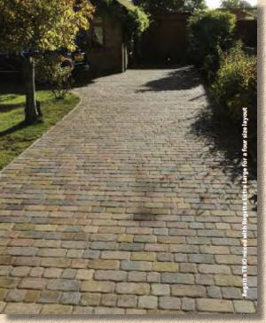
I have to be honest: Regatta is not my favourite block pavior. I'm not a big fan of any of the texture-moulded blocks, no matter who makes them. The one exception might be Classico, which is what it is: a block moulded to give the impression of a near-perfect bevel-edge sett, but all those that try (and fail) to emulate worn setts, battered stone or time-worn surfaces leave me cold.
They are a sort of Disneyfied pavior, how a block looks when designed by someone who's only ever seen cartoons. Give me a simple distressed pavior, such as Alpha, any day of the week. At least they are not trying to be anything other than what they are: bumped and bruised concrete blocks.
So, what of the rest of the brochure? What can be said about the products that have been around for years? It's hard to assess the Brett menu without drawing comparisons with their main competitors, but I'm not sure how beneficial that is, either to the consumer or to the manufacturer.
The flag paving range is dominated by imported stone, but that's true for nearly everyone nowadays. The natural stone offered by Brett is predictable. It has all the essentials, so there is sandstone, limestone, granite and slate, with secondary processed upmarket options on some products and all the trimmings such as circles, steps and edgings. There's nothing distinctive or exclusive, but then maybe sticking to the more popular items is a better strategy in the current economic climate. I do believe that, if you want to be regarded as a serious national brand in the residential paving market, you need at least one exclusive product, something to set you apart and give you an identity.
It would also be good to see a native stone in there. I know they don't sell in vast quantities, but there is a growing appetite for home-grown stone. If nothing else, a good value york-type sandstone or a quirky bit of slate can be that elusive exclusive item that's needed.
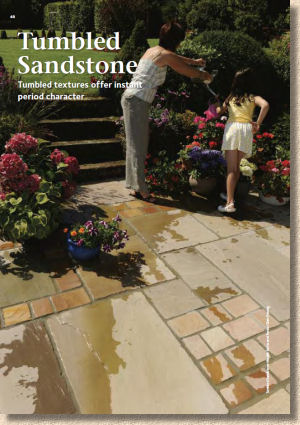
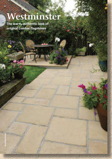
The concrete flag range is pretty much sorted. There's something for everyone, without going overboard with choice. There is the requisite riven-effect (Westminster/Canterbury) for the cottage-garden look, as well as polished contemporary (Moderno/Texitone), and a budget utilitarian offering (Quorndon/Broadway). There's also the wannabe-brick effect Olde English, which is bafflingly popular, but does add a sense of completeness to the concrete flag range.
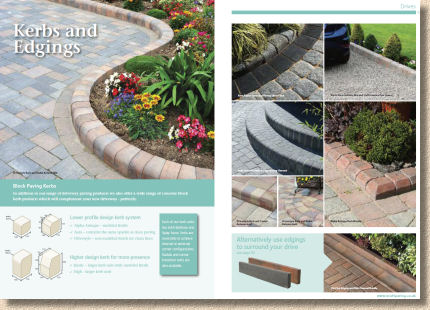
Similarly, the concrete block range is well-rounded and reasonably complete without being encyclopaedic. There are the essential standard and distressed blocks (Alpha, Beta and Omega) which are supplemented by having permeable versions, and then there's the texture-moulded options (Regatta/Aura), and the unmistakeable Classico. There's also a great supporting cast of kerbs, edgings, channels, starter blocks and circles. One aspect in which Brett has always excelled is its range of colours which are as good as anyone else's and better than most.
Overall, it's a good solid selection of products without having anything too 'out there' or wacky. Maybe that's what is needed, though – something to cause a stir, as Bradstone have done with their PatioDeck product, and Marshalls with their Cobbletech blocks. These esoteric new products don't always sell as well as was hoped, but they do stimulate interest, opinion and conversation on the increasingly essential 'anti-social meejah' sphere.
The brochure itself is pretty much faultless. Brett found a winning formula a few years back and they've rightly stuck with it. The images are very good and largely well-chosen. Yes, there are a few that could have done with a bit of the owld PotatoShop to erase glaring installation errors, but it's only pedants such as me that notice these things. The text hits the right balance between being informative without ever descending into floweriness, jargon or verbosity. The technical information is also bang on – just the data that is needed and nothing that isn't. I do like the patio pack illustrations with their effective gradient transition from photo-quality rendition of colour and texture to grainy pencil-sketch outline more akin to garden design.
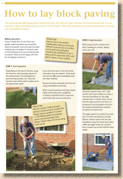
The installation guidance is a curate's egg. Most manufacturers have edged away from trying to provide How-To's in their brochure. You can't do justice in limited print space and the web is a much better platform for this sort of thing, anyway, so it's surprising to see expanded coverage in this year's brochure. While generally sound, some of it is vague to the point of being meaningless.
The test of any such guidance lies in assessing how much trouble a DIYer could get themselves into relying solely on what's provided. At least they've printed the help-line number close by!
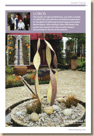
I'm not usually a big fan of corporate trumpet blowing and tokenistic lip-service write-ups in product brochures, but I have to confess that I was quite absorbed by the stuff about the Loros hospice and Lincoln Construction Week. Nicely balanced and it came across that the driving force behind Brett's involvement genuinely hails from a sense of community involvement rather than a cynical marketing opportunity. Well done!

I traditionally end these reviews with an exhortation to obtain your own copy of the brochure and form your own opinion. Brett, along with certain other manufacturers, are in the enviable position of being an 'essential' in any serious contractor's or designer's library, although this is somewhat stymied by their lack of national presence. I do wish we could get Brett products in the north, in Scotland, Wales and Norn Iron, but logistic reality means that, when we do drag them out of their comfort zone in the south and east of England, we pay for the privilege. It's a shame because there are some excellent products that deserve a wider audience.
In summary, even if you can't get Brett in your little corner of the country, it's worth taking a look at the brochure. There's a lot to enjoy, not least the work of some top-notch contractors, but also lots of inspiration and ideas that can be adapted, if you apply a little lateral thinking!

Download from website
Call from UK: 0845 608 0570


