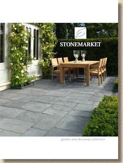
Stonemarket 2016 Brochure
There's something not quite right about reviewing a Stonemarket brochure when the sun is cracking the flags outside, and when I'm actively contemplating putting on the shorts in place of jeans because the denim is sticking to my legs. In an ideal world, Stonemarket's annual feast of paving porn should be reviewed when the heating is on, when an extra jumper is being worn, when the writing helps stop the worrying about just what sort of useless, inappropriate crap the kids will buy me for Christmas this year.
However, events have conspired against us for 2016. I was home in Ireland at the time of the new product launch back in autumn 2015, and then, I'm told, a miasma of befuddling parturient hormones swirling around the brain of the Marshalls/Stonemarket PR supremo resulted in the proposed 'special viewing' of new products never being scheduled, which in turn meant the brochures were never proffered, and as these reviews are only ever done on request, no scrutineering has been possible until now. Or until 6 weeks ago, actually, which is when the brochures arrived, just in time to coincide with the mad Spring rush when the trade erupts with febrile urgency and the amount of free time available to pen these opinionated ditties drops to zero…or even less!
Some things change; some things don't; and some things are timeless. It feels that the look and style and feel of a Stonemarket brochure falls into that latter category. Unmistakeable yet familiar, understated yet irresistible, the same but different.
The opening page index is certainly the same. The same horizontal layout as last year, with the same headings and just a different 'welcome' image stretched across the top. New products, few of which I've actually seen in the flesh, are marked with comment in a lighter text, but, as ever, the term 'new' ranges from ' completely new and never seen before ' to ' new colour option ', so what may at first seem like a healthy offering of novel excitement, might turn out to be somewhat underwhelming. A closer look is needed.
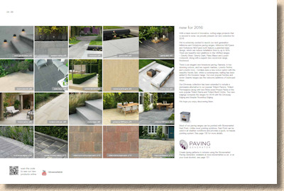
Helpfully, the newbies are explained, to some degree, on the following page. It seems that the biggest 'new' is a re-formatting of the tried and trusted Millstone and Yorkstone flags which have been given a capitalised boost by being dubbed 'NEXTpave'. What's that all about then?
Predicted by every blind man wearing a gas mask on a galloping horse running backwards through a coalmine, plenty of 'new' in the porcelain….ooops! ….the 'vitrified' paving range. New in the sense of new colours and textures, mainly.
New limestones, new marbles (not the glassy spherical items beloved on 1950s schoolboys, I assume), a new walling, Excelsior, and bull-nosed step-tread versions of two already established favourite stones.
Never really known for their block paving, Stonemarket have finally come up with the almost inevitable permeable version of the tumbled Trident paver, and a new edging to boot.
So, as predicted, new in all its various forms, but are they any good?
Well, hampered by not having seen most of the newbies in real life, it's going to be difficult to generate a full and frank opinion, but, even judging from professionally photographed, studio-lit, marketing images, it should be obvious that there are some winners and some also-ran doneys in amongst this line-up.
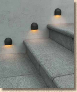
Bull-nosed Arctic Granite step treads? There'll definitely be some interest, but price will have a major influence on this one because the un-rounded square arris standard flags make perfectly good step treads. There's no doubt that bull nosing just looks so much classier but will the premium for including that sensuous softening of the leading edge be considered a worthwhile expense?
Excelsior Walling is the entirely predictable complement to the reconstituted stone Excelsior paving offer. Same concrete: different format, this time as a single sized block – 440x100x215mm. This is all about sheer personal taste. Some folk, it seems, prefer the uniformity and homogeneity, but I've never been a big fan of having the same product on the ground as up the walls. I like contrast. Not stark contrast, just something subtle and interest-generating, something which alerts the eye to where the horizontal ends and the vertical begins.
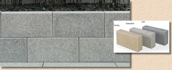
I thought about why this might be. Is it because we traditionally use different grades of stone for the two applications? Paving needs to withstand heavy and determined abrasion from traffic whereas walling has to endure only the weather, and so, very often, different stones, or different grades of the same stone, were used and the different usage resulted in distinctive appearances for both. Could that be the source of my discomfiture?
Knotwood is the logical 'next step' for the Vitrified portfolio. Many of us, myself included, assumed the 'stone-alike' ceramic paving would be the ones that generated most interest when this product group was launched into the market at full pelt a few years back, but even in the early days, feedback from installers and customers was that they really liked the 'wood-alikes' even more, and so we are given Knotwood, a linear format tile in two starkly contrasting colours, the soft, silvery smoke of Birch or the hard, rich, aged Cherry.
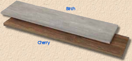
Both come as 1200x300mm planks, which suit the idea of replicating old floorboards or antique decking, but also offer the potential as mowing strips or contrast borders to other areas of paving. A winner? Don't bet all your good hand-made shirts on it, but it's worth risking a few of the crisp M&S ones you wear for meetings with the boss!
Elsewhere in the Stonemarket World of Ceramics, there are a couple of new colours for the Gravity porcelain tile. A bit-darker option dubbed ….errr….Dark and a significantly lighter version sold as Steel. The contractors tell me that the Gravity is a popular choice with their customers, so opening out the shade-range is little more than common sense.
The same applies to the limestone-ish Paleo ceramic, which now has a very much darker option in Blauw, and the slate-alike Lucent which has a buttery Cotswold option for 2016.

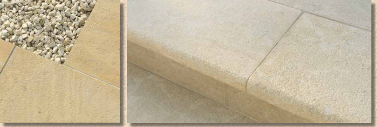
Namera is a whole new stone. I haven't seen it or touched it, but it looks suspiciously like a quartzitic sandstone with an appealing texture. Available as a 5-size, 12m² project pack or as BN step treads in two quite similar colour options: Pyramis Gold, a sort of golden buff, and Tala Sand, which, unsurprisingly, is a paler, sandy buff. The odds on this one are harder to judge as it definitely needs to be experienced before forming a proper opinion. I shall seek it out at my local Stonemarket provender.
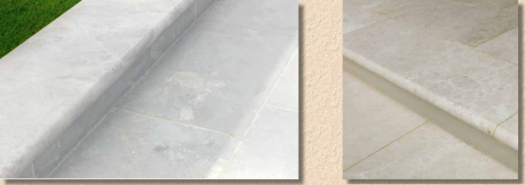
Lorento , too, is new, and is one of the marbles being offered. Marble, true marble that is, has never been a big seller in Britain, althugh its bastard offspring, Travertine, is inexplicably popular, primarily with folk who can't let go of their Mediterranean holiday memories and seek to recreate it in the back garden for the three days a year we have Mediterranean temperatures to suit.
White marble? Well, 'Perlino' and Ivory' as they are being referred to, but white marble? In Britain? In certain parts of snooty London and the affluent commuter belt, perhaps, but I can't see this selling much north of, say, Milton Keynes. Bonkers!
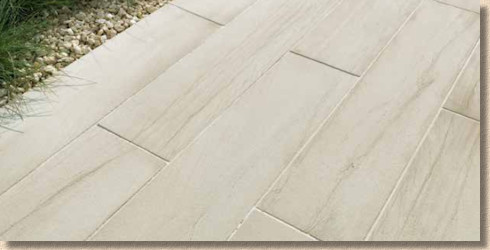
Cordara is the plank format sandstone that does look classy when well laid, but, in the wrong hands, will highlight every little misalignment and fault. A slightly paler Nordic Ash version for 2016 (even though it's from India – how Nordic is that?) will only enhance its reputation as a stylish modern answer for those looking to use classic stone in a more contemporary way.
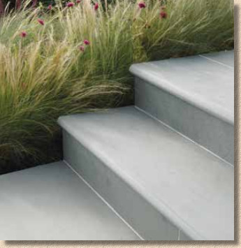
Nordus (where do they get these names from? Have they got a bag of Scandiwegian Scrabble tiles up in Elland?), the ultra-cool dark slate from Brazil is honoured by having BN step treads added to the range. A truly gorgeous stone now made even more delicious.
Available in both the paler Gris and darker Schwarz colour options
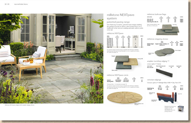
And so we come to what Stonemarket seem to think is the Big Idea for 2016: NEXTpave . It must be good – it has capital letters! They've rolled this out with the Yorkstone and Millstone reproduction wet-cast concrete flags, and given that Millstone is the brand that built Stonemarket's highly enviable reputation, it's unlikely the boffins at Ryton would eff about with something so hallowed.
Basically, improvements (and considerable investment) in wet-cast technology now allow the thickness of the castings to be far more accurate than was traditionally the case. Seasoned installers will be familiar with the 'cast-on-a-slope' pieces where one edge of the flag was, say, 18mm thick while the opposite edge was 32mm thick, all of which required very careful bed preparation.
The new moulds, in essence, ensure the castings are, for want of a better word, ' calibrated '. All of a uniform thickness, no more sloping pieces, no more impossible lips and trips when installed. Further, by adding an accurate rectangular base, the new flags can be laid close-jointed, touching (almost) at the bottom and allowing the oversize base to create the ideal joint width at the surface.

So, the big selling point is that the flags can be laid on a screeded bed , rather than having to pfaff about making individual beds , and the joint width is sorted without needing spacers . They claim it can cut installation time in half. Maybe. If you're a completely useless cack-handed twonk incapable of tying your own laces, that is. For the more experienced installer, it might save 20-25% but in all honesty, the time saving comes from the bedding and a good flagger will probably save just 20-30 seconds per flag by using a screeded bed rather than making each bed individually.
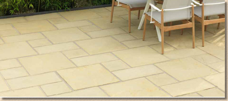
Wet-cast has struggled for almost two decades now against the unstoppable onslaught of natural stone from overseas, so any advances in technology are to be welcomed, but, as someone who has spent almost 50 years laying paving, being able to control the joint width is something I regard as part of the true flagger's art. What happens when Mr & Mrs Awkward want, say, Millstone with minimal 6mm joints? While it may seem that having an oversize base makes the job easier, it simultaneously reduces choice. Is this a reflection of the gradual and cynical de-skilling of the paving trade, making it possible for any general landscaper, builder or DIYer to do what was once a respected and skilled job?
For me, the NEXTpave system would actively discourage its use on projects where I had any say, and that is a real shame because the Millstone range, in particular, was always a favourite.
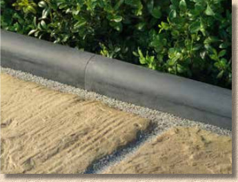
Another wet-cast newbie, the Ampliar edging. It's an edging kerb. It's a roundtop. It's a yard long (915mm). It's dark grey. Errr…..that's it. Woot!
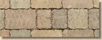
And so on to the poor relation of the Stonemarket range, the concrete block paving. Following a couple of years of interesting if not world-changing developments, 2016 is a quiet year for innovation. Trident Paviors , the three-size tumbled block, is now available as a 'project pack', which is just all three sizes in one pack, hardly revolutionary, but I'm sure it will be welcomed by some. And there's a permeable version, too, although it only seems to be available in the Maple colour option and comes in single size packs.
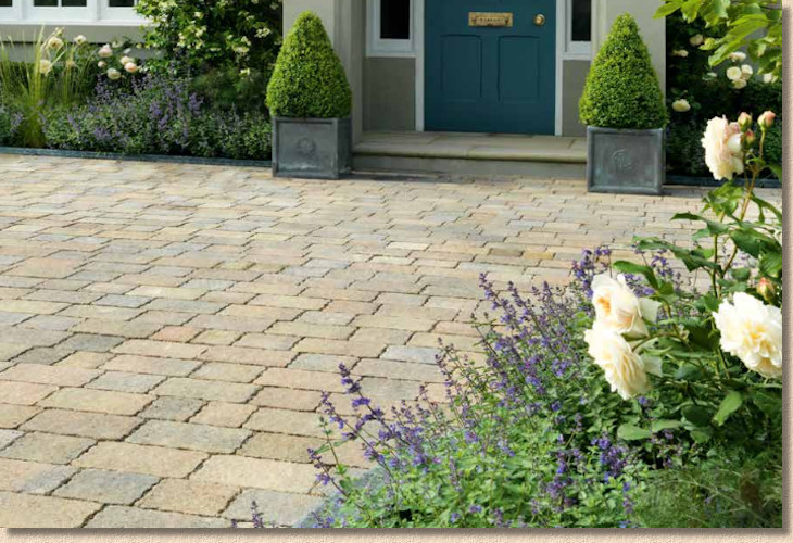
While I'm genuinely delighted to see more permeable paving being offered by the likes of Stonemarket, this whole sector remains disappointingly underused. Why are we not having more permeable driveways installed? Yes, there's the cost issue, but there's also a reluctance on the part of some installers to get involved in promoting the idea. That has to change.
And, if we can have grants and subsidies for solar panels, new boilers, cavity wall insulation and the like, why can't we have something similar for permeable paving? Surely reducing the impact of surface water is just as important as reducing energy consumption, isn't it? Every winter we sit and watch, aghast, as huge tracts of the nation submerge beneath a rising tide of surplus, mismanaged water. A few quid towards a permeable driveway has to be more cost effective for local and central government than building ever higher flood defences, doesn't it?
I know I've droned on about this before, but if, as a society, we are serious about water and energy management, then we ned to encourage those systems which promote best practice, and that, for me, includes permeable paving in all its manifold forms.
And there we have it. Enough newbies to keep the range fresh and contemporary, including a couple that should prove to be genuine winners, and no obvious donkeys. That has to be a good thing!
Considering the format and layout and overall look, it seems nothing, absolutely buggerall, has been changed, and why should it? For over a decade, Stonemarket have consistently produced the brochure against which all others are judged, and that will not change in 2016. Top of the range products in a top of the range brochure. Exceptional photography, uncluttered styling, just enough descriptive text, and all the essential packaging/sizing info on the one page. It's exactly what a brochure should be.
But what next? For how much longer can Stonemarket rely on this tried-and-tested solution? On one hand, there's a lot to be said for if-it's-not-broke-don't-fix-it position, but on the other, there's a growing sense of yearning for something that will raise the bar yet again, something that will make us all take a step back and recognise just how far ahead of the field Stonemarket can be when they want.
Essentially, they are a victim of their own success. They have become just so damned good at this brochure and marketing lark that maybe new products alone are no longer enough to meet our collective sky-high expectations. At least one thing won't change, and that is the exhilarating anticipation of seeing the new Stonemarket brochure….and maybe seeing it before it's old news!
Stonemarket England & Wales: 0345 30 20 603
Stonemarket Scotland: 0345 30 40 703
Click here to download brochure


