Chelsea Flower Show 2013
Every year, the Royal Horticultural Society's Chelsea Flower Show seems to find a theme, a 'big thing', an "in" paving. Back in 2008 , every show garden worth its salt featured Vande Moortel clay pavers, and then in 2010 limestone was the flavour of the year, and over the last couple of years there's been a growing trend towards native British sandstone, and this year, it went mega. Literally mega.
Honed and shot-sawn large-format sandstone dominated the hard-landscaping in several of the big show gardens. Isn't it funny how allegedly independent designers alight on the same theme at the same time, and so often!
To blow my own trumpet for once, I predicted this before Christmas. The trend towards native stone has been growing stronger and stronger amongst high-end designers since the flood of imported stone prostituted itself by appearing on EBay for a few quid per square metre. Then, when leafing through the latest crop of product brochures, many of which have now been reviewed on this site but there are still more to come, it was apparent that big flags were a trend being made to happen. We saw bits and pieces at Chelsea in 2011, and more of it last year, and so when it came to thinking about what we might see this year, it was not exactly rocket salad to guess that 2013 could be the year of mega sandstone flags.
And so it came to pass that press day at Chelsea revealed the unmistakeable buff and amber hues of north-country (I think they call it Yorkshire) stone on garden after garden. Indeed the very first garden I encountered, the Arthritis Research UK Garden designed by Chris Beardshaw and built by Keith Chapman Landscapes , assisted by Jody Lythgoe, who both proved to be enormously generous with their time in talking with me at length about the build, and sharing their experiences. I'm so, so pleased they'll be taking home a thoroughly deserved Gold medal.

I'm not really qualified to explain the theory behind the design, but it's one of those 'journey' gardens, where you start in one spot and travel towards enlightenment. In this case, the trail starts at the rear of the garden in a secluded 'room' with a simply stunning feature dry-built stone chimney breast built by Stonemason David Griffiths, and a stone paving with a rougher texture to represent the bone damage caused by arthritis, before moving through a transition section of random stone, and then venturing out into what I would call a typical Beardshaw-scape of balanced planting and delicious, neat, smoother hard-landscaping.
The paving itself features impressive 1400x1400x75mm honed sandstone from Calvert's Witton Fell quarry up Leyburn way in North Yorkshire. It's a warm-looking stone, quite grainy and flecked with spots and specks and flecks of darker colour, but Keith reckons it's a pain to work with because it's a little too soft for a paving stone, and is incredibly easy to spall if not treated with respect, so to lay fifty-odd square metres of it with sand-filled close jointing and no spalling is quite an achievement.
And it all seems to have struck a chord with the public as the garden was voted top in the poll for People's Choice.
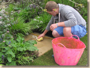
Next door, the RBC Blue Water Roof Garden is something of a contrast, being based around high-quality decking (or 'boardwalk' as the guide describes it) and Kennedy gratings carried over a stream and fountain. The aim is to show how urban spaces can be greened by the use of water recycling, green roofs, bio-diversity, habitat enrichment and sustainability. How many boxes has that ticked?

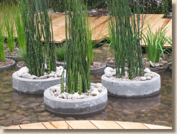
There's no obvious paving, but then when you start to look at the detail, there are dozens of little surprises. The use of concrete pipes set on end as planters in the stream, the chain downpipe for roof rainwater run-off, the gravel-topped raised circular fountain. All very restful and just the sort of garden that would really appeal in the centre of a city. But no paving??
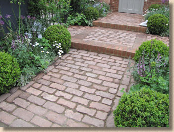
There's a bit of a gap then, with plots that are more about flogging goods than showing off gardening or landscaping expertise. The greenhouses and garden gates I can understand, and to be fair to them, the respective exhibitors did make some effort to look vaguely horticultural, including the use of the lovely National Trust Paving generously provided by John Clifford at Westminster Stone .
But Liz Earle? The make-up woman? With some pot marigolds plonked in front of the sales counter? WTF? The lass herself, Liz, turned up on the Monday to do some additional unnecessary marketing, but I still couldn't work out the connection between all that is best in gardening and ladies' face jollop. If they'd been with the rest of the trade on Eastern Avenue, I wouldn't have batted an eyelid, but on Main Avenue? More money than sense!
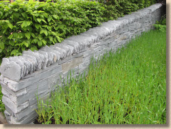
Next up is a very cool garden. Cool as in cucumber, not as in the latest pop sensation. Cool is the word that kept coming into my mind as I looked again and again at Stockton Drilling 's " As Nature Intended " garden featuring the enviable Broughton Moor water-cut stone flags and Westmorland Green cropped walling stone from Burlington Slate , up in the Lake District. This is some of the most beautiful stone in all of England, but as a paving, it works best in small quantities and when contrasting with other, less refined materials. Set in a field of fresh green barley, with dark green yew uprights, it becomes another shade and its rich colouring and intriguing bands of colour are distressingly underplayed.

This stone is one that really does come to life when wetted, and so almost every time I passed during the course of Press Day, someone had just, or was in the process of, playing a hose over the paving to make that rich serpentine colour sing out and distinguish itself from the field of green.
To be objective, I think it did well to take home a Silver-Gilt medal because this is one of those 'statement' gardens that is there to prick the conscience about the use of natural materials, rather than exhibit a garden someone might actually desire. Yes, it does contain a few clever ideas; the use of woven willow contrasted with Yew, and the inclusion of Cumbrian stone are to be applauded, but as a whole, it's making a point rather than making a garden.
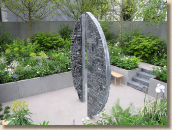
Another 'statement' piece was the " Stop The Spread " garden from the Food And Environment Research Association which was taking the opportunity afforded by a plot at Chelsea to 'spread' the message about the threat faced by many of our native species in the face of a plethora of pests and diseases. Ash tree dieback is the obvious example, and again, while this is an important and relevant message for both gardeners and the wider public, having dead trees on show is probably not the best strategy for winning medals, which could well explain the Silver medal.
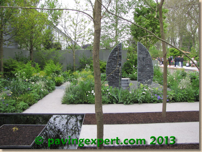
The access paths were formed using a crushed silver granite (I doubt it was G603, but one can always hope!) laid as a loose aggregate between retaining aluminium edgings. A little bright for really sunny days, so perhaps it's as well the day was mostly cloudy. The circular 'composition in slate' feature in the centre of the sunken garden bit was the focus of most attention, which may have distracted observers from the key message, but as with all these statement gardens, finding a balance between disseminating the central message and creating an attractive garden is no easy task.
Down at the bottom of Main Avenue you couldn't really miss the show-stopper from Fleming's Nurseries crowd of over-exuberant Australians. It was bleeding obvious from the off that this " Trailfinders' Australian Garden " would win Best In Show. It was just so brash and in-yer-face and dominant that no other garden stood a chance. However, this was one of those gardens that you needed to be in or above to fully appreciate. The team had very generously provided a sort of elevated viewing platform, but an extra metre really wasn't enough. Some of the proper togfers were clambering up step ladders atop the elevated platform and still weren't high enough. When you see the aerial shots on the telly, that's when you could appreciate just how magnificent this was.
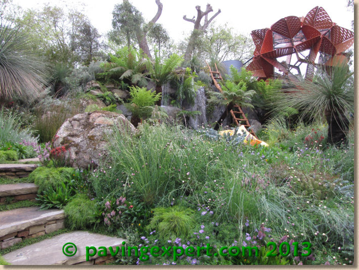
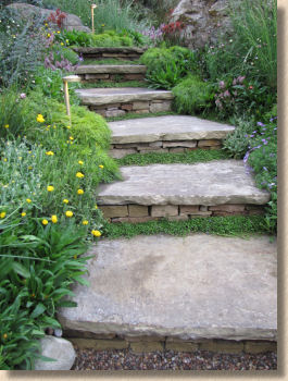
Down at pleb togfer level, the ginormous granite boulders just demanded attention, as did the weirdly bulbous bottle trees. The only hard-landscaping that was apparent comprised some simple flagstone steps heading up the bank, although later TV shots revealed some decking and other bits and pieces that would have been interesting to see, if I'd been 6m tall. Indeed, the designer, Philip Johnson, has publicly confessed "The aim was to showcase exactly what can be achieved in landscape design without using any hard-landscaping elements at all." We'll have less of that sort of nonsense, I reckon!
I've no doubt that the garden warranted its Gold Medal and its Best-In-Show award, but there was almost nothing on which I could possibly comment. It feels that I'm short-changing you by not saying more, and I wish I could say more, but I couldn't see anything other than granite boulders, cascading water and strange Aussie plants.
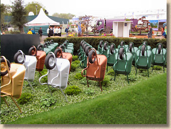
So, 180 degree turn and head back up Main Avenue towards the Royal Hospital, but not before admiring the 'tribute' to the humble wheelbarrow. We all use them; they are the workhorse of the paving and landscaping trades; and yet we rarely acknowledge their value, so to see them being celebrated really brought home just how important they are to us.
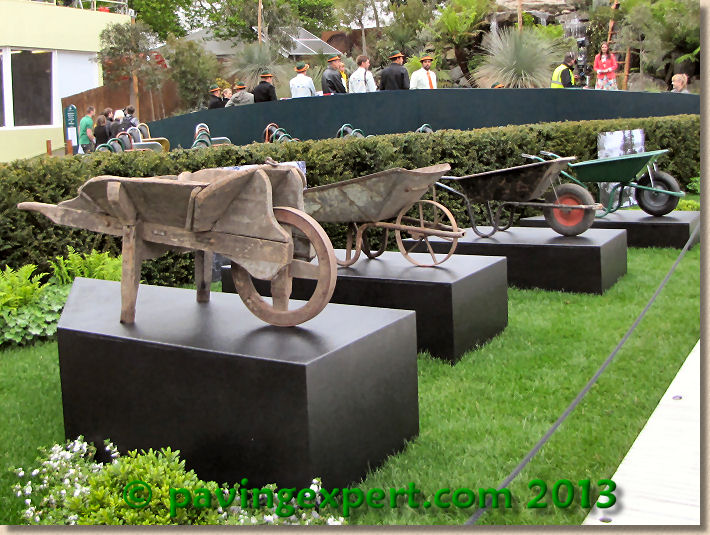
The wooden barrow from the 1930s probably weighs as much when empty as the modern pressed steel barrow does when fully loaded. The folded steel barrows I started with in the late 60s weighed quite a bit but at least they lasted longer than a month, which seems to be the lifespan of some of the cheaper, wafer-thin, crappy steel jobbies that we get nowadays. But what about the barrows not on show? No plastic barrows; no ball-barrows, so beloved of 1980s gardeners, and none of the short-lived jalopies which had a fibre-glass body: short-lived in that they were only around for a couple of years, and short-lived because they rarely lasted more than a week under site conditions.
Anyway, back to the gardens and the first on this side of the avenue is The Brewin Dolphin Garden which is brought to you by the letter L, apparently. There's a L-shaped hardwood boardwalk running beneath an L-shaped canopy and over an L-shaped shallow water feature with dark cobbles and pebbles as its bed and honed sandstone copings at its edges. The boardwalk is flanked by 900x900 smooth sandstone flags which are dressed with sensuously rounded boulders intended as seating or perches, and at the far end (the base of the L) it opens out into a patio area.

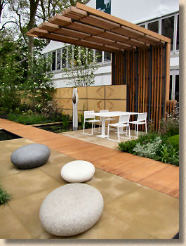
The only incongruity for me was the plywood walls. They'd been dolled-up with some routed regular motif, but while the boardwalk sang of quality materials, the walls whistled a cheap'n'cheerless tune of unnecessary economy.
Tucked away, right at the back, is a vertical water-drop backed with the same dark pebbles set into a dusky pink vertical wall. The cascade skids over the little knobbly protuberances before effortlessly tinkling into the pool beneath, generating minimal disturbance to the surface but just enough sound to ease the mind.
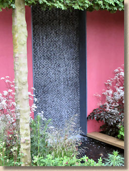
It's a very much a modern garden, not one where you'd expect to see the kids kicking about a ball or growing sunflowers, but a more sedate, mature patch of tranquillity for a couple wanting to chill. Apart from that rackety wooden walling, it exudes wealth and entitlement, which may well have been the brief, given the nature of the commissioning client's business. It was so obviously a Chelsea Gold garden, and so it proved when it came to doling out the gongs on Tuesday morning. You'd be a tad disappointed if you splurged all that dosh and didn't walk away with gold!
Next door, another paean to the wonders of sandstone. The Homebase " Sowing The Seeds Of Change " garden is a more traditional family garden for the 21st century, mixing utility and amenity, with veg beds, flowers, a little bit of lawn, and recreational space in the form of a pergola-covered dining area.
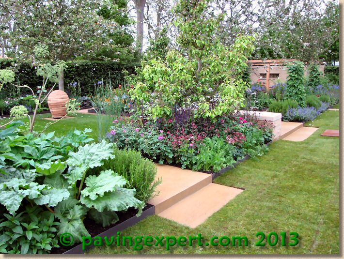
The orthogonal pathways are either shot-sawn yorkstone (Crosland Hill?) with its unmistakeable surface texture, or crushed 'Yorkshire Grit' held in place by dark brown steel EverEdge . The hard paved areas are laid close-jointed with sand infill and feature minor changes in level, small 100mm steps up or down which add interest, while the aggregate paths are all on the one level. The walling is split faced stone to match the paving, although in a touch of real class, the copings are honed, with bull-nosed arrisses and lovely, precise detailing at corners. The contrast between the rougher vertical faces and the smooth copings set at the ideal bum-inviting height is not a new idea but it's rarely seen executed so well.
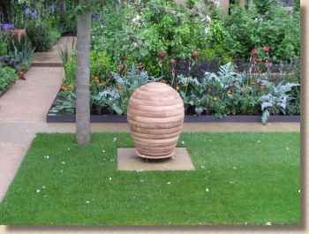

The stone used for carved beehive-like piece in the centre of the lawn looks suspiciously Indian, with its heavy, iron-rich banding, but it is a delicious feature piece that just begs to be caressed. It's so simple but emphatic, in keeping with the general feel and colour palette of the garden, but simultaneously distinct and appealing. I can't think of anything that could have looked better. Worth a Gold for that yoke alone!
Hey! What's this? No sandstone? Is that allowed? Not only is there no sandstone, but the clock has been turned back five years and we have the reappearance of Vande Moortel clay pavers. Oh! There's a sight for sore eyes!
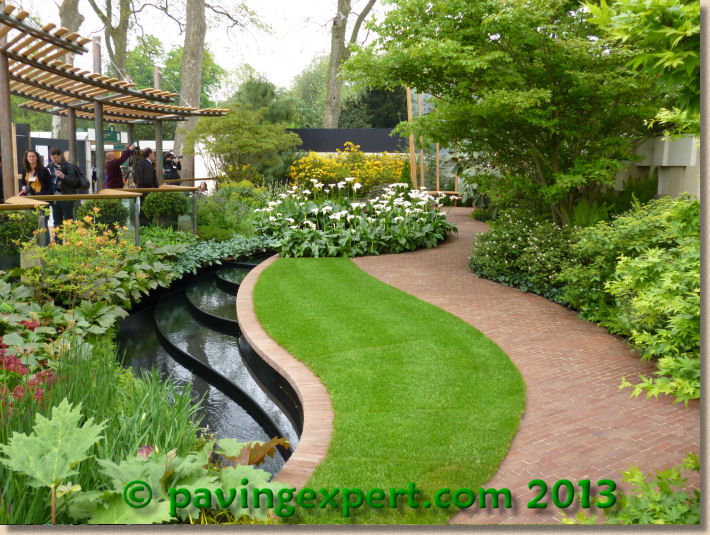
The East Village garden, paid for by Delancey , is pretty close to heaven. A sensual, sinuous path of the reddy-brown 200x50mm Vande Moortel pavers snakes its way along the right hand edge, bordered by a lawn of perfect green, what I believe is referred to as a 'sward', edged with a soldier course of the same skinny pavers, which guard the edge of a dark chasm of a black-faced stream which burbles over a series of broad steps before disappearing into any abyssal plughole, swirling lazily under the influence of the coriolis force before plunging down into blackness, no doubt to re-appear at the head of the system again in 30 seconds.
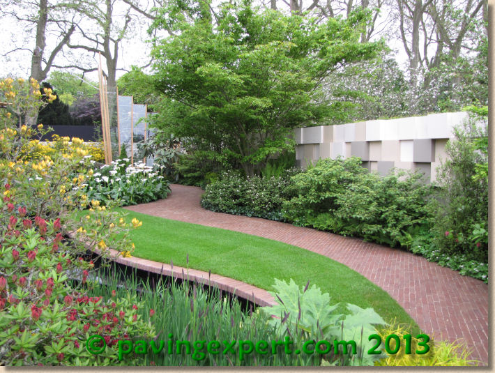
The long edges of the plot are fringed with rich herbaceous beds and medium-sized specimen trees, while the left hand edge very accommodatingly provides a viewing platform which projects into the garden offering a more intimate viewpoint.
It's easy to see this as a tamed-down version of a public space, and indeed, its roots lie in the regeneration projects triggered by the London Olympics, but it has been domesticated by the inclusion of a soaring, glass-backed seating area-cum-patio. Put it into a residential garden and it would be a resting point, a destination, a spot to stop and reflect as the wider garden is explored, or scale upwards and it becomes a charming parkscape, a quiet paradise in a public area. This is a garden that's brimming with ideas which should be applied to any landscape, large or small, formal or informal, urban or rural. There are no boundaries.
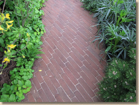
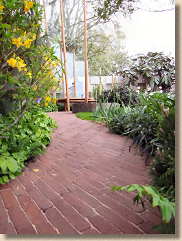
But at the core of this deceptively simple, yet endlessly elegant design is a paved surface of near impeccable quality. I've long raved about the Vande Moortel pavers and use them on my own projects whenever possible, and so they are a welcome sight here amongst the elite of landscaping, but look too at the quality of the installation. They've been laid as running bond but at roughly 45 degrees to the general alignment of the path, which results in awkward 45°-ish cuts at both ends of every 50mm wide course, and over a 15m plot, that's a lot of cuts. Try as I might, I couldn't spot a single misaligned or ill-fitting cut piece. No tiny bits the size of a fingernail; no overly wide joints where the laying operative couldn't be arsed to cut two pieces; no skewed slices hidden with a bit of foliage. When you see cutting-in of such a high standard, you just know that everything else will be spot on.
Gold hardly seems adequate reward for such lovely work.
Loathe as I am to haul myself away from the tranquillity of the East Village garden, needs must and so cross the aluminium walkway to the Telegraph Garden , which is pretty much everything I don't understand about modern garden design. At its most basic, and I admit to over-simplifying this, it's cubes and boxes of clipped greenery, with some low level weed-like underplanting and a couple of trees nicked from an abandoned railway track plonked in to fill the space. The edges are mulched with, get this, barbecue charcoal and there's some half-finished timber framing around the rear sides.
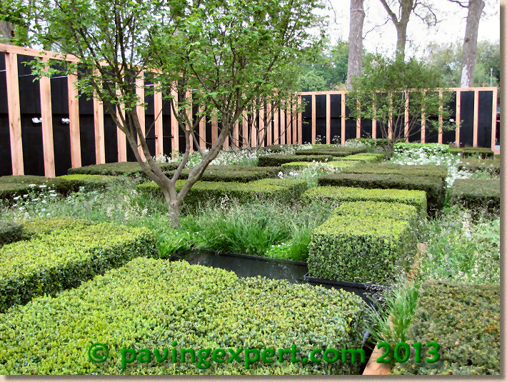
I just do not understand why this is attractive, why it's considered good design, or why anyone would want it anywhere near their own gaff. I'm not blaming the designer or the contractors; it's a failing of mine. I seem to be missing the gene which codes for appreciation of high concepts such as raw fish bits (sushi), fancy dress caterwauling (opera) or this garden.
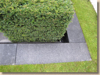
I spent a god 10 minutes trying to work out what to photograph, and in the end, I took a couple of shots of the flamed black granite used as a mowing strip and a couple of shots of the garden in its entirety because I could not, for the life of me, figure out what was supposed to be good or appealing or attractive or inspirational. I even went back twice over the course of the day just to double check, but the veil never lifted and I remain confused, even now. How this wins a Gold of equal merit to that given to the East Village garden is yet another concept that is beyond my ken!
Never mind. We can't all like everything, and it can't get any worse. Oh 'eck! It just has. The Laurent Perrier Garden next door is a celebration (if that's the right word) of travertine in all its abysmal forms. Setts, flags, cladding, just about every god-awful method in which the poorly-baked form of dirty limestone can be misused has been employed on this tribute to the home of the gassy wine itself, Champagne.
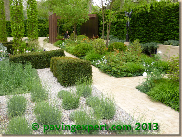
I daresay travertine makes sense in that part of the world. Champagne, the region in northern France, is a natural limestone 'terroir', albeit not travertine, so there is a tenuous link to using this stone as a backdrop to the rest of the Franco-Italianate planting as envisaged by a Swede, but someone should have told him that in Britain, using travertine outside a bathroom is punishable by being clamped into the stocks and pelted with over-ripe mangel-wurzels thrown by venerable Chelsea Pensioners.

Sorry, but I can't even pretend to be objective about this. It's an abomination. Unjointed, stack-bond travertine setts as a pathway? Well, I suppose weeds need a home just like everything else, and at least the inevitable moss, which will be queuing up to colonise the paving before it crumbles to mush in the good old British damp, will offer a modicum of enhanced traction on the slippery-when-wet surface. Giving this a Gold devalues those gardens which genuinely deserve such praise!
The next garden garnered a lot of press attention for various reasons. The B&Q Sentebale Forget-Me-Not Garden has some tenuous connection to Prince Harold, but no sign of the lad himself; they got the incredibly photogenic Emilia Fox to pout and pose for the assembled press throng; and it is a garden featuring more hard-landscaping than greenery. Now there's a thing!
So, naturally, you'll be expecting me to rave about all that lovely stone, and it is lovely stone, very, very lovely stone. But there's too much of it. Yes: here's me, the paving obsessive declaring there is too much paving. I bet you never thought you'd hear that on this website!
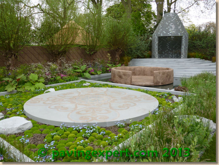
In fact, all that hard-scaping probably dented its chances of the top gong for young Harold Windsor and his designer chum who walked away with a Silver-Gilt, but even if you are aware of the reason for all that delicious grey-blue sandstone tiered upwards to the stone ribs of a Lesotho hut, the garden as a whole didn't mesh. To me, it seemed to consist of three discrete elements; the aforesaid steps and hut structure; a giant-sized baked mud bowl; and an inlaid feature stone circle which reflected the tribal designs adorning the native farmers' snuggle blankets. So, the link is the landscape of Lesotho, but it is snapshots of the country rather than a coherent impression, like looking at postcards sent home by friends visiting the place on holiday and mistakenly thinking you have a real sense of the place.
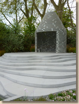
I can't fault the stone. The steps are all laser cut (I think she meant water cut) and there's a wonderful organic shape to them as the stumble upwards, which is supposed to represent they sedimentary mountains of the country, and the build quality seems perfect, albeit from afar. The hut at the summit is a work of art, but isn't it too neat, too tidy, too accurate and clean and engineered to be a farmer's shelter? Lovely stone, though.
And so to the last of the big gardens on Main Avenue, the " Windows Through Time " garden from show sponsor, M&G Investments . This was intended as a celebration of 100 years at Chelsea, and so they got first dibs on this corner plot which is always a showstopper.
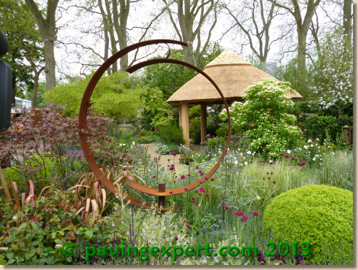
It's exactly what you would have expected. Romantic, gentle, safe, respectful with elements from years gone by. There's a rusty iron hoop that is claimed to be a modern sculpture forming the eponymous Window; there's a thatched gazebo; there are brick'n'stone ruins at the far end; there is plenty of soft, dreamy planting; and the paving is….sandstone. Yet more honed sandstone, laid off-set or dog-legged however you want to call it on the long axis and as straight broken bond courses on the short axis. Close-jointed, sand-filled, yet again – isn't it uncanny how they all have the same idea whilst working in alleged isolation?
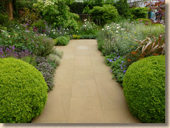
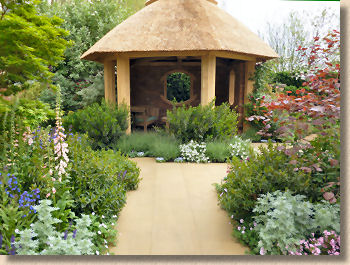
I don't know what stone this is, there was never anyone around with a clue about the hard stuff, but more than ready to drone on about Tenuissimma and Ophiopogon. It looks very North Yorkshire with its feint iron banding, and I noticed that it, too, was easily marked by foot traffic, which is fairly limited on Press Day immediately before or after judging. As with all these millimetre-perfect honed sandstones, if we come back for Chelsea's 200th birthday, they should have developed a bit more character, softened the arrisses, lost a couple of corners, maybe developed a crack or three. Honed yorkstone always looks phenomenal when new and pristine and clean, but it will only ever deteriorate from that point, and that's what we should be looking forward to. The yorkstone we love is the old stuff, the flags that have experienced a bit of life and hob-nailed boots and soggy British winters, which is why reclaimed flags can command a higher price than newly quarried. It does concern me that anyone commissioning a garden based on some of these show gardens is in for a bit of a rude awakening if they think the paving will stay looking that way!
Turning the corner onto Royal Hospital Way and just three big gardens down here, with the Fresh Start Gardens taking up the remaining space. And the first of these is another visual stunner.
The Seeability Garden sponsored by posh peoples' bank, Coutts, is almost like an optical illusion, as it uses three paths of thin roofing slate set on edge and aligned towards the centre, each slate pointing directly to the origin, where a large Robinia tree forms the focal point. The slate is loosely jointed with a black foundry sand and the effect is nothing short of dazzling.

As you walk around the two open sides, you notice how the orientation of the slate gradually alters to maintain a precise focus, which is probably some metaphor for the garden's message about sight loss. And as gorgeous as this slate work is, it is matched by some of the best sculpture anywhere on the site. A curtain of stainless steel spheres; a curved wall of rusted steel tubes; a sinuous fence of oak palisades, all suggest a barrier but allow glimpses through to that central point.
In terms of craftsmanship, the slate path is probably the most complex piece of paving at the show. Technically, it's relatively easy to set-out, but it's laborious and demanding. However the finished effect is just a delight.
In real life, slate-on-edge paths are notorious for acquiring detritus in the joints, so they need regular cleaning to keep the look, and this is always a problem. Designer Darren Hawkes chose to use a loose foundry sand to give him the jet black contrast which emphasises the individuality of each piece of slate, but I would have gone for one of the finer grained basalt resin mortars which at least would allow the path to be power-washed every month or so without losing any of the jointing.
I kept coming back to this garden, just to revel in its beauty and style. It's a small, feature garden rather than a whole set, and so would need to be a part of a larger scheme, a hidden delight perhaps, and maybe a more generous seating area would help, but I can't help feeling that by given a Silver-gilt, Darren was robbed. His design, and the work of the builders, deserved more than that.

From the sublime to the...well, the less than sublime, to Kate Gould Gardens' " The Wasteland " which is said to be a re-creation of an abandoned industrial site. This is another garden with which I struggled.
I could see the underlying story, the triumph of nature over man's endeavours, but the claim that this was intended to be a communal garden just left me stumped. Would I want to take my grand-daughter to a place like this? Pretty as it was, it just didn't seem to match my idea of a restful spot.
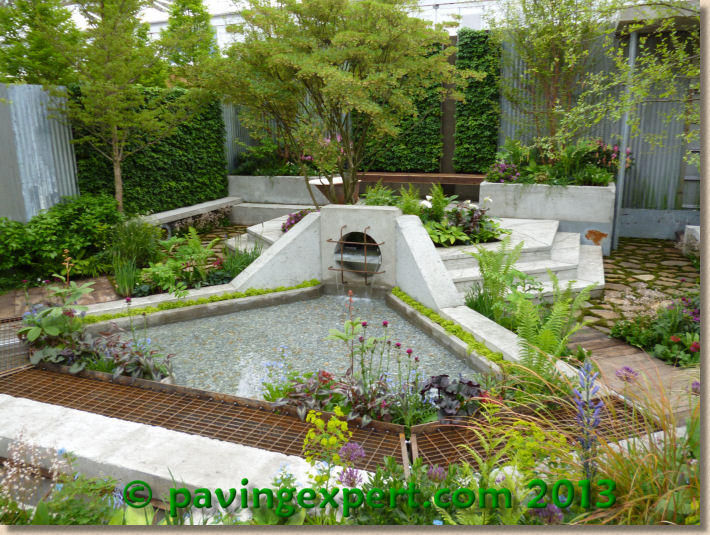
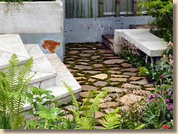
The sight of exposed rebar in many of the concrete structures is, I can only suppose, and artistic touch, but from a construction point of view, it's bad practice, it's dangerous, and it severely limits the lifespan of the garden. Yet the sunken area of stone crazy paving with mossed joints is beautifully executed, if impractical.
So, another statement garden, but this one has a mixed message. Is it nature reclaiming industrial desecration, or is it recycling the desecration to make something allegedly beautiful? I'm lost!
And to add to the sense of bewilderment, the garden gets a Gold! There is no logic to this at all!
So finally, we come to the last of the Big Show Gardens. The city of Stoke-on-Trent's Story of Transformation. The title tells you all you need to know: it's a tribute to the city's success in hauling itself out of the 1970s slump and near obliteration of the pottery trade, as well as the coal mines, into a bright 21st century of promise and opportunity...and a Saxon warrior!
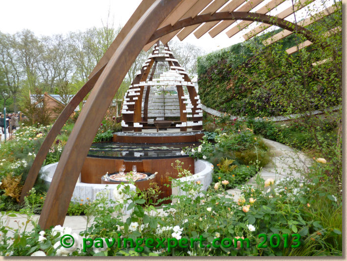
Almost predictably, there's a bottle kiln, or the remnants of one, at least, and it wouldn't be a Stoke garden without one I suppose, and there's the winding path, which was rather wonderfully cut from Staffordshire sandstone as perfectly interlocking organic shapes. It's just a pity there was almost always some eejit stood on it spoiling the shot! Tucked away right at the back a wonderful dry stone wall which was almost lost in the dizzy planting.
These gardens paying homage to a town, city or region are a recurring theme at Chelsea and I often feel they make a rod for their own back by trying to do too much. Do you just take a snapshot as some have done in the past and risk being seen as frozen in time, or do you try with a timeline and cram centuries of history and endeavour into a few square metres?
Maybe that's why they only took a Silver back to the north Midlands.
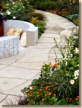
There is so much more to see at Chelsea and I wish I had the time to give fuller coverage to the amazing Artisan Gardens and the Fresh Start projects because there are the germs of tomorrow big gardens in amongst them, either lurking in some of the ideas, or in full view as the talent which drives the designers and builders. However, we're already at 4,500 words and so I must limit my comments to those that really were outstanding and rely on photies with minimal comments to speak on their behalf.

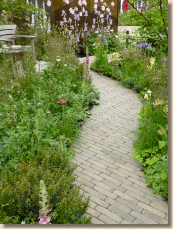
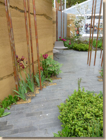
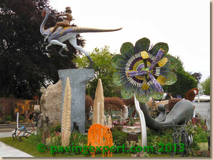
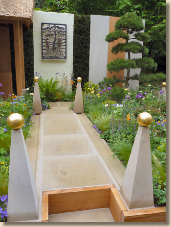
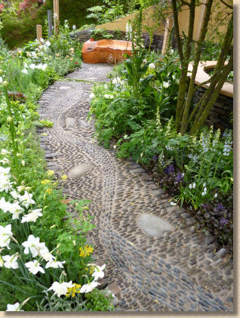
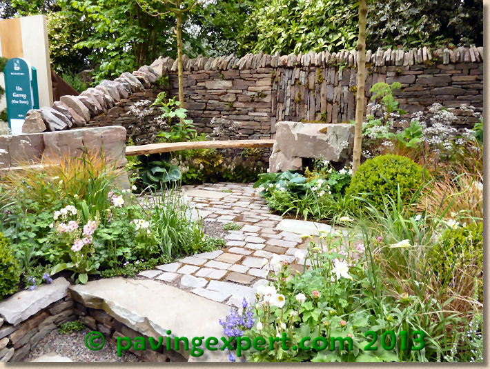
As a centenary year, it was always going to feel special, but I'm not sure Chelsea 2013 lived up to its billing. The Australian garden was a jaw-dropper, but other than that, there wasn't a lot to rave about. Sandstone is definitely “in” and in larger format, it's bang on trend. I actually liked the hardwood boardwalks (they really shouldn't be thought of as decking) but I disliked the creeping commercial presence on Main Avenue. If they don't want to produce a high-quality garden, then send them packing to Eastern Avenue or Royal Hospital Way, and leave Main Avenue for those with serious intentions.
And despite the taste for sandstone, my favourite garden was the East Village with those clay pavers. It was a bit different, but it was so tasteful and versatile. If I remember in time, I'll fashion a pavingexpert.com Platinum-effect medal and give it to them next year.


