Tobermore's 2006/07 Catalogue
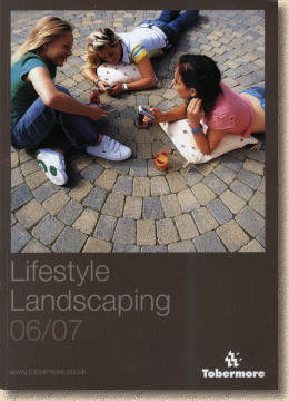
The first mainland Tobermore Paving Centre threw open its doors to the Great British Public just before Easter, and it's been perfectly timed to coincide with the release of the new 2006-07 Lifestyle Landscaping Brochure. I had intended to review both in the one article, but, as per usual, the words took over and by the time I'd put down what I needed to say, the word-count was over 3,000, and the image count was impractical for anyone without broadband, so I've split the piece into two. This page carries a review of the new Catalogue while the new Paving Centre at Leyland, Lancashire is reviewed on the preceding page .
So – does the new brochure live up to the high standard set by the new Paving Centre ? Unlike many other manufacturers, Tobermore aim for a bi-annual brochure, issuing supplements if and when they have significant new product releases. For a medium-sized manufacturer serving a smaller population base, this is a sensible strategy, but now their market has taken in an extra 10 million or so in Scotland and northern England, that bi-annual strategy may have to be reconsidered.
The 2006-07 "Lifestyle Landscaping" catalogue is almost 33% bigger than the 2004 issue: 102 pages now, in place of the previous 76, but has all that extra paper been used wisely?
As you'd expect, the various product groups have been afforded their own sections, and as is the way with almost every “residential” paving brochure, the first few pages have to be given over to marketing waffle about the importance of hard-landscaping. Thankfully, the 8 or so pages used for this purpose by Tobermore are mercifully free of meaningless buzzwords. Instead there's a focus on why outdoor spaces are important, especially for families (a theme that is re-stated throughout the catalogue), about how driveways are play areas and not just car spaces, and about adding value to your home, the paramount obsession of almost every homeowner at the moment.
Part of me wonders why we have to endure these introductory sections in modern catalogues: after all, if someone has gone to the trouble of picking up the catalogue and has settled down to read it, it's pretty likely they're already convinced of the need for some form of paving – surely all the catalogue need do is persuade them that this is the brand for their project? Do we need extensive preambles and buzzwords and lifestyle statements? Does anyone actually read them or do they simply flick through to the real meat? A small survey conducted via the website suggests it's 50:50. Some do, some don't, but almost everyone agreed the introductory pages had little or no impact on their eventual decision.
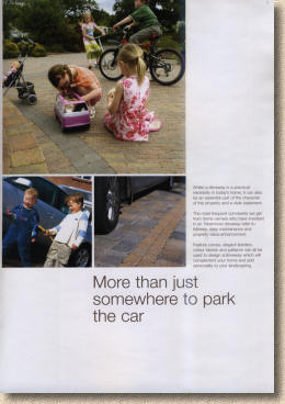
To be fair to Tobermore, I feel they have shown commendable restraint. Four sets of double page spreads, with one page of each 'set' given over to a full-page image, and each 'set' devoted to a single theme that is introduced in a few simple statements with no hype. There is enough to prompt essential thought and consideration, but not so much that it becomes meaningless, while the images play an essential part in expanding the theme.
The page shown opposite prompts consideration about how we use our driveways, and is typical of the provocative questions raised in these introductory pages.
There's a brief mention of Tobermore's landscape design service. Here I feel they have actually underplayed their hand. The offer of a no charge, no obligation 30 minute consultation with a trained hard-scape advisor is a fantastic marketing tool and, if I had any input, I'd be shouting it from the rooftops. Such a consultation from a private practitioner would set you back at least 30 quid, and twice that in some parts, yet Tobermore are giving it away!
A consistent theme throughout the catalogue is a paucity of text and a calm, uncluttered feel to the pages. Going back to the mini-survey conducted earlier this spring, most respondents agreed they rarely read the text and relied primarily on the images. Personally, if it's a choice between 3 paragraphs of meaningless mealy-mouthed marketing mottos and one decent photo, give me the photo every time, but there has to be some explanatory text, to convey the potential usage, to explore possible design ideas, and to stimulate thought. My thought is that there's not quite enough of that with this catalogue.
Ten pages are given over to the Tobermore Tegula range, which includes the smaller Tegula Setts and the circle features. Twenty-four well-composed and brilliantly executed photographs, including two full-page shots, plus swatch images of colours and textures, yet barely 200 words to expand on the inspiration provided by the photographs.
A “Case Study” here would have been ideal – get a client, and possibly the contractor/designer, to explain why they chose Tobermore Tegula in preference to, say, Shannon or Mourne or Pedesta; get them to say what they liked, and how they came to choose that particular colour, how they thought about the edge courses, the kerbs, and so on. 300-500 words of text: a couple of minutes of reading, and yet such a piece would add a real human touch to the decision-making process.
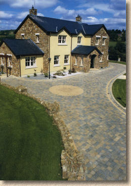
Most of the products are familiar, and rather than comment on the known, I'd prefer to showcase the new, and in particular, two new block products that are a little out of the ordinary; indeed, they could accurately be described as adventurous because they break many of the unwritten rules we have come to expect with segmental paving products.
is a three size tumbled block available in two multi-colour options: Sunset, a warm blend of soft reds and gentle golds, while Slate is a monochromatic mix of charcoal and grey tones. Nowt terribly revolutionary there, I hear you think, but what sets apart Roma is that there is no common dimension.
Other tumbled products are manufactured to have block where one dimension, which we assume to be the course width, is common to other blocks in the range. The Tobermore Tegula blocks have a course width of 173mm, with three length options: 104, 173 and 208mm. This enables them to be laid as coursework. Roma 'breaks the mould', if you'll excuse the pun. The block sizes are 120x120mm, 120x180mm, and then a 180x240mm – see! No common size!
The blocks come in a single bale, which limits versatility, but I can understand the need, from a manufacturing point of view, to simplify production and packaging for what is an experimental paving system. If it proves to be popular, then maybe the installation of separate moulds and separate cubing and packaging lines could be justified, but for now, an all-in bale makes sense.
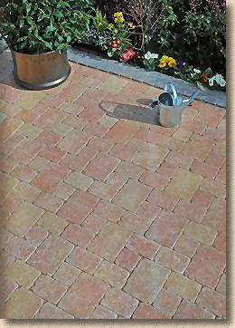
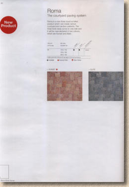
What doesn't make sense is the very low-key promotion given to this new product. Two pages; one photo, albeit a full-page image; two colour swatches and thirty seven words of descriptive text. It's hardly what you'd call a “bang”. And although the cursory text mentions “courtyard” and “random” patterns (can a pattern be random? Isn't that an oxymoron?), only one layout is shown, an attractive, repeating pattern that I assume is the aforementioned “Courtyard” option.
It is possible to lay the Roma blocks as a coursed pattern, by alternating courses of different widths. I expect to see an exploration of such design options with a new product, and I expect to see suggestions for combinations. I don't expect to see half-a-page of white space. I can only assume the publication schedule for the catalogue precluded the staging of additional photo-opportunities.
is the second new block product, although I first saw this in an experimental form a year or so ago. If Roma bent the rules by not having a common dimension, the Arena blasts apart the rule book by having blocks that are not even rectangular. The Arena blocks have what can only be described as an organic shape, a sort of very curvy, roughly rectilinear form with rounded corners and sides that are not always parallel. It's unlike anything we've ever seen from a CBP manufacturer, and is more akin to rounded beach or river cobbles, although the surface is far more pedestrian-friendly.
There is no pattern for Arena. You can't lay such a non-geometric shape to a pattern. It can be persuaded into what I suppose we must call 'courses' or it can be laid in a totally chaotic arrangement that is oddly pleasing for an informal setting, such as a garden. Circles are also possible, and, given enough time and an amenable client, I reckon some very, very interesting and unique layouts could be achieved.
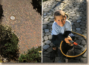
Arena is available in three multi-colours. Slate is much the same as that used with Roma in that it's a multi-grey; Heather is a warm multi with touches of red, gold and charcoal, while Bracken is an earthy brown multi, with warm buffs and charcoal greys. At 60mm thick, there's no obvious reason why it couldn't be used for driveways and not just garden paths and patios. However, there is one issue that would need to be resolved before recommending its use on a driveway: just how do we fill those unnaturally wide joints?
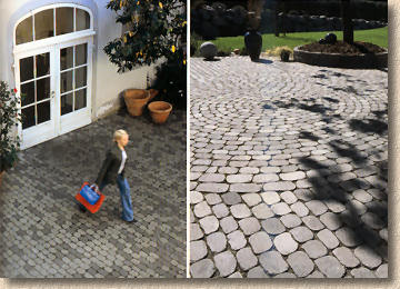
I know that Tobermore have been trialling all sorts of jointing options. For an informal garden project, kiln-dried sand would not be a problem, as loads are minimal and colonisation of the joints by lesser vegetation could be a real advantage. For those preferring a clean look, it's possible to 'bind' the jointing sand using a specialist “wide joint stabiliser” or a sealant. Alternatively, one of the better polymeric jointing products, such as Romex, would be ideal, if a little expensive. I've suggested to Tobermore that they try a certain coarse self-binding limestone dust that we successfully used with wide-joint paving systems in the 70s and 80s, but no definitive advice is given in the catalogue.
As with the Roma, information is worryingly sparse and understated for a new product. There are more photos, admittedly, and less white space on the two pages allotted to the product, but the text runs to just two sentences and none of the issues raised above are broached.
The other product ranges remain largely unchanged. The Pietra Natural Stone offers a fine selection of imported granites and sandstones in various forms, and there is a sense that, of all the paving manufacturers based on the island or Ireland, Tobermore seem to have the best-considered range, presenting customers with a sensible selection of quality, proven products, but nothing revolutionary or outlandish.
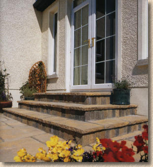
It's pleasing to see a couple of pages given over to products used to construct steps and ramps. With the growing implementation of Document M of the Building Regs (which covers disabled access, amongst other things) ramps and safe steps are having to be designed and constructed for most new homes, which has stimulated a degree of debate amongst contractors as to what constitutes a safe and level threshold. The info included here won't answer all the questions raised, but it is a welcome advance, and one that can be expanded in future supplements.
The technical information is rudimentary, but as I've said before, I'm happier when manufacturers stick to manufacturing and leave the laying advice to others. There is so much variation in paving installation that any publication, whether it's a catalogue or a website, can offer only generalised advice. Specific advice is best left to contractors and designers able to see the site. There are some good tips on finding that elusive “good contractor” and a short section of wise words regarding cleaning and aftercare. Finally, directions for the much-admired Paving Centres now includes the new site at Leyland, as well as the more established centres in Tobermore, Bangor, Dublin and Galway. The 'map' for the Leyland centre has omitted the junction number for those travelling on the M6, so when you get your copy of the catalogue, make a note that it is Junction 28.
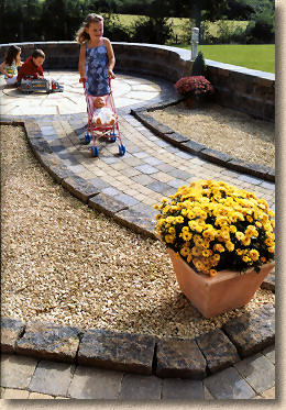
Overall, this is a very useful, functional yet attractive catalogue. The quality of images is consistently high, and they are excellent sales aids, either for visitors to the Paving Centres or for Contractors. With certain other manufacturers I've griped about the presence of far too many PYTs (pretty young things) and their aspirational lifestyles. With Tobermore, it's children. As a son of Erin myself, I know we tend to have a more family-oriented culture, and children are rightly regarded as a 'wealth', but using eyes educated for much of my life in England, it is noticeable just how many of the images include children. I appreciate this promotes the idea of family, of home, of investing for the future, and I know that we are less inclined to dislike a child at a patio table than we might be with a pearly-toothed, perfectly-styled PYT, but I'd still prefer to see a larger proportion of model-free images.
Let the paving speak for itself – it is good enough, and doesn't need help from a child!
I'd also like to see a bit more text, as long as it is not waffle. There are plenty of good comments and suggestions that could be used to accompany the images, and while too many readers will continue to ignore the text, even in its unread state, text provides balance to a publication such as this.
I know the many contractors in Scotland and Northern England that have tried the Tobermore products will be as keen as mustard to get their grubby paws on this new catalogue, and I know Mark, Roy, Andy and all the other Tobermore staff will be distributing them as widely as possible in the coming weeks. For those contractors not familiar with the brand or the products, you owe it to your customers to at least look at what's on offer.
For those poor souls eking an existence in Lower Britain - sorry! There are no immediate plans to distribute Tobermore Paving down south, but there's no harm in getting a catalogue to see what's on offer. Not only do the Northerners have better ale and footie teams, they have exclusive access to top quality paving, too! 
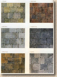
To finish on a positive note, I've always believed Tobermore swatches are the most honest and the most valuable in any of the catalogues published either side of the water. They are sensibly sized on the page; the colours are generally representative; the texture usually comes through, even in two-dimensional print, and, with the aid of a pair of scissors, they enable direct comparison with other products. I know that Tobermore have a separate swatch book, which every contractor should have, but these in-catalogue swatches are invaluable for the residential clients.
Click here to order your own copy of the Tobermore Lifestyle Landscaping 2006 catalogue, or any other literature from Tobermore, including the excellent SwatchBook and a selection of drawings and images on CD-rom.
Previous Page - Tobermore Paving Centre Review


