Marshalls' Brochure 2017
There was a time when the very thought of reviewing this year’s brochure from market leader Marshalls in early Spring was unthinkable. It always arrived just before Christmas to ensure I had summat to read in the long, dark festive layoff, and it was always heavily trailed by a ‘New Products’ sneak preview in late Autumn. Now, for reasons that are way, way, way beyond my pay scale, it’s early March before I get given the VIP tour of Marshalls-land just outside Halifax, and a personal guided walk-through of the new brochure.
And so, with April upon us at the end of the week, it seems ludicrously late to be compiling a review of a brochure that has been widely available for months and products that are already in use, but that’s the way of it for 2017.
The very first thing that hits you about the 2017 edition is that BIG changes have been made. Gone is the portrait format and familiar design that has been in service for well over a decade (although 2015/16 did see a break from the thereunto usual dark green background colour scheme) and we have, instead, a landscape format. Isn’t it uncanny how many of these annual brochures from so many different sources all hit on the same idea at the very same time. Amazing!

However, as I’ve said previously this Spring, landscape format is just so bloody obvious that it’s a wonder it’s taken this long for the ridiculously well-paid design gurus to realise its potential….if only there had been some sort of clue about how a landscape format could be better suited for use with a hard landscaping company selling landscape products. Mmm – those agencies certainly earn their dosh, don’t they!
To be fair, it’s not solely the format that’s been re-thought. The whole brochure has been redone from top to tail, with re-grouping of products into more consumer-friendly sets, and a much more dedicated focus on the consumer.
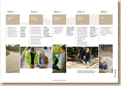
In fact, that was a key aim for this new brochure. Marshalls decided that these publications aren’t really for the likes of contractors, specifiers, designers and ignoramuses such as me. They are for the consumer, they are, in essence, a marketing tool (which we’ve always known) but a marketing tool that has to target a specific audience more keenly: the consumer.
Those of us wanting more than pretty pictures, succinct descriptions, and basic info will have to look elsewhere.
Being honest, I thought it had *always* been that way! I have brochures from the late 1980s and early 1990s that are, very, very definitely, aimed at the consumer and not the contractor, at the homeowner, not the specifier – in fact, way back then, we had completely separate and distinct publications for the ‘trade’ and a nicely-packaged, photo-heavy brochures for the consumer. So: has anything really changed?
Layout and Format:
Well, the layout and feel of this latest brochure has definitely changed since last year’s offering, starting with that re-grouping of products into Contemporary , Traditional , Family Friendly , Walling , and then Driveways .
Given the range of products we now expect to see from a major supplier, I can’t argue against such grouping. The previous distinction between concrete and stone products became increasingly meaningless with each passing year, and with the surge of porcelain (Ooops! " Vitrified "), such classification was effectively useless. As a nation, we now seem to have settled into a comfy understanding of whether we want or patios to have a modern look or something more nostalgic, or whether we’re actually just covering ground to make it usable by a growing family at a sensible sort of cost.
The patio section, now called Paving and Accessories, starts off with four full pages of very impressive 3D swatches. Oh! These are good! Damned clever photography and then arranging them to create tonal palettes of greys, buffs, and browns, with iconised info of product type (say, Jumbo or Linear or Coping, etc.) and directions to the relevant page.
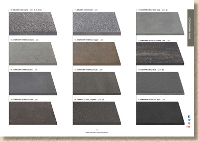
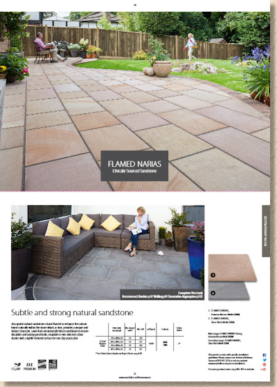
Each product is now afforded its own page, and a select few being honoured with a full-page glory shot accompanied by a facing info page containing a smaller landscape-oriented photo, swatches, size and pack information, and a selection of logos indicating environmental, ethical and price status. Open out the brochure, lay it flat (hit the fold with a mallet, I suggest) and you have all the relevant knowledge right before you.
It’s not quite clear why some products get this favourable treatment while others must make do with just the subsidiary page format, but, in general, it works. As you’d expect from a company with the stature of Marshalls, the photography is exemplary and many shots have actually been acquired courtesy of the far-reaching tentacles of the Registered Installer scheme, although, other than the briefest of acknowledgements, little is made of this.
This same page format is used throughout, for patios, driveways, even for the so-called ‘budget’ products, so the consistency rapidly becomes familiar, and it is hard to see how it could be improved.
New Products:
Along with the growing appetite for landscape orientation, the other noticeable trend amongst the bigger suppliers this year is a bigger slew of new products, and Marshalls are no exception.
Sadly, the new brochure lacks an index page with handy little icons to indicate everything that’s new, but, assuming we’re to include the new colours and textures on the ever-expanding porcelain/vitrified range, then it’s probably well over 25 new items.
The new Eclipse granite colour is Ember , a soft orangey-buff. The appreciation of granites that aren’t a lighter or darker shade of ubiquitous grey does seem to be growing, and this warm addition will be welcomed by those tiring of the monochrome obsession. And it's not all that dissimilar to the background I use for this website!
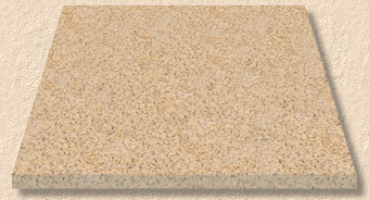
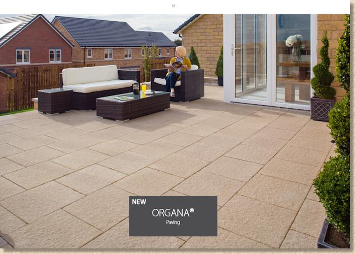
Organa is a whole new range of lightly almost-riven textured paving in three colours but only two sizes and both are bloody squares (450x450 and 600 x600) which will sadly stymie their potential. Strangely, the product detailed notes, alleged to be given on pages 106-107 of the brochure, are completely absent, so there’s not much more I can say about this, other than I did see it, albeit indoors under artificial lighting, and it looked “interesting”, according to my notes.
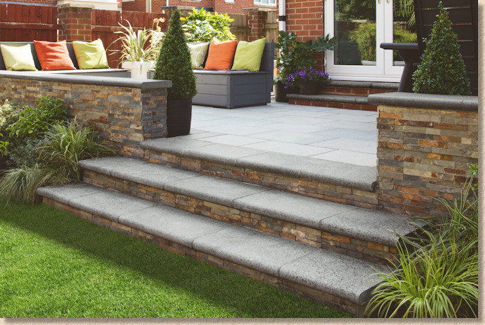
Four new porcelains in various shades of grey (surely we have the full fifty by now, don’t we?) don’t really warrant further explanation, but there is a wagon-load of new Bullnose Steps , adding nine new flavours to the existing three. This is great news – properly finished step treads and corner units in Versuro sandstone, Lazaro marble, Casarta slate and Eclipse granite. Now there really is no excuse for the sort of awful ‘made-from-flag-offcuts’ steps that have blighted so many otherwise excellent schemes over recent years.
Onwards we go to the driveway section (having gaily skipped through walling and copings without spotting anything of arresting interest) and it should come as no surprise whatsoever that much of the innovation stems from the ubiquitous DriveSys notion that has driven (no pun intended) so much of Marshalls driveway product development over the last 5 years or so.
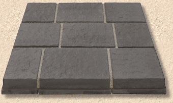
DriveSys Flamed Stone is, they reckon, an emulation of flamed Blue Pennant sandstone, except it’s not like any Blue Pennant I’ve ever seen, being significantly darker, with a much more restricted range of tone, and a debatable flamed appearance. Still, if you like it, you like it, but it’s not for me.
However, there *is* a DriveSys newbie that does float my boat, but for some reason it’s separated from the main pages devoted to DriveSys products, and appears, stranded almost, towards the back of the brochure on pages 156-157.
DriveSys Classic Paver is an ersatz clay paver in the DriveSys style, and quite convincing it is, too. A 2:1 ratio multi-red effect clay pavior in two tones (Manor Red and Abbey Red) that was laid as 45° herringbone when I saw it, but, I suspect, will also work as any other standard brick layout (90°HB, stackbond, basketweave, etc.)
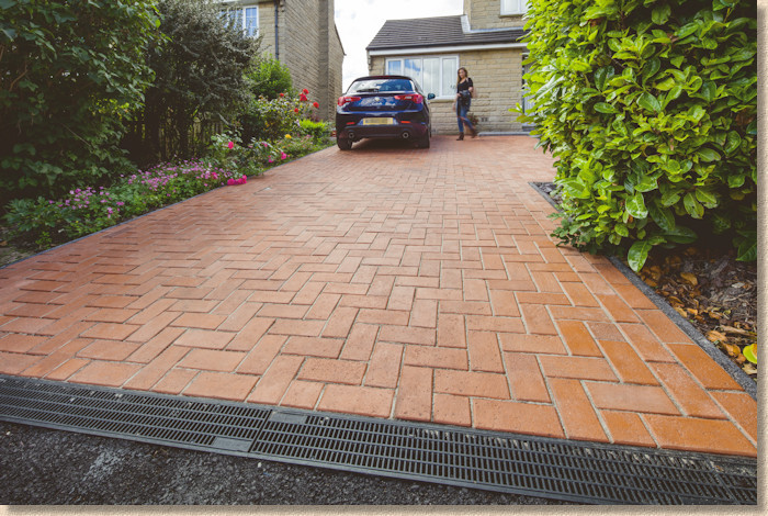
The problem for clay pavers has never been the pavers themselves, but the numpties expected to lay them. Clay pavers have what the trade refers to as ‘charm’ which means they have what might be considered ‘generous’ dimensional tolerances and a tendency to deform ever-so-slightly out of square when fired in a kiln, all of which makes them more of a challenge to lay accurately, but, as their many admirers will tell you, gives them an organic, naturalistic appearance that concrete or porcelain can never quite emulate.
So, what the clever chaps and chapesses at Marshals have done is take the top 10mm or so of ‘quaint’ clay paver, replicated it in their veneered and engineered concrete, and given it a hidden base that *is* dimensionally accurate and genuinely orthogonal, so that all the usual challenges of laying are designed out, and the whole system is laid as a standard block paver (or standard DriveSys paver, anyway).
The jointing presents a slightly different challenge, as the 8-12mm joints of the usual DriveSys fare can’t be used with these simul-clays, so a new product suitable for narrower, 2-5mm joints will be provided as part of the package.
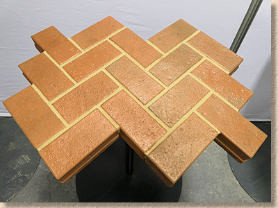
Will this reinvigorate interest in clay pavers? I’d like to think so, not solely in order to bring my own garden paving back into fashion, but because clay pavers (and Marshalls once boasted a very impressive range) are one of the true beauties of British paving, and they deserve a second chance.
No matter how much I liked the DriveSys Classic Paver it was not my favourite of the new products on show. Perhaps surprisingly, that honour goes to a drainage product, the Driveline Drain , which is just…well….just bloody brilliant.
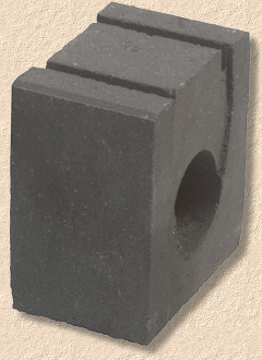
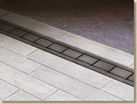
It’s brilliant because it’s simple, it’s effective, it’s subtle, and it’s a miracle no-one thought of it sooner. I ruminated upon it quite a bit on the way back to the correct side of the Pennines after seeing it at Southowram, and it struck me that its nearest equivalent is probably the much-heralded and now much-copied Beany Block from Marshalls commercial range. It’s a 100mm-wide concrete block with a hollow shaft through the middle and cleverly tapered sides that allow water to drip down to that central hole when the blocks are laid as a line drain.
The holes of each adjacent block align and link up to create a hidden, sub-surface ‘pipe’ through which surface water can run to a suitable outfall. All that appears at the surface is a rather neat an attractive charcoal block with regular, discreet, 10mm slots, and the occasional access unit and/or T-junction box.
I hate making predictions as it’s usually the kiss of death, but, given I’ve been told at what price these blocks will retail, I reckon they will become the de facto linear drain of choice for the majority of block driveways over the next 2-3 years. They are just so bloody clever, you’d have to be a fool NOT to use them!
Summing up:
I can’t help feeling I’ve missed summat. If only there was an index to help me spot all the newbies and check-off product names against my mental list, but, for now, that’s all the new stuff covered. I think!
Overall, this is a real step forward in the annual evolution of the Marshalls’ brochure, the one by which all others are judged, and the one that sets the agenda for almost every other paving manufacturer and supplier in Britain. The move to landscape orientation is very welcome and the only fault I can pick at is that the whole thing is still bound along its long edge, whereas it would handle so much better, in my opinion, by folding along that shorter edge.
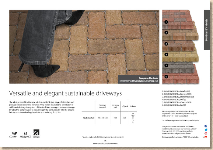
The swatch photography will have every other supplier of note rushing to their designers asking for ‘something similar’ for 2018, and, to be honest, the whole approach to layout, style and format has now set the agenda for the next half-decade.
If that attention to the brochure presentation was all they had, it would be reason enough to ensure you had a copy of Marshalls’ 2017 edition, but then, to top it all off, the products are so damned delicious, and some of them just so annoyingly innovative and clever, you would have to be certifiably insane not to have a copy, whether you are the target homeowner, a professional contractor, a jobbing landscaper, or even a lowly designer.
For the umpteenth year in a row, Marshalls present the most comprehensive and well-considered collection of residential hard-landscaping products on the British market. If you don’t know Marshalls, you don’t know hard-landscaping. Simple as that!
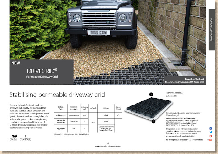
I knew I'd forgotten something! Just what the trade needs right now....yet another bloody plastic grid for gravel - DriveGrid.
Marshalls' Customer Helpline: 0845 820 5000


