Bradstone Brochure 2008
Firstly, I must apologise for the tardiness of this review. I've been so tied-up with all sorts of other projects that the time required to write a fair and reasonably detailed assessment of the 2008 Bradstone brochure simply hasn't existed over the past three weeks. Every day, I've promised myself that I'll definitely find a couple of hours the next day and get it done, but every day, the emails pour in, the phone never seems to stop ringing, and the Reichskinder need running here, there and everywhere.
Enough of the travails at Borlochs Hall; on with the motley! Since their triumph at last year's Chelsea Flower Show, where they romped home with the coveted 'Best in Show' award for Sarah Eberle's stunning Martian garden, Bradstone has come over all horticultural. The 2008 brochure makes no bones about it: Bradstone see their products as the premier choice for garden makeovers and patios. The whole brochure has the style and the substance of a garden designer's notebook.
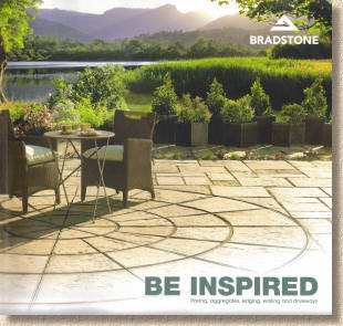
The size has been changed from last year's A4 format to a custom 230mm square size, with the mantra “Be Inspired” writ large over an image of a tarnside patio that subtly fades into a designer-style sketch. To reinforce the garden designer message, the two opening pages are given over to the bemedalled Sarah Eberle, who presents a glowing encomium to her employers in a faux-handwritten font, again emphasising the sense of a notebook crammed with memos and jottings.
The contents page further indicates that emphasis. There's no mention of the word 'paving', just three garden styles: Classic, Contemporary, and Mediterranean. The 'ancillaries', such as walling, driveways and decorative aggs are given individual listings, but "paving" has been supplanted by "garden", so we have sections entitled "What shape is your garden in?" and "What style of garden inspires you?"
The first of these considers four generic garden styles; small, medium, large, and sloping, replete with designer-style sketches and bullet-point notes. To be brutal, there's nothing revolutionary amongst the suggestions, they're very much elementary level garden design, but then they should prove to be thought-provoking and inspirational to DIY gardeners undertaking their own makeover.
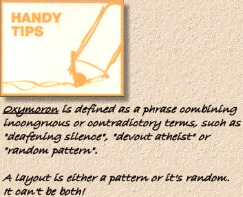
Each product is given two pages, with good quality photos of varying sizes, and most of the dimensional information that might be needed. More of the faux-handwritten script relays “Handy Tips” such as the fact that Old Town is available in a wide range of sizes and is thereby ideal for creating “random patterns”.
We could debate all day whether such-and such a flagstone is classic or contemporary; it doesn't really make any difference, because the best garden designs are highly personal and individualistic, rather than design-by-flowchart. However, the three groupings are logical and reasonably comprehensive. The riven products, both concrete and stone, are declared to be classics, while the polished paving is very definitely 'contemporary'.
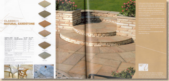
Each double page spread follows a template: Product name with interwebby punctuation and dimensional info on the left; photos in the centre; descriptive text and jottings on the right. While this gives a consistent feel to the brochure, some of the photos suffer from being forced to span the spine, while there's ample free space elsewhere that could have been used to host an undivided image, capable of lying flat for easier viewing.
While flags are given extensive space to make their case for inclusion in your garden, block paving is not afforded the same courtesy, and this section seems cramped and rushed. Blocks have never been a core Bradstone product, and there are plenty of cousin companies within the AI family that can offer a more extensive range, but I would have liked to see just a little more brochure real estate given over to some the very good blocks manufactured beneath the AI umbrella.
The installation guide is lean; in fact, it's anorexic and in imminent danger of collapsing, due to insufficient musculature to support its own mass. I've written quite a few 'installation guides' for various manufacturers, developers, housing associations and the like over the past couple of years, so I appreciate just how much of a challenge it is to provide sound guidance in a concise yet convincing manner. The shortest I've managed to date ran to two sheets of A4, including somewhat cramped illustrations: let's say 800 words. This brochure offers roughly 250 words on patio construction.
Aware that I can be somewhat loquacious, and often need to trim my witterings, the acid test relied upon when hacking and slashing at my installation text is whether a reasonably competent DIYer would be able to build the patio/driveway/planter/dwarf wall using only the information provided and their own common sense. I'm not sure this would be possible with the guidance on offer in this brochure.
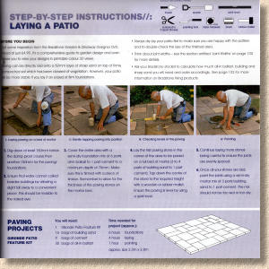
Which brings me back to a recurring theme: are we right to expect manufacturers to provide comprehensive installation guidance within a product catalogue? Judging from the number of requests I've had to write such information for manufacturers, it's obvious that many of them feel obligated to do so, but perhaps a sales brochure is not the best place to put it. A couple of texts I've prepared for clients are intended to be distributed as hand-outs, available on request, with pointers and links to further reference resources where necessary. It's an idea I like. What I'm less keen on is sparse information being used as an opportunity to plug an optional DVD that costs a penny short of a fiver.
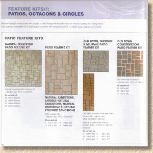
What is done well, however, is the diagrammatic guidance on layouts and patterns. Admittedly, some of the terminology and 'patterns' are technically incorrect but the overall depiction is clear and logical. Such information is a boon to designers as it explains the potential layouts far better than any text.
The care and maintenance section is as good as any I've seen, but suffers a little from the usual evasiveness that's endemic in such pieces when the need to suggest/recommend a particular cleaner or sealant or algaecide is needed.
Over the last 2-3 years, Bradstone, and AI as a whole, has acknowledged its environmental responsibilities, and has taken what I perceive to be sincere and positive steps to reducing its impact on finite resources, of aggressively promoting sustainability amongst its staff, its customers and the wider community, and of being prepared to lay itself bare before the gimlet eye of third-party accreditation schemes. Two pages towards the rear are given over to a few bars of trumpet blowing, and I feel it is deserved. Maybe not so many pictures of kiddies next time, as there's a danger of veering off into Michael Jackson style “I believe children are the future” territory, but the message and the ambition do warrant such exposure.

The Product Summary and Index are useful, more than you realise at first, but over the course of a season, you find yourself referring to these latter pages time and time again, either as an aide-memoire or to guide you the actual page you want. More brochures should learn from this example.
In summary, there's no denying that Bradstone have well-and-truly nailed their colours to the mast of the Good Ship Garden Designer. That's always been their strongest market, and this brochure is intended to deliver a full broadside to the designers and artistically-inclined makeover clients, an intention that is precisely targeted and duly honoured. The homeowners will appreciate its gentle mix of coffee-table aesthetics with sketch-book styling, and most contractors will find it to be a reliable selling aid when meeting with clients. The spine-spanning photos are slightly disappointing, but, over the course of a season they'll probably be pressed flat on so many occasions that the impact of the centrefold is reduced to nil … perhaps.
What is certain is that the Bradstone 2008 brochure will be one of the 4 or 5 such publications that every self-respecting contractor will have to hand when going out to look at potential projects, and it's one that no garden designer capable of holding a pencil should be without.
Click here to order a copy of the new Bradstone 2008 Brochure


