Formpave 2011
Formpave are one of those manufacturers that don't feel the need to issue an annual brochure, preferring to wait until there's summat worth saying (or they come close to the end of a print run!) in the form of new products or new techniques.
When the alluring Avenida Combined™ blocks were launched back in the late summer of last year , I'd half expected a new brochure to follow hot on its heels, but with changes at the company, it's taken until now to get the latest edition of the always entertaining Formpave Folio into the public domain. So: has it been worth the wait?
The thing about Formpave's brochure is that, unlike catalogues that undergo radical metamorphosis every 12 months or so, this tends to evolve slowly, adapting in response to its environment and rejecting change for the sake of change. So the latest version, which I hesitate to refer to as the 2011 edition, is essentially an updated version of the previous published back in 2000-and-odd.
As you'd expect, the core products remain. Product innovation at Formpave is a slow process, with only two noticeable additions to the range in the past decade: the aforementioned Avenida and the widely admired Eco-Granite. As with the brochure, this is partly due to a rejection of innovation for innovation's sake, but also partly because if you have a winning hand, why would you twist? The core products offer something for every key market, from standard 200x100mm pavers, through tumbled and textured, to permeable blocks and harvesting systems.
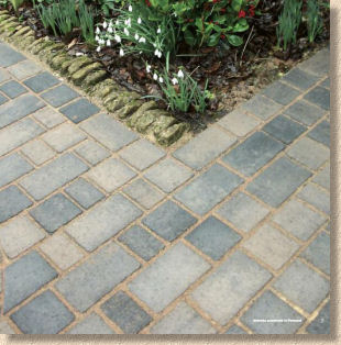
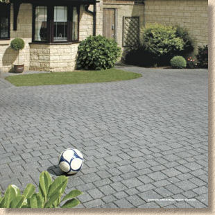
So the only significant product change in this latest edition is the wholesale addition of the Avenida range. This is the too-clever-by-half block that can be laid as a conventional or as a permeable pavement, and to illustrate the point, there's a whole slew of new photies showing both options, in the full range of three colours (Traditional, Pennant and Vendage – translates as Murky Brown hues, Charcoaly shades and Warm Brown tones). The USP, as marketing types like to say, is that the client cane have areas of permeable, say the driveway, immediately adjacent to areas of conventional, such as a patio, and all in the same paver, with only the jointing revealing the difference.

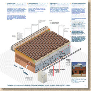
Elsewhere in the brochure, the gentle evolution policy is apparent. Some of the photies are very familiar, but a good photie is a good photie, and it's important to bear in mind that most of our customers won't have seen the previous three editions so won't know that the circle picture has been around a while. The 3D swatches are reassuringly familiar, and combined with the 3D cross-section drawings, represent something of a house style for Formpave. I think these are probably the best construction drawings shown in any brochure from a large manufacturer. They are simple enough for the client to comprehend, but carry sufficient detail for the contractor to understand what is required, and didn't someone say something about a good picture being worth a thousand words?
As for the overall impression, I've said repeatedly that Formpave make lovely products but I do wish they'd do something about those photies which show congruent joints – any fule kno that joints should be staggered!


At the time of writing, I've only seen the PDF master of the new brochure, so I could be mistaken, but it does seem that it is smaller (looks like a square format rather than the usual A4 rectangle) and the number of pages seems to have been culled to just 24 excluding the front and rear cover. I'm not sure how wise this strategy might be. We've seen 'lean' brochures from a few other manufacturers since the bankers screwed us all, but it has been noticeable that most of those that dabbled with 'austerity' brochures returned to the full cream version pretty rapidly, and one marketing bod whom I respect enormously told me that the feedback they'd had regarding their own 'lite' edition was that the company must be struggling if it couldn't manage a decent catalogue.
I'll put the PDF version on the website - feel free to download it at will . I look forward to seeing a hard copy, if they can make it this far north, if only to judge the quality of the paper and the printing. However, it's important to realise that the brochure is not what the company is selling. Their paving remains as good as ever, no matter what they do with the marketing bumf.


