Global Stone 2009
Hey! This is a bit different. A new season brochure that's not all glossy and shiny. Ooooh! Must have a look!
Global Stone 's latest edition has a new and distinctive look that will do much to set them apart in what is a very busy market. The hot-off-the-press 2009 "Product Guide" comes in an A4 format containing a generous 68 full colour pages of loveliness.
As the name suggests Global Stone's key product range is stone. They have slightly compromised themselves by offering a very tasty rustic-style clay paver on page 58, but everything else is stone and the general tone of the whole catalogue is that they've carefully and deliberately selected products that offer versatility and quality while providing a potential paving for almost every patio, courtyard or driveway project, regardless of style or budget.
The contents page loosely organises the various offerings by rock type, so all the sandstones are grouped together, as are the limestones, granites, marbles etc. The only product group honoured with its own section is the brand leader Old Rectory range of antiqued/weathered sandstone flagstones, setts (even though they refer to them as "cobbles") and walling. New products are not identified here, but they are on the individual pages. I always think it's a good idea to flag up (do you see what I did there?) new items on the contents page so that regular readers can sate their appetite by flipping to them straightaway, while occasional browsers will unwittingly be made aware that this is a supplier with a progressive attitude.
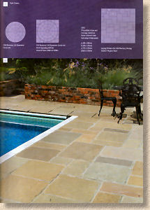
One of the secrets of success with any brochure/catalogue/product guide lies in creating the ideal balance of sumptuous photography with just enough descriptive text and adequate sizing/coverage information. Just how all this is put together will make or break a brochure, and I think Global Stone have got it as close to perfect as is possible. All the relevant information is provided on the page, alongside the photos and text, avoiding the need to refer to some page tucked away at the back. Simple diagrams give a much needed sense of scale for the various elements and project packs, enabling the reader to gain a much better impression of how they would work in reality.
The only minor bug I can spot is the use of plan sizes including joint width: so, a 560x560mm flagstone is described as 570x570mm including joint. I know from experience that some customers get themselves into a state over this, and fail to understand the concept of a non-zero width joint. I've had a number of layout designs returned to me because the drawing shows 560mm modules when the customer is adamant that the brochure says the flags are 570mm wide. While quoting joint-inclusive dimensions gives a more accurate figure for determining coverage, it doesn't half make life hard for flustered designers!
Enough of the gripes, and on with the motley. There are a few new products, so a few words about them before moving on to a more circumspect assessment of the “Product Guide” as a whole, and by 'new', I mean new products, not new colours or sizes added to existing product ranges. Bear in mind that many of these were previewed at Glee last September.
Arundel is a clever idea, albeit one that has been used for some time by lesser traders. The concept is simple: provide a 'mixed bag' of paving that takes advantage of the lower price accorded to some of the imported stone. Amongst the riff-raff, there's been a ploy of 'diluting' Rajpura Green with the cheaper Forest Brown but selling it to unsuspecting customers as 'Raj' at Raj prices, even though as little as 20% might actually be Raj. Arundel attempts no deceit. It clearly states that its mission is to provide “value for money” via a “non-selected offering”. There are three 'themes', if that is the right term: Autumn Blend looks to include representatives from the Mint, Modak, Raj and Brown stones, while Beige Blend and Brown Blend should be reasonably self-explanatory. There are four different sizes of flags in each “Blend” along with circle kits, all of which makes this a very attractive package for those looking for natural stone of a reasonable quality at a very reasonable price.
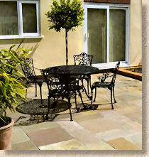
Artisan is a smooth ground sandstone. Many suppliers are now offering a smooth ground version of their sandstones and certain types of stone descend into characterless anonymity once any texture is machined from the surface. The Artisan Grey is one of those, whereas the Buff Brown does retain interest with its veining and banding. This may not be a bad thing, as there is often a need for 'understatement' in a design, and the shrinking violet appearance of the Artisan Grey can provide just that. The text suggests Artisan would work well with the Linear Paving (see later) and I've no reason to doubt that. However, as a standalone paving, I suspect it would not attract much attention, especially as it is available in only one size, 420x845mm (I assume that's not including joint!) which makes it too characterless for larger areas.
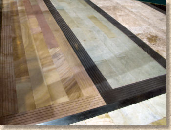
The Linear Paving is an idea that is very "now". It's been given various names by the various suppliers: long aspect paving, plank paving, boardwalk paving. The name changes but the concept remains the same: a long, narrow honed stone most commonly laid transverse broken bond. It offers versatility either as a string course to the edges or as break bands within a larger area of contrast paving, or it can be laid 'en masse' to cover an area with a 'floorboard' like effect.
It's the versatility that attracts me to this form of paving. Yes: it can be applied to any number of different stones; granite, limestone, slate, etc., and it can be used in all sorts of ways, but, as evidenced by the next new offering from Global stone, it is an idea that can be developed further. Fusion Paving relies on a simple 'grooved' surface to elevate the basic principle to a whole new level. While you'd be less likely to use this 'en masse', it is a superb contrast unit for edges or break bands. Lovely!
Moving on to Limestone, Elegance is the new shot-textured limestone with precisely cut sawn edges. This is a subtle paving and one that is not immediately appreciated. It's neat and tidy and understated, yet warm and rustic wonderfully tactile. It's an ideal paving for those conservatory-through-patio projects, which are unfathomably popular of late, and this is cleverly highlighted by the use of a neat “Use-In-&-Use-Out” icon on the page.

I bumped into the Global Stone Gang at a trade event early last year and the key buyers were adamant that what they wanted for 2009 was native stone. Having built their enviable reputation by sourcing and selecting the very best imported stone, they felt it was time to offer their clients the very best stone from these islands, a move which I wholeheartedly endorse. And so we have the first offerings: Welsh Slate and genuine Yorkstone .
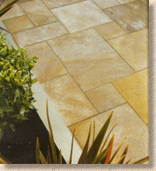
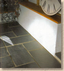
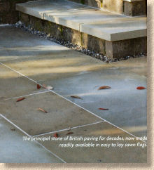
It would be hard, if not impossible, to identify two more iconic native stones than these. They could have gone for Pennant sandstone from the Forest of Dean or Caithness stone from the Scottish Highlands, but by choosing the sepulchral indigo tones of Welsh Slate and the exceptional durability of Yorkstone, they've chosen the Best of British and made them readily available to a much wider audience. The patio-buying public has developed a real appetite for stone paving largely thanks to the cheap prices that have fuelled the import invasion, and there is a growing number of clients looking for something a little more discerning, a little more gracious, a little more authentic, and for a British patio, it just doesn't come more authentic than Welsh Slate or Yorkshire Grit.
Travertine Linear paving – you take a wonderful idea and then go just that one step too far. Travertine: why? Although the icon claims it can be used “In or Out”, believe you in me: it looks much better IN a skip than out of it!
So, with the exception of the aforementioned Rose Cottage Clay Pavers , that's all the new stuff and it has to be acknowledged that it's an impressive assembly. The reliable top sellers have been retained and even augmented by the addition of new textures and stylings, most notably the Linear Paving. It's a comprehensive collection of the traditional and the contemporary and I defy anyone to claim there's nowt in it for their project. Once again, Global Stone have marked their territory as the pre-eminent supplier of stone-only paving for the residential market.
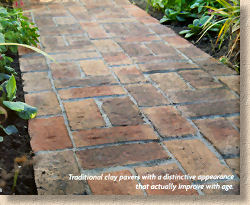
Regarding the new look and styling of the 'Product Guide', it is highly distinctive, and will set Global apart from all of their would-be competitors. The matt-texture of the paper is a strange and fickle thing, though. In several photos, it engenders as soft, naturalistic look to the image, yet in others, it seems hazy and unfocussed. It's definitely different, and definitely an idea I'd like to see developed further. On the whole, the matt texture and muted tones give a more realistic reproduction for stone paving, but several photos do need to be sharpened to lose the fuzzy, sometimes indistinct edges and detail.
The text and technical info is practically perfect in every way. The laying guide is excellent (I know: I wrote it!) and it now runs to a beefy four and a half pages. I'm particularly pleased that we were able to expand the coverage given to cleaning and maintenance, as these are a regular source of questions for many users. We would have liked the space to build in a few diagrams or photies, but given the choice of guidance on maintenance or additional diagrams, I'd plump for the text every time.
Brochures should be with Global Stone stockists NOW (or in the very near future) but you can always order your copy online, via the Global Stone website


