Tatton 2014
It's been a hectic couple of months for all sorts of personal reasons, and it's been practically impossible to keep up-to-date with News postings on the website, but some events simply can't be missed….even if it takes a couple of weeks to get around to actually posting a sorry excuse of a review. So, with sincere apologies to regular readers both for the tardiness and brevity of what follows, I give you the pavingexpert.com Review of RHS Tatton 2014 .
I had such high hopes for Tatton this year. A glorious period of weather for the build-up; following-on from successful shows at Chelsea and Hampton Court just weeks ago; and a sense that Tatton would, literally, break new ground with exciting themes and agendas for the show gardens.
It was, for us in north-west England, the hottest day of the year up that point, and so plenty of liquids, loose and generous clothing, and even mode-of-transport to the showground a mere 10 miles from here all required careful consideration. Scorchio days like this might seem ideal for wandering around the north's biggest garden show, but the heat can actually make it all too tiring and uncomfortable, encouraging even the hardiest of reporters to seek shade and ice-cream. Sweat running down the forehead, between the brows and into the eyes doesn't often make for great photies.
On Press Day, we are obliged to 'sign in' at the Press Tent which is, as usual, located as far as possible from the entrance to ensure maximum inconvenience. The fact that there was no sentry guarding the free copies of the Show Programme, and the presence of just two journalists at 9:30am should have forewarned me as to just how low-key and underwhelming this day was to become.
The site could hardly be described as 'buzzing'. Plenty of contractors and exhibitors milling about admiring their own work and that of the competition; a handful of tea bars and ice cream vendors busily updating facebook and twitter in the absence of any paying customers; but press and media reporters are about as common as hen's teeth. There only seemed to be two TV crews, too: the inevitable BBC wandering about shoving everyone else out of the way, and a token crew from the regional ITV franchise.
The Photo-Call sheet which lists the allegedly notable press events for the day may offer a clue for the paucity of cameras. While schoolchildren singing and a fire-eater blowing off into the air may be worthy of note, there's no hint of any form of celebrity, not even a d-list reality TV reject to tempt the photographers of the national dailies to venture this far north.
Fair enough, I would be the first to welcome a celeb-free garden show, but at an event such as this, they can serve a purpose. They can, and do, attract attention, stimulate interest, albeit for the wrong reasons, but there's no denying that a sprinkling of glitter will generate press coverage, which, in turn, brings in the punters and consequently the exhibitors.
Let's look at the positives: an absence of so-called personalities means there no pushing-and-shoving to get the best position for that cracking photie, no clamour, no jostling, no argy-bargy...but then there is precious little attendance from the exhibitors to explain or promote their gardens. It's more-or-less a chicken-and-egg situation: do the exhibitors not show up because there's buggerall press interest, or do the press stay away because there's no-one on the show gardens to give them a story?

Maybe it's because there are relatively few show gardens to actually see, and those that are here have been scattered like dandelion seeds on the breeze all over the site. The traditional cluster of more impressive efforts around the copse of trees known as The Egerton Clump is all but gone with just six or seven exhibits, depending on how you define 'The Clump' and how you define Show Gardens. In total, just twenty-five gardens of all classes – and these 'classes' are perfectly vague and nebulous: Summer Gardens? Elements Gardens? How are these different from Show Gardens?
So, plenty of trudging to see each of the gardens, which is inconvenient for someone with mobility issues, but should encourage more able-bodied and agile visitors to cover more of the site. But what really strikes me as I haul my sorry arse from one end of Tatton Park to the other is just how much empty space there is. Gaps. Absence of anything interesting. Yawning chasms of nothingness. Like a half-filled concert hall that is embarrassing to both the band and the crowd. Why? And where are all the 'regulars', the familiar exhibitors who have kept Tatton interesting for more than a decade?
And from the twenty-five gardens, those with something worth looking at (from a hard-landscaping point of view, obv!) can be counted on a single hand. The oh-so-tiring plain riven Indian sandstone which was thankfully absent from Chelsea is here in force, and some of it is even laid upside-down! With very few exceptions, there is a near total dearth of fresh thinking when it comes to the hardscape. In fact, far too many so-called show gardens seem to have included the paving and walling as an afterthought.
Was there anything at all worth the journey?
I did like the Taste of Wythenshawe garden from the ever-adventurous students at Reaseheath College. My limited knowledge of what is claimed to have been (maybe still is?) Europe's largest housing estate on the southside of Manchester has been garnered mainly through visits to the truly wonderful Cardiac Care Unit at the eponymous hospital, which has kept this old heart of mine ticking over for the last dozen years with all sorts of damned clever surgical interventions, but even I couldn't miss the knowing references to the almost-complete Metro tram system, perfectly offset against cool grey saw-marked Ventura sandstone from Bradstone. Ok: So it's Indian stone, but at least it's a little bit out of the ordinary, and radiating through the "edible forest" it provided a modern, chic, urban feel to a garden bursting with thoughtful ideas. And look at the installation quality - proper taper cut flags!
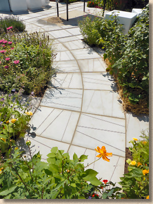
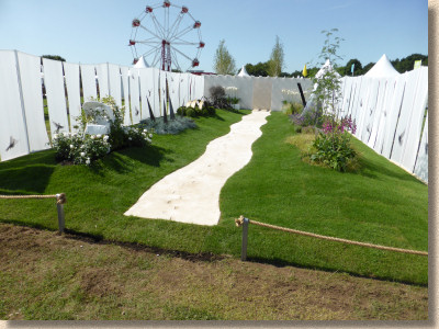
Compare and contrast with Life Is A Garden Path , which is essentially a squiggly path of poor concrete which has been ballsed-up with some naive attempt to recreate a child's footprints in the unset concrete. It claims to represent that most abysmal buzzword of modern culture: a journey. Oh, FFS! It's a fairly shoddy path between some ordinary grass plagued by lumpy bits, with two rows of white sheets pegged out on the washing lines to either side! And just to reinforce the awfulness, there's a hidden section at the back which features ….you guessed it….the most awful Indian sandstone of the lot (Fossil Mint), laid in two stack bond courses with overly wide joints filled with cheap limestone gravel….and all with some dreary soundtrack. Quick! Get me away from here before I self-combust!
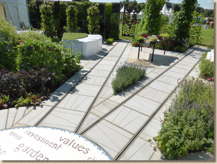
A good number of respectable suppliers and organisations seemed to be crowing all over Twitter and Facebook about the Vogue garden from BALI, but try as I might, I could not share their enthusiasm. It seemed to me to be a garden of wonderful components put together in the simplest and least inspiring arrangement possible. Gorgeous sawn yorkstone paving courtesy of London Stone, but all one size laid in a basic half bond coursed pattern which does nothing to bring out the true character of the stone, and the same material used for wall copings. A HUGE feature slab with a water-cut motif has been upended towards the back, and as impressive as it is, there's no contrast with the rest of the hardscape, nothing other than its scale to make it special.
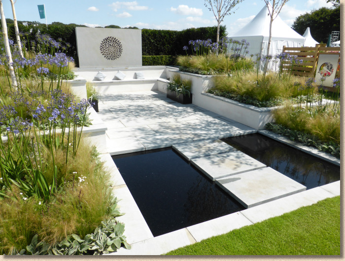
Its stated aim is to be a contemporary, controlled space, but even on this boiler of a day, I found it too cold, too austere, too severe to make me want to indulge in its harsh seating and intimidating lines. It's a showpiece garden that might be used a couple of times a year rather than summat you'd want to relax in every evening and weekend. Lovely stone, lovely planting, all very striking, but not for me, I'm afraid.

A Styalish Garden , apart from being a bloody awful pun, is a sort-of post-war park garden brought to us by the residents of Styal nick near Wilmslow, both the grown up prison, erstwhile home to the late M. Hindley, and the enterprising youth wing. It's nothing special but I liked the way they'd used CarpetStones with a simple limestone jointing to create interesting paths – the look (albeit from a galloping horse) of expensive setts with none of the hassle.
Meanwhile, on an adjacent plot, another of Her Maj's select rest homes, Ashworth Hospital near Liverpool, currently entertaining a certain I. Brady who was known to the aforesaid M. Hindley, are the party responsible for the inverted Indian sandstone. I found myself being far more annoyed by this Hope and Recovery garden than was probably warranted, primarily because the cack-handed paving clashed so awfully with the beautifully sawn and carved copings and pier caps. This could have been so, so much better if only someone had looked at how paving should actually be laid.
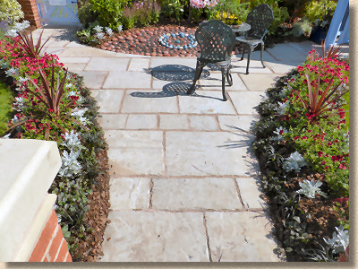
The Elements element garden on the edge of The Clump was more like what I expect to see at Tatton. It might not be my personal taste, but I can appreciate the clever design, the knowledgeable choice of materials and planting, the high standard of installation and the sheer visual impact. It is one of the few "Wow" gardens at this year's show, and it's no surprise to see it reap a Gold medal.
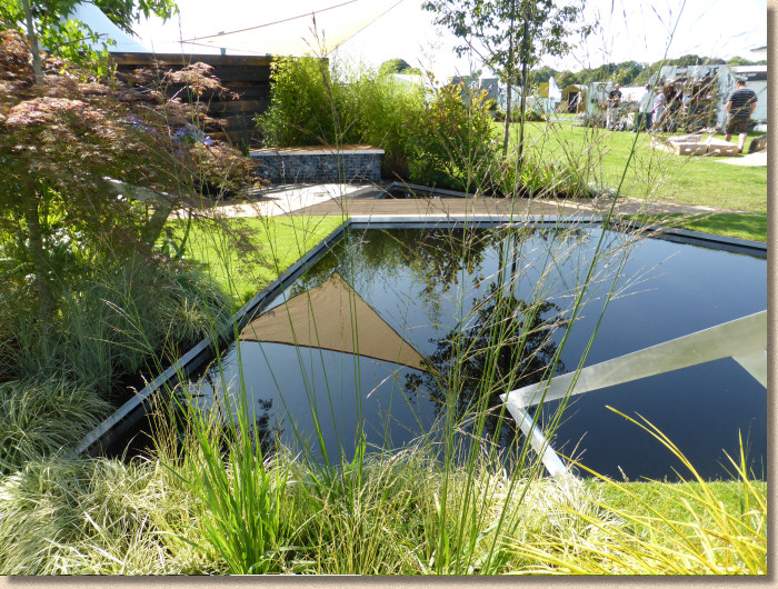
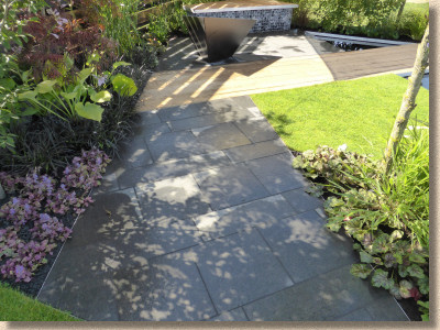
I love the dark flamed granite, a stone I've been using increasingly often on my own designs, even though my photies don't do it justice because it had been wetted down shortly before my visit in an attempt to win over the judges. However, as soon as I see black-dyed pools and vertical geometric shapes of no obvious function, something switches off in my poor simple brain and I find myself unable to fully enjoy the whole because of the anguish caused by the parts.
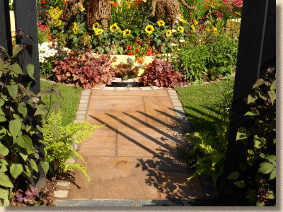
Maggie's Forest Garden doubly delighted me, both on the day and by winning a well-deserved Best In Show. It was the one exhibit that felt it offered something for every garden, no matter how big or small, simple or grand, budget or expensive. It's a garden that just works on so many levels. It's intended to represent the care ethos of the Maggie's Centres (they provide support to those affected by cancer) but it would work equally well as an urban garden on a small plot or expanded to create a transitional space in a larger scheme.
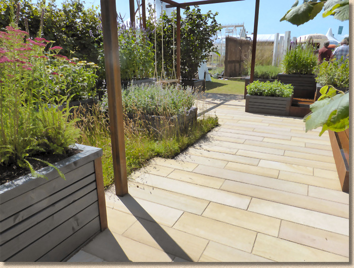
The quartzitic sandstone paving (200mm wide Cordara planks/linear paving from Stonemarket) is laid in simple orthogonal courses, but the warm, darker honeyed tones with greyish bands and the timber-like patterning give a sense of subtle decking as it staggers through soft, feathery planting, cool pools, and all edged with a complementary rusty-iron edging and pergola uprights.
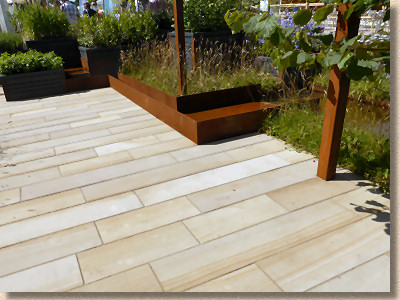
You could plonk a chair just about anywhere and be assured of a great view, then move to benefit from the shade as the sun passes over, and repeatedly find detail to delight and amuse. Everything looks and feels right: the balance of hard and soft landscaping, the colour palette, the complementary textures, the height and depth, the view lines, the way it soothes the soul and encourages you to sit and just revel in the glory of a perfectly executed garden.
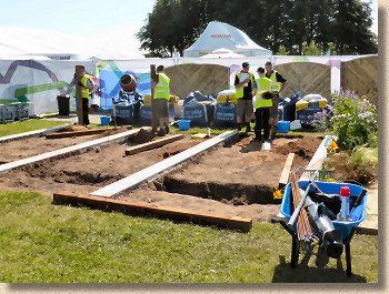
I know I've missed mentioning loads of gardens, and several that actually deserve more attention, but time is against me, and I do want to mention those events that take place at Tatton which make it unique. The World Skills Championship, which had just kicked off when I was there, provides a showcase for the next generation of landscape contractors. It did seem to be better organised this year, with a clearer message of what was being attempted and more of a level playing field with each team building the same garden, rendering it easier for the general public to judge for themselves.
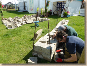
The Dry Stone Walling Association are back again with their live wall building demonstration which is one of those tasks which no sane person can resist watching, if only for a couple of minutes. All Shires Stonework, led by Dominic Mansley, were wrestling with local Kerridge sandstone from Macclesfield but still managed to have the craic with me for twenty minutes or so, which is always welcome.
The Young Designer gardens are given their own space. I can't pretend to understand or even like all of them, but by giving talent a place to show off, we ensure a steady and ongoing supply of first class designers. It's only a few years back that one Hugo Bugg, winner of a Gold at Chelsea back in May, was showing his oeuvre at Tatton.
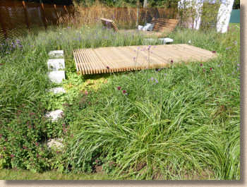
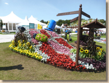
The National Flower Bed competition which celebrates, and rightly so, all that is phenomenal in the planting that adorns so many British parks and civic spaces is a well-deserved nod to the tireless efforts of the increasingly threatened parks and gardens services of the nation.
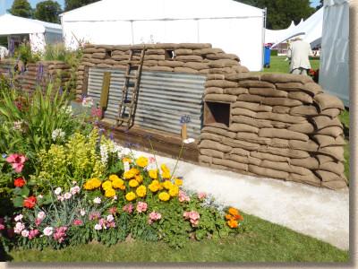
And last, but very, very definitely not least, the School's competition. This is where tomorrow's gardeners are to be found, and judging by the sheer inventiveness and eagerness shown by these primary school kids, the gardens of the nation are in very safe hands. It could be so easy to dismiss these little plots of wonder as charming yet naïve, but just look at the imagination, the flair, the insight. Evelyn St Primary School had difficulty sourcing yellow paving bricks for their Wizard of Oz garden (if only there was a website able to help in such emergencies!) so they used sunshine yellow marigolds instead. Marvellous!

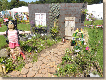
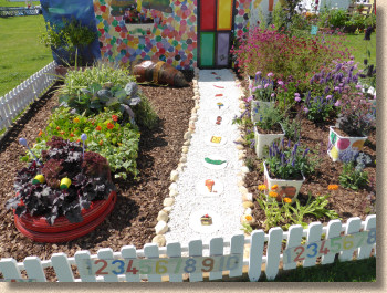
There's always plenty for me to moan about at Tatton. I still think the organisation and promotion is woeful compared to other RHS shows, but then I see something like the Log Slice path in the "Where My Wellies Take Me" garden by Grange Community Primary School and I'm reminded that you just don't see anything like this at that Chelsea. And that's precisely why I keep coming back here every year.


