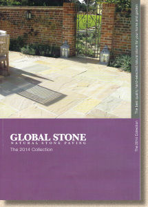
Global Stone 2014 Brochure
There are some paving manufacturers and stone distributors who reckon they know it all and plough on paying scant regard to what anyone says, good or bad, and there are manufacturers and distributors who swear blind that everything they do is in response to customer feedback, despite that being patently untrue, and then there are a handful of companies who actually do consult, who purposely seek out feedback of any and all shades, who request constructive criticism and then act on it. When you've been ogling brochures and catalogues for as long as I have, you can usually tell which is which, spot the companies who haven't listened to the market and separate them from those who obviously have a very large and finely-tuned ear to the ground.
Global Stone have a knack of knowing just what customers want, and then providing it in straightforward, uncomplicated offers which are consistently trimmed, teased and taken up a notch in response to customer expectations and the ever-changing tastes of the British patio-buying public. This affinity and rapport comes from listening and asking and being prepared to accept that a supplier in their enviable position doesn't need to be a trendsetter or trailblazer. Their role is to give the public what they want, rather than tell them what they should have, and there are few who offer as comprehensive a range of popular paving at such affordable prices.
So, when you look at what has changed since the 2013 Collection (as they name it), it's an exercise in gradual improvement. The product range has been tweaked, as expected, and the brochure itself has been significantly improved to give it a lighter, airier, more accessible feel.
If we start by looking at the new products, it's noticeable that the newcomers are not radical innovations, but extensions of existing proven themes, which ties in perfectly with the mission brief outlined above. However, none of them are actually labelled as new, in either the very useful Index page or by means of a splash logo on the relevant page. It is usually noted in the accompanying text, but it's all a little understated.
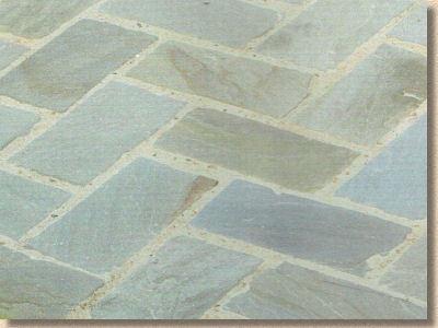
The Old Rectory Victorian Pavers (p10) is a slightly larger than usual 30mm calibrated sett, with plan dimensions of 120x240mm. The main image shows it mortar jointed (I'd have used a darker mortar to emphasise the stone) but I'm not sure if close jointing would be possible and there's nowt in the text to help me. Two colours: Buff Brown and York Green, but that one size limits the versatility. I suppose if they sell well enough, we might see complementary sizes in years to come, which would be no bad thing. It's what they do with most of the other sett paving ranges.
Or maybe they are trying to differentiate them from the mis-named Old Rectory Cobbles, which are actually setts. I wish I had a tenner for every time I point out the very important difference between cobbles and setts – I could afford that lovely new Triumph Thunderbird Commander (in Phantom Black, please) and ride off into the sunset!
Anyway both the so-called 'Cobbles' and the standard Old Rectory flagstones are augmented by the addition of the Buff Brown colour option. Looking at it now, it seems odd that a premium range such as Old Rectory could have gone for so long *without* a buffy-browny coloured offering. Anyway, the new colour isn't shown as a 'Cobble' (it burns my fingertips to type that word when I know it is incorrect!) but it is squeezed in as a corner image on the flags page (p6) but it's an image which really doesn't do it justice.
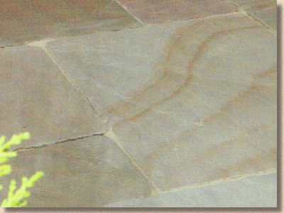
So, what else is new? Oh, there's the Serenity Quartzite Paving which the index page icon indicates is not suitable for outdoor use, but the relevant page itself (p39) has the little bare-branch tree icon which suggests it *is* actually suitable for outdoor use, and to be honest, I can't think of any quartzites that aren't suitable for outdoor use! The quartzite addition to the Serenity range is just one colour, Willow, a sort of grey with the barest hints of soft green which seems to be available in 7.3m² project packs only for now. It's a 560 series stone in the four most popular sizes (275mm square and 275/560/845x560mm – Global add 10mm to the stated sizes to allow for jointing, but it just seems to confuse some DIYers).
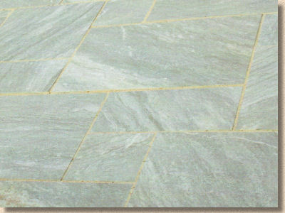
I'm a big fan of most quartzites. There are very few I've ever seen that I thought were naff or unsuitable for the British market. I've a feeling I saw it at the ill-fated Glee show last year , but I'm not 100% certain which means either I didn't actually see it, or if I did, it didn't excite me enough in a good way or a bad way for it to be memorable. It certainly looks appetising in the brochure photie, but again, the jointing doesn't do it any favours by providing virtually no contrast or definition.
However, as much as I admire quartzites, I loathe Travertines. It's a purely personal thing but I have never seen a travertine outside the bathroom or the Mediterranean that looked right for its situation. There must be some deep-seated reason why I have such an unjustified dislike for a stone that has never really done me any harm. Maybe I had a traumatic experience in a vesicle-besieged wet room or toilet as a kid (in rural Ireland? Pretty unlikely!) More likely it triggers some teenage memory of alcohol induced anti-peristalsis in a northern nightclub. Whatever it was, it's left me with a preternatural aversion to the low-rent form of marble.
So maybe I'm not the best person to judge the alleged charms of the new colours, Pewter and Cappuccino , which are repeatedly referred to as 'warm'. They'd be a damned sight warmer on a bonfire if I had my way!
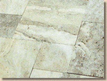
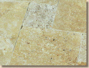
I know some people love it, but no matter how I try, travertine, and especially the buff-brown-tan colours, remind me of plaque-infested manky teeth, I just can't see the attraction. If, perhaps, it was wonderfully hard-wearing or exceptionally low-maintenance, or even relatively cheap, I could have a more mellow and balanced opinion, but it's none of these things.
I'll say no more: it's not my role to sabotage Global Stone's potential sales of this….this….this 'stone'. If you like it, then you like it and you are beyond redemption in my eyes. Knowing the buying team and the business model at Global for more than a decade, I can be fairly sure that the new additions are better than average travertines, but they're not for me.
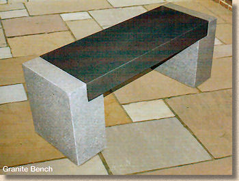
Other than that, the only additional newbie is a flat granite bench, lumped in with the sandstone fripperies for some unknown reason. It's a bench; it's made from granite. These things are nearly always phenomenally good value for money and I see no reason why this should not be the case with the GS bench. Yer arse gets cold, so a cushion is advisable – you now know as much as I do.
Looking at the products, there's not a lot that's new, but that seems to be the way of things with many suppliers this year. I had thought that with the much anticipated recovery, there'd be a resurgence of innovation this season, but it seems not to be. What GS have introduced makes sense for their particular business model and blends in well with the existing ranges. The native stone contingent, which was always going to be a hard sell to GS customers, has dwindled a little further and now comprises a solitary York Stone sold only as project packs. Respect is due for continuing to try selling native stone to a market more driven by price. It's disappointing to see the stone that has paved our nations for millennia struggle for sales against an onslaught of imports, but such is the modern world of globalisation.
However, when you look at the breadth of stone paving and internal flooring offered within the Global Stone 2014 Collection, you have to admire their eye for a good looking stone and their ear for what is popular with the public. There's nothing in there that you could discount as being not worthy of its place. Every item is a popular seller, and given that Global Stone's route to market is primarily via independent BMs, landscaping outlets and garden centres, they need to focus on popular rather than experimental.
If we accept that they have got the portfolio right, what about the brochure? Does that deliver what's needed from a brochure, primarily an attractive, pictorial sales tool and an information source which is simple to follow and easy to use.
The overall look is, I feel, much improved from last year. The pages don't feel as packed and cramped, and the silliness of putting unnecessary text boxes bang in the eye-line of some of the best photies has been lost. Also, the organisation seems more logical, with products grouped according to rock type rather than some artificial demarcation based on spurious marketing notions. The index page is immensely useful and makes locating specific products so much simpler than has been the case previously. Even the intended-to-be-useful icons are clearer, achieved largely by reducing the number required and then by dividing products into just two uses: indoor or outdoor, and two styles; contemporary or traditional.
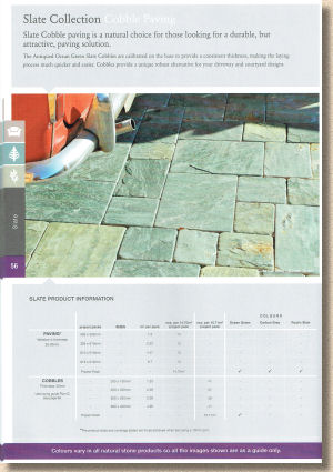
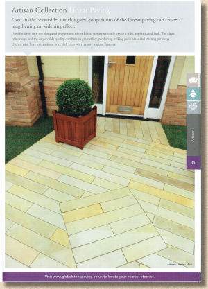
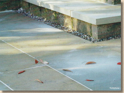
The photies improve year on year. I accept they will never have the budget of some of the mega-premier brands, and in that light, we have to appreciate just how much is achieved with a slender wallet. There are still some issues with colour reproduction, which is partly tied to the type of paper used for the brochure and also the stated GS preference to photograph dry, unsealed paving, and so I kept wondering why there seems to be an unwritten rule that all pointing should be bland, neutral grey-buff. So many images would be improved by using a mortar, either cement or resin, which offered contrast and definition for the stone. With certain stone colours and textures, a darker mortar retreats from the eye and throws the paving forward, giving it pre-eminence, and with such lovely stone, that can only be a good thing.
But to be fair, anyone can see the quality and the potential. The images generally do justice and the back-up information in the form of swatches and size tables is proportionate – just enough to convey essential info without detracting from the main photies or distracting the attention from the lovely stuff. And the back-up back-up information, by which I mean the layout plans, the laying advice and maintenance guides tucked in the last few pages, remains as excellent as ever.
Global Stone are one of the most important distributors for stone paving in Britain with an enormously strong identity for providing good value. The product range remains strong and it's good to see that the brochure is now genuinely equally as strong. It will be a huge boon to homeowners and DIYers looking for a new patio or garden hardscape, but it's well worthy of sitting in the travelling library of the more discerning contractors who like to offer their customers a fully comprehensive selection.


