Brett 2012 Brochure
Since releasing the first of their magazine-styled catalogue back in 2009 , Brett has consistently produced the most interesting of all the annual brochures. It might not have the most luscious photography or the most comprehensive customer advice, but when the whole package is considered and the target market is taken into account, it is a masterstroke of marketing.
It manages to have the informal, chatty air of a garden or DIY magazine while providing genuinely good quality information on the product lines and simultaneously entertaining the most casual of readers. But after three years, have they managed to keep the idea afloat?
The basic styling remains pretty much as the two previous editions. One hundred , full colour A4 pages on quality gloss paper with enticing headlines on the front cover, a bold strapline title, Gardens & Drives, and the Brett logo minimised to the bottom right corner. The overall effect is very much that of a mid-range magazine: not as snooty as, say, The Garden, but more upmarket than the typical garden centre freebie.
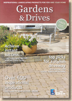
Inside, there does seem to be a slight reduction in the air of chattiness that so impressed with the first edition. It has eased off slightly into a more typical paving brochure format, with definite and dedicated product pages, and noticeably less of the informality such as tips and highlighted suggestions. Traces of that original magazine layout remain, but the contents page reveals just four 'features' peppered amongst the product info pages, and the 'feature' on the Brett Approved Installer scheme has to be regarded as trumpet-blowing (albeit completely justifiable) rather than a mini-article of genuine interest.
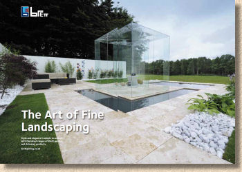
The whole lot kicks off with natural stone, and we might as well get the nasty business out of the way first, so start with the Travertine and then you know things can only get better. Actually, I saw for myself the Travertine pool-surround installation featured in the brochure, and it just reinforced all my negative opinions about this most useless of stones. The brochure photos , as you'd expect, show it at what passes for its best. It was persisting down when I was there, and it just confirmed my belief that there is nowt more bloody miserable looking than Travertine under a rain-laden northern sky.
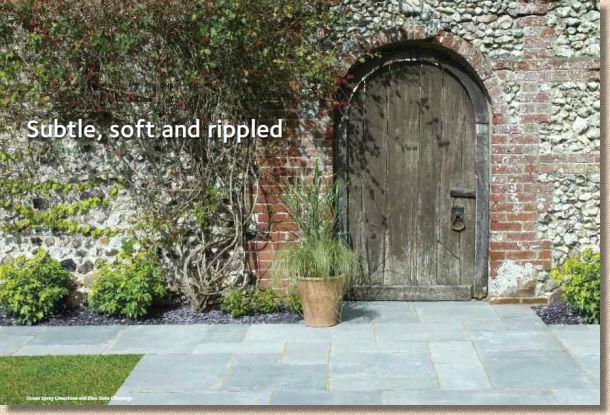
So on with the motley, and it's largely as you'd expect from natural stone, although there is a push towards the premium products and less focus on the bog-standard. The photos tell the story and the text is sparse, which was fine when there was more of a magazine feel to the whole thing but for some reason, it seems basic this year. The 'plank' or 'linear' paving is something I really admire and I'd like to see its potential shown off more, and the same for the limestone. I've said it umpteen times before, but I'll say it again until someone listens to me: the imported limestones, with the exception of the black-for-a-day stuff, is the best value paving stone on the market at the moment. Lovely flint wall and owld gate, but let's see the blue limestone, eh?
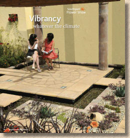
When it comes to the concrete flags, the format is repeated: plenty of good images, but sparse text and none of the chatty tips and hints. There's the briefest of mentions that the Bronte flagstones (page 42) were used at Southport Flower Show , an event close to my heart. Now that would make a great short story – why Bronte? How were they bedded around that water feature? What about the inset lighting?
A few pages later, there is a double page spread for three of the RHS shows. Granted there's not a lot of information, but it's enough and it does offer some inspiration. However, I can't help feeling there's a missed opportunity here.
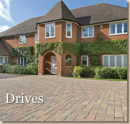
And again with the driveways (ie: block paving) section. It's all lapsed into a sort of default paving brochure format and so there's nothing to distinguish it from the other high-end manufacturers. The photos are more than adequate; indeed, some are exceptional, and the swatches are perfectly acceptable, but it's all very bland.
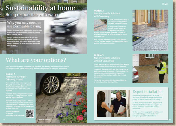
Suddenly, there's a double page spread about permeable paving and whether it's necessary for a residential driveway. Instead of boring householders (who will be the bulk of the readership) with details of how permeable paving is supposed to work, there are three very simple, straightforward, concise outlines of what needs to be considered, followed with a short section explaining that permeable paving is 'different' but the Brett Approved Installers will be able to advise. This is exactly what's been missing from the brochure up to now. Extremely well-written text that's informative without being overly technical or condescending. It's probably the best explanation of the comedy driveway legislation ever seen in a manufacturer's brochure. Maybe it's not possible to decorate every page with the magazine chattiness, but if there was something like this every half-dozen pages or so, that would help break the monotony of one product after another.
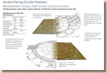
Finally, we come to the design and technical info section, and it does just what I've been wanting since page 3. Here we have the user-friendly approach, bursting with design ideas, clever suggestions and all the necessary packaging gubbins that designers and contractors need. The design drawings that fade from photo to line drawing are wonderful. They perfectly bridge the gap between boring swatch and designer's sketch. This is a new approach. It's fresh and inspiring and there should be more of it. Maybe there should be more scattered throughout the brochure to lighten the overall tone.
Reading through the above after 24 hours doing summat else, it strikes me that it may come across as slightly negative and that would be grossly unfair. If the brochure is compared to any of those from Brett's main competitors, it more than holds its own. It oozes quality; it is obviously the creation of a serious manufacturer with a very strong product range; it provides all the information that would be needed to persuade a client to explore further.
If anything, it's a victim of its own success. The two previous editions, and particularly the first one from 2010, were so bloody good, so informal and relaxed and….and…magazine-y, that this latest version doesn't quite match the standard that was set so very high by its predecessors.
That should serve to remind us lesser mortals of just what an enormous challenge it must be to produce a spectacular brochure on an annual basis. It can't be easy to detach yourself from months of hard slog and view it objectively as does someone like me, an outsider with no vested interest. If only I could erase the memory of those previous brochures from my memory, I'm confident that I'd be singing the praises of this edition.
And so it should be borne in mind that, any contractor serious about providing a comprehensive service to their clients must have the Brett range in their portfolio, either the hard copy or the very useful PDF version which can be displayed to customers on a tablet or similar. The same applies to designers who will see products in the Brett range that have no equal elsewhere. And any homeowner who omits the Brett products form their ponderings when deciding what to have for their new driveway or patio is doing themselves a massive disservice.
It's also worth noting that the company have simplified the web address for this year. No more the overly long, forward slash riddled url that sent browsers to a sub-section of the larger, corporate Brett website, but a dedicated and simple address – brettpaving.co.uk – once again proving that the best ideas are often the simple ones.

