Chelsea Flower Show 2008
While most other reviews or coverage of the 2008 RHS Chelsea Flower Show sponsored by Marshalls ( to give its full title just this once ) wax lyrical about the planting or the colour scheme, my gimlet eye is trained only for hard-landscaping, and so what follows may be somewhat partial for those who get themselves involved in soft-landscaping or garden construction, but there's no sense in me waffling on about things of which I have little interest and even less knowledge. Suffice to say that topiary is very 'in' and green is the colour.
Coming to the important stuff, namely the paving and other hard-landscaping, natural stone is the material of choice in a considerable majority of gardens, but it's worth noting that the "Best in Show" award for both the Show Garden and Urban Garden categories was won by a garden that relied on reclaimed clay pavers for its paving. Concrete, with one notable exception, was largely absent from the show gardens, but there was generous use of resin-bound surfacing, timber and even "Corian™" formerly limited to use for kitchen/bathroom countertops and the like.
Given that their respective names are probably best known to regular users of this website, I'll start with the two big paving manufacturers' gardens; Marshalls and Brett.
Marshalls are into year two of their sponsorship on this event and seem to be more than pleased with the arrangement. For the second year in succession they've used their prime plot on the corner of Main Avenue and Royal Hospital Way to push a social responsibility message rather than blatantly plug their own products and services. This year, they turned to one of their own in-house designers, Ian Dexter, and had him work with schools local to Marshalls' factories to develop a garden design entitled What kids really want , part of a conscious effort by the RHS and Marshalls to get kids off their ars ... errr ... backsides and discover the real world, with its physical and sensual challenges.
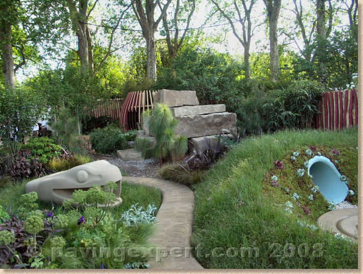
During a special presentation on Tuesday morning, Designer Ian, ably aided (or hindered) by Marshalls' marketing director Chris Harrop and Domestic PR wallah Jeremy Swallow, explained the design process, how the kids had come up with designs full of dungeons and dragons, castles, creepy-crawlies, spaceships and Jurassic-inspired planting. Obviously, some of the more imaginative schemes had to be tamed, but judging from the reaction of the kids present on the Monday, they were happy enough with the outcome. They rapidly took ownership of their garden, with its guardian snake, hidden dens, observation platforms, secret pathways and underground tunnels. In fact, the Marshallettes had a bit of a job in rounding them up and getting them to leave: a 'reward trip' to the museum and that London Eye had to be curtailed because the kids were happier climbing rocks, chucking stones in the pond and lurking in the undergrowth.
Regardless of what the judges may think, the fact that these kids did not want to leave is testament that the design worked and despite the negative stereotyping modern school kids get as Playstation-addicted, socially awkward, hoodie-wearing proto-thugs, the inner-child remains and they can't resist a 'den' in which to hide, a tree to climb or a pond to backfill.
Marshalls have gone to great lengths to overhaul the traditional view of a Chelsea garden, targeted (as they often are) at an affluent, aspirational adult audience. Instead of focussing on what appeals to the grown-ups and their friends, this is a garden that really could tempt children out of their bedrooms, and it's a timely reminder that for many of us, there is a significant period of our lives when our gardens *are* geared towards the needs of our offspring. Swings and slides, paddling pools, mini football pitches, BMX tracks, tents and wendy houses – although these should eventually give way to more adult pursuits such as herbaceous borders, vegetable plots or sunken patios, it's easy to forget that a successful family garden has to accommodate what kids really want.
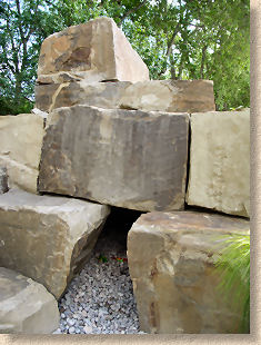
What makes this garden even more remarkable is that it is totally devoid of stock Marshalls' paving products. Yes; the snake has been hewn from stone dragged out of a Marshalls' quarry, the huge blocks used to form the rock stack were taken from Appleton quarry in the Leeds-Bradford demilitarised zone, but other than that: nothing. No sandstone paving, no decorative concrete walling, no block paving. Admittedly, the uniformed Marshallettes were doling out somewhere around 50,000 complimentary copies of the 2008 catalogue in recycled paper carrier bags (a significant improvement on the placky bags used at Glee last autumn ), but it has to be acknowledged that it's a brave (and largely successful) marketing strategy that relies on NOT showing any product.

The snake gets its revenge on designer Ian Dexter
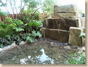
They did, however, maintain their ethical stance, with all the materials sourced from the UK and this has contributed to a significant reduction in the “carbon footprint” for the garden, which has been calculated as a measly 5.4 tonnes, compared to 16.3 tonnes for the 2007 garden.
Chris Harrop made a highly relevant comment during the initial presentation, stating that he sees part of Marshalls' mission being to break down barriers between hard- and soft-scapes, and that hard-landscaping is the platform that allows soft-landscaping to flourish. This is a salient point: all great gardens rely on a skeleton of hard-landscaping, and while many visitors want to see plants in all sorts of combinations, it is the hard-landscaping that allows us to access the plants, to actually use the garden and enjoy it at its best.
Some 'horticulturalists' suffer from a precious attitude to paving in a garden; indeed, a feature during the TV coverage of the Flower Show was bemoaning the fact that some of us have paved front gardens, which the presenter seemed to view as blasphemous bordering on heretical, arguing that we should have soft-scapes only, that our totally selfish insistence on having a place to park the car or somewhere to plonk a patio table is directly responsible for the annual flooding of the Severn, coastal erosion, the melting of the Antarctic ice sheet and the imminent extinction of Orang-utans. This is idealistic nonsense.
Most of us live in the real world, where we need somewhere to park, somewhere to eat, somewhere to entertain. While it would be wonderful if we all had the space to locate parking facilities elsewhere on the family estate (perhaps the stables or the servants' quarters could be converted?), this is not always possible on a typical 3-bed home, and so we need to pave part of the front garden because that's the way we live in the 21st century. There has to be a trade-off between form and function. I'm no admirer of the all-paved front gardens – they only need a couple of fuel pumps to complete the garage forecourt look – but there is a happy medium where there is ample paving for the car and to access the house, but there are beds and planters and pots to soften edges, to maintain the form of a 'garden' while providing functional off-road parking.
This theme of Real Life was deliciously exhibited by Brett , with their Geoffrey Whiten designed garden of that name. I have to admit that I was disappointed to learn that the judges had rather stingily awarded only a bronze to what was definitely the most achievable entry in the Show Garden category. This design was composed of elements that most of us could use at home; it would not look out of place wherever and however we live, whether it's a new semi on a housing estate, an Edwardian family home or a 200 year old country cottage. Its popularity amongst ordinary gardeners is evidenced by its presence on the four-garden shortlist for the RHS/BBC People's Choice award.
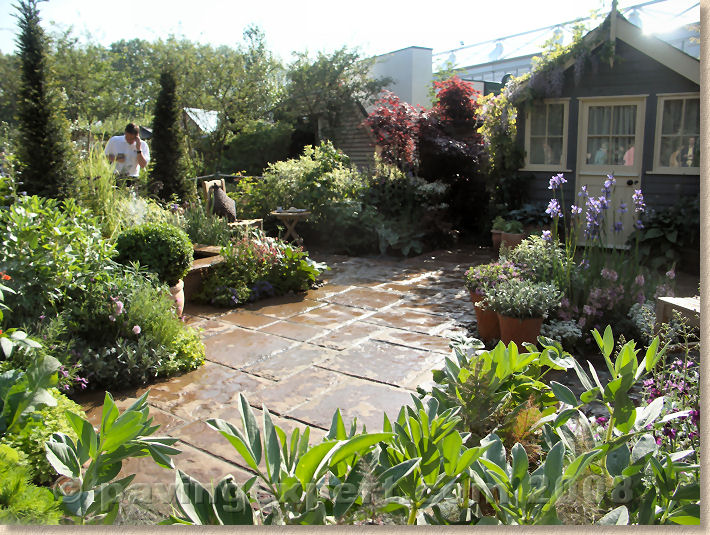
Brett were also the only exhibitor to make extensive use of concrete paving; most other gardens used natural stone or clay pavers, but Brett flew the flag for concrete and showed what is possible when it is viewed without prejudice and used in imaginative layouts. For this garden, Brett have experimented with new colour blends, inspired by the rusty-buff tones of the aged yorkstone flags used on some of the more salubrious streets in and around Chelsea and Kensington. They're also trialling a “concept” flagstone, thinner, fibre-reinforced paving flag that will offer more square metres per tonne and all the environmental benefits that entails. Marketing manager, Zack Barrett, admits there's still some tweaking to do, and that they were using Chelsea as a stage to judge people's impressions and opinions, but from what I saw, it looks good.
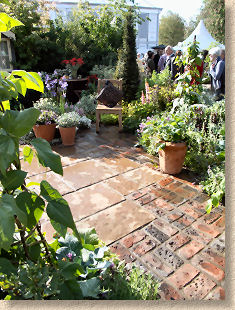
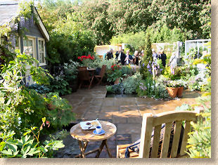
Geoff's design is based around adaptability and sustainability, and targeted at what Brett describe as "Real People". So there are elements of rainwater harvesting, composting, water features and growing vegetables (which is very “in” this year), all contained within a highly attractive and traditional family-friendly space, with adequate room for the essential patio table and chairs, and, much to the delight of a whole bus-load of predominantly male togfers, a body-painted nearly-nude dolly bird.

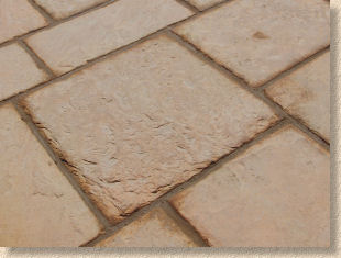
Despite the dominance of imported stone in new garden construction over the past five years or so, there is still a steady demand for high quality concrete products, and so it is important that Brett exhibit what is possible, and show the way forward with new colours, new textures and thinner formats. For all sorts of reasons, not everyone wants Raj Green or Fossil Mint: indeed, there's a growing sense that the more design-conscious customers are looking for alternatives, and many are re-examining what's been happing with the high-end concrete products while EBay has been flooded with 12 quid per metre Indian stone. By exhibiting at the world's most famous garden show, Brett have ensured their brand is at the forefront of designer's consciousness.
Well, that's the two manufacturer sponsored gardens covered, so what was happening in the others? As mentioned already, concrete paving was conspicuous by its absence, and it was noticeable that most of the competition gardens (that is the Show, Urban and Courtyard gardens submitted for judgement and hoping to be awarded a medal) had elected to avoid the more common forms of Indian sandstone. The two big paving themes were British stone, especially that sourced from either side of the Pennines, and the superb Dutch/Belgian narrow format clay pavers.
Every now and again, a material or product grabs the attention of the designers and you see the same thing on a number of gardens. A few years back, it was Indian sandstone; in 2008, it is the narrow format clay pavers. They featured on three gardens, and the importer must be ecstatic, as all three won a Gold Medal, one was declared Best Show Garden ( Laurent Perrier by Tom Stafford-Smith), one was declared Best Urban Garden ( A Welcome Sight by Adam Frost) and the third was voted the Peoples' Choice ( Bupa garden by Cleve West). Van Moortel can't possibly have imagined such a level of success!
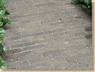
These pavers have been widely used in Belgium and the Netherlands for decades, but their non-BS compliant plan size (roughly 4:1) seems to have held back their use in Britain. I've been raving about these pavers for over 20 years and have brought them into the country for my own projects on a few occasions, so it gives me enormous satisfaction to see the rest of the world catch up with my impeccable palate, at long last!
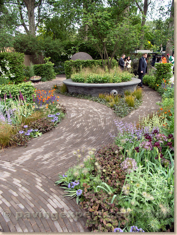
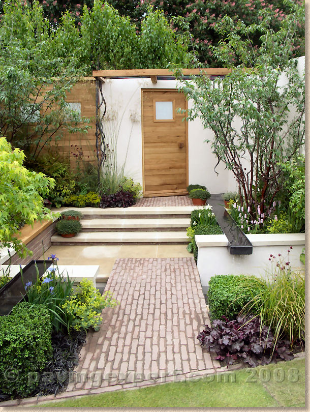
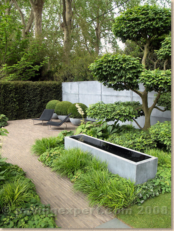
All three gardens used a brownish colour of paver, but no-one was absolutely certain about just what colour had been supplied. There are six or seven 'browny' pavers in the catalogue and while I'm not 100% sure, I reckon the Mahogany colour was used on at least two of the gardens. Whenever you have curvy, organic, wandering garden paths, these 200-ish by 50-ish pavers are the ideal choice: they have everything going for them. Their relatively small size tricks the eye into thinking the path is wider than it actually is; the natural, sympathetic colouring blends perfectly with garden greenery; and when used longitudinally, as shown in the Bupa garden, they emphasise the curves and lead the eye onwards, tempting the visitor ever deeper into the garden.
And if you're wondering which garden won the only category missing from the above, and what paving was used, well Dorset cereals made it a clean sweep for clay pavers by winning Best Courtyard Garden for their Edible Playground garden paved with .... clay pavers (source, colour and supplier unknown at time of writing).
In a change from the narrow format pavers from the Low Countries (are we still allowed to call them that?), this tiny garden featured traditional 'British' format pavers, 200-ish by 100-ish, laid in an attractive basketweave pattern, which I always thinks looks best with a cottage garden styling - so good, in fact, that I used it on my own patio !
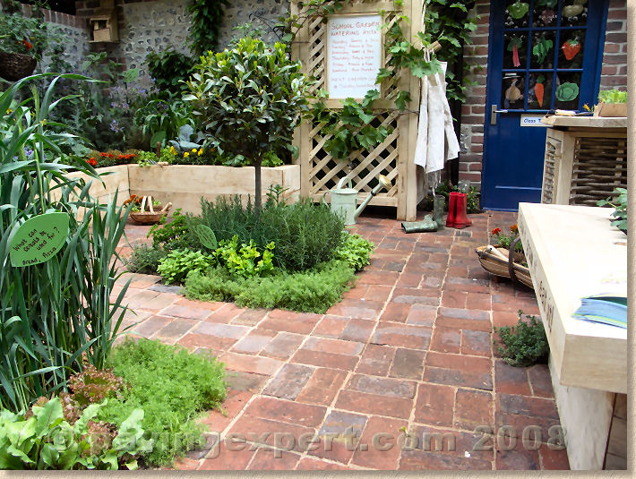
Which leaves us with stone, the most popular paving material at Chelsea 2008, and by quite some distance. This was partly driven by the RHS policy of using native products and promoting sustainability wherever possible. I can't recall ever seeing a show where so much native stone was on display; I think it's fair to say that there was more native stone at Chelsea than there was that the Stone Show held on the other side of London just a couple of months ago.
Amongst the show gardens, The Daily Telegraph Garden by Arabella Lennox-Boyd featured a sinuous pathway of Blue-Grey Slate from Burlington 's quarries in the Lake District hovering above a shimmering lake bounded by two bands of honed Purbeck stone separated by a slate mulch.
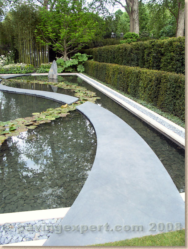 Daily Telegraph Garden
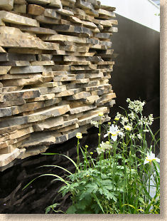
The QVC Garden featured stone from Johnsons Wellfield Crosland Hill quarry, for the the paving, the planter-seating and as broken scants to form an intriguing walling material. The iron-stained and weathered edges of scants and blocks are often overlooked as a usable material, but this is a superb example of making the most of a valuable resource.
From the Cotswolds, Daylesford Organic's Summer Solstice Garden (shown on the right) used the creamy Cotswold limestone for both mortared and dry walling, as flagstones for the main paths around the vegetable plot and as a self-binding gravel for the paths in between the individual beds.
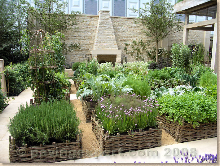
Solstice Garden
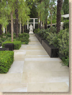
The cleverly conceived Cadogan Garden (left) represented what might be the look of a typical London Square in 50 years time, once climate change has had a real effect. While the tall palms and exotic planting might seem fanciful, there's a comforting reassurance that those traditional favourites, york stone flags and granite setts, are still being used for the hard landscaping.
The Reflective Garden by Clare Agnew Design also used a Pennine stone from Longcliffe quarry in Derbyshire, while the Pemberton Greenish Recess Garden used paving and walling cut from a single block of stone taken out of Waddington Fell quarry near Clitheroe in north-east Lancashire. This allowed adjacent units of stone to maintain the distinctive banding of colours within the natural material.
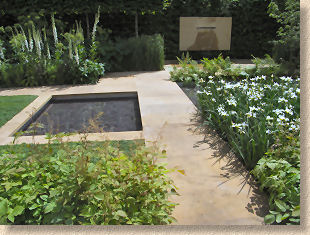

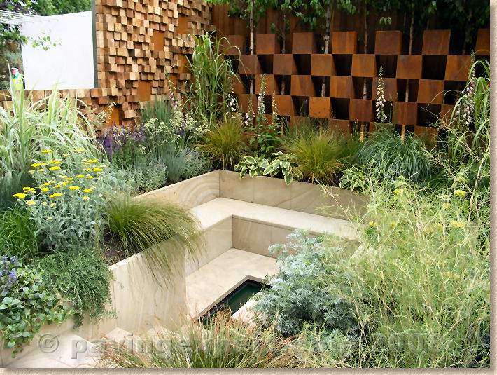
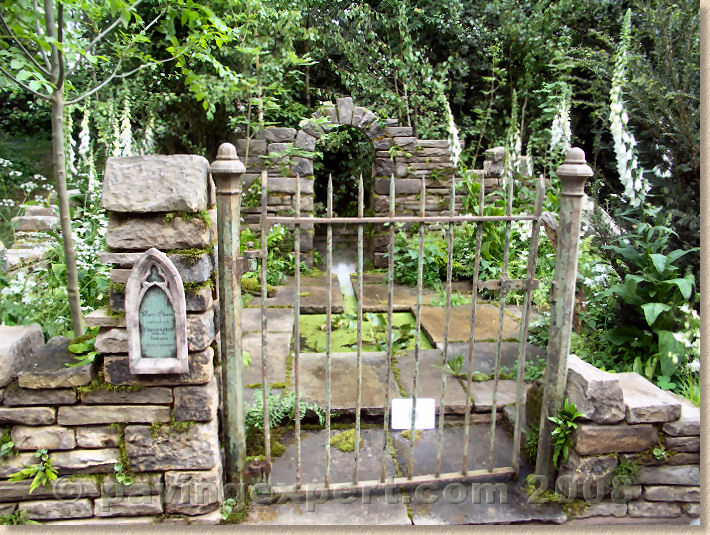
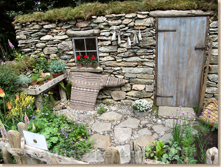
Within the Courtyard gardens, Simmons & Simmons' Journey To Work relied on a curving path of diagonally-arranged 'floorboards' of what looked like Whinney Hill sandstone with its distinctive grey flecks. Several of the other courtyard gardens, notably the Mist Placed re-creation of a dilapidated chapel garden, relied on reclaimed stone whether it was old moss-covered yorkstone or salvaged Shetland "Brigganstanes".
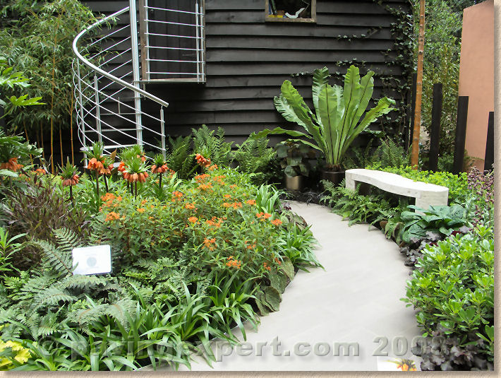
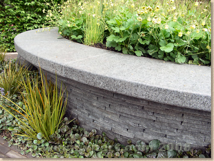
One exceptionally clever use of stone could be found in Cleve West's delectable Bupa Garden (is it really obvious that I loved this garden?) where a central planter-cum-bench had been built using the waste and broken pieces from granite worktops, supplied by my pals at Rock Unique .
This was a fascinating structure, built with an undercutting curved profile that allowed users to tuck their feet beneath themselves and so rise from the bench with greater ease. Details such as that often go un-noticed and un-appreciated by anyone not troubled with mobility problems, but it is exactly such detail that makes for a winning display. I must also mention the fantastically tactile flame-textured granite coping, which I found difficult to leave alone, such was its appeal. A lovely dark grey granite, cut to the sensuous curved shape and then gently flamed to create a satisfyingly lightly-roughened texture that begged to be stroked.
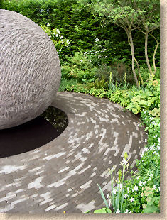
A similar attention to detail also in the huge 2100mm diameter feature ball at the far end of the garden, which was cast using a Lytag-based concrete and coloured to match that of those scrumptious clay pavers. Once cured, had its surface subtly chiselled in definite patterns, creating a feature that has both visual and tactile appeal.
Of the imported stone, the one that you could hardly avoid, even if you wanted, was the vulgar Ocean to a Garden effort. I don't like to be rude, but this looked like a cynical exercise in flogging Italian marble, and the token gesture of roughly 20 quids-worth of plants from Homebase didn't help. The stone is very pleasant, if you like that sort of thing, but the carving was iffy in places and the installation left an unpleasant taste in the mouth.
Just around the corner, the never-knowingly-understated Australian Garden from Fleming's and Trailfinders featured contour-inspired planter walls formed from the garish Western Australian sandstone, sexily sweeping around to a fantastic 'infinity' pond that came right up to the very edge of the plot. From a geologists' point of view, the sandstone is fascinating and bursting with warm vibrant colours – reds, oranges, coral, buffs and so many more fiery hues – but subtle it ain't! However, it worked wonderfully well with the Australian hardwood decking and gave a real sense of the antipodean climate and colourscape.
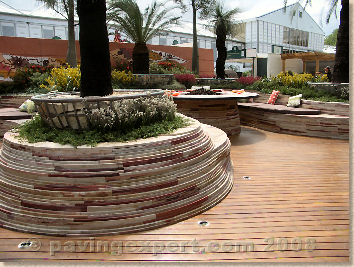
Australian Garden
And a well-deserved mention to Mark Gregory's Garden for The Children's Society , which was built to an environmental and sustainable agenda, with discreet green walls and roofs, water harvesting, and clever compost storage, and used a gorgeous smoke-grey lightweight basalt for part of the hard paving. On the access ramp, the stone had been milled to create transverse anti-slip bars that added even more appeal to what is already a very appealing stone.
Beyond stone and clay pavers, there were other paving materials on show. Resin bound surfacing was relatively popular with the best example being the yummy North East England @ Home garden, which featured a large circle of resin bound recycled glass delicately coloured and dubbed "Squirrel Grey", which even if you're not a fan of the colour, provides a rare opportunity to walk all over the despised tree rats. Several other gardens featured smaller patches of resin bound and resin bonded surfacing in all sorts of tones but none of them really took advantage of the incredible design potential that these products offer.
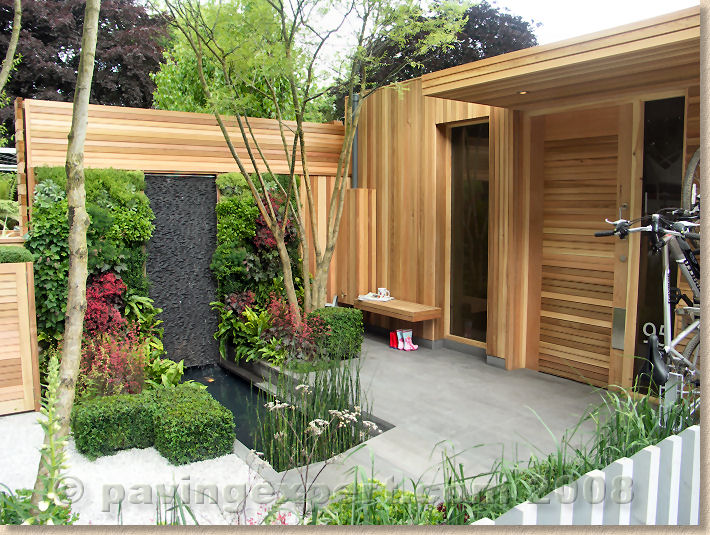
Children's Society garden
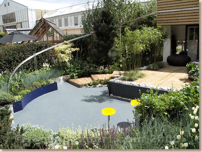
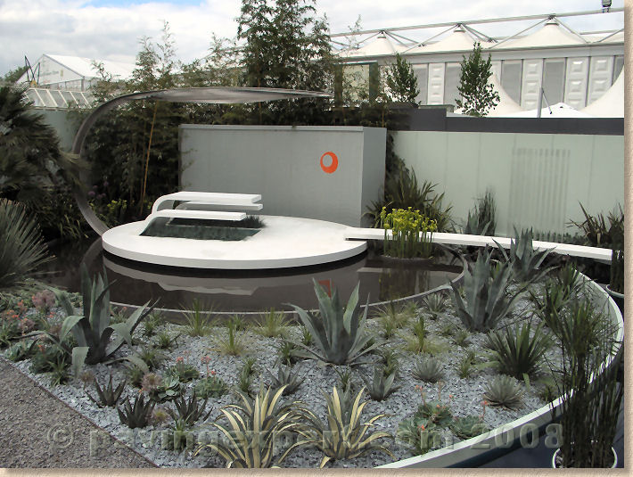
The one 'alternative product' that really did proclaim its potential was Corian™, as evidenced in the dazzling Elevations garden designed by Philip Nash. Many of you will now be thing: "quot;Corian™? In't that what they use for kitchen worktops?" Yes: it is, but in this setting, it has been used to create truly amazing paths, suspended walkways, walls, seatsÂ… in fact, it looked as though every hard surface was Corian™. As a new paving material, it is fascinating, as it allows the creation of seamless runs and spaces, with embossed textures or motifs, and a vast array of colours, but there's something very futuristic about it – as though one had strayed onto Tracey Island before the avenue of palms dropped flat to allow Virgil to take off in Thunderbird 2. And at around 500 quid per square metre (and that's a trade price!), I don't think we'll be seeing it being over-used. For the high-end garden design community (read that as the “more money than sense crowd”), I've no doubt their over-active grey cells are already playing with possibilities, and I'd love to see more because it really does offer the opportunity to make the fantastic a reality, but it's not going to steal much trade from the Indian sandstone market.
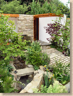
Tokyo City Garden
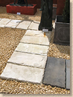
Upside down indian sandstone ... again!
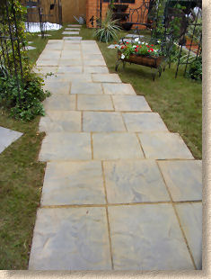
If I have to explain why, you're on the wrong website!
Overall, Chelsea 2008 has been a wonderful year from a hard-landscaping perspective. The big winners have been gardens that have used proven materials with a natural slant. The headline grabber has to be the scrumptious narrow-format clay pavers: the prizes alone tell you how good they are, but the resurgence of British stone has to be welcomed, whether it's slate from The Lakes or limestone from the Cotswolds. The continued presence of at least two of our major paving manufacturers has ensured that hard-landscaping isn't shoved off the agenda, and I would be even happier if one or two of those that chose not to exhibit this year would re-consider for 2009. For all sorts of dubious reasons, hard-landscaping is being given a hard time at the moment and we need more exhibitors to reinforce the message that a garden without hard-landscaping is not actually a garden; it's a field.


