Brett Brochure 2019
In time-honoured tradition, the poor owld postie tasked with covering this end of the village trudges his way along the lane burdened down by the first batch of 2019’s product brochures from the main paving and hard-landscaping manufacturers. He offers a weary acknowledgement, as if to say, "Here we go again…" and hands over a loosely bound yet slightly battered assortment of large envelopes and jiffy bags for my attention.
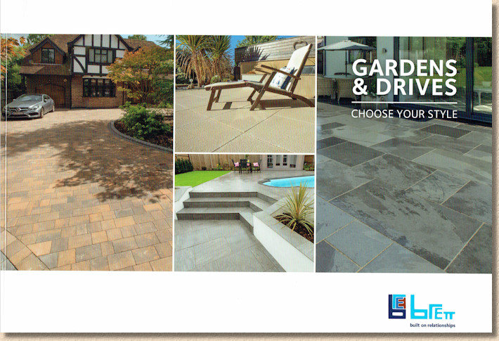
Some are still under embargo until after the holiday shutdown, but the first of the pile that is ready to go and rarin’ for the critic’s eye is from Brett . Gardens and Drives 2019, subtitled " Choose Your Style ", which, I suppose, is the basic operating instructions for a brochure such as this. It’s the same ‘Mission Statement’ as last year , and the same A4 landscape, bound-on-the-short-edge format, albeit with none of the distinctive sky-blue Brett corporate colouring. For 2019, they’ve switched to plain white, and they’ve added four pages, up to 120 from last year’s 116.
Opening the cover page, it’s a sensible start, too, having the contents listed immediately on the first double-page spread, and sensible sub-divisions: Intro; Gardens; Drives; Accessories; and Product Information. with sub-sub-divisions as required. However, nothing is marked or flashed as New, so it will be a matter of hoping this becomes apparent as I wade through what follows.
The usual bumf about choosing style, deciding on colour, going the DIY route or finding an installer follows (with a laudable listing of the gong winners from last February’s awards ceremony ) plus a double page spread on the Brett Porcelain offering which differs from almost every other supplier by offering the Hybrid ‘Geo-Ceramica’ range of porcelain bonded to a concrete base for ease of installation.
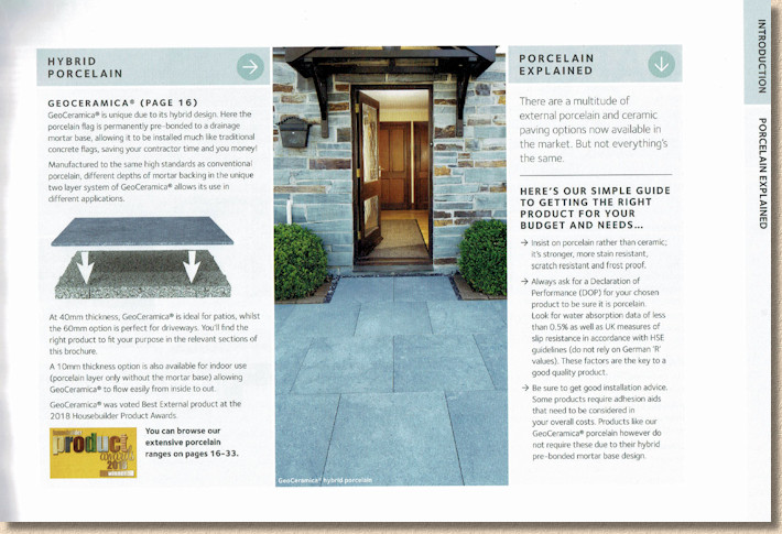
Tucked away on one edge of the spread is a far-too-short and simple ‘Porcelain Explained’ box, which declares porcelains and ceramics are not always the same thing, and to be wary of German ‘R’ values for surface traction but offers no real explanation. A missed opportunity, methinks.
And, in line with all the hyper-ventilating and over-enthusiasm taking place right now regarding all things’ porcelain and ceramic, that’s where the brochure kicks off, with a whopping 17 pages given over to the so-called Garden options alone, which seem to include both 60mm Geo-Ceramica variants of some products, along with 10mm version for indoor use.
This is a massive and highly significant retrenchment by Brett. When others around the porcelain paving pool jumped in with both feet a few year’s back, Brett held steady to see how the market would respond to this new Fancy Dan in Speedo’s paving option, before eventually joining the fray with a modest but considered selection of what was then the very top-quality Italian porcelain. The Geo-Ceramica product marked a decision to follow a slightly different, if parallel, swimming lane, but what is being offered for 2019 is a full-blooded commitment to porcelain, promoting it to lead the brochure, and fleshing out what was the previous basic bones-only offer.
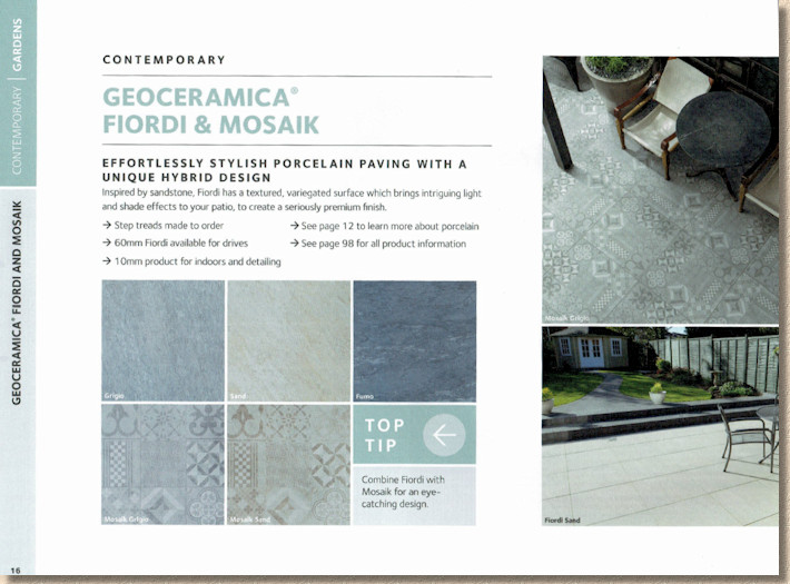
However, nothing is marked as new, which unnecessarily complicates my job, as my only option is a ‘compare and contrast’ routine with 2018’s dark and sombre brochure. The palette remains overwhelmingly grey with a few soft creams and, of course, the mandatory timber effect, which is turning out to be far more popular than anticipated. However, for me, the bigger issue is the lack of modular sizes within each product range.
The Geo-Ceramica ranges come as a one-size-hopefully-fits-all 600x600mm square, as does the basic ‘Eclipse’ range, while the ‘Elegante’ offers an alternative 1200x400mm linear styling more suited to its stone and timber flavours, and there’s a chunky 1000x500mm option with the ‘Elegante Glacier’.
It’s hardly the designer’s dream, but since the porcelain invasion took off half-a-decade ago, the 600x600mm format has performed well, and maybe the nation’s patio buyers have become inured to the single-size, beyond-boring, squares-laid-as-stretcher-bond layout, and consequently lack the imagination (or the education) to realise so much more is possible with complementary modular sizes.
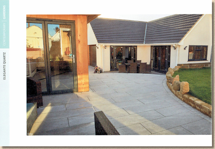
Brett are by no means the only major supplier to offer a limited size range; there’s plenty others rigidly sticking with the 600 squares, but why? When there are so many, almost limitless colour, texture and pattern options possible with porcelain and ceramics, why the hell are we stuck with one bloody size? Could it possibly be because the act of offering a multi-size range requires far more commitment and investment from suppliers and, in these uncertain times, with a fickle market, and patio paving once again falling victim to the whims of fashion, is such a level of commitment and investment a wise move?
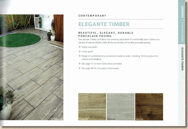
The market is split: those that have wholeheartedly committed to porcelain as their major offer are actively exploring sizes, in terms of modularity and design potential, but also in terms of scale, with a sense that grand statement pieces, 1000mm and more, are more in line with popular taste. Meanwhile, the more circumspect supplier, those still hoping to offer a more eclectic range of paving materials, stick with what they know will sell, and sell well.
My own feeling is that the poker table for porcelain is now defined, and so it’s a matter for those wanting to play to declare their hand. There will be plenty who offer the basic ‘Three of a Kind’ or ‘Straight’, but the bigger winners will be those who lay down a Full House or a Royal Flush. The better contractors, the more discerning designers will gather around those with a more comprehensive offer: their customers would expect no less.
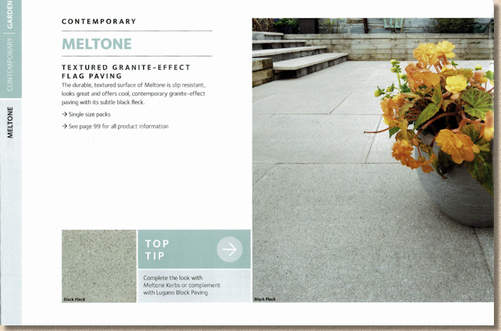
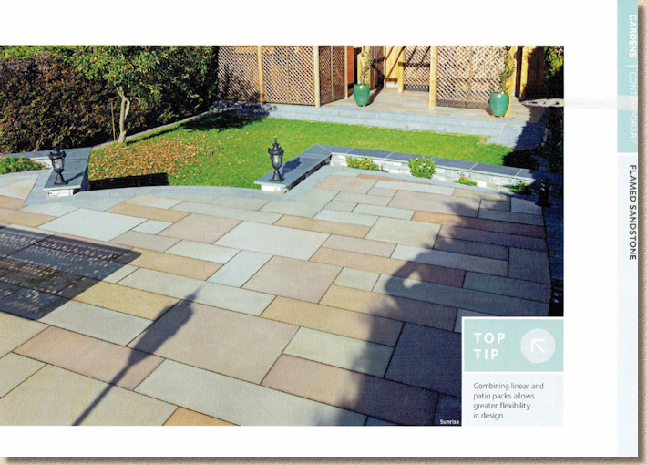
The remainder of the Garden offer all seems to be familiar, albeit somewhat slimmed down. The premium end of the concrete flag paving has never been Brett’s forte, and their offer now is limited to the granite-effect Meltone and the lightly textured Chaucer, while the natural stone has seen similar streamlining with only a flamed sandstone, a flamed granite, a textured sandstone, a riven Brazilian slate, plus basic riven sandstones. The highly troublesome polished/honed sandstones have gone – if only other suppliers would follow suit – and we are left with what can only be regarded as the proven performers. Such is the fickle finger of fashion – all those quartzites, limestones, banded sandstones and the like that were dominant just a few years ago are now consigned to the clearance yard.
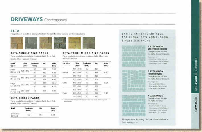
Nothing new in the Driveways section, just further consolidation around established performers such as Alpha, Omega, Aura and Beta, plus permeable versions and the heavy-duty Geo-Ceramica which has sold in bigger quantities that I expected for driveway projects.
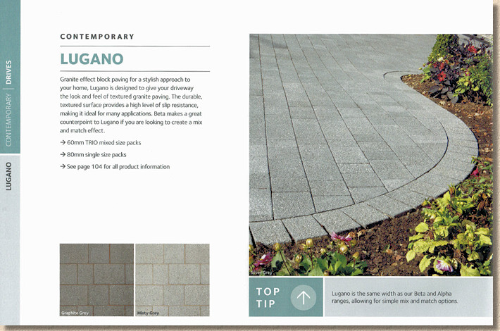
However, it’s worth noting that Driveways now takes second place to Gardens in the brochure order. Driveways, and Concrete Block Pavers ( CBPs ) in particular, were always Brett (and its forebearers) main strength. Huge swathes of contractors, particularly in Southern England, declared unwavering allegiance to Brett paviors, and enough still do. But CBPs are having a tough time out there, challenged from all sides by Resin Surfacing, Patterned Concrete, and now, even by Porcelain.
It would be foolish to write off what still remains as the most cost-effective and versatile form of driveway paving. There is life yet in CBPs, but it needs encouragement. Permeable paving hasn’t been given the impetus it deserves and requires from our foolish, myopic politicians, but, equally, too many British manufacturers have not properly pushed the development of new CBPs, as has happened elsewhere in the world. There are things that can only be done with concrete, it remains our most versatile building material, but it’s undervalued and underutilised for modern residential paving. Its day will come again….
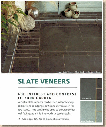
On to the Accessories and it’s the same again: no changes or developments of any real significance, with the exception of the poorly-explained Slate Veneers, which are given as being 300x75mm, but no explanation of depth. Are they, as perhaps we should expect with the title "Veneers", just paper-thin slices of slate?
It pains me terribly to say this, but it’s all a little underwhelming. There is nothing that makes me want to get out my spade and maul and set about laying once more, or even ferret out my pad and pencils to start designing. The new year of 2019, it would seem, is largely a year of treading water.
I can make allowance for the aforementioned economic uncertainty, and the reservations of buyers to commit to capital intensive home-improvement projects when we aren’t even sure of what will be our political status in just three months’ time.
I can try to find positives in the brochure format and layout, even though I’m not sure why the distinctive Brett Blue has been abandoned, and there’s no acknowledgement at all of the year – maybe they plan to palm us off with this brochure for more than a season?
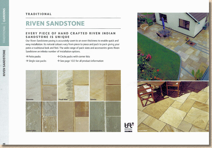
The layout of the pages is much cleaner and crisper, on that virginal white paper that has lost the darkness and claustrophobia of last year’s brochure. The quality images are generally good, some old favourites, admittedly, with old favourite errors in laying still persisting, but enough that are new and more ‘woke’.
The text on the page is just about as minimal as it dares, with the essential tech info dismissed to the back pages. Swatches are reasonably generous, but even so, the whole has a feel of being a collection of images with labels, rather than a brochure that will eagerly sell to homeowners or act as a marketing aid to contractors and designers.
It’s not that it’s a bad brochure. It will definitely help shift product, it will most assuredly be picked-up and perused at many a Builders’ Merchants, but what disappoints me is that it could have been so much more. How has it come about that in the term of just one decade, Brett have gone from producing one of my favourite brochures of the past 30 years ( 2009 edition ) to this washed-out facsimile of the 2018 brochure with added porcelain?
The brochure was sent to me along with a note describing it as " newly refreshed ", a term I feel can hide a million sins. Were it not for the porcelain in general, and the Geo-Ceramica in particular, there would be nothing at all fresh about it. It’s a re-statement of 2018, with the distinctive Brett Blue drained out, and porcelain pushed in. Yet, refreshed it is, solely by the switch to a white background. It feels lighter and classier but, like so many makeovers, it’s mostly smoke and mirrors and MDF.
Refreshed may be an appropriate term for the brochure, but I’m less comfortable with that adjective being used for the products. It would be so good to have one or two genuinely new products to put beneath the critic’s microscope, something to follow through 2019, but perhaps we should just be grateful for having as wide a palette as we already have.
Brett are in the enviable position of being a supplier that are too big to be ignored. They are a major part of the British market, and so anyone serious about residential paving will need to be aware of the Brett offer for 2019, and I’m confident enough will probably find more-or-less what they want. The Brett 2019 brochure will be an essential addition to the toolkit for many contractors and designers.
But treading water is ultimately energy-sapping and it gets you nowhere. A clear stroke and confirmed destination are needed, sooner rather than later.

