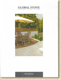
Global Stone 2010
One of the true success stories over recent tears has been the ascension of Colchester-based Global Stone to their current position as the leading independent stone supplier for residential paving projects. In a cut-throat market such as this there are two strategies for success: be price-driven (pronounced " cheap ") or be product driven, relying on a range that offers quality at a realistic cost. While too many opt for the first (and easier) option, we should be thankful that Global Stone have always been more inclined to the latter.
The 2010 brochure is a real step up in quality and presentation. The matt-effect 68-page 2009 version has been replaced by 76 A4-sized pages of stylish semi-gloss with a sleek cover of pure white with an A5 sized central photo and a simple logo. Its look is very reminiscent of a certain other brochure reviewed at the turn of the year, albeit in a slightly different size.
It also feels like quality. The cover is heavyweight silky paper, verging on being card and all the internal pages are printed on silk-laid sheet which reinforces the sense of quality, giving the photos a subtle semi-gloss appearance and imparting a tactile joy to the publication as a whole.
In contrast to many of the other brochures reviewed this season, Global Stone have eschewed the waffle, the trumpet-blowing and the style-shtick. Page 2 is a single paragraph introduction with a big photo; page 3 is an index/contents listing; and then page 4 jumps straight in with the actual products.
I'm sure some homeowners browsing through other brochures enjoy the style guidance that is intended to be thought-provoking and stimulating, but how often are those pages consulted after that initial read-through? I know from personal experience that purchasing decisions are mostly influenced by the product pages so a brochure that focuses on that aspect is a valuable tool, and if the budget determines the number of pages, losing what I call the waffle-pages in favour of product-pages has to be a sensible move.
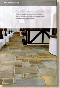
On with the motley: there's no indication of new products which echoes the attitude of most other manufacturers and suppliers during these straitened times, but it is noticeable that many of the photographs are new and, it has to be said, are exceptionally well-staged. Yes, there are a few glaring errors in laying details which would only be spotted by a paving pedant such as meself, but the composition is very good with the stone being the focus of every image while the accessories, ranging from up-market cars to simple wooden trugs, always play second fiddle to the paving.
The balance of each page is improved, too, comprising a consistent white background with a colour-coded header defining the group of products under consideration, amply generous photos and simple text in a clean, crisp sans-serif font. Size and pack information is provided in elegant tabular format and the letter-coded reference to potential layouts for the various 'Project Packs' is incredibly useful for those less familiar with the possibilities of design.
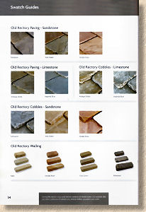
There are no colour/texture swatches on the product pages; instead they've been shunted off to a separate section towards the rear of the brochure, but the images used therein to convey a sense of colour and texture are rather small. It's hard to tell much from a 34mm square (inch-and-half in old money).
With no new products to review, an overview of the range as a whole is warranted. The bulk is made up of imported sandstone, as flags, as setts, as linear pieces and as walling blocks, in the now familiar colours. The two stand-out products for me are the bullnosed flags with a distinctive riven surface and the Arundel Paving, a "value for money" assortment of sizes, textures and colours that, when laid, is reminiscent of the effect obtained when reclaimed yorkstone is laid in southern England: a mish-mash of stone from various locations that don't match but have the uncanny knack of complementing each other in combination.
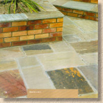
The limestone range is sparse in comparison, but they are proven products and it's good to see a supplier acknowledging the fading problem that afflicts the allegedly black limestone, even if it is described as "toning down". The accompanying photos are quite representative of the stone as it will be after a few months of daylight.
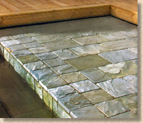
Slate is restricted to just two colours, the truly gorgeous Ocean Green and the subtle, understated Carbon Grey. Sadly, it seems the Welsh Slate that graced last year's edition has been quietly dropped. I know it's frighteningly expensive in comparison to the imports, but there's nothing else like it and it is a native stone. On a positive note, the genuine Yorkstone, direct from yer actual Yorkshire, has been retained, and very welcome it is.
Travertine is still with us, inexplicably, but then it does sell which proves the adage that there's one born every minute. The stone selection is rounded off with the king of natural stone, granite, as a four-size flag option, as 200x100 sawn and tumbled pavers (NOT cobbles, as it says in the text) and as the inevitable 100mm cropped cubes.
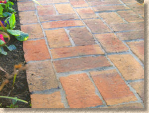
The range is completed by the mouth-watering Rose Cottage clay pavers, which are a joy to the eye and the ideal contrast paver or edge course for any form of natural stone, and finally the usual assortment of spheres, tables and monoliths.
It's a range best described as 'solid'. Every product is proven, with nothing that might be considered outlandish, risky or edgy. There's enough there to satisfy most tastes and as Global Stone's target market is the typical homeowner rather than those with a nebulous design vision or an unlimited budget, it has to be considered as mission accomplished.
As mentioned earlier, the swatches section is a good idea, but undercooked, while the layout guides are useful but really need dimensions adding to give a true sense of scale. Having the 1800mm dia and the 2800mm dia circle options shown as the same size could be confusing for some. I won't comment on the laying advice, as I have to admit responsibility for it, but it should be noted that while many brochures have shied away from installation guidance over the last couple of years or so, Global Stone have seen fit to invest a whole nine pages to advice on laying, maintenance, aftercare and suitability. That, I feel, shows respect for the customer.
Of all the brochures I've seen this season, whether they've been reviewed on this site or not, the Global Stone 2010 edition is the one that has shown the biggest improvement. That's not to say that last year's effort wasn't up to much: it was very good and never off my desk throughout the season, but this updated version is at least two rungs further up the ladder and should be added to the library of every serious contractor and designer.
You can pick up a copy of the brochure at selected stockists throughout the country.
Alternatively, you can order by telephone or via the Global Stone website (which still shows the 2009 brochure but the 2010 edition will be sent out)

Tel: 0845 60 60 240


