New Directory from Brett
Brett Landscaping launched their new catalogue a month or so, but, as with their products, the new brochure doesn't seem to travel this far north and my copy only arrived over the weekend, with a plea from marketing manager, Zack Barrett, hoping I would find it to be an improvement based on the review of last year. I couldn't recall be overly critical last year: I remember the catalogues being split into three but apart from that I enjoyed using it on numerous occasions, so I decided to check what I wrote back in February 2005. Aaah! My two pet hates – grinning PYTs (Pretty Young Things) and Spot Bloody Bedding. Apart from that, I think my comments are fairly positive, and if all I can find to moan about is eejit models and spot bedding, faults that can be found in almost every manufacturers' publicity material, then it should be regarded as an overall success!
The most obvious “improvement”, is that they've gone back to the single brochure format, rather than the three-parter of 2005. If you've a product catalogue that's challenging Yellow/Golden Pages at the weigh-in, then splitting your portfolio into three strands is probably a sound move, but when all three together are struggling to pass the 100-page marker, I can't see the justification. So, the return to a unified catalogue is definitely a step (or three!) in the right direction.
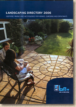
Except, it's not a "catalogue", nor a "brochure"; it's now a "Landscaping Directory", with the sub-title "Inspiring paving and accessories for homes, gardens and driveways". I quite like that – the concept of a "directory" suggests it will be information-based, rather than a magazine format, and that it will point the reader to further sources. The cover is attractive, and the PYTs are strategically shoved over to one side, allowing the late afternoon sun and long shadows to play lovingly over a circle of 'Canterbury' wet-cast flagstones. This is a good image for use on the cover. It's not too aspirational, but it immediately gives the impression that this is a paving guide for residential projects, and so it's bound to be picked up by casual browsers as well as the contractors.
2006 offers sixty-four full-colour pages within a semi-rigid front and rear cover. The contents are sub-divided into six sections: The now seemingly obligatory “Inspiration” section, followed by three core sections devotes to “Garden Landscaping”, “Natural Stone” and “Block Paving”, a short 2-page featurette on lighting, and wrapping up with 8 pages given over to “Advice and Guidance”. That seems logical enough….let's have a closer look.
The first two pages beyond the contents page conveniently identify the new products, and illustrate them with photos. Obviously, these are of major interest to contractors, so I'll devote a few paragraphs to them. I should point out that I haven't seen many of these “in the flesh”. Brett products are virtually unknown in this part of the country, and I only usually get to see them when on missionary trips to Lower Britain. My travels haven't led me any further south than Birmingham since the turn of the year, but I'll be in that London next week for the Natural Stone Show , and while there, I'll be making a point of getting in to a couple of paving stockists if I don't have the time to trek out to Brett HQ in Kent.
So: The new stuff...
– an addition to an existing range, so there is obviously a demand. These are natural stone flags, hewn from genuine slate (of Chinese origin, I seem to recall) and available in three colours, three sizes, and supplied complete with corner infill kits. It has to be said that the colours are quite sombre, but that's the nature of slate and of the three, I prefer the darkest of the lot, the Olive Black. The texture is quite smooth, with some cleaving marks, and it's very fine-grained. Unmistakeably natural in origin, it combines well with other stone products, particularly those offering a contrast, such as the silver-grey granite setts.
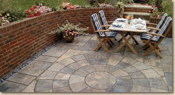
– this is an one-sized organic-shaped wet-cast concrete flagstone that is laid to an interlocking layout, replicating crazy paving. The most obvious application is for creating informal garden paths and/or stepping stones. This is one of those products that I would really need to see before saying much more. The photos in the brochure look appealing, but I'm old enough to remember previous attempts at this sort of idea from other manufacturers and it was never overly popular. The downfall was the fact that every piece was identical: if Brett have managed to inject some life into the format by introducing colour and texture variation, then it might “have legs”, but I need to see it before making up my mind.
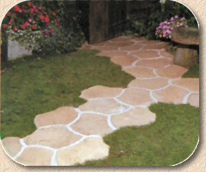
– Warwick is a mid-price range of wet-cast concrete flagstones with a worn-smooth texture. This new version promises various grey tones, which could be very fetching, but again, it does need to be seen. Regular readers will know I'm a big fan of neutral colours, particularly greys, but there are greys, and there are greys. The six-size format offers potential for genuinely random layouts and I'll readily admit I'm more intrigued by this product than by the Puzzle Path.
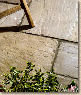
– another addition to an existing range, this new colour offering revels in the name of "Barley Fields", which suggests light buffs with flashes of gold. It's hard to tell from the photo, which is half in shadow, but it looks warm and summery, not too dissimilar to the import sold as "Camel" or "Golden" by some distributors, which is a good choice for those looking for a Ham-stone or Cotswoldy type of colouring.
– this secondary processing has proven to be very popular since it first started appearing three or four years ago, and rightly so. With many of the imported stones, tumbling dramatically alters the colouring, as well as the texture, and gives them a genuine aged look. Brett are offering three tumbled colours – Forest Glen (a browny-olive with green-tinges), Twilight, the charcoal-buff flavour, and Sunset, the rose-pink stone. I'm very keen to see these, as it's all but impossible to guess what effect tumbling will have on the tones and hues, but given Brett's pedigree, I can't imagine they'll be anything other than gorgeous.
is the final new product, and it's a permeable block paving system. Permeable is THE next big thing for block paving, albeit through necessity rather than fashion, and every manufacturer of note is upping their game in this sector. Again, it's a product that needs to be seen to be judged, but the 'corrugated' edges look quite naturalistic. Only two colours, brindle and charcoal, for now, but I am sure the palette will expand as awareness of these products grows and the concept of sending water into a pavement (something we've been avoiding for roughly 2,00 years) becomes more widely appreciated.
Taking a broader view of all the new products, this is a clever platter of new items. There's a bit of something new in each of the three main groups (stone, wet-cast flags and block paving) with a commendable environmental product (T-Flow®) but not so much that you're over-faced and confused by it all.
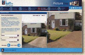
On to the rest of the “Directory”. The next page introduces us to Brett's “Picture This”, an online “what-would-it-look-like if..” interactive application of the type being introduced by several manufacturers. Basically, you upload a photo of your driveway (or select one from the online library that is similar to your project) and then paint-in your chosen type of block, kerbs and other features until you have a visualisation that suits your taste. There isn't the space to review this particular version, but suffice to say that this type of application is a massive boon to both homeowners and contractors, as it can remove a lot of the uncertainty that was previously inevitable with driveway design. We're still a good way off a universal application that can compensate for angle and perspective, but we get closer with every year.
After the “Picture This” gizmo, there are 18 pages of “inspiration”, which features dozens of photos and some sound advice interspersed with the usual buzz-words such as “Living” and “Relaxing”. We've seen some of the photos in previous catalogues, but there's nowt wrong with that – a good photo is a good photo – but there's plenty of new images, and some interesting ideas. I particularly like the “Before and After” pages because they give a good sense of what is possible without straying too far into fantasy land.
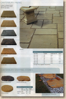
The product sections are extremely well-designed. Clever isometric views of the flags function as colour swatches, while clear and simple tables give information on sizes, weights and coverage, with a generous sprinkling of photos showing the products in use. Similar products are grouped together in a logical structure, but there is no strong ruler dividing one product from the next, so there is a sense of constant flow through the pages. This can be a disadvantage when looking for a particular product whose name you've temporarily forgotten, but the layout isn't at all cluttered and you will soon find what it was you're looking for.
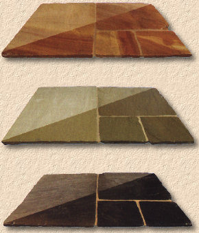
The Natural Stone section follows the same format, with the added bonus of showing the flagstone swatches with one half sealed using an unidentified semi-gloss product. Again, there's a logical sequence from one product to the next that concludes with a couple of pages given over to decorative aggregates. One thing I do miss is the full-page photos. I know many of those images that were afforded a page of their own last year are used again in this catalogue, but one thing that I loved in 2005 was the extravagant, exuberant, ostentation use of stunning full-page piccies.
Block paving is in the same vein: simple, unfussy layout, although the swatches are Bird's Eye View, rather than isometric. Some of the tables, such as those for Theta and Theta Duo, seem to have been split into two for no reason other than layout, but even so, it's not difficult to find the info you need.
Maybe it's because we're all so familiar with block paving nowadays, or maybe it's because the profit earned from block manufacturing is not as much as that for other products, but it does seem that Brett, along with several other manufacturers, have downgraded CBPs position over the last couple of years. At the turn of the millennium, Block Paving led these catalogues and page after page was spent extolling their virtues and design possibilities. Now it feels as though they've been tucked in at the back for the sake of completeness.
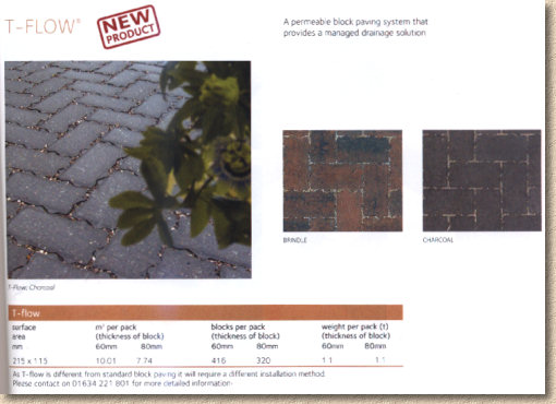
The new product, T-Flow®, is given a paltry half-page – surely a new product, and one with such important environmental implications, warrants more than a half-page? Where is the construction diagram explaining how it's intended to work, and why it's a 'greener' from of paving? It will be a real challenge for a contractor to sell this product from such a meagre offering. Admittedly, there is a telephone number given for requesting further info, but I do think this is one product that genuinely warrants at least a full page to itself.
In contrast, the kerb system for use with block paving is given a full page, and it makes good use of it, with just about every possible layout and permutation illustrated. On the opposite page, though, drainage and recess tray covers are squashed into one-third of a page.
A double page spread for lighting includes several photos that do a good job of conveying the mood that can be created by clever use of relatively simple lighting units. There's no installation guide, which is probably down to Elfin Safety, but the subject feels under-explored. I know from the number of enquiries that come in via the website that lighting is being considered by more and more homeowners when they have a driveway or patio installed, and a couple of extra pages would probably have done justice to the subject.
The final section covers layouts and construction advice. The layouts are straightforward and easy enough to understand and they cover the essentials, but don't delve very deep into design alternatives. The construction advice, I'm saddened to report, still advocates the completely idiotic and unacceptable spot bedding method, but only for wet-cast flags. If a full bed is recommended for natural stone flag, why not for wet-cast?
Spot bedding is for cowboys and amateurs. It's implicated in many of the failed patios I'm asked to inspect. Why does a reputable company such as Brett persist in showing it? Why devote a paragraph of text to sub-base installation (when a sub-base is not always necessary for a patio) and then make the ridiculous claim that “The 5 spot mortar method is suitable for lightly used domestic areas” . No it's bloody well not. It's crap. It fails. And it would NEVER be passed as acceptable on a professionally managed project. Just look at those gaping voids beneath the flags in the illustration – it doesn't take a genius to work out what happen to those flags when anything heavier than a doll's pram tracks across them!
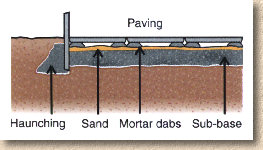
The block laying advice is generally sound and reasonably comprehensive given the limitations of space. Perhaps if less space had been wasted on spot bedding…..
Overall, this is a compact catalogue that contains far more than you'd think was possible in just sixty-odd pages. Yes, there are places where ideas and products could have been developed further, but maybe providing a taster of what's available is all that's necessary. Most people have internet access and so it's much easier to find additional information than it was even five years ago.
A noticeable trend amongst several catalogues over the last couple of years ahs been to devote more space to “lifestyle and inspiration” rather than to product information, and one of two catalogues have, in my opinion, strayed to far over the line that separates brochure from magazine. I think Brett have got it just about right with this “Directory”. The lifestyle and inspiration pages don't feel fluffy and meaningless – they are interesting without being patronising or overly aspirational. The product info is just enough of a taster to whet the appetite and inspire further investigation. I just wish they'd follow the example of certain other manufacturers and drop the spot-bedding bollocks!
You can request your own copy of the Brett 2006 Directory by calling 01634 222188 or via their website (which seems not to like Firefox for some unknown reason)


