Stonemarket New Products
Oh, I do like a sneak preview! Years ago, all the manufacturers and distributors of any significance would unveil their offerings for the following season at a single event, but those days are gone and now we have to wait for a brochure or be lucky enough to get an invite to an event such as this: the grand reveal for stockists and suppliers.
Stonemarket decided to stage their exposition at their manufacturing plant on the outskirts of Coventry and had a full crew of Stonemarketeers on hand to explain what was what and why. More importantly, they were doling out stuffed-to-the-gunwales bacon butties, which is just what was required after a 3hr shuffle along the comedy car park occasionally known as the M6 Cheshire.
The real target for this unmasking is, of course, the merchants. The object of the exercise is to let them see what they could and/or should be stocking and selling come the spring of 2014, and so there's quite a bit about marketing support, POS nonsense and no end of other gubbins to ensure merchants continue to do the bare minimum in return for maximum profitability. Consequently there was not much product on show, which I found a little disappointing. However, when you accept that most merchants don't give a flying duck about the aesthetics and versatility and potential of a product, just its sales volumes, you can understand why there's not the scale of effort to showcase the products as would have happened at a trade show.
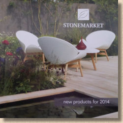
All of which makes a critic's job that bit harder, as you have to get your mind to whisk you away from a tin shed in Warwickshire to an imaginary setting on a sweeping driveway or a panoramic patio. Of course, some of the publicity shots in the accompanying booklet help because, this being Stonemarket, they are simply oozing with class and style, but no matter how good the photie, seeing a flagstone or block in the flesh in a complementary and sympathetic setting is unbeatable.
So what did we get to see? Most of what's new is natural stone, and it comes from all corners of the world. There's a concrete flagstone and concrete blocks to complete the range but it is the stone what really stands out. Some of it is OK, some is good and one or two are great, but this is all just opinion. I'm certain some of the items which I find less appealing will be at the top of the list for others and those I love will seem dull and bland to some. The thing is, I've now seen them for real whereas many of you will have to wait months for that privilege!
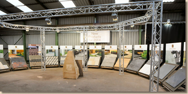
To keep things simple (for me) I'll fly through them in the order they appear in the booklet.
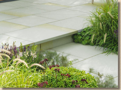
Westmoor Crest – native blue-grey banded yorkstone with a shot textured finish which softens the colour but enhances the tactility. As a twist on a tried-and-tested favourite, will it attract enough attention or is this a case of gilding the lily?
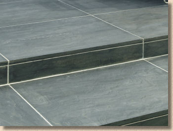
Avant-Garde Obsidian – the public's appetite for black stone seemingly knows no bounds but the twirly-swirly metamorphic marble from India is too busy for me. The option to have ginormous 1000x1000mm flagstones will help its appeal, but it's still an acquired taste.
Avant-Garde Colossus – this is simply the aforementioned ginormous size applied across the Avanat-Garde range. Along with black/monochrome palettes, the 'in thing' of late is B-I-G flags, so take an upmarket luxury brand such as Avant-Garde and supersize it. A bugger to lay well, but real statement pieces when done properly.
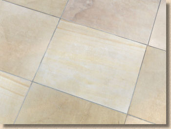
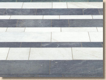
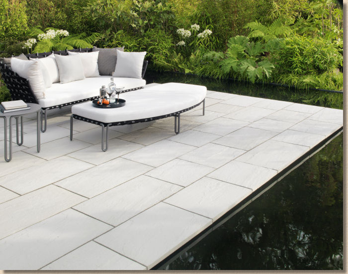
Equinox Crystal – and here's the white (or white-ish) to complete the monochrome palette. It's a quartzite, so it's as hard as iron, and like all quartzites, I suspect it will keep itself relatively clean compared to the porous sandstones, but apart from the glinty-twinkly surface, there's not a lot of character, unless you count the occasional peppering of Fool's Gold (iron pyrites – which they say is fixed so won't turn to rust. We'll see!)
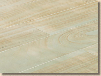
Cordara – the other 'trend' is long aspect/linear/plank paving, so here's Cordora, a buffy-brown quartzitic sandstone sawn against the grain to give the resulting units a sort-of wood look. I just know this is going to appeal to those who want the style of decking without the concomitant trip to A&E when you slip on it in the wet. Very interesting. Not for me, but still very interesting!
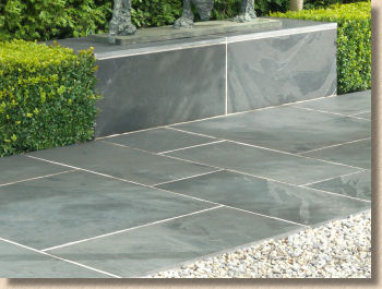
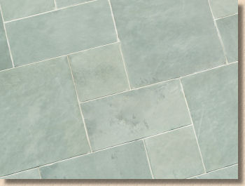
Nordus Schwarz – is that a bulge in my pants or just a ball of line in my pocket? This is gorgeous! A Brazilian deep blue-black slate which cleaves to give a silken face, enhanced by precision brushing to leave just enough character to emphasise its natural origin. Classy, understated, sassy and very, very chic. You want black? You want this stupidly named beauty!
Nordus Gris – what's with the silly Teutonic names? Gris is grey, so this must be the pale companion to the Schwarz. Paler in colour and, sadly, paler in character.
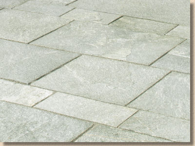
Quartos – another quartzite (maybe the time has come for quartzite: it's been vastly under-rated for decades!) but one with a more rugged cleaved face and a silvery colouring with hints of palest jade. I sense this stone needs a contrasting companion to make it work. The format of having two gauged widths and random lengths will help, but it's a little too subdued on its own.
Dorian – wasn't she the floozy on some sit-com on the telly? There's nothing flashy or outrageous about this dull, mid-grey limestone. It's been given a top-secret 'rubbed finish', allegedly, but even that hasn't managed to make this look vaguely interesting, and definitely not interesting enough for a photie, apparently!
Haus Carrara and Mocha – when trying to justify the price of this type of product, many manufacturers like to talk about 'reconstituted stone' but now the even more pretentious term 'engineered concrete' is being bandied about in relation to these Haus products. All bloody concrete is engineered! Some of it isn't engineered very well, but even a bodged twenty-to-plenty mix has been engineered, albeit more by accident than design. And if that wasn't enough to put me off, the colours and styling of these make me wonder what sort of eejit could ever think this is attractive paving. The only way it could look less realistic is if it came in glossy tile red. Sorry, but to me, this looks like a basic wet-cast concrete flag that's been daubed with garage floor paint. Engineered my arse!
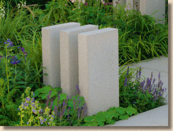
Rio Palisades – if you go back through the brochure review on this site, it won't be long before you find a paragraph or two of me waxing lyrical about palisades. They are used extensively on the continent, but for some completely unfathomable reason, they have never really taken off in Britain and Ireland, which is a crime. They are just so bloody useful.
Neater than a flag-on-edge, more versatile than walling for small level changes and retainers, ideal for step risers, why would you not use them? And now that they are available in the subtle colours and shot texture of the Rio range, you've even less reason not to include them on your next multi-level project. Try them once and you'll be sold, I promise!
Millstone Driveway Setts – my 4 year old granddaughter – no, scrub that: my 3 week old grandson could have predicted this development. A block paving *system* that bears an uncanny resemblance to Cobbletech, the wannabe sett pavior which Marshalls have barely mentioned since its launch 18 months or so ago.
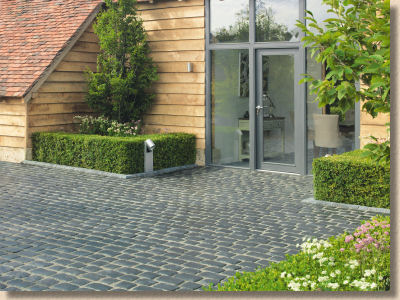
There's no point wasting valuable typing skills on the product itself, as it's all been said before, but why launch the same bleeding pavior under a different name? I admit I have zero skills when it comes to marketing, but this 'doubling-up' which occurs with various brands, not just Marshalls, convinces me even more that much of what the marketing bods tell us is pure bollocks. Next, they'll be selling us 3x2's with a daft name: Artisane – the versatile 900x600mm Gris flagstone of engineered concrete with a subtle pimple texture and an innovative paper backing!
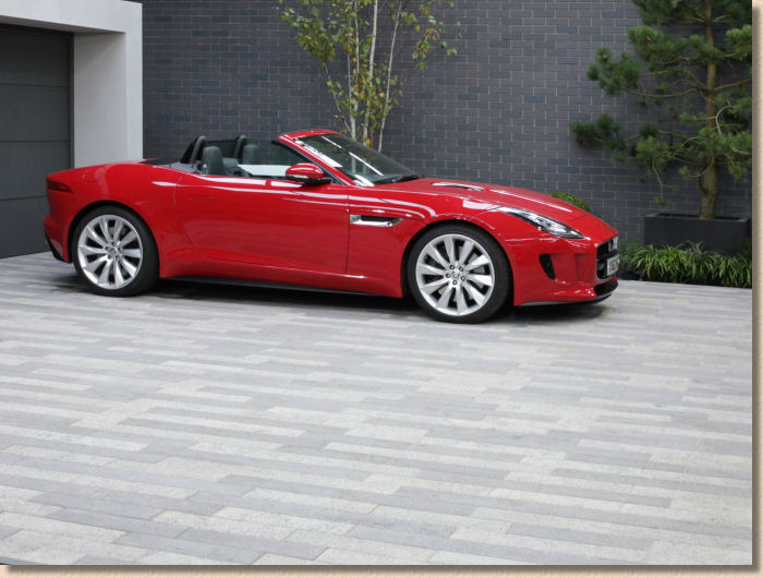
Vecta – the long aspect block paver. Long overdue, and very modern with the washed-to-expose surface which has been popular in that Europe for 15 years or more. It's products such as this which will re-vitalise the stagnant block paver market. They bring new thinking, new styling, new design opportunities and a buzz of excitement on the right project.
I can't fault what Stonemarket have given us here, I can even accept the nonsensical sizing (was it 380mm?) but I do wish they'd added a third colour. Two is simply inadequate. Please, please, please give us a mid grey!
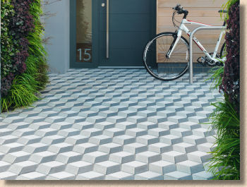
Rhombix – and this is exactly the sort of thing that caused the block paving market to stagnate. It's awful. It hurts your eyes. It's disorienting, it's dizzying, it's an Escher mindf*ck under your feet.
The more I look at this, the more it makes me think of those chevron roundabouts. Who, in their right mind, would want an expanse of this geometric gobbledegook on their driveway? The only application for which it might, and I emphasise, might be suitable, is to create harlequin-like borders, break bands or edge courses. Other than that, look for it in the bargain bin on eBay (other auction sites are available) around this time next year. It should make good hardcore.
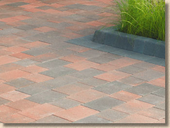
Avenu – instantly forgettable. An untumbled Tegula or Pavilion. Going back to the previous comments about stagnation in the CBP market, this type of product had its day well over a decade ago and if we want to see block sales recover, then we need new looks, not a tired and uninspiring format such as this. I've never yet seen a pavement laid using these untumbled multi-size pavers which I thought was a triumph. They are paving for people of small imagination. Supermarket paving, but Stonemarket don't sell to supermarkets!
As ever, I know it's a good range of new products when there's stuff that make me want to kiss it and stuff that makes me want to retch. That's always a sure sign that they've got a thoroughly comprehensive range on offer.
What is striking is the number of new products. This is a confident and positive selection from one of the most insightful of paving brands. It's not quite back to the glory days of fantastic flights of fancy and experimentation, but it's heading in that direction, which surely must be a reflection of the general feeling about the economy. Bear in mind, however, that Stonemarket is a luxury brand, and the typical Stonemarket customer is unlikely to have been "in it" quite as deep as many in this country, so the re-emergence of these aspirational products is probably timed to perfection.
For the installers and contractors, the news of the impending launch of Stonemarket Landscaper Network, a sort-of Layers' Scheme, will be of immense interest, but hold your horses. This is NOT an approved contractor scheme a la Marshalls' Register. It's more a loyalty card a la Starbucks, where you acquire points which will earn you discounts or freebies. There will, as you'd expect, be some light-touch vetting to keep out the dregs who spoil it for the rest of us, but the Stonemarketeers are very, very keen to emphasise it is NOT a 'Register', not an 'Approved List' or 'Assurance Scheme'. It's glorified Green Shield Stamps for posh paving.
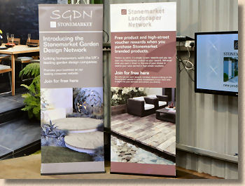
There's a parallel scheme for Garden Designer's cleverly entitled the Stonemarket Garden Designer network which will operate in a similar manner.
So, to sum up, how did it go? They gave us a feedback form (and a free pen to fill it out), but it's multiple choice and I always ignore that sort of feedback form as it's too limiting and steers the compiler to the sort of answers the marketing bods want to hear.
I do appreciate the opportunity to see new products in the flesh. Far too many suppliers just churn out a brochure and expect me to pontificate based on the images therein, which rarely does justice to either the products or the supplier. Now that we have no effective real life showcase for the wider paving industry, these one-off expositions are as good as it is going to get, and any chance to see paving is better than none.
But, having said all that, the setting and the relatively small sample panels didn't really bring out the best. I wondered how difficult/expensive it would have been to arrange a showcase display, as they would have done for a trade show. This would have allowed us all to see larger, more expansive and shaped panels of the paving, juxtaposed so we can better evaluate comparisons and contrasts.
Was this down to the fact that 90+% of the target audience were merchants with no real appetite for designer displays? Was it a budgeting decision? Was it a matter of time and having limited stock?
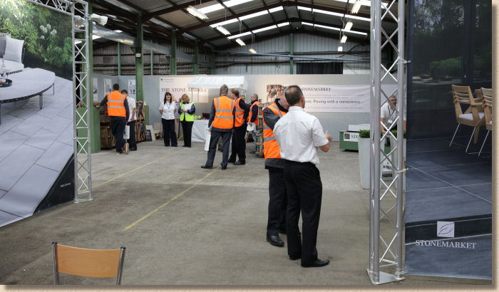
The staff were well briefed, very approachable, cagey in their answers to awkward questions, which is exactly as it should be, and generally helpful rather than hectoring. Plenty of them, too, which ensured no-one was left isolated or lost at any time.
The small size of the display would be the only thing I'd change. There is no shortage of space at this location, far from it in fact, and it's not as though it costs owt! The marketing and POS gubbins can remain, but when it comes to showing off the new products to best effect, Stonemarket used to be one of the most imaginative brands and their displays never failed to delight. Re-create that, and I'll be an exceptionally happy bunny.
So, having given me the amuse bouche, I now have to wait for the sumptuous brochure to really whet my appetite and then start hunting down stockists who have made the commitment to put in more generous displays. Roll on Spring!


